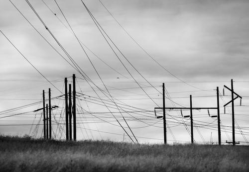
It is nice when someone makes a nice picture out of annoying wires and posts. You, or someone, likened it to a piece of jazz, which I think is a good description. At first chaotic with seemingly unconnected directions, but then we pick up on the main sweep from top left to bottom right, and the anomalies become welcome little creative flairs.
I am undecided about the sky. It is beautiful, with understated colour and shape, and brings a bit of joy to the scene, but I can’t help wondering about going all in with your graphic theme, and photographing against a plain pale overcast sky. The pretty sky competes with the graphic lines of wires. Or is that tension between the natural beauty and the stark man-made objects exactly the point of your image?
Both images are great, but I like this (older) one in particular. Excellent composition. I probably wouldn't know what to do with all those lines, but you made perfect sense out of them! Well done. The one you posted called "Lines" makes sense as well, but because it's even more complicated my eyes (brain) take longer to 'understand' it. Perhaps a B&W edit with increased contrast would make it click faster, but I don't think it's necessary - works fine as it is, no need to rush to conclusions... 👍
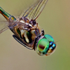
I know I'm being pedantic here but that isn't a bottlebrush, it is a banksia. The bird is a rainbow lorikeet, although there are many variations on lorikeets and they have differing local names.
It's a composition that uses lines from three corners to direct us to the meeting of the bird's head, with the all important eye, and the banksia. The eyes is important because it helps us make sense of the inverter position of the feeding lorikeet.
A very good shot that has much of the personality of these eyecatching and amusing birds.
One of the reasons I'm so thoroughly enjoying this weekly thread is how often other participants have been able to state what I couldn't quite access verbally - both regarding my own photos and other posts. I didn't realize 'til you wrote it, Pete, but I do indeed love the tension between pretty sky and the ugly, blight on the landscape, fascinating and photogenic wires and poles!
I tried converting this to black and white, and added a different cloud formation just to confirm my awakened thoughts. See attached. I do have some stark b&w graphical (if I understand the term correctly) poles and wires, but those were originally shot against plain blue sky, so there wasn't a "mood" involved. Many thanks!
Thanks so much! I was chasing the moon just before sunrise and serendipity found me that composition. Re my new photo this week, I tried a black and white in response to Pete's comments, though it's not as contrasty as perhaps should be. However, I still much prefer the color, reasons given in my reply to Pete above. Appreciate your interest!
When I quickly scanned the week's contributions, I didn't see gateposts. I thought I was looking at chess pieces. It wasn't until I started to write and looked closer that it dawned.
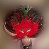
Your exploration of bokeh balls continues. It's a worthy project. Finding new ways to do this must be quite a challenge. This week is very different again with the ball picking up the shapes from the gateposts. I have no problems with either the proportions or the softer shape of the balls to the left. IMNHO the secret is the red dot.It works a couple of ways.It gives balance to the stronger balls on the right and it gives a transition to the softer groupings on the left. As a single ball of that colourand being close in size to the gatepost ball, it pairs with that ball while creating a bridge to all the light balls..
Keep them coming.
You got me. I'm a dog lover and this shot reels me in.Your angle and lens choice make the hand and cup feel as though they are those of the viewer. It feels as though we are offering the water to the pup. His eyes look directly back at us. Bonding is established. Add in the tilt of the head and the tuenrd down tip of the ear. We have personality. I don't know about y'all but I know that dig and I would get along just fine. It isn't the dog that has done this, it's the little touches that the photographer has caught that have created the bond.
I agree, that the red ball pulls one's eye into the shot.
But this is the first image I've posted of this kind. I think you may be mistaking my image for a series posted by SimpleJoy in which OOF lights and objects are prominent in his compositions.
I'm afraid any praise attached to this shot belongs to pure dumb luck. While I was trying to capture her personality, the intended shot was of a long drool trail that was billowing in the AC.
Apologies Rich and SimpleJoy. Rich is correct and I confused the work from each of you.
May I put it down to the problems I have in trying to follow conversations in the flat view forum format.?
Pete has covered Linda's image comprehensively. I might have suggested B&W as well. Linda has supplied a b&W version. I agree with her. I prefer the original colour version for exactly the reason Pete mulled over as a possibility.
Conclusion? Discussing images is a win, win activity for photographers.
It certainly does. It's a huge issue in India.
Here, the men have become a united block. This is conveyed in the similarity of their clothes , postures and eye direction. They appear relaxed and confident. Smug? The solitary woman stands directly opposite. She isn't relaxed, she is on her feet, facing the men and in movement. The angle of her head is wonderfully caught and even at this distance we can tell that she looks above the men to the Goddess. The men have their backs turned to the female values represented in the statue.
In the current mood in parts of the indian community, this image might be banned. That's a measure of how good it is.
This isn't a definitive answer. It's my take on what I was looking at and my reactions.
It was in an art installation in Naples. There were a number of other pieces although they were very different to this. I think they were making a point about art being chained to the classical, which means Roman and Greek.
Another "I think." This post appears to support the roof and may well be a comment on the continued use of the three Greek orders of pillar capital design, the Doric, Ionic and Corinthian. It is highly probable that my interpretation is merely a display of my biases and how they warp my view of things. I dislike Corinthian style and I get bored with its overuse. There's a lot of it in Naples. I saw the pillar/capital as a rejection of Corinthian and a playful suggestion to try something else. If so, this looks closer to the Doric and Ionian I enjoy.