• Members 1548 posts
    June 23, 2023, 1:51 a.m.

    Thanks Chris. They often look like that, They're pretty fast so I'm never sure quite what I've got till I get home.

    Thanks Bryan, and glad these birds made you smile, they can entertain me for hours. When they are moving, I shoot fast and pray, but never sure what I got till later. These two were disputing the perch but unaggressively and as one would come down, the other would lift so they looked like they were on a trampoline.

    Andrew I always appreciate your edits and I do agree with you about the slanted stage. Sometimes we have to change what's there in favor of visual balance, and it looks better this way. I did a little editing of the water but not as much as you did. I like it. There was some fog that day that softened the water.

    Thanks Linda. They were in a perch dispute, but not displaying or fighting, just kind of jousting, so it looked more like play and it may have been. Straightening this stuff is always a quandary. Andrew made this look feasible. Sometimes it just can't be done because of the placement of other elements.

    Thanks! I have often thought they look like choreographed dance troupes, or actors on a stage.
  • Members 1075 posts
    June 23, 2023, 8:24 a.m.

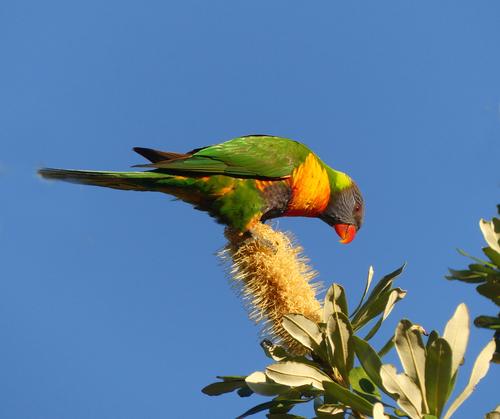
    Yes I guess we are blessed to have them to view and photograph. They aren't necessarily that prevalent, depending where one is and in what season. I hadn't seen Rainbow Lorikeets around until recently, which I assume is due to the late flowering of the Banksias. I had seen other parrots around here this time last year. There is another pair of Lorikeets around one having an almost bright red chest. I got a cluttered shot of him yesterday afternoon in overcast light and the red channel was blown!
    I did include the original for reference. As you see I had to resurrect his tail after removing the oof leaves. Also cleaned a bit of gunk off his beak for him.

  • Members 1662 posts
    June 23, 2023, 9 a.m.

    Great capture and impressive colors! The composition works well and your edit is effective for what I assume you want to show. (I like images with blurred foliage in the foreground, but first of all I'm not a bird photographer, so don't take advice from me here 😉 and second of all, it would probably have to be a little bit less to the edge and taken at a smaller f-stop to work effectively)

    For me personally the blue sky is a little bit too intense, making the overall image look oversaturated to me. The bird looks great as it is though, so I'd only decrease saturation of the sky slightly.

  • Members 1075 posts
    June 23, 2023, 9:44 a.m.

    I agree with that. I would have preferred to have other elements in the scene to reduce the amount of sky. But I did increase the saturation and contrast a bit because the original had a touch of majenta? in it...

  • Members 132 posts
    June 23, 2023, 10:11 a.m.

    Fantastic Pete, this photo in which many forms and the modesty of colors and shapes make the photo a haven within the normal bustle that otherwise prevails in touristic environments make it a joi to take it all in. The light is also beautiful and fantastic and the woman who takes a picture almost looks like a local herself due to the colors of her clothing. I don't really know what to say, but in that peace, colors and shapes I feel almost overwhelmed in a positive sense of course. For me, this is this week's picture.

    Lou

  • Members 1075 posts
    June 23, 2023, 11:09 a.m.

    I like what you have done re composition. I also like the yellows and copper green. I can't tell if you have brought the yellows up in pp. There doesn't appear to be enough natural light. But it is pleasant either way, especially on the side of the Eiffel Tower in the top pic.

  • Members 132 posts
    June 23, 2023, 12:06 p.m.

    Hi Linda,

    About your photo, it's kind of crowded and the center looks like an abstracted animal head. It is a kind of photo ala an Herman Rorschachtest, after all they are never right and are never wrong either and although I don't like to give such pragmatic considerations. So I can agree with your own opinion you have about your own work about the execution and the concept.

    Lou

  • Members 1075 posts
    June 23, 2023, 1:46 p.m.

    That is an exceptional photo Pete. The light, the pastel colours, the architecture, the foreground and background, the people. Everything comes together. Makes me want to go back there.

  • Members 523 posts
    June 23, 2023, 2:03 p.m.

    Generally speaking, I usually like a bit more breathing room and context for birds. Attached is a quick edit of your original. For me this crop (with a bit of cloning) feels more natural and comfortable. I'd likely try to darken a few of the lightest leaves on right side, if I kept them. I chuckled about the rich blue sky color comment because I've been hearing that my skies are "too blue" for years 😁 Some is peronal preference, yes, but when I am out on clear, dry days and wearing my polarizing sunglasses, the sky is every bit the color of yours!

    1edit p1030581.jpg

    1edit p1030581.jpg

    JPG, 1.2 MB, uploaded by LindaS on June 23, 2023.

  • Members 523 posts
    June 23, 2023, 3:30 p.m.

    Thanks! Yes, the symmetry was on purpose, though as with some of my other decisions, I'm rethinking that.

    Thanks so much, Paula. Fun to know your mother was into that song! You have guessed the basic construction correctly. I did a black and white of the original, then duplicated the layer, but set it slightly off. Then I created a blank canvas double the width, laid the result on the left side and then duplicated that side. Moved the newest layer to the right side and flipped its orientation horizontally.

    Thank you kindly. I do go a little wild on rare occasions 🙂 Pleased you enjoyed!

    Thanks so much for your candid reply, Lou. The crowded look was my primary intent (little boxes on the hillside...all the same). Now that I can not un-see the abstract animal head resulting from the mirror image layer, I may have to run with a new theme entirely 🙂

    By mentioning I was not in love with this, I wanted folks who have a negative reaction to feel free to reply. Many of you seem to have been here a long time and are comfortable offering candid assessments to each other, while I'm pretty new to the party. I welcome any and all reactions and suggestions!

  • Members 861 posts
    June 23, 2023, 10:02 p.m.

    img_4802_$40_72dpi_web.jpg

    img_4802_$40_72dpi_web.jpg

    JPG, 2.5 MB, uploaded by OpenCube on June 23, 2023.

  • Members 1369 posts
    June 24, 2023, 2:39 p.m.

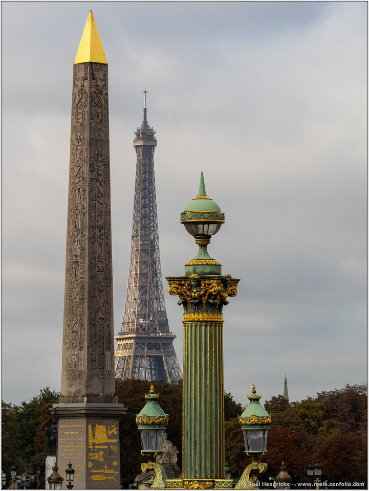
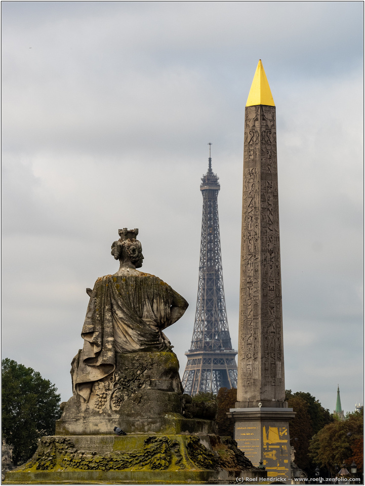
    Looking for a different angle is the way to go in a famous place. There's no point in doing the shot that everyone has seen before. Finding the different angle is another matter. Everyone searches for it but here you have managed it.
    The Eiffel states where we are and then come the surprise, the playing with the iconic shape by putting it alongside rival verticals that have been overlooked. I like the ups and downs of shot one and the touches of gold on each that link them together as well. As a further surprise, it is all managed on a day that does no favours for photographers. The dull, evenly lit grey sky welcomes the touches of gold.
    Photographers don't happen across shots like this, they need to know how to look.

  • Members 1369 posts
    June 24, 2023, 2:55 p.m.
  • Members 861 posts
    June 24, 2023, 2:57 p.m.

    "There were rumors of anti-Castro pigeons drinking in bars the night before the assassination. Someone overheard them saying 'Coup, Coup'" - Bill Hicks.

    img_4114_$40_72dpi_web.jpg

  • Members 533 posts
    June 24, 2023, 7:22 p.m.

    When trying to get an unusual photo of the Eiffel Tower, the very fact that it is not the dominant feature is well down the road to success!

    The first photo sees a nicely composed army of vertical features, ranging from the obelisk and Eiffel Tower to the array of relatively small lamps. There is even a theme of gold trimmings to link them as well, which adds some welcome warmth to the scene. Their ages range from the ancient obelisk through the ornate lamps to the relatively modern tower, but in each case their function was primarily to impress.

    In the second, the vertical theme is still there, but reduced, and the addition of the female statue adds a nice twist. She has her back to us, but appears to be looking at the verticals, which dare to dwarf her, and we see the tip of her sword by her left shoulder indicating she may be willing to do something about it. It is interesting how her inclusion invites stories and interpretations, which the first photo does not. Or maybe that is just me.

    At first sight the photos are similar, but actually I enjoyed them both for different reasons.

    Pete

  • Members 1369 posts
    June 24, 2023, 7:53 p.m.

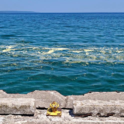
    When I looked at this at large size the yellow on the ocean became far more visible. It's the unusualness of that colour on the ocean that is the point of the image. The inclusion of a bit more yellow, courtesy of the bollard, is clever. It gives another yellow along another horizontal line and adds a satisfying pattern to the whole.

  • Members 533 posts
    June 24, 2023, 7:59 p.m.

    This is another little gem or Master-Peas. The close-up peas floating in a spoon on a green sea of pea-shaped bokeh balls is very engaging, with the pink “pea” providing the visual hook.
    I tried to work out how it was done. With a lens throwing the foreground into bokeh balls and the background creamy, with a sharp slice through the pea and spoon. Also the lighting, where the reflection in the spoon is so bright. Or is it a composite. In any case it was fun to ponder and, whatever method was used, really doesn’t matter and it results in this great success.

    Pete

  • Members 533 posts
    June 24, 2023, 8:06 p.m.

    Thanks Mike, I was about to type my response, when I noticed you had already made the points I wanted to make.

    I would just like to add, I enjoyed the Canadian Brown snake slithering out from its hiding place and heading towards the bollard!

    Pete