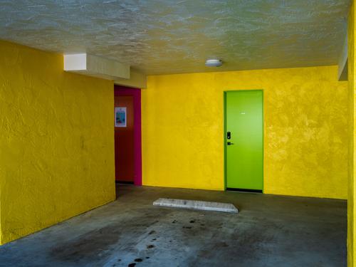
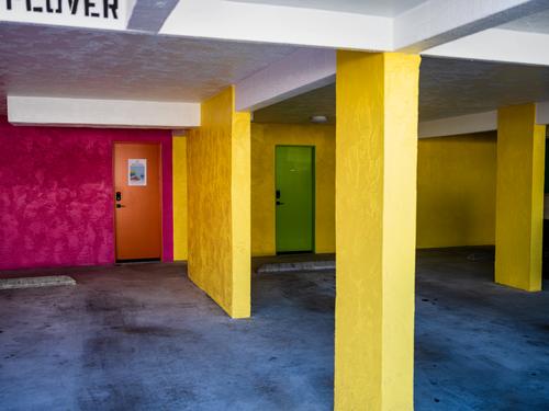
A shot that raises many questions about photography.
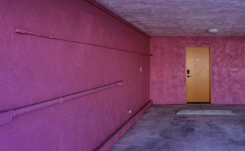
I like it because it surprises me on many levels. A bare room as a subject. The colour impact and the unexpected nature of those colours in that space. An image almost entirely formed by straight lines. It would be a very small step to see the image to blocks of Rothko colour rather than see it as a room. Even so, I'm fully aware of the classic perspective lines that mean we still see it as a room with depth. The image plays with all this.
It's a photographic vision you can't do too often with the same subject. As soon as you do, the element of surprise disappears.
That's fine, the challenge for the photographer is to find new ways to look.
One of the best things about the Weekly Critique forum is the variety of images being posted for us to think about.
Good one Rich42.
Really, I enjoy this on much the same level as I enjoy "modern" art where an image has been abstracted to the max.
-
-
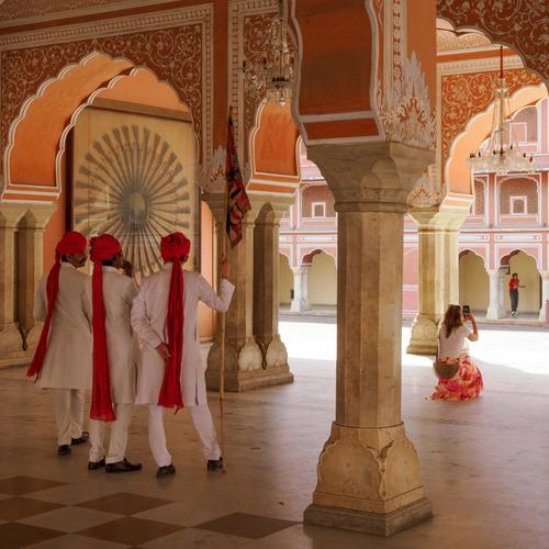
Another outstanding travel photo. A location and costumes that spell travel. A situation where the viewer can reflect on aspects of a different culture as well. And all wrapped up in a visually satisfying image.
The men in traditional uniforms watch a tourist photographing a modern Indian girl.
The long tails/caps of the turbans wonderously are repeated in the many columns. Your tourist has obligingly colour coded herself to fit in as had the smaller figure. The sight lines from the group to the tourist continue to the distant girls so we absolutely can't miss her and use her in our interpretation of the image.
Your chandelier takes up the form of the large mandala on the wall and brings balance to the right side.
The exposure is worth noting. It isn't easy to have shaded interiors and bright exteriors. Pete has solved it with only a small burnt out area and some fading of intensity towards the background. It suggests heat and distance and so it works. The background girl is within shade so she isn't lost in a highlight. -
This is driving me nuts. Not your photos Rich but the flat view. I'd have liked to have seen the second series of shots before I wrote my previous comment on the Magenta room. I feel that everytime I make a comment I need to look through all the posts to see what others are saying that I might want to consider in my response and then Ihave to do the same thing all over again as I look for any responses to anything I might have said previously.
-
@OpenCube has written:
"There were rumors of anti-Castro pigeons drinking in bars the night before the assassination. Someone overheard them saying 'Coup, Coup'" - Bill Hicks.
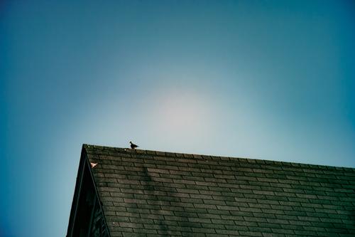
Love it. Your pigeon is perfectly positioned with the sun behind it and the lines of the roof and apex of the gable. Simple but highly effective.
-
@MikeFewster has written:@OpenCube has written:
"There were rumors of anti-Castro pigeons drinking in bars the night before the assassination. Someone overheard them saying 'Coup, Coup'" - Bill Hicks.
Love it. Your pigeon is perfectly positioned with the sun behind it and the lines of the roof and apex of the gable. Simple but highly effective.
Fully agree - I really enjoy the simplicity and composition! Well done.
-
I meant to say. Pete's title for the shot is perfect. Full of appropriate ambiguity.
-
-
@MikeFewster has written:@Rich42 has written:@minniev has written:@Rich42 has written:
Rich
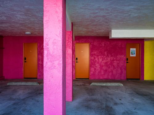
Well your photo is certainly well titled, magenta it is for sure. Not sure what kind of structure this is, but it seems like something Steven Shore or William Eggleston might have been drawn to photograph, all geometry and color. You have a great set of diagonals headed into the distance on the left so we have to look that way and get pulled to the orange door. The other odds and ends: a mat that is probably not a mat, an odd array of railings, an electrical outlet and a water hydrant, all fail to answer the question of what we are seeing. An image that is more interesting than it initially seems to be. Nicely spotted.
Minniev,
Thanks for looking.
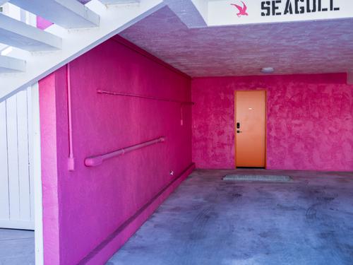
It's a first floor garage in a small apartment building in Carlsbad, CA. One of many funky coastal towns along the Southern California coast.
Someone had a lot of fun with paint!
Rich
This is driving me nuts. Not your photos Rich but the flat view. I'd have liked to have seen the second series of shots before I wrote my previous comment on the Magenta room. I feel that everytime I make a comment I need to look through all the posts to see what others are saying that I might want to consider in my response and then Ihave to do the same thing all over again as I look for any responses to anything I might have said previously.
😉
-
@ChrisOly has written:
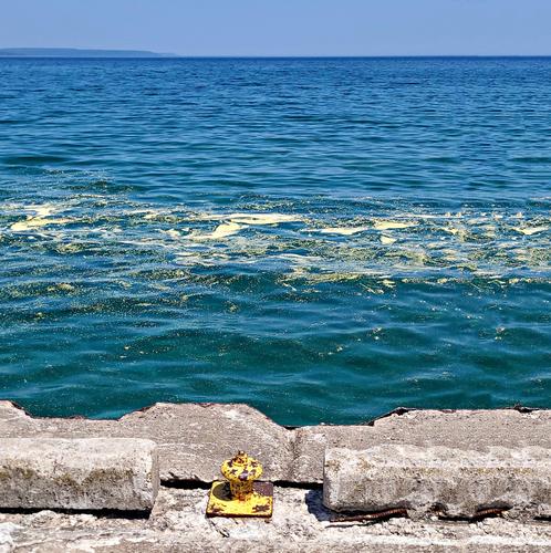
YELLOW
A sudden accumulation of pollen (from pine) appeared on Lake Huron this summer, site not seen in 25 years. Probably global warming is the cause...
If you had not mentioned the pollen I would probably have missed it in the shot, thinking that the slight colorization on the breaking waves, was a trick of the light.
The yellow rivet anchoring the scene to the quai is a very good addition: this grounds what would otherwise be a fairly standard seascape. -
@LindaS has written:
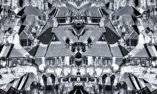
Little boxes on the hillside
Little boxes made of ticky tacky
Little boxes on the hillside
Little boxes all the sameMalvina Reynolds
www.youtube.com/watch?v=-Cjk0zst3CsAs I took the shot, the song popped into my head. However, I am not at all confident of my execution of the concept.
This kaleidoscopic exercize is worth digging into.
It's not something I would consider making (unless I would shoot through the cylinder of an actual kaleidoscope (which I have done in the past).
But I like the pattern that emerges from your processing. -
@JimKasson has written:
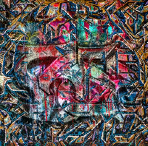
I wrote some Matlab code to do some more processing on the graffiti images:
You've probably already gotten a lot of comments on this.
(I've not had sufficient time for the thread this week... especially no time to read all comments...)
Let me just add that I continue to admire your creativity with photographic tools.
This result here reminds me most of a velvety quilt. Really nice abstract effect. -
@minniev has written:
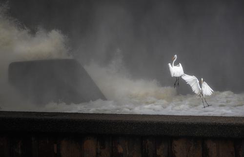
Wave Jumpers
(Sorry, but I'm obsessed with the birds again so you'll be inundated with them till I get through this phase. Old friends know I am addicted to the birds).
As always, I am unsure about the crop, but have already removed some dead space right upper quadrant. I'm also unsure about straightening. None of the dam angles are actually straight, they are all tilted to allow water to move downriver, but it is distracting from a visual geometry standpoint.
Better viewed large.
These look so much like children at play, while in reality they are probably working hard to get a meal and survive.
The elegance of the fragile birds against the brutalistic architecture and rough textures of the dam never ceases to amaze and wow me. -
@LouHolland has written:
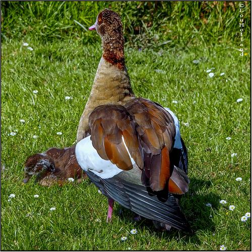
enlarge> click> downarrow, Thanks Lou
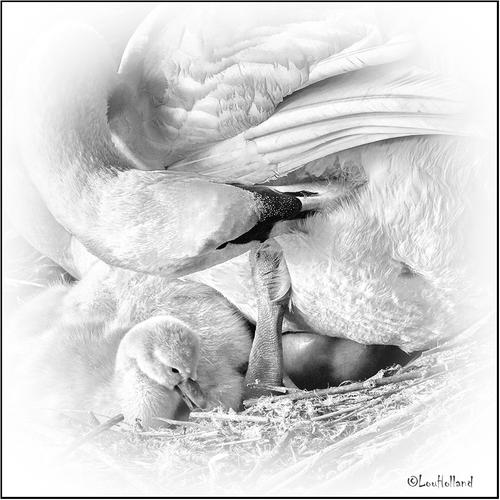
Two wildly diverse images.
The first feels like a missed opportunity: an objective shot (in colour) of a bird that fails to face the photographer, with a little one huddled in front of him, barely recognizable as anything more than a ball of feathers.
The second feels like a work of art: tender, intimate, excellent expressions in both animals in an engaging, complicated looking composition. -
@MikeFewster has written:
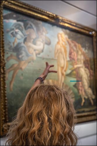
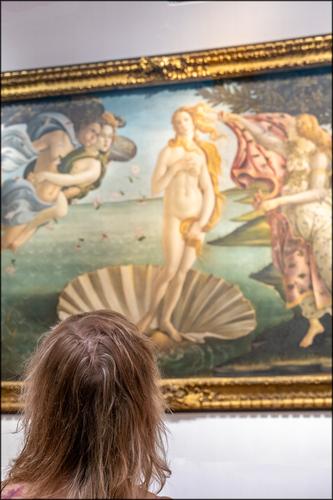
IMNHO, most goddesses as seen through medieval eyes look over rated today..
Not so with Botticelli.
I love how you captures a woman with fairly chaotic hair looking at the Venus that also has her hairdo swept sideways by the winds.
It's a fun catch for sure. -
@PeteS has written:
Tourist Attraction
This is the third in my series of recent street photography and was taken in City Palace, Jaipur, India.
Although there is no obligation to comment on every photograph posted, I normally try to comment on everyone's image, or on at least one of them if there are multiples. Unfortunately I failed last week and apologise to those whose photos I missed, and rest assured, they were missed and not ignored!
Pete
That is wonderfully composed image, like a jewel box that opens up little doors and drawers and goes deeper and deeper.
Three men under an arch, in traditional (guard) dress, looking at a woman kneeling who wears traditional patterns but on modern clothes (I think I see jeans there, under the shawl and below the white blouse) and she herself is looking like modern people do (through their screen) towards another arch when a final person is framed. Lovely.The colours are a wonderful array of tints that go well together with all those reds, oranges, yellows and ochres.
(Imagine a tourist in a bright blue anorak here. But if I do that, it might also look good, but for totally different reasons.)You've got yourself an instant classic here.
