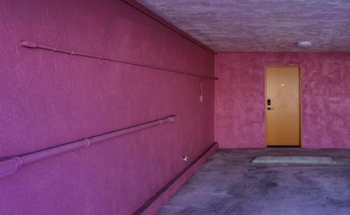
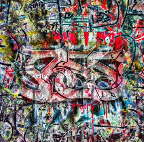
It has this aura of old. Very symmetrical, on purpose I reckon. I like it.
-
-
Wild, but good!
-
-
-
@minniev has written:
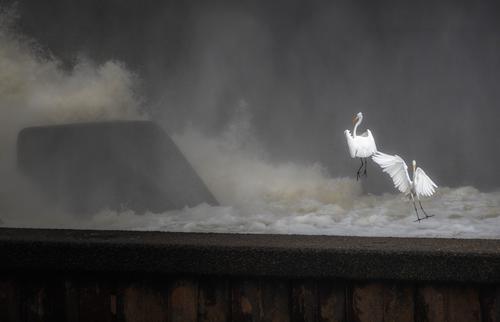
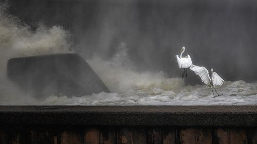
Wave Jumpers
(Sorry, but I'm obsessed with the birds again so you'll be inundated with them till I get through this phase. Old friends know I am addicted to the birds).
As always, I am unsure about the crop, but have already removed some dead space right upper quadrant. I'm also unsure about straightening. None of the dam angles are actually straight, they are all tilted to allow water to move downriver, but it is distracting from a visual geometry standpoint.
Better viewed large.
This one has given me a chuckle over my morning coffee. The bird on the left looks like it is hovering on an updraft. The one on the right looks like a good cartoonists' stick drawing as it comes in to land. A little off balance, we are unsure what the result may be. The rest of the frame contains just enough fill to justify the crop size and the tones give highlight to the bright whites of the birds. A healthy obsession.
-
-
-
@minniev has written:
Wave Jumpers
(Sorry, but I'm obsessed with the birds again so you'll be inundated with them till I get through this phase. Old friends know I am addicted to the birds).
As always, I am unsure about the crop, but have already removed some dead space right upper quadrant. I'm also unsure about straightening. None of the dam angles are actually straight, they are all tilted to allow water to move downriver, but it is distracting from a visual geometry standpoint.
Better viewed large.
A very nicely captured timed event Paula. I like this but for myself I would straighten the lower wall, because I can and because it bothers me. Likely others do not have the OCD obsession that afflicts me for this type of thing. I am suspicious that you have muted the wave action of the image and softened parts but I could be wrong about that. I would like it more with some additional detail in the wave and turbulent water areas. That may be contrary to your intent with this to showcase the birds. In any case, I included an example below that is more along the lines that I was thinking.
I can well understand your addiction to these birds and that dam. No doubt it is an endless source of fascinating images for you. I am missing your swamp images but I understand from your postings that the swamp has been transformed by nature.
Andrew
-
@RoelHendrickx has written:
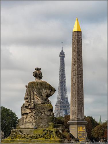
PARIS
Finally I have again a computer that allows me to select and process large numbers of images efficiently.
This will allow me to finally get cracking on my backlog of images from travels in the past few years.These two are from a short break in Paris, almost two years ago.
The period when Christo had gift-wrapped the Arc de Triomphe.
But I was not only interested in that temporary installation.When visiting a city that I (and millions of other tourists) have visited before, I try to find new angles on well-known sights.
Getting the exactly required elevation for a vantage point that I have previsualized in my head, can be a tricky proposition, but very rewarding.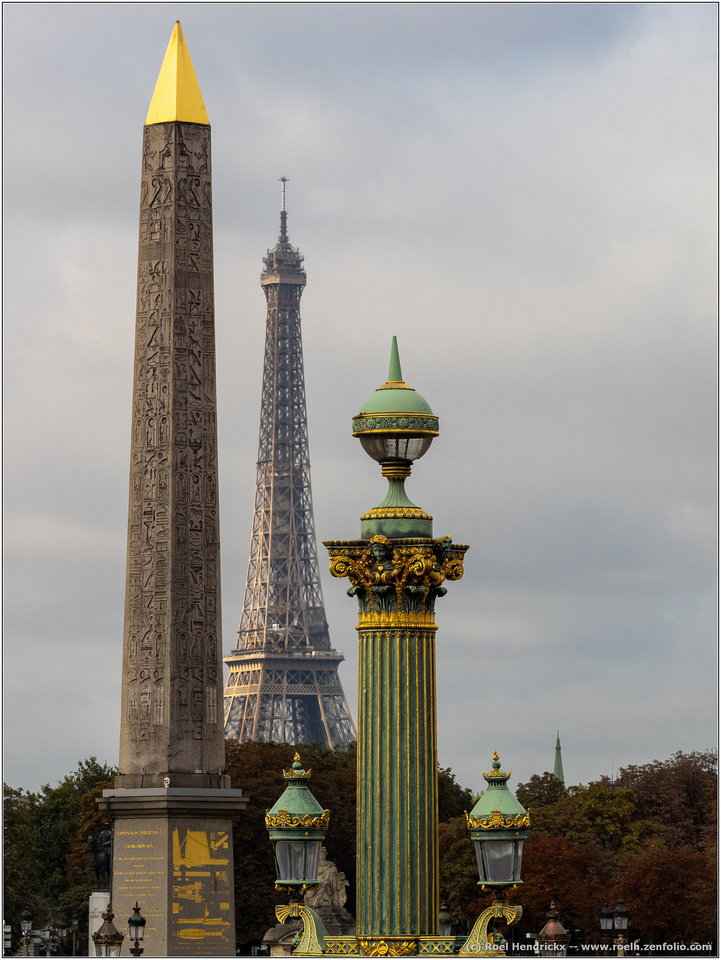
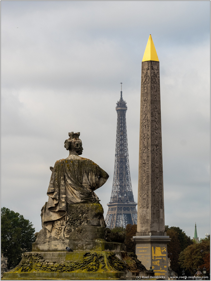
I like both of these Roel. The light on the ET in the first is better than in the second. I played with the second a bit. I have included that image below but mostly because it shows a dust? spot on the sensor on the right side and about half way up. Hopefully you have cleaned it since this image was taken. For reasons unknown to me, your two images will not show up in the full screen gallery mode.
Andrew
-
Thanks everyone for your kind comments and interesting feedback! I really appreciate it.
@Bryan has written:@simplejoy has written:I thought, I'd continue with the theme of striving for "world-peas"... shouldn't be too hard, I hope. 😉

Someone didn‘t get the dresscode… by simple.joy, on FlickrHello SJ,
I am into polyhedra: Platonic, Archimedean and Johnson solids and the many more irregular ones. Do you know the name of that particular one? I can decipher the shape from your pic two weeks ago: octagonal ends, a row of florets and a row of hexagons either side of the centre. I used to spend many hours playing with 3d software modelling different dome types as a structural shell - but never built one...
And the pic is your usual captivating style. I particularly like the shiny reflection under the front edge of the spoon. An idea to expand on?Thank you - glad you like it!
Unfortunately, I also don't know what it's called, but your description is accurate. I feel like I've seen it several times already, usually as glass beads though. Perhaps one of the manufacturer of those does provide a name on their website or can give you an information if you ask.
-
@JimKasson has written:
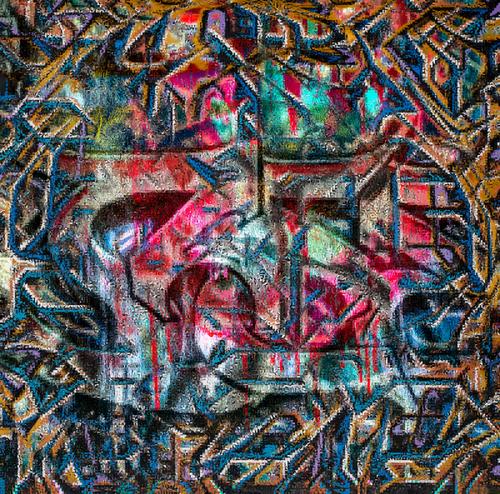
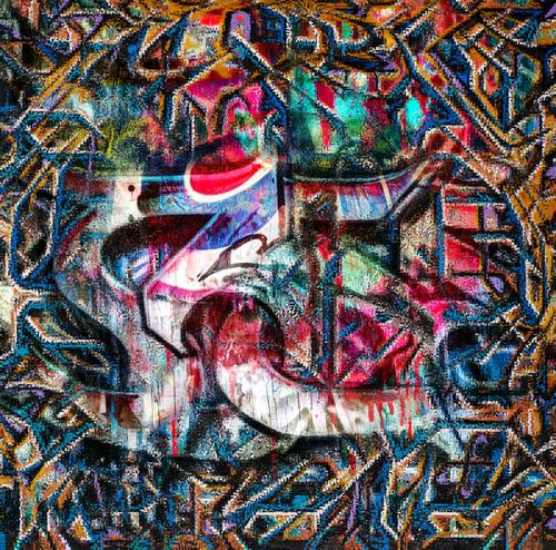
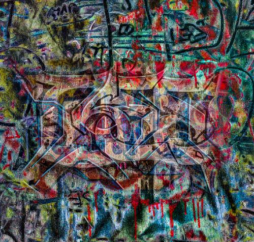
I wrote some Matlab code to do some more processing on the graffiti images:
Looks really interesting and works very well! Now I'm wondering how that effect might work with some less abstract images... have you tried?
One additional thing I'd try, is leave part of the image (things, letters for figures which appear to be more in the foreground) without the processing, in order for it to stick out more. Something like this:
I'm sure there's a more effective way to do that or another one of your graffiti shots (like the one with the giraffe) where it might work better.
-
@RoelHendrickx has written:


Both have a good aesthetic sense, but the composition of the second one is definitely better. In this one, there is a kind of confrontation between stone and iron, the over-the-shoulder shot gives it a cinematic atmosphere in which there seems to be a dialogue between the two stone characters... it could be "are you ready?" 😀
Manuel
-
-
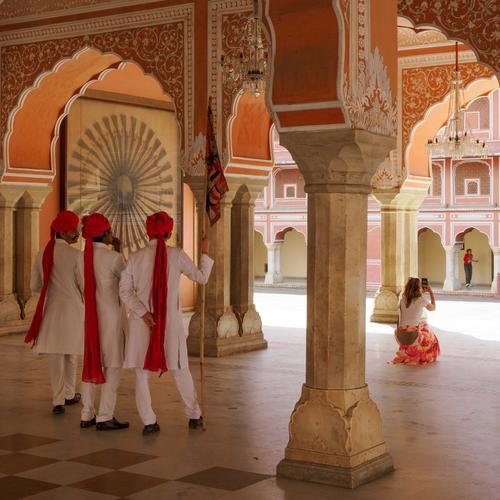
Tourist Attraction
This is the third in my series of recent street photography and was taken in City Palace, Jaipur, India.
Although there is no obligation to comment on every photograph posted, I normally try to comment on everyone's image, or on at least one of them if there are multiples. Unfortunately I failed last week and apologise to those whose photos I missed, and rest assured, they were missed and not ignored!
Pete
-
@PeteS has written:
Tourist Attraction
Pete
Great shot - very effective composition and beautiful colors. It's quite funny that she's facing away from the three guards (?), making it look like she's the main attraction. Excellent capture!
-
-
@simplejoy has written:
One additional thing I'd try, is leave part of the image (things, letters for figures which appear to be more in the foreground) without the processing, in order for it to stick out more.
Like these?
-
@RoelHendrickx has written:
PARIS
Finally I have again a computer that allows me to select and process large numbers of images efficiently.
This will allow me to finally get cracking on my backlog of images from travels in the past few years.These two are from a short break in Paris, almost two years ago.
The period when Christo had gift-wrapped the Arc de Triomphe.
But I was not only interested in that temporary installation.When visiting a city that I (and millions of other tourists) have visited before, I try to find new angles on well-known sights.
Getting the exactly required elevation for a vantage point that I have previsualized in my head, can be a tricky proposition, but very rewarding.

Both of these are quite nice, very elegant and beautifully composed. The vantage point contributes to the elegance by helping keep all the elements of the scenes lined up perfectly. The first is hands down my favorite because of the light reflecting off the shiny metal surfaces, and off the familiar icon of the Eiffel tower. The first gives more impression of music notes, trilling down the scale, more like piano or violin. The second is the horn section.
