• Members 690 posts
    July 2, 2023, 5:26 p.m.

    That's a very interesting idea.

    Except for the drop shadows under the Google arrows. Kinda creepy. It's bad enough to see their cars obsessively mapping our entire existence. Now I'm afraid that reality will actually include seeing those arrows hovering about, In fact, looking out my window . . . I think I see them . . . everywhere!!!!!

    😉

    In the case of Jim's post, all the information needed to nail the location was right there in the image. It literally defined its geographical location.

    For most other images, lacking road signs actually announcing their state route designation and distance from known towns, the author would need to give some pretty detailed other information. It could be a lot of fun.

    I posted a view from my house in Prescott, AZ toward the San Francisco peaks in Flagstaff, AZ here some weeks ago. I posted that same image and a few others in another forum a few years ago. Some other participants became interested in the "sight line" of the shot, lined things up on a map and were able to guess the location of my house within a few miles.

    I lived in a gated community then.

    I posted accurate coordinates, and one contributor who had been a UPS driver, and had worked in Prescott, on googling the coordinates and the 'street view,' immediately recognized the neighborhood, my house, the view toward Flagstaff, and remembered the passcode into the gates!

    Rich
  • Members 533 posts
    July 4, 2023, 8:11 p.m.

    The wide angle lens helps turn a leg into a leading line and, of course, show as much as possible of that cramped location. It also turns the layered stone on the left into more leading lines.
    Using torches to give light and very dark areas was a good idea, and makes it a far more interesting image than if a flash had been used to give a more standard view in much flatter light.
    I have a special appreciation for the image, as I have also crawled into a similar structure on my own, and although it was fascinating to see, the photos were totally boring. Your choices prevented that from happening.

    Pete

  • Members 533 posts
    July 4, 2023, 8:15 p.m.

    I can applaud the sentiments behind the fashion made of plastic, but there is still a certain creepy feeling to the idea. Your photo has succeeded in emphasising that feeling, especially with your choice of mask, which you added in PP.

    Pete

  • Members 533 posts
    July 4, 2023, 8:24 p.m.

    To say you have made something of nothing here may sound like a put down, but I do not mean it that way, in fact I mean the opposite and love your creativity.
    The narrow depth of field is well used, and the choice to have a tiny amount of substance of different colours on each prong of the fork was excellent, and adds interest and allows the viewer to wonder why, extending the interaction with the photo.
    As already mentioned, the photo can be interpreted as a formation of starships, or maybe even asteroids.

    Pete

  • Members 533 posts
    July 4, 2023, 8:47 p.m.

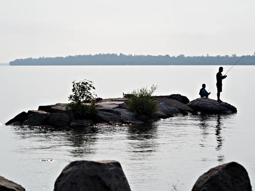
    Very peaceful. On an island, with no visible means of leaving, and nothing to do but fish.
    I think the almost total lack of colour adds to the peacefulness by removing their stimulus.
    The reflection of the island and islanders has been sliced and elongated by the ripples, and it’s texture is a nice link to the rocks in the foreground. The expanse of water beyond the island is featureless, and makes the far shore seem even further away and increases the sense of isolation.
    Good that the man’s head does not overlap the shoreline and it is not so much of a problem that the fishing rod does.

    Pete

  • Members 533 posts
    July 4, 2023, 8:59 p.m.

    The Palio is a great subject, and, although the race itself offers high drama, the preparations and lore of the Contrade is fascinating too. Your series illustrates an interesting aspect of which I wasn’t aware - the baptism of the new members.
    The series sets the scene at the Unicorn fountain, and I appreciate the table of diners in the corner in the opening shot, and moves on and zooms in to the baptism, in good journalistic style. The colours are nicely carried through the series too, starting with oranges and yellows and ochres, then adding a complementary blue with the people.
    A good set of individual photos combine to make an even better series.

    Pete

  • Members 533 posts
    July 4, 2023, 9:09 p.m.

    The contrasty light and the colours are the initial attractions and the composition too. Then the contrast between nature and man-made objects arouses interest, but the objects are low tech and have a degree of patina, so seem to fit nicely into their organic background.

    It would be easy to walk past this scene, but I am glad you didn’t.

    Pete

  • Members 533 posts
    July 4, 2023, 9:20 p.m.

    There are so many bold creative choices here and they all seem to be good ones.
    The vertical panorama frame works well with the vertical theme of the image. (Normally I am not keen on vertical panoramas.)
    The choice of pure black and pure white adds weight to the graphic nature of the subject.
    The subject itself is not inspiring, so it was an inspired choice to see it and make it the subject of a photo.
    The clean straight lines dominate, but are off-set by the jumble at the bottom, which I like, although a version without would be a (equally?) strong option.

    Pete

  • Members 533 posts
    July 4, 2023, 9:27 p.m.

    Often photos done to look like paintings look cheesy, but I really like this one. I think it is because you have not been afraid to make it really look like a painting, and have not been tempted to hang on to photographic detail. Maybe you actually painted on the photo itself? You seem to imply that by your comment. In any case the resulting image gives an impression of the scene, the light, the colours, the atmosphere, whilst leaving the brain plenty of scope to fill in the details.

    Pete

  • Members 533 posts
    July 4, 2023, 9:39 p.m.

    You have captured the detail of the bud nicely, and shown its nature well. The out of focus flower in the foreground is an unusual choice, but actually works quite well. It attracts attention through its colour, shape and position, but points immediately to the main subject, the bud. Since it is only partially displayed and the colour not too bright, it does not distract in the way a complete bloom would.
    The pin sharpness of the bud also draws attention to itself.

    A good image, which is all the better for being unorthodox.

    Pete

  • Members 533 posts
    July 4, 2023, 9:49 p.m.

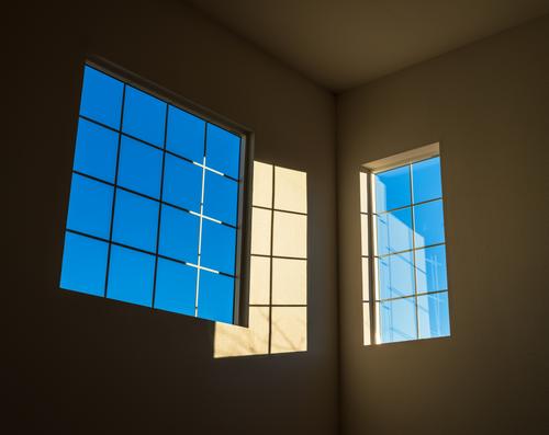
    There are good strong graphic elements here. The colours are strong and complementary. The objects are composed well in the frame. A simple image, except it is not. The real spice is the fact the shapes are superimposed on one another, shadows of a window on one window and reflections of the whole thing in the other. The geometric shapes are not flat, but at right-angles to each other, and our eyes try to see the shapes flat and fail.
    What a great subject to find in your living room.

    Pete

  • Members 533 posts
    July 4, 2023, 10:07 p.m.

    Either one of these would evoke feelings of small town America a few decades ago. Even though I was never there at the time, films like the Last Picture Show, which has been mentioned quite appropriately, and photos of the time are enough for me to recognise the scene and feel a nostalgia for something I never experienced! It triggers the creativity to complete the film, of which this is a scene, or write the book to explain the characters we see. This is borne out by everybody getting involved with identifying details, coaxing new versions out of you, and even finding the original setting on Google Street View, even down to the same bent posts, a detail I enjoyed in your photos!
    Seeing the two images side by side, I definitely prefer the first. The girl looking out of the frame wistfully, the man engrossed in a phone call. What is their relationship? Whey are they there? The trigger for stories is stronger than when they share a telephone booth.

    Pete

  • Members 533 posts
    July 4, 2023, 10:15 p.m.

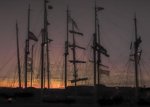
    There is a real forest of masts, spars and ropes all silhouetted against a fine sunset. It is very satisfying. I wonder if some of that satisfaction comes from trying to imagine the beauty of the sailing vessels to which they belong? Would some of the magic disappear if they were “only” an industrial structure?

    Pete

  • Members 533 posts
    July 4, 2023, 10:22 p.m.

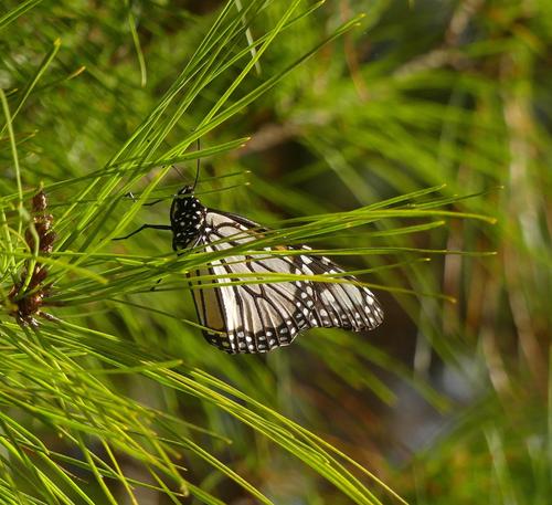
    That’s a fine butterfly photo. Nice and sharp and raised above the usual by your choice to have the needles in front of the butterfly. They do not obscure it, but gives the image a far more naturalistic feel and less like a run of the mill illustration in a butterfly spotter’s handbook.

    Pete

  • Members 690 posts
    July 4, 2023, 10:40 p.m.

    There are good strong graphic elements here. The colours are strong and complementary. The objects are composed well in the frame. A simple image, except it is not. The real spice is the fact the shapes are superimposed on one another, shadows of a window on one window and reflections of the whole thing in the other. The geometric shapes are not flat, but at right-angles to each other, and our eyes try to see the shapes flat and fail.
    What a great subject to find in your living room.

    Pete
    [/quote]

    Thank you, Pete. 😊

    Rich

  • Members 1216 posts
    July 4, 2023, 11:42 p.m.

    Thank you.

  • Members 1051 posts
    July 5, 2023, 8:23 a.m.

    Oops... a bit late with comments this week.
    Excellent as everyone mentioned.
    I see 4 jets with smoke trails at an airshow, with spice on top...

  • Members 1051 posts
    July 5, 2023, 8:25 a.m.

    Sultry, dreamy, captures a moment.

  • Members 1051 posts
    July 5, 2023, 8:29 a.m.

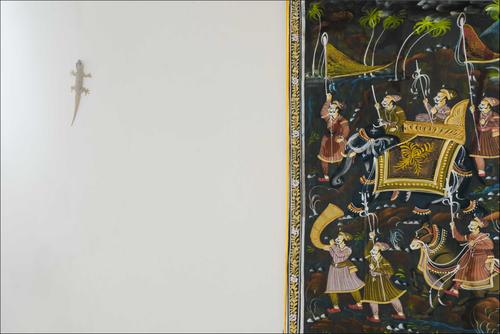
    Poor little gecko. It would appear he is carrying the plague or something and they are not too impressed.

  • Members 1051 posts
    July 5, 2023, 8:44 a.m.

    As Jim said, disorientating. And it is interesting to ask why that effect. Our sense of order is challenged because nature is disturbing the regular cues of the perpendicular boxes we build.

  • Members 690 posts
    July 5, 2023, 3:11 p.m.

    Thanks, Bryan.

    Rich

  • Members 690 posts
    July 5, 2023, 3:13 p.m.

    Thanks, Chris

    Rich