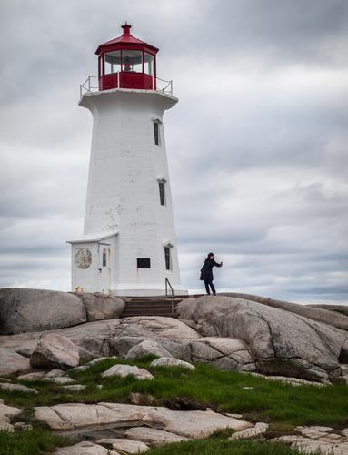
This is a topic that could easily host a lively discussion about the pro's and con's of both approaches. I spent a number of years fretting over people and landscapes, pacing and sulking while tourists got in the way of a pristine view I wanted to capture. And I still seek classic kinds of views for some images. Your landscape that you posted this week was superb without people. But I have learned to find a different kind of photo by including some people and looking for their stories. I tend to keep my people fairly small compared to the landscape, and have a collection of what I call Tiny People that are folks doing something within an iconic landscape. Here is the lady who taught me that lesson, many years and several cameras ago, in Nova Scotia. Shortly after I arrived, I found my way to this iconic lighthouse. But this woman spent half an hour posing for selfies while I steamed. In utter frustration, I took pictures of her. To my surprise, I liked them better than the ones I took after she left.
-
-
@minniev has written:@Fireplace33 has written:@WhyNot has written:
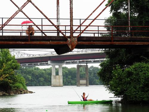
Day on the River
To be honest, it was only after reading the comment, that I began to really appreciate this good image. And in a new and better way !
There is a quite an imaginative art to finding a story, real or not, in an image :-)
I think that stories like that work best when there are people in the image.
My images often just show the landscape without people, so maybe I'm missing out on story telling opportunitesThis is a topic that could easily host a lively discussion about the pro's and con's of both approaches. I spent a number of years fretting over people and landscapes, pacing and sulking while tourists got in the way of a pristine view I wanted to capture. And I still seek classic kinds of views for some images. Your landscape that you posted this week was superb without people. But I have learned to find a different kind of photo by including some people and looking for their stories. I tend to keep my people fairly small compared to the landscape, and have a collection of what I call Tiny People that are folks doing something within an iconic landscape. Here is the lady who taught me that lesson, many years and several cameras ago, in Nova Scotia. Shortly after I arrived, I found my way to this iconic lighthouse. But this woman spent half an hour posing for selfies while I steamed. In utter frustration, I took pictures of her. To my surprise, I liked them better than the ones I took after she left.
People in landscapes can be a real asset (story, sense of scale), provided that they are in the right spot.
Your selfie-lady at the lighthouse looks good because of where she stands: nicely isolated against the sky but still in relation to the lighthouse.
It would be less succesful if she was standing in a place where she half overlaps with the building.Obviously, in many case you can move around as photographer to create your own ideal triangle between yourself and the two subjects.
But not always. -
@RoelHendrickx has written:@minniev has written:@Fireplace33 has written:@WhyNot has written:
Day on the River
To be honest, it was only after reading the comment, that I began to really appreciate this good image. And in a new and better way !
There is a quite an imaginative art to finding a story, real or not, in an image :-)
I think that stories like that work best when there are people in the image.
My images often just show the landscape without people, so maybe I'm missing out on story telling opportunitesThis is a topic that could easily host a lively discussion about the pro's and con's of both approaches. I spent a number of years fretting over people and landscapes, pacing and sulking while tourists got in the way of a pristine view I wanted to capture. And I still seek classic kinds of views for some images. Your landscape that you posted this week was superb without people. But I have learned to find a different kind of photo by including some people and looking for their stories. I tend to keep my people fairly small compared to the landscape, and have a collection of what I call Tiny People that are folks doing something within an iconic landscape. Here is the lady who taught me that lesson, many years and several cameras ago, in Nova Scotia. Shortly after I arrived, I found my way to this iconic lighthouse. But this woman spent half an hour posing for selfies while I steamed. In utter frustration, I took pictures of her. To my surprise, I liked them better than the ones I took after she left.
People in landscapes can be a real asset (story, sense of scale), provided that they are in the right spot.
Your selfie-lady at the lighthouse looks good because of where she stands: nicely isolated against the sky but still in relation to the lighthouse.
It would be less succesful if she was standing in a place where she half overlaps with the building.Obviously, in many case you can move around as photographer to create your own ideal triangle between yourself and the two subjects.
But not always.The lighthouse shot is good!
I do put people in my shots, but not all the time. They are often there to give scale and to give the viewer the idea that someone else was there too and was enjoying the scene :-)
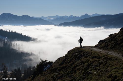
Here's one that worked for me. That person is my wife, so its was relatively easy to place her in the right position :-)
We go hiking together in the mountains in Austria. This was from one of our favourite routes in the Höchkönig region, on the way to the Riedinger Waterfalls.
I displayed this shot in our local village open air gallery.
Trevor -
@Fireplace33 has written:@RoelHendrickx has written:@minniev has written:@Fireplace33 has written:@WhyNot has written:
Day on the River
To be honest, it was only after reading the comment, that I began to really appreciate this good image. And in a new and better way !
There is a quite an imaginative art to finding a story, real or not, in an image :-)
I think that stories like that work best when there are people in the image.
My images often just show the landscape without people, so maybe I'm missing out on story telling opportunitesThis is a topic that could easily host a lively discussion about the pro's and con's of both approaches. I spent a number of years fretting over people and landscapes, pacing and sulking while tourists got in the way of a pristine view I wanted to capture. And I still seek classic kinds of views for some images. Your landscape that you posted this week was superb without people. But I have learned to find a different kind of photo by including some people and looking for their stories. I tend to keep my people fairly small compared to the landscape, and have a collection of what I call Tiny People that are folks doing something within an iconic landscape. Here is the lady who taught me that lesson, many years and several cameras ago, in Nova Scotia. Shortly after I arrived, I found my way to this iconic lighthouse. But this woman spent half an hour posing for selfies while I steamed. In utter frustration, I took pictures of her. To my surprise, I liked them better than the ones I took after she left.
People in landscapes can be a real asset (story, sense of scale), provided that they are in the right spot.
Your selfie-lady at the lighthouse looks good because of where she stands: nicely isolated against the sky but still in relation to the lighthouse.
It would be less succesful if she was standing in a place where she half overlaps with the building.Obviously, in many case you can move around as photographer to create your own ideal triangle between yourself and the two subjects.
But not always.The lighthouse shot is good!
I do put people in my shots, but not all the time. They are often there to give scale and to give the viewer the idea that someone else was there too and was enjoying the scene :-)
Here's one that worked for me. That person is my wife, so its was relatively easy to place her in the right position :-)
We go hiking together in the mountains in Austria. This was from one of our favourite routes in the Höchkönig region, on the way to the Riedinger Waterfalls.
I displayed this shot in our local village open air gallery.
TrevorVery cool image.
You have a very convenient wife. (haha)In a few days I will be leaving for a trip to Oberbayern (a little south of München) to visit lifelong friends.
We have a few good hikes ahead of us.
Your image makes me wish we were already there.And here is one of mine from last year on the Orkney Islands, making use of roughly the same idea, with my good hiking friend Jan providing scale to the "Old Man of Hoy"

-
@simplejoy has written:
Something different from the macro-guy? I guess so... 😉:
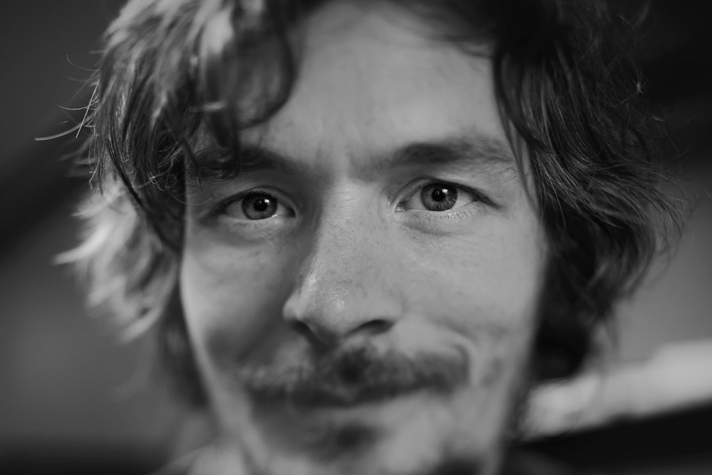
Eye - ought to focus by simple.joy, on FlickrI‘ve been thinking for a while what kind of portraits I‘d like to shoot, if I ever have an opportunity to do so… I think I‘m getting closer - it certainly involves some use of my tilt/shift setup and some unusual lenses.
Suffice to say that this looks better with photogenic people (I can confirm from trying the technique with my kids) but this is what you have to make do with, I suppose! 😅
The eyes are difficult to leave. You have used the shallow depth of field to good effect, with the eyes very sharp, and the rest attractively blurred, but with enough sharpness to see the other features of the face. The face seems friendly and whimsical and I would say I can see it in his eyes, but, in truth, I am sure the upward curl of his mouth plays an important role in that assessment.
The eyes are the most important and must be sharp. Everyone knows that and so do the rule books, but I think playing with portraits, where anything but the eyes are sharp would be an interesting project. I must follow through on my thoughts one day.Pete
-
@Rich42 has written:
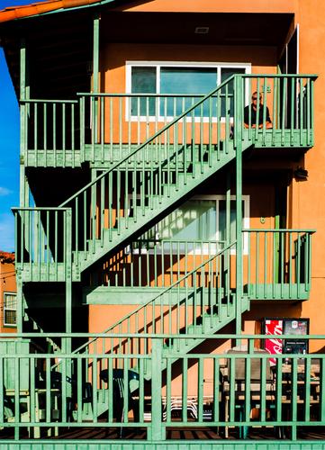
The Strand, Oceanside, CA.
Thanks to Photoshop for supplying shift, tilt and swing capability (well, almost) to my D800E and 50mm shot in its Perspective Warp functions.
I was perched on a narrow, rocky sea wall along the single-lane "Strand", looking up at this scene (and getting some spray from the unpredictable waves). I wasn't brave or creative enough to try setting up my view camera in such a situation. Besides, the opportunity for the shot, as it turned out, would have been defeated by the laborious effort of real shifts, tilts and swings. Let alone figuring a way to actually see the ground glass which would have been behind the wall, perched over the waves.
The unedited image had a lot of optical perspective "distortion."
The building and stairs had been a faded salmon color for some years, before it got a fresh coat of salmon and new green paint on the wooden superstructure in 2014, literally begging to be photographed. The lone figure was a serendipitous plus. A few years later, a new owner painted everything a uniform gray.
Rich
The photo is a fine study of an interesting building in strong light, with endless lines and geometrical lines to explore.
Then we discover the man looking at us, which makes us question his presence and his purpose. Does he add a friendly human touch or is there somehow a sinister twist? He completely transforms the picture and triggers story lines, which the lines in the photo could not do on their own.Pete
-
@JimStirling has written:
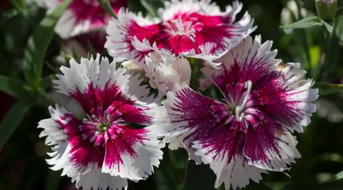
A photo taken testing out the close up abilities of the Olympus 12-40mm pro II , handheld no stacking taken before the weather took a turn for the worse 😀
The flowers look very sharp, but actually the depth of field is quite shallow, if the larger version is studied. I don’t think this matters, as it is the overall effect, which counts, and that is the front flowers and opening flower are sharp and then rolling into unsharpness in the background.
The stamens are extremely sharp, so the lens passes that test with flying colours.Pete
-
@minniev has written:
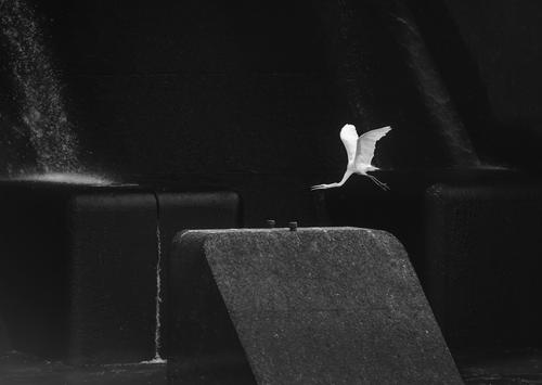
"Hate to eat and run, but I gotta go now..."
I get fascinated with the shapes and tones beneath the dam.Yes, the dam certainly provides some great shapes and tones. The quandary is how much to reveal. I like the idea of not revealing too much in the darkness, leaving the viewer to guess a little and not provide all the answers in brightness. The larger version provides enough of the little details to satisfy the appetite, so there is no need to make it brighter, but like thinking about good food, I am tempted say, “just a bit more”, but like good food, you only know it was enough when you’ve overdone it. So maybe leave it as it is.
Pete
-
@LouHolland has written:
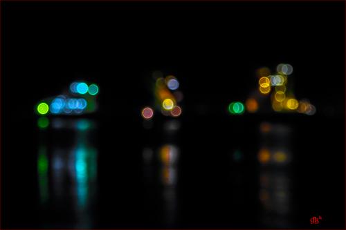
Harbor activity created by blobs and reflections.
Thanks for looking
LouA truly minimalistic harbour scene, although the patterns of lights are actually quite complicated. In any case the colours are attractive, set against a pure black background, and the three groups have different shapes, which makes it easy on the eye and the image has a peaceful feel to it.
The bokeh balls are quite sharp and flare kept to a minimum.
It is an image I can look at for a long time.Pete
-
@PeteS has written:
The photo is a fine study of an interesting building in strong light, with endless lines and geometrical lines to explore.
Then we discover the man looking at us, which makes us question his presence and his purpose. Does he add a friendly human touch or is there somehow a sinister twist? He completely transforms the picture and triggers story lines, which the lines in the photo could not do on their own.Pete
[/quote]Thanks Pete.
The Watcher is enigmatic.
Rich
-
@Bryan has written:
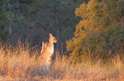
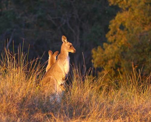
Just for the cuteness factor. x2 if you look closely
.
This is a lovely scene in fantastic light and the little joey is the icing on the cake.
You could consider underexposing it slightly, as the kangaroo is plenty bright enough and that would darken the shady areas, which would make the kangaroo really stand out. Since the kangaroo is quite small in the frame, you could consider quite a considerable crop, and yet still keep enough of the characteristic background, which still captures that wonderful light and shows the kangaroo’s environment.
Maybe like this….
Pete
-
@minniev has written:@LouHolland has written:
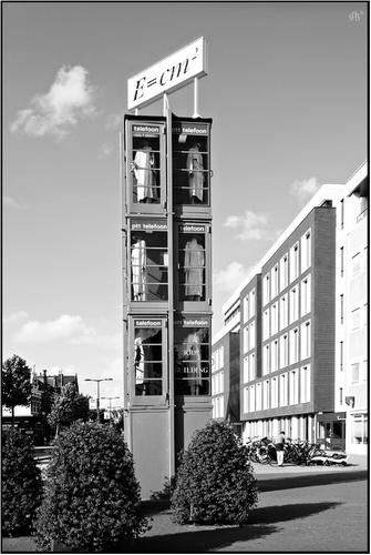
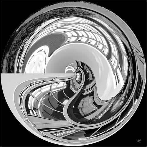
The original image is pretty extraordinary due to its odd name and construction, and the contents of the stacked booths. But the manipulated one i super fun, rolling the whole affair up into a crystal marble with all its lines converted to curves and all its contrasts bent with the lines. Nice work.
I have to agree with Minnie here. Both are good for the reasons she mentions. As a pair, they work well and are informative, but if I had to choose, then it would be the second, which is exceptional.
Pete
-
@Fireplace33 has written:
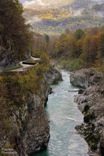
View from Napoleon's bridge
I just found this C&C thread and it looks interesting :-)
Probably a bit late in the week to enter an image here now, but I thought I'd give it a try.
This image was taken on a slighty misty morning in October 2021 on a hiking tour through part of Slovenia and then on into Italy.
The Soča valley is breathtakingly beautiful, but it’s especially nice with its Autumn colours on show.
I’ve printed this image quite big on canvas (120 x 80 cm) and have it hanging on my balcony wall, and see it almost every day.
I like it because it reminds me of a great tour, perhaps you like it too?This is a lovely landscape and image. The joint leading lines of valley, river and road take the viewer to the atmospheric sunlit forest on the hillside. Even though the leading lines are fairly direct, there is so much detail in them, that the viewer takes in the scene as the eye travels to the background, and there is no need for them to meander to force the viewer to observe them.
I have admired your work in Wormsmeat’s weekly Through your Eyes thread over the years, so hope you enjoy this thread enough to take part regularly.
Pete
-
@PeteS has written:@Bryan has written:
Just for the cuteness factor. x2 if you look closely
.
This is a lovely scene in fantastic light and the little joey is the icing on the cake.
You could consider underexposing it slightly, as the kangaroo is plenty bright enough and that would darken the shady areas, which would make the kangaroo really stand out. Since the kangaroo is quite small in the frame, you could consider quite a considerable crop, and yet still keep enough of the characteristic background, which still captures that wonderful light and shows the kangaroo’s environment.
Maybe like this….
Pete
I very much like Pete's crop. There is still enough of the foreground and background so we experience the environment. More is seen of the kangaroo and the joey is more easily distinguished. The framing of the adult is improved within the shape of the bushes.
As a driver on outback roads in Australia, the crop especially gives me nightmares. That kind of lit up kangaroo, especially at predawn or dusk, is not something you want to see. wherever possible, I don't drive outback at night. -
-
@OpenCube has written:
Hello,
You posted this image quite late in the weekly exercize (after midnight between Tuesday and Wednesday, seen from this timezone).
Please repost in the new Wednesday C&C thread for July 19 that I will kick off in just a few minutes.
Roel -
@PeteS has written:@Bryan has written:
Just for the cuteness factor. x2 if you look closely
.
This is a lovely scene in fantastic light and the little joey is the icing on the cake.
You could consider underexposing it slightly, as the kangaroo is plenty bright enough and that would darken the shady areas, which would make the kangaroo really stand out. Since the kangaroo is quite small in the frame, you could consider quite a considerable crop, and yet still keep enough of the characteristic background, which still captures that wonderful light and shows the kangaroo’s environment.
Maybe like this….
Pete
I know it is past the use by date of the last week, but I have been offline and I feel I owe Pete a reply. So sorry if this is a no-no...
Pete, I had a few different crops and chose the larger one because I was thinking those with larger screens than than my 15" laptop would see the subject big enough anyway. I also wanted to include as much detail in the background and didn't reduce highlights anymore. However yours is better on both points. Thanks for the retouch and encouragement.
Bryan
