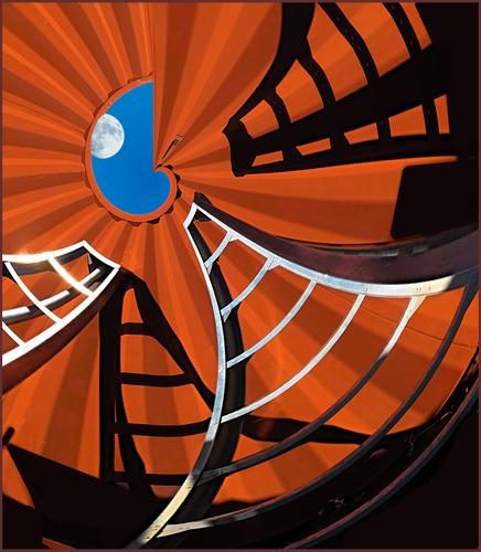
I continue to be enthralled by your fanciful world of nature and colors. If there is a planet in existence like this, sign me up for the trip!
-
-
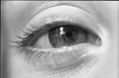
Too trite to quote the cliche, "The eyes are the window to..." But really, how could it not be true? Every time I scroll down page 1 of this week's thread, your photo demands that I stop to learn more about this person. Quite an emotional image for me.
-
Because I have spent the past three years in a small forum that is all about playing in the digital darkroom, I didn't think to mention here that my Escape Hatch is a highly manipulated creation from two photographs. Folks, please let me know if I should provide information upfront if I share another that is not reality. The last thing I want is for you to feel deceived!
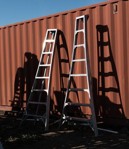
The scene was apple-picking ladders leaning against a metal shed. I'm attaching a jpg of the original raw file; it is not a "finished" product in any way. The moon is a shot from my own library of skies, clouds and moons.
The sleek forms of these purely-for-function commercial orchard ladders have appealed to me for years, and I have photographed their real-life purpose often.
This time I was exploring different ways to use the lines, forms and shadows and liked this tightly packed circular look that leads to the tiny exit at the top. My idea to place the moon as the destination came last in the process. I think I've mentioned that I often don't fully form an idea before starting to play, but kind of make it up as I go along. I very much enjoy the process.
I'm so grateful for your interest and comments!
-
Cartesian to polar conversion? Whatever it is, it’s a wonderful, creative distortion.
-
Thank you Jim! "Polar Coordinates" in PS Elements. This filter has no specific controls aside from selecting "polar to rectangular" or "rectangular to polar." I didn't keep the psd file and don't recall how much additional work (if any) I did for that specific look. I'm pretty sure I recall being delighted by the result. Happy surprises, such as I still find with textures and blend modes, are a big part of my joy of the hobby 😁
-
D'accord. Reminds me of something I wrote a while back:
I live near Carmel, California. The photographic history of this place is freighted with an approach to image-making called previsualization. Ansel Adams wrote about visualization, which he defined as “the ability to anticipate a finished image before making the exposure”. Minor White later distinguished between what he called “pre-visualization”, or visualization before the negative is exposed, and “post-visualization”, which occurs during ensuing processing. I’ll use White’s terminology here.
Previsualization is an ethos so much a part of the local photographic community that it seems heretical of me to question it, but that’s what I’m going to do in this article. Some previsualization is absolutely necessary for all photographers. However, it’s something I resist taking very far in my own work. I have my reasons, and some of them may apply to you.
Although I may be an outlier, I’m not alone. In 2001, when I interviewed Michael Kenna for the CPA newsletter Focus, he said: “One of the joys of night photography is that you can’t completely control it. I like to do eight hour exposures — just leave the shutter open, and see what happens. Fog moves in; clouds come and go; condensation might appear on the lens; the unexpected and unpredictable happens. I love that. One of the reasons I first did night photography was that I got a bit bored with previsualization. In the daytime, if you’re a reasonably competent photographer, there’s no reason you can’t get exactly what you see. I started making very long exposures and working at night in part to get some unpredictability back.”
Henri Cartier-Bresson talked about looking for, and finding “the decisive moment”. I imagined that his contact sheets were populated by individual images carefully chosen in time. Imagine my surprise when I got to see many of his contact sheets at the ICP museum in New York City. In one respect, his contact sheets looked a lot like mine: finding a likely spot, exploring a few ways of dealing with it, running into some dead ends, finding something that works, and either making two or three quick exposures and moving on or making several exposures with essentially the same framing while waiting for people to arrange themselves. (I’m not claiming that my contact sheets look like Cartier-Bresson’s in any larger sense, although I wish they did). The contact sheets tell the story of a photographer working out the possibilities while making images, rather than sitting back and contemplating until the image is complete in his head before tripping the shutter.
In 1980, Lustrum Press published a book called Contact: Theory, which, for forty-odd photographers, presents a well-known photograph, the contact sheet from which the negative was picked, and an explanation by the photographer of the thinking involved in the selection. By looking at the contact sheets, you’ll see how the photographers get to their images. You’ll see some approaches similar to Cartier-Bresson’s. You’ll see many other techniques. You’ll see things that didn’t work. You’ll see some photographic narration. You won’t see any perfect images unrelated to the others on the sheet.
I’m not against all previsualization. Without it, we wouldn’t need to focus or set the exposure. We wouldn’t need viewfinders. We would point the camera in random directions, trip the shutter at random times, and pore through the results later, like looking for Shakespearian nuggets in the output of a million monkeys with a million typewriters.
Heavily emphasizing previsualization doesn’t work for me. If you are a devotee, ask yourself if too much previsualization is damaging your photography. It may be that it isn’t, and previsualization fits your photographic style perfectly. If that’s the case, by all means go ahead and plan the heck out of your pictures. If, however, you’ve bought the whole program without thinking about it too hard, you may want to back off.
For many, previsualization starts with envisioning just the way the tonality of the actual scene will map to the tones in the final print before tripping the shutter. Ansel Adams’ Zone System is an orderly approach to both looking at the scene while thinking tonality and making the pre-exposure vision a reality. In moderation, I see nothing wrong with this. The mapping will take place whether the photographer thinks about it or not, and it’s a good thing if the tone mapping fits the photographer’s intentions for the image.
When tone mapping the main thing the photographer thinks about, it’s a distraction. I’ve watched people meter everything under the sun and some things in the shade while the magic light faded to ordinary, and heard people talk about agitation for N-2 development when it was obvious that the esthetics of their pictures needed more work than their technique. In most circles today, such talk has been replaced by ETTR discussions and the like. The technology changes, but the emphasis of the susceptible remains the same.
The purpose of exposure (and negative development, if we’re talking film) is twofold: to maximize the signal to noise ratio in the final print (think of film grain as noise), and to make sure that important tones at the extremes are not robbed of detail. Modern negative films are so capable in both grain and dynamic range that, for most subject matter, you can be a little off in exposure or development and not affect the final result in any meaningful way. Modern, large sensor digital cameras have analogous capability. If you allow yourself a third or two-thirds of a stop error rather than embracing the task of getting it bang on, exposure for most scenes turns from scratch-your-head-for-five-minutes hard to falling-off-a-log simple. All the time and attention you’ve gained can be put into the esthetics of the image.
Another element of previsualization is finding a framing that works visually and expresses your intent. Thinking hard about the edges of the frame before the exposure is a good thing. You have options before you trip the shutter that are unavailable later; you can move forward or backward to change the perspective, you can change lens focal length, and you can move from side to side and affect the relationship of objects in the image. It is natural to use the whole format; you can see the result in the finder or on the ground glass, and you usually get the highest image quality.
However, filling the frame can become a photographic fetish. In the eighties and nineties it was fashionable to prove that you hadn’t cropped your images by filing out your negative carrier and printing sprocket holes, frame numbers, shadows of film hold-downs, Polaroid 55P/N matrices, or the twin Hasselblad tick marks. It was a powerful movement, and I admit that I was an occasional practitioner, but it was essentially an affectation, and one that drew the viewer’s attention from the image itself. Having a laser focus on cropping in the camera to the native shape can close you off to possibilities that might be better. Why should the best composition for any subject be of the aspect ratio of the camera that you happen to have at hand?
Photography, like any art, improves with experimentation. Great photographs don’t usually come about as the result of extended navel-gazing sessions, but as the result of trying something, having it kind of work, making it better, exploring blind alleys, honing away unnecessary elements, and finally arriving at something worthwhile. The result of an experiment is, by definition, unknown. Therefore the result can’t be previsualized. Therefore previsualization and experimentation are incompatible. Too much emphasis on previsualization discourages experimentation.
For me, there’s an element of play in making photographs. I can’t make the case as logically as I did in the preceding paragraph, but I find that emphasis on previsualization diminishes playfulness. Trying to tie down all the options and leave nothing to chance sets up a frame of mind for me that makes it hard to be light, be open, and go with where the subject leads me.
Some of you may be saying: “There’s no conflict here; the Zone System is based upon controlled experimentation – that’s how you decide on your film speeds and your development times.” You’re right about that. However, Zone System adherents are either testing or making images. I am arguing for more fluidity – getting to a place where there’s no clear dividing line between experimenting (playing, if you will) and doing serious work.
When I see the work of photographers who talk a lot about previsualization, I see, for each one, a fairly narrow range of subject matter, and a similarly limited range of approach. The images usually have high technical quality. If you’re intent on previsualizing the result, you’re not going to search out situations that are so different from what you’re previously encountered that you don’t know what the final image will look like. If you’ve developed techniques for dealing with photographic problems you’re going to use those techniques because you know how they work. Gallery owners will love you, because they value predictability, but there will be many roads not taken.
Previsualization assumes follow-through. If you have an image in your mind when you release the shutter, and in processing the image you change your mind and take it somewhere else, that has to count as a failed previsualization. It may not be a failure as a photograph, however. We are fortunate to have examples of Ansel Adams prints from the same negatives made many years apart, and we are able to see evolution in the way the images are printed. To the degree that previsualization was involved in creating the negatives, the earlier prints must be closer to Adams’ pre-exposure vision. Does that make the later prints bad? Of course not. Just not previsualized.
What’s it look like to let go of previsualization? Here’s a case study. Several years ago, Charles Cramer got interested in taking pictures of waves. In this project, he made over a thousand medium format digital captures on one weeklong trip to Hawaii, varying location, framing, and shutter speed. To create this image, Charlie found a nice arrangement of rocks, and maintained that position for 20-30 exposures, because, as he says, “Each resulting image (with the exception of the rocks) was completely different! For the series I used exposure times of around 1/2 second, and waited until the wave started to recede. It’s quite a lovely surprise to see each exposure on my camera LCD, as you never quite know how it’s going to look. I felt like the waves were performing for me, assuming different shapes and colors for each exposure.”
I often employ a photographic approach opposite previsualization: I actually want to be surprised by some aspect of the image captured during the exposure. I create photographic series that make surprises likely, even unavoidable. I love doing this. I’m so excited about seeing what happened when I get to image editing. Over time, as – through the unavoidable process of learning – the results get more predictable, I start looking for a new project. I don’t do this kind of photography exclusively; I can be as calculating as I need to be in some circumstances. However, if all my photographs were heavily previsualized, my photographic world would be a colder, sadder, less playful place.
It may look to you that I am rejecting craft in photography. That’s not my intent; I’m just suggesting that your photography may improve if you don’t hold on to the craft too tightly. Don’t spend all your energy forcing your vision on the world; the world has much to teach you if you’ll let it.
-
Your essay spoke to me more than I can express, Jim. What a wonderful gift you've shared. Thank you!!
-
General Reviews ....
Intersting idea. ... I guess this examination of brick work would correspond to looking at the brushwork of a painter .. Not often discussed ,, but interesting ...
Definitely different and an engaging portrait ..... Something I explored about 30 years ago .....
I like heron and I like dams .. Use to visit our local dam and take similar pictures but age and other problems have kept me away for the last decade ... So I enjoy your trips ... might like a bit larger bird but then ....
This is an interesting and intriguing picture that I wondered how you arrived at it ..... until you explained .... Living in a city where the engineers are responsible for the engine used to get to the moon earlier and in a few years this has some interesting interpretations for me ... Still an interesting artistic design and interpretation of the scene .... I like to say that the digital file is the sketch and the post is the final picture but I've never wandered over here ....
An interesting visit and a new type of display .. I recently visited a local museum and hope to bring some of those here but not quite like this ... nice .... well maybe that's not enough for this thread....
WhyNot
-
As long as it ain't AI, I assume everyone manipulates their photos in some manner. I don't feel deceived. It's a relief to know this wasn't somehow done in camera. Cause now I don't have to keep randomly thinking, "how in the world did they make that shot happen."
Still, a good magician should not reveal their secrets for free.
-
-
A well thought out essay and exploration of "pre-visualization" ...A good read .....
I find that the frame is often a problem.. I like to write that I shoot to crop -- making sure I keep everything I might want in the frame for inclusion in the final composition ..... I use Olympus cameras and 4X3 is interesting but not usually where I end up , although I usually try to arrive at one of the standard framings.... but having that viewfinder frame in the eye when pressing the shutter button and filling the frame is difficult to resist and occasionally it works ... Framing is one of those elements of photography that I think doesn't get enough attention in books and pictures displayed on the Internet ...
WhyNot
As a further thought on the "Zone System" ... It is often ignored that AA used a view camera with those wonderful film sheets until late in life. Also, by using sheet film the exposure system was intimately tied to both the chemistry and the darkroom ...and has really never translated well to roll film or digital .... IMHO .. of course ....
-
-
@simplejoy has written:
Something different from the macro-guy? I guess so... 😉:
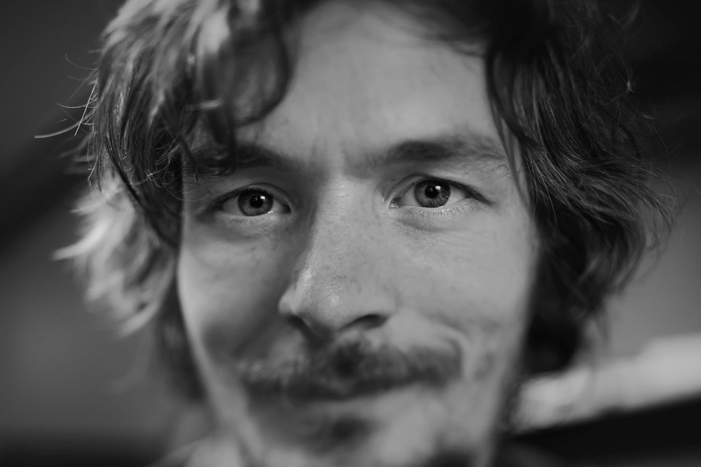
Eye - ought to focus by simple.joy, on FlickrI‘ve been thinking for a while what kind of portraits I‘d like to shoot, if I ever have an opportunity to do so… I think I‘m getting closer - it certainly involves some use of my tilt/shift setup and some unusual lenses.
Suffice to say that this looks better with photogenic people (I can confirm from trying the technique with my kids) but this is what you have to make do with, I suppose! 😅
Linda posted the very same phrase that came to my mind when I saw this - the eyes as windows of the soul. The lens and technique make the eyes so powerfully dominant that they grabbed onto this viewer rather tightly and make me feel more like I'm looking at a person than a photograph. Extremely effective portrait that reveals more than physical appearance.
-
@LindaS has written:
Escape Hatch
This is one of those wonderful and creative images whose charm is hard to put into words. It breaks lots of rules and doesn't adhere to any particular formula for photographic success, yet we know as soon as we look at it that it works. So I fumble for ways to say why. The complementary colors work. The geometry works. The contrast of light and shadow works. The abbreviated fibronacci spiral works. The fractal-ish look works. It deserves to be displayed. But the image is more than the sum of its parts and it is as joyful as the fun you had in making it, something I understand because the only reason I do photography is for the fun of playing with the pixels I harvest.
Thanks for sharing the steps you took in making it.
-
@PeteS has written:
Artistic touch
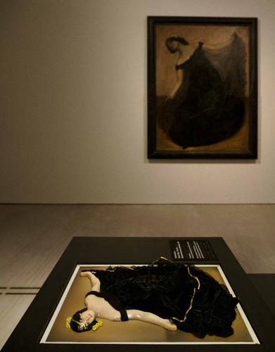
Recently, I visited an Art Museum in Berlin(Berlinische Galerie), and they have made an effort to enhance the experience for visitors with impaired eyesight. Near some of the works in their permanent collection, they have set up 3D models of the paintings to allow them to be explored using the sense of touch.
Pete
It's a good thing you told us what we are looking at because I would never have puzzled it out in spite of having some experience in making observable objects accessible to blind visitors. Without that knowledge, it appears that a version of the painting has set about to extricate herself from a copy of the artwork so that she can move more freely about the museum. Nicely framed and caught.
-
@JimStirling has written:
A photo taken testing out the close up abilities of the Olympus 12-40mm pro II , handheld no stacking taken before the weather took a turn for the worse 😀
Nice image. Sweet William, maybe? I'm not a flower expert by any means. They are pretty things with all their most important parts in good focus and clear color in that dappled light. I find that the 12-40 does a quite creditable job on closeups, and I find it easier to handle than the somewhat quirky 60 macro.
Glad to have you join us!
-
@WhyNot has written:@minniev has written:@WhyNot has written:
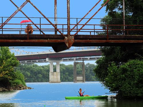
Day on the River
WhyNot
I really like this! While I appreciate photos that are beautiful or puzzling, what I probably am most drawn to are photos that hold a story inside. This one is brimming over with story that we get to figure out for ourselves. The younger lady in the kayak seems to be getting no bites on her rod and she looks a bit dour about it. Juxtaposed positionally and life-wise, the older fellow with the red umbrella upstairs on the rusty old bridge has been reduced to traveling with what looks like a quad cane, but he is still afoot, shirtless, sporting a tan and a stylishly trimmed beard, and has dropped in his line with a float that matches her kayak. Is it an invitation? Might he teach her a thing or too (about fishing)? I see a May/December romance.
Your characters have remarkable detail. I wish the sky had just a little more detail in it, to tell us photographers it isn't blown out, but a richly detailed sky would probably detract from the details of the story, which are small details by necessity. Some haze reduction in the distance maybe? I dunno. I respond first to the story and I think it's wonderful..
Thank you ..... That sky is our typical southern bright overcast that brought a nice cool breeze to a hot summer day ... I could have taken some time and done something with that sky
well ..... hopefully I could have taken more time and done something a little better .. maybe .....
WhyNot
I don't think it needs a bright blue sky, which takes too much away from the characters and just isn't what we usually have. I think just a tad of detail in the all-too-familiar off white flat sky we in the US southeast are often blessed with in summer. Give me a few minutes and I'll experiment a bit.
-
@Rich42 has written:
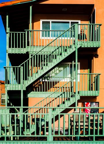
The Strand, Oceanside, CA.
Thanks to Photoshop for supplying shift, tilt and swing capability (well, almost) to my D800E and 50mm shot in its Perspective Warp functions.
I was perched on a narrow, rocky sea wall along the single-lane "Strand", looking up at this scene (and getting some spray from the unpredictable waves). I wasn't brave or creative enough to try setting up my view camera in such a situation. Besides, the opportunity for the shot, as it turned out, would have been defeated by the laborious effort of real shifts, tilts and swings. Let alone figuring a way to actually see the ground glass which would have been behind the wall, perched over the waves.
The unedited image had a lot of optical perspective "distortion."
The building and stairs had been a faded salmon color for some years, before it got a fresh coat of salmon and new green paint on the wooden superstructure in 2014, literally begging to be photographed. The lone figure was a serendipitous plus. A few years later, a new owner painted everything a uniform gray.
Rich
Since I prefer most of my buildings straight up, I'm very grateful for the Adobe tools that let me fix such leans and distortions to my liking. Great CA coast colors, what a shame that someone has thought uniform gray would be an improvement. The fellow upstairs and the soft drink machine downstairs make this image more than an architectural presentation about geometry, though those elements are still abundant. The strong shadows give it a bit of 3D impression, too. Nice.
