-
-
-
@LouHolland has written:
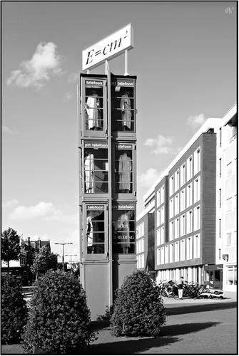
OK, I give up. It's not Einstein's famous equation, so what are the quantities E, c and m in this sign and what is a body building?
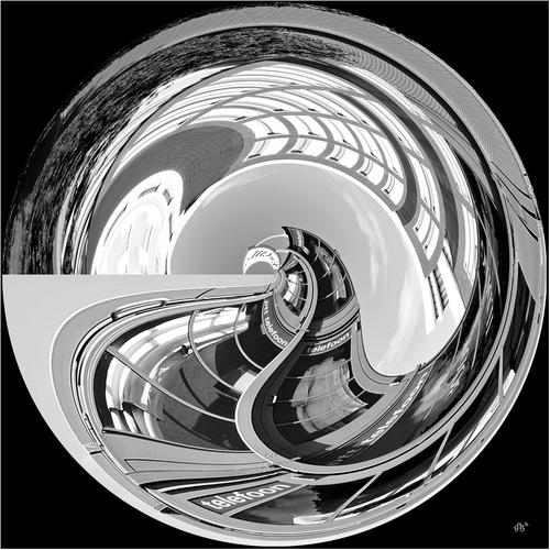
I really like the wonderful lens distortion in the second shot. I like the B&W treatment, which I assume enhances the effect, although the color version might be interesting.
What kind of lens did you use in the second shot?
Rich
-
@Rich42 has written:
What kind of lens did you use in the second shot?
Looks like a rectangular to polar conversion.
-
If you apply the rectangular to polar transform to Mondrian's classic paintings, it makes them more fun. You can also modernise his primary colours by converting red to magenta and blue to cyan.
Don -
@JimKasson has written:@Rich42 has written:
What kind of lens did you use in the second shot?
Looks like a rectangular to polar conversion.
I think some parts of this country would welcome a "polar conversion" right about now.
🙄
Rich
-
@LouHolland has written:
Hi Rich, No it's not that equetion what we just find on top of those classic stacked telefoon boots. Also it is not write the right way. It seems just a form of a playful approach. I don't know, I didnt write it.
So the jackets in the stacked phone booths are the bodies, that's why the artist calls it "the bodybuilding".Lou
[quote="@Rich42"]
OK, I give up. It's not Einstein's famous equation, so what are the quantities E, c and m in this sign and what is a body building?
I really like the wonderful lens distortion in the second shot. I like the B&W treatment, which I assume enhances the effect, although the color version might be interesting.
What kind of lens did you use in the second shot?Rich
-
@JimKasson has written:@Rich42 has written:
What kind of lens did you use in the second shot?
Looks like a rectangular to polar conversion.
Jim, it can be shot with any lens as the effect is achieved with a square crop and the polar processing. A rectangular crop creates a different vanishing point and effect.
Lou -
-
@LouHolland has written:@JimKasson has written:@Rich42 has written:
What kind of lens did you use in the second shot?
Looks like a rectangular to polar conversion.
Jim, it can be shot with any lens as the effect is achieved with a square crop and the polar processing. A rectangular crop creates a different vanishing point and effect.
LouBy rectangular, I meant Cartesian.
-
@JimKasson has written:@LouHolland has written:@JimKasson has written:@Rich42 has written:
What kind of lens did you use in the second shot?
Looks like a rectangular to polar conversion.
Jim, it can be shot with any lens as the effect is achieved with a square crop and the polar processing. A rectangular crop creates a different vanishing point and effect.
LouBy rectangular, I meant Cartesian.
Cartesian indeed as been used by Escher and Fibonacci.
-
@LouHolland has written:
The original image is pretty extraordinary due to its odd name and construction, and the contents of the stacked booths. But the manipulated one i super fun, rolling the whole affair up into a crystal marble with all its lines converted to curves and all its contrasts bent with the lines. Nice work.
-
@OpenCube has written:
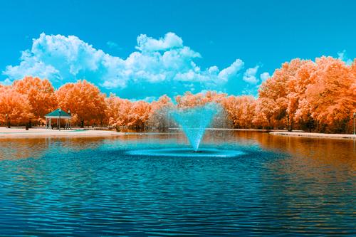
Blue and orange always seem to play well together don't they?
-
@MikeFewster has written:
I have watched the replies to minniev's photo this week as the thread grew. Keeping the discussions trackable gets much easier when they are all set out consecutively in one place as they are in this thread. That's something to think about.
It's the fish in the throat and the shape therein that makes the shot different and a worthy addition to the Dam Birds story. As always, on a screen it is very hard to see dark tone gradations. With this provision, I agree with the suggestions for a little less contrast.
There's another factor. It is very much part of a series and is likely to be displayed along with others. Seen this way, it is better to consider the tone range of the lot and how each works within the overall collection. This might determine the eventual treatment chosen.Thanks, Mike! It is indeed part of a collection either online or on display, and my choices had to do with a high contrast subset that I've been developing since the original collection was displayed. If I print/display these, I'll have to be cautious with the tonalities. The paper I use picks up the subtlest of tonalities if I make the right decisions on the front end.
Ah, the challenges of flat view. The look of this post is something I created, not a result of posts accumulating naturally. I copy the quotes out of each message posted about the image and assemble them into a response to my own initial image. Then I add my comments beneath each quote. It's the easiest/clearest way I've found to respond to everyone without creating a bunch of different posts and duplicating the image yet again a multitude of times. The highlight/quote feature is one of the hidden formatting bonuses we have here, but it took me a while to find it.
-
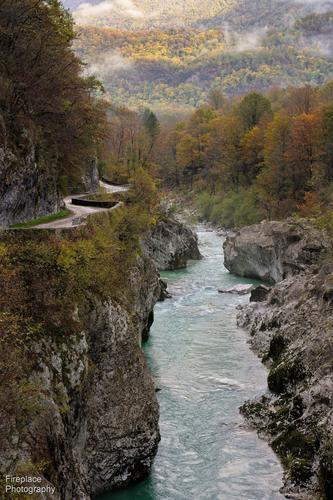
View from Napoleon's bridge
I just found this C&C thread and it looks interesting :-)
Probably a bit late in the week to enter an image here now, but I thought I'd give it a try.
This image was taken on a slighty misty morning in October 2021 on a hiking tour through part of Slovenia and then on into Italy.
The Soča valley is breathtakingly beautiful, but it’s especially nice with its Autumn colours on show.
I’ve printed this image quite big on canvas (120 x 80 cm) and have it hanging on my balcony wall, and see it almost every day.
I like it because it reminds me of a great tour, perhaps you like it too? -
@Fireplace33 has written:
View from Napoleon's bridge
I just found this C&C thread and it looks interesting :-)
Probably a bit late in the week to enter an image here now, but I thought I'd give it a try.
This image was taken on a slighty misty morning in October 2021 on a hiking tour through part of Slovenia and then on into Italy.
The Soča valley is breathtakingly beautiful, but it’s especially nice with its Autumn colours on show.
I’ve printed this image quite big on canvas (120 x 80 cm) and have it hanging on my balcony wall.
I like it because it reminds me of a great tour, perhaps you like it too?Great shot - looks like a wonderful place! I like the composition and how it incorporates both layers provided by the water and the meandering road. I live in a very similar environment but often times in these kind of small valleys there are no roads, which makes it harder to shoot when you don‘t have time for a hike…
-
@simplejoy has written:@Fireplace33 has written:
View from Napoleon's bridge
I just found this C&C thread and it looks interesting :-)
Probably a bit late in the week to enter an image here now, but I thought I'd give it a try.
This image was taken on a slighty misty morning in October 2021 on a hiking tour through part of Slovenia and then on into Italy.
The Soča valley is breathtakingly beautiful, but it’s especially nice with its Autumn colours on show.
I’ve printed this image quite big on canvas (120 x 80 cm) and have it hanging on my balcony wall.
I like it because it reminds me of a great tour, perhaps you like it too?Great shot - looks like a wonderful place! I like the composition and how it incorporates both layers provided by the water and the meandering road. I live in a very similar environment but often times in these kind of small valleys there are no roads, which makes it harder to shoot when you don‘t have time for a hike…
This is glorious. It needs to be seen big to bring out the details. The textures on water, rocks, leaves and clouds can be explored over and over. Visually the parallels between the road and the river are quite magical as they both take us back into the background. While the background is lit up with sunlight, it doesn't distract. We have more than enough detail in the shadowed foreground for that foreground to hold its own. The sunlit area adds warmth and suggests it is worth heading in that direction. I also liked the clouds where the shapes sit comfortably with the hill contours.
I'd put it on my wall too.
I hope you have more for us. -
@ChrisOly has written:
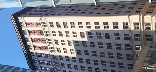
3 X 4
Title relates to the window set-up in a downtown building, probably created in 1930's.
Picture taken with smartphone and no pp was involved.The geometric patterns are the theme, but it is the stepped shadow, which makes such a difference, splitting the facade into more rectangular shapes, and does so without cutting across any of the windows.
The slivers of surrounding buildings are a little distracting at first sight, but on reflection, they add a frame and a sense of the crowded area of buildings.Pete
