• Members 1556 posts
    July 20, 2023, 9:34 p.m.

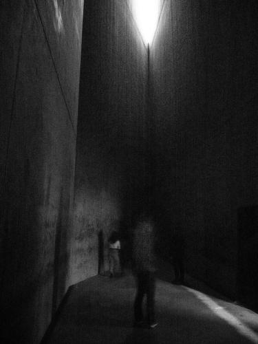
    This is a powerful and troubling image. You've captured exactly what you describe as feeling, which allows you to pass that feeling on to the viewer who hasn't had your experience. That is what impactful photography does. It's hard, which is why it's rather rare. The processing (or abuse as you call it) is very effective. It creates a dreamlike effect and also emulates the tragic time being honored. The two figures are spirit-like. The lighting is perfect - the beam from the distant opening, and its effect on the floor - insinuates one slim ray of hope.

    Excellent image Pete.

  • Members 704 posts
    July 20, 2023, 9:40 p.m.

    I fear to think what evil dwells behind that ominous wall! Needing iron reinforcements to keep the horror inside.

    Even in the pretty light of day it is ominous. And foreboding.

    [shudder!]

    😉

    Rich

  • Members 1662 posts
    July 20, 2023, 9:46 p.m.

    Welcome!

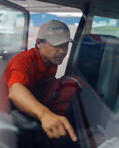
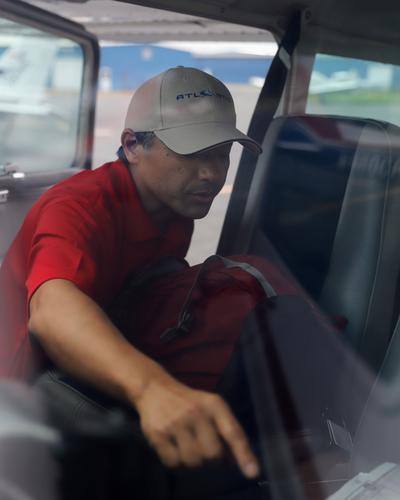
    Love that second shot - it's a very interesting scene and I enjoy the composition, perspective and the muted look (I assume it was shot through glass?) is also great. The only thing I would change is give a little bit of contrast back to some selected areas of interest - particularly the face - in processing. Something like that:

    _MG_3357_JSPhotoHobby.jpg

    _MG_3357_JSPhotoHobby.jpg

    JPG, 818.3 KB, uploaded by simplejoy on July 20, 2023.

  • Members 1662 posts
    July 20, 2023, 9:52 p.m.

    Fully agree with @minniev here! I'm afraid I have nothing of value to add in terms of feedback... This image just captures the mood/feeling that you describe perfectly. Well done!

  • Members 1376 posts
    July 20, 2023, 10:41 p.m.

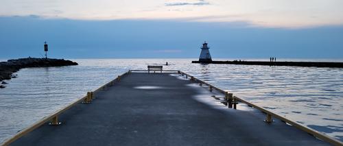
    At first I thought this was a cliche shot of a pier receding to an ocean or lake. Then, the more I looked, the more I found to like.
    First, it has to be viewed at large size to bring out the details. Your shot breaks the mould by having the pier offset to the left and having the far end framed by the breakwaters and their features. Then there is the bench at the end. The little cluster of horizontal lines plays with a stack of other horizontal lines in that area. It is no ordinary receding jetty shot. The end of the pier, railings, breakwaters, horizon,clouds and foreground all connect. Further, we get a prompt to the jetskier. He's positioned dead centre but it feels just right because of the off centre poition of the pier. I also like the line of bright reflections on the right hand side of the pier that carry our eyes to precisely the same spot. The whole image is a pattern of dark on light and light on dark.
    The final surprise. A relatively featureless band stretching across the width of an image, as does the white/grey band at the top here, should have felt wrong. Not here. I think it works because it is another of the light/dark juxtapositions that are a strength of the image and another of your horizontal lines. The panoramic framing works with these lines.
    Really effective Chirs.

  • Members 1376 posts
    July 20, 2023, 10:53 p.m.

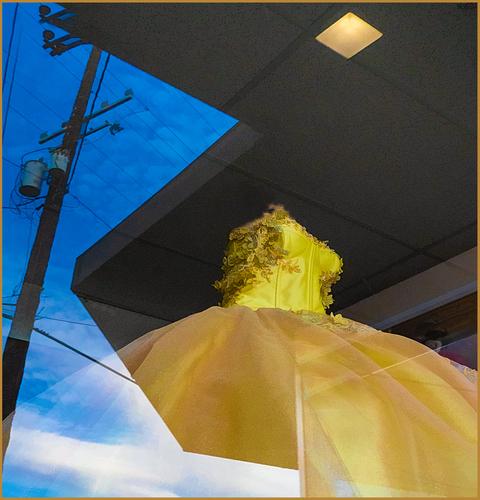
    Simply excellent. No story comes to mind, purely a collage of shapes and colours that are both striking and pleasing together. Special mention for the triangles and diamonds found in the reflection and within the shop. The positioning of the pole crosspiece in its triangle is a joy. The whole image is full of parallel lines between disparate objects that bring it all into a harmonious whole.
    Lots of ticks and stars.

  • Members 1556 posts
    July 20, 2023, 11:14 p.m.

    Welcome! There's nothing as helpful as feedback from a diverse group of photographers to help us grow. You'll use some of the feedback you get, decide not to use other feedback, and you'll learn how to look more critically at your own images and those of others. Be sure and share your own thoughts about the images you find here too. We are all in this project together!

    I really like the second image. The blur, intended or not, makes it more interesting, and the man's position with the pointing finger makes for an excellent composition with a leading line we can't help but follow. I think SimpleJoy's edit improved it a lot, too, bringing it to life and restoring some detail to his face.

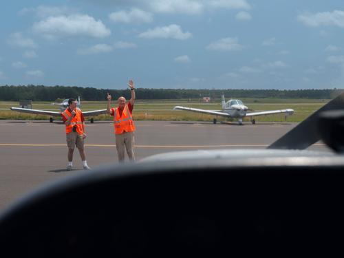
    The first one is a good capture of the workers, the two distant aircraft, and a nice sky, well exposed and with nice detail. The foreground is a little muddled because I can't make out exactly what it is. (Maybe the cockpit of a plane coming in?) More detail would help clear that up so the viewer can be sure what they are seeing. If it's not possible to get both in focus, at least some brightening to clarify things. (And you could consider stacking multiple images to get focus on both). As it is, the dark blurred object feels like it's blocking view of the image.

  • Members 1662 posts
    July 20, 2023, 11:18 p.m.

    Beautiful and very effective shot! I like the powerful color contrast, but also the interplay of shapes and duality of inside/outside. With the "head- and armless" yellow dress, the strong lines "cutting in" and the sky (depicting the imagines heavenly future of the potential dress-wearing individual) being partly blocked by the power pole, it has potential to be interpreted in many different and interesting ways. Excellent work!

  • Members 1249 posts
    July 21, 2023, 12:26 a.m.

    Thank you kindly Mike. You have certainly analyzed the shot correctly, because it was exactly my intent to capture this moment in time.

  • Members 149 posts
    July 21, 2023, 12:51 a.m.

    The first image I was trying to give the impression of being the pilot getting directions, I shot it from the cockpit. I see what you mean, the foreground is too undefined.

    The second came out as intended. I like the idea of adding more contrast to the face.The original had pretty flat color. I did a filter in post of try to brighten it.

    I was shooting and moving, not a lot of time to setup the shot. The second image was shot first, with the lens wide open. I didn't reset the aperture when I did subsequent shots because I was trying to imagine what something would look like and then run over and shoot it. In will have to more conscious of it.

    Thanks!

  • Members 1376 posts
    July 21, 2023, 7:45 a.m.

    While at first they look different, together they are an exploration of symmetry.
    The second first. An elegant house from a period where symmetry was much valued. The facade of the building, its neighbours, the treed setting and the foreground might have been done with a split image with the LHS mirroring the right. The photographer has framed the shot with extreme care to bring out that symmetry. He goes close to having brought it off in the sky as well. There is barely enough difference in the sky to convince us it hasn't been faked. To add to the homage to symmetry, the foreground drive and the sky are close enough in tones to suggest a vertical symmetry. If that had been a blue sky, this photo would not have been nearly as charming.
    Photo one has symmetry through the repetition of shapes along an unusual wall. While the wall itself would get my attention as a structure, as a photo I prefer the second. This comes as a surprise to me because generally I prefer asymmetrical to symmetrical shapes. I have a theory that a preference for symmetry or asymmetry is something akin to left and right handedness.

  • Members 1376 posts
    July 21, 2023, 8:13 a.m.

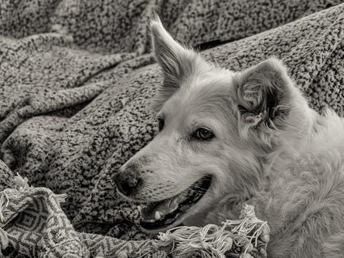
    As Linda suggests, the closeness of tone and texture between Pearl and the blankets, especially since the photographer has selected things so we only see Pearl and the blankets, means that we identify Pearl with the blankets. Definitely a family dog that everyone is comfortable with. Character revealing photographic portraits aren't always of humans.

  • Members 1376 posts
    July 21, 2023, 8:23 a.m.

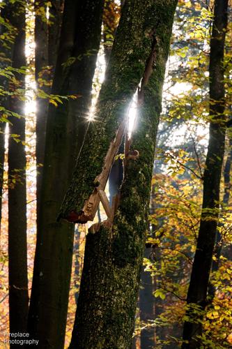
    You need to have your eyes and mind open to see the potential in a detail like this. It could have been photographed from anywhere around 360 degrees but it has been lined up so the sun creates drama from the crack. The drama isn't over, we know this could topple at any moment.
    The little chip at the bottom of the sp;lit is a good touch,the size and angle add to the feeling of the fragility of the present situation.
    The slope on the increases the feeling that a fall is imminent.
    Tension.

  • Members 533 posts
    July 21, 2023, 12:50 p.m.

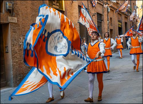
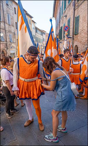
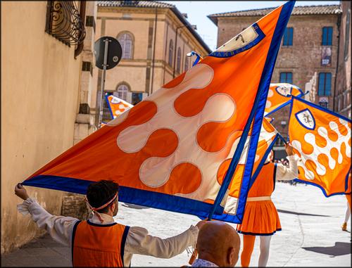
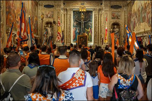
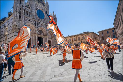
    This is another fine series about the Siena Palio. The photos tell the story, ably assisted by your text, filling in the interesting details. It was very considerate of the Unicorns to choose such photogenic colours as the strong, complementary colours of orange and blue, with the considerable benefit of combining so well with the orangey-yellows of the sandstone walls and the grey paving stones.
    All the photos are strong, but I particularly like the first one. The flags dominate the foreground and their poles lead towards the procession and down the old street. They have a hint of motion blur, which I like, in fact it could have been a bit more for my taste, but then I am a big fan of motion blur! The flag bearer in the foreground has a confidant air, which is very appropriate.
    The seamstress adds a moment of reality and humour to the series, whilst the church scene shows the religious connections. Finally the march up into the main square, with the Duomo throning over the scene, and you did well to capture all the flags pointing towards the Duomo, where they all hope to enter after a successful race.

    Pete

  • Members 533 posts
    July 21, 2023, 12:55 p.m.

    This is a very peaceful scene at the end of the day. The Sun is going down, the wet surfaces are drying, the jet-skier is returning home and the fisherman are enjoying the peace on the quay and rocks.
    The squat shape of the lighthouse mirrors the fore-shortened shape of the jetty, thereby adding to the harmony.

    Pete

  • Members 855 posts
    July 21, 2023, 1:16 p.m.

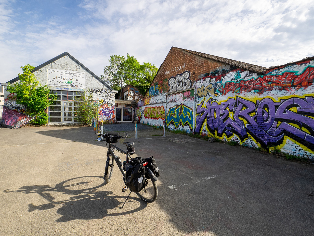
    The bike and its shadow was a good prop to use in this shot, the graffiti is nice and colourful, but it is a bit static.
    If you had been, by chance, lucky enough to encounter the graffiti artists there, doing their thing, I'm sure such your "action shot" would have made it into the book :-)
    Maybe worth finding out when they'll be there next and going back ?

  • Members 855 posts
    July 21, 2023, 1:20 p.m.

    I like the first and also the last. Those uniforms are an amazing colour and really make the photos pop!