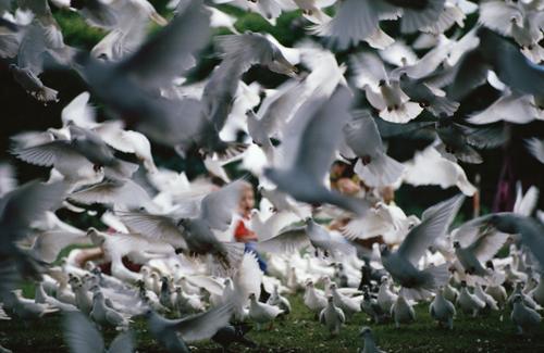
I like it, and see why it's on the wall !!
The surprised expression on the boy's face really does make this shot. Lucky indeed!
The whole air-space is just completely full of birds here. How they don't crash into each other is a mystery, or perhaps they do ?
-
-
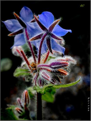
Dark, blurry, nosiy and difficult to make out what's there, but that's what makes this shot very moody!
A worthy tribute ! -
Thank you, Fireplace33
Rich
-
Minniev is your dog a patou? Or a dog raised among the sheep so that he sees himself as a congener of the sheep and will seriously defend it against the wolves or other threats? In any case, the photo is nicely taken and your dog has a nice appearance.
Lou
-
Given the age of the depot, I feel that mono is more appropriate, despite the strong vibrant colors. That's why it's my choice.
Lou -
@ChrisOly has written:@LindaS has written:
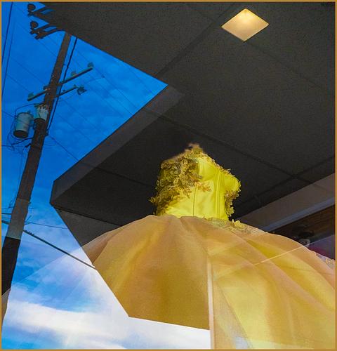
Oh I like that one! You certainly make us look up and see great architectural wonders, like last week's...Kodos for spotting those interesting sites. Love the colours and that opening in the roof which matches the golden structure. Well seen and captured.
Glad you like it, Chris! The "opening" is one of the ceiling light fixtures used for the window display. I took full advantage of my rotating LCD screen to get the low angle, and to keep my own reflection out of the picture 😁
@minniev has written:I do love window reflection pictures. You and Lou are masters of that sub genre. I have no idea what that yellow thing is (it looks more like a prom dress than anything I can think of) but the entanglement of it, the sharp roof angles, the ghostly light fixture, and the utility pole makes for a very intriguing image. Yellow and blue look great blocked against each other, A very abstracted photograph but visually quite pleasing.
Thanks Paula! The shop sells quinceañera gowns. *("Widely celebrated among Latinos, the quinceañera marks an important milestone in a girl's life. Part birthday party, part rite of passage, it symbolizes a girl's entrance into womanhood when turning 15, traditionally showcasing her purity and readiness for marriage.") * I had to chuckle about the telephone pole when I decided to post this pic in the Wednesday thread. I recently participated in conversations on UHH about the ugliness - or beauty - of poles and wires. People seem to love 'em or hate 'em, and many would never, ever consider making them the subject!
@MikeFewster has written:Simply excellent. No story comes to mind, purely a collage of shapes and colours that are both striking and pleasing together. Special mention for the triangles and diamonds found in the reflection and within the shop. The positioning of the pole crosspiece in its triangle is a joy. The whole image is full of parallel lines between disparate objects that bring it all into a harmonious whole.
Lots of ticks and stars.Mike, you always find something in a photo that I don't see (whether my image or someone else's), so it's both educational and fun to read your articulate, detailed impressions. Many thanks!
@simplejoy has written:Beautiful and very effective shot! I like the powerful color contrast, but also the interplay of shapes and duality of inside/outside. With the "head- and armless" yellow dress, the strong lines "cutting in" and the sky (depicting the imagined heavenly future of the potential dress-wearing individual) being partly blocked by the power pole, it has potential to be interpreted in many different and interesting ways. Excellent work!
I'm so pleased the photo engages you, simplejoy. I enjoy your writing almost as much as your incredibly creative photography. Thanks very much - and also, thanks again for the other thread with the "out of focus" theme. Fun and inspiring!
-
@PeteS has written:@ChrisOly has written:
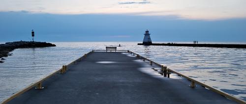
Calm waters.
Location is Southampton, Ont. Canada on Lake Huron.
This is a very peaceful scene at the end of the day. The Sun is going down, the wet surfaces are drying, the jet-skier is returning home and the fisherman are enjoying the peace on the quay and rocks.
The squat shape of the lighthouse mirrors the fore-shortened shape of the jetty, thereby adding to the harmony.Pete
Good pick up on the significance of the shape of the lighthouse. It adds quite bit to the success of the image.
-
Sorry for not being very active this week.
I am on the road until July 26 with very limited internet access and only my phone as tool.
But I have seen photos and discussions so far and both are very interesting! -
@PeteS has written:
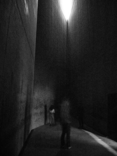
From Darkness
The Jewish Museum in Berlin in is well worth a visit, and not least for the iconic architecture of Daniel Libeskind, which becomes part of the exhibition. It is not just about the Shoah/ Holocaust, although that is a central theme of course, but also about Jewish life and art through the centuries.
An architectural feature is dark windowless shafts running the height of the building, to represent “that which cannot be displayed” , artefacts turned to ashes and works of people killed by the Nazis and their non-existent descendants. It represents the hole in the Jewish community left by those who perished.
The entrance is through a windowless door at the bottom of the shaft, which closes automatically and on a dull winters day, eyes need a moment to adjust before they can see anything. I leant against a wall whilst I waited and found it very moving. But how to express that in a photograph? In the end, I decided to underexpose and thoroughly mistreat the sensor, by raising the brightness in post (about 5 stops, I think) and no processing for noise. This dark thread-bear image is an approximate visual representation of my feelings at the time.Extraordinary.
I'm going to try to forget that this is a photograph and that I have read Pete's introduction. I will try to look at it and respond to it purely as an image.
The Greeks and the medieval builders knew what they were doing when they used tall, slim, repeating shapes in buildings when they wanted to inspire humility, reverence and awe. Forests elicit the same response. It is something to do with the way our brains are wired.
It's at work in this image and Pete's framing has multiplied the effect. But it's more complex. The lines lean inward and give claustrophobia. Neither can you climb inward slopes.
There are fragments of humans here. One turns away from us. The other is only a suggestion. A memory perhaps. Individuals are here but overwhelmed by the scale of their surroundings.
The tones couldn't be more sombre. We are at the very edge that divides perception from total darkness.
From the darkest area of the image, a fraction to the right of the centre, one line emerges. It extends upwards until a tiny point breaks into a small triangle of pre light. It is small, it seems out of reach but it is there. Hope, optimism, life, your God of choice?Even without knowing what this place is, I think I would have felt the above from the image. It's an extraordinary memorial. Extraordinary is a good word for what the photographer has done in making an image with so much depth and power. The memorial hasn't merely been recorded. Choice after choice has been made by the photographer in the creation of this image.
-
-
@OpenCube has written:
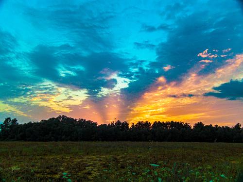
My initial response was - a beautiful, dramatic sunset well captured. I looked at it larger and realized it was more complicated than that. Yes, the sky is a somewhat enhanced version of what we all yearn for when we are out for a sunset shot: brilliant colors, glorious cloud formation, ray effects. The foreground initially seems almost irrelevant - until we look closer. Then we discover that carefully defined line of flowers, tinged in neon, leading like a fairy path from the first shelf of flowers into the far distance across the field. It's a pretty wonderful creation, all told.
I'm unsure whether the noise/grain and CA are things you intend or incidental to the camera and/or lens and/or processing. I find them a little distracting and would try to mitigate them. Likewise, I'm not sure if the light pole or tower in the distance is deliberate or incidental. My own inclination would be to clone it out. But if these characteristics are your intent, by all means stick with them.
-
-
@LouHolland has written:
-Continuation Snake Wall
Fabulous blue and red and green and white combination of colours with amazing details.
-
@minniev has written:
My initial response was - a beautiful, dramatic sunset well captured. I looked at it larger and realized it was more complicated than that. Yes, the sky is a somewhat enhanced version of what we all yearn for when we are out for a sunset shot: brilliant colors, glorious cloud formation, ray effects. The foreground initially seems almost irrelevant - until we look closer. Then we discover that carefully defined line of flowers, tinged in neon, leading like a fairy path from the first shelf of flowers into the far distance across the field. It's a pretty wonderful creation, all told.
I'm unsure whether the noise/grain and CA are things you intend or incidental to the camera and/or lens and/or processing. I find them a little distracting and would try to mitigate them. Likewise, I'm not sure if the light pole or tower in the distance is deliberate or incidental. My own inclination would be to clone it out. But if these characteristics are your intent, by all means stick with them.
I wish I was half as creative as my images might occasionally suggest. Never even noticed the line til now. Thanks for pointing it out.
Noise is a product of the camera, mostly. It's a Sony f828. Even on iso 64, it's a noisy little bugger. I'm sure I made it worse by pushing around in post and forgetting to do something about noise. I had thought about the pole removal, but this image is for a select audience first. That pole is in some ways a clue about it's location
-
@Fireplace33 has written:@Rich42 has written:
Rich
I like it, and see why it's on the wall !!
The surprised expression on the boy's face really does make this shot. Lucky indeed!
The whole air-space is just completely full of birds here. How they don't crash into each other is a mystery, or perhaps they do ?Very nice. You can almost hear the flurry and whir of all the wings and we are right in the middle of them. The varying degrees of blur create the feeling that we are close and they are all around and that they are all moving. Because the nearer birds are darker and those further are better lit, the depth of the flock is enhanced.
As Fireplace says, the position of the boy in the space, so near the centre, may have been luck but it makes the shot. Surprise. wonder, pleasure. The touch of red from his clothes ensures that we see him. Perfect.
I'm undecided about the following. It is well worth doing as a large print. If it was mine I'd experiment a bit with Topaz and this image to decrease the noise a bit before enlarging and also to try for a little more definition on the boy's face. I wouldn't try to sharpen the lot with Topaz, the softness of the edges should be retained. Just the area around the boy's face. There isn't a lot for Topaz to work with so it would only be a marginal change, which is all I think it needs. -
@MikeFewster has written:
I like it, and see why it's on the wall !!
The surprised expression on the boy's face really does make this shot. Lucky indeed!
The whole air-space is just completely full of birds here. How they don't crash into each other is a mystery, or perhaps they do ?Very nice. You can almost hear the flurry and whir of all the wings and we are right in the middle of them. The varying degrees of blur create the feeling that we are close and they are all around and that they are all moving. Because the nearer birds are darker and those further are better lit, the depth of the flock is enhanced.
As Fireplace says, the position of the boy in the space, so near the centre, may have been luck but it makes the shot. Surprise. wonder, pleasure. The touch of red from his clothes ensures that we see him. Perfect.
I'm undecided about the following. It is well worth doing as a large print. If it was mine I'd experiment a bit with Topaz and this image to decrease the noise a bit before enlarging and also to try for a little more definition on the boy's face. I wouldn't try to sharpen the lot with Topaz, the softness of the edges should be retained. Just the area around the boy's face. There isn't a lot for Topaz to work with so it would only be a marginal change, which is all I think it needs.
[/quote]Thanks, Mike.
The image hanging on my wall is 14.25" x 23" (that's the size of the opening in the mat). There is no grain to speak of in Kodachrome, but the drum scan shows a very slight texture (that's a lot of enlargement for a 35mm film image) that is not objectionable in any way. I did not apply any sharpening to the image here or to the print. I wouldn't apply any noise reduction, the image doesn't need it. The print is striking.
Rich
-
@LindaS has written:
Juxtaposition
Storefront window display with reflections from the street.
It is possible to enjoy this photo purely on the level of patterns, shapes and colours, but there is so much more to it. The photo shows two contrasting worlds.
In the blue world on the left, the colour is in the beautiful blue sky, with a lovely texture of clouds. It is this natural beauty, which draws the eye, even though it is the background. The poles and wires form interesting geometrical shapes, but they are not dominant enough, they do not occupy enough of the frame, to be a subjects in themselves. They are simply in the way, but by being ugly, they make the sky seem more beautiful.
In the yellow world on the right, our eyes are drawn to the beautiful yellow dress. It is not natural, but man-made, even if it does try to mimic nature with trimmings of leaves. This time the beauty is in the foreground and the background is man-made, with the utilitarian ceiling almost hidden in shadows, but visible enough to provide a similar beauty and the beast contrast, to highlight the beauty of the dress against the ugly background. The light in the ceiling balances the composition visually, and additionally its shape, which follows the utilitarian rectangles of the ceiling, and it’s colour, which matches the dress, offers other balances too.
These two worlds are separated by a harsh zig-zag frontier, which is far more satisfying than a straight line would have been.
Well done for seeing and appreciating this scene enough to turn it into a fine photograph.Pete
-
@LouHolland has written:
Enlarge click image > click downarrow
The Snakewall,
The snakewall is part of a reqtangular herb garden next to one of the many country estates just behind the dunes. This line of 18th century estates were for the more affluent and some had foothills down to the sea and therefore their own beach.This country estate later became a restaurant because of the spacious herb garden so that the residents could provide their own herbs.By the way, I have named it "Snake Wall", because of its model.
LouThis pair form a nice illustration of the country estate.
The second shows the building, and the image is composed using symmetry, as the architect of the building did in the past. The path leads then branches to introduce the two side buildings then curves around to the grand house itself, whose chimneys and clock tower lead towards the sky.
The clouds provide a bit of randomness to contrast with the neatly ordered estate below, and their slightly purple tone complements the greens. The trees, whose colour links to the grass and whose random form links to the clouds, help merge these two worlds.The first shows a delightful wall. It is not only its unusual snaky form, but also the texture and colour of the bricks, which makes it an eye catcher. The surrounding trees and leaves contrast well with its rectangular shapes. The bright green lawn ensures are eyes are lead down the wall to this patch of light.
I like the processing too. There seems to be a pattern of fine lines overlaid, rather like an etching, and I wonder whether it was a found piece or drawn especially for this photo? The bight spots in the sky have been coloured a yellow or ochre, which washes over the leaves in an attractive way. I think it has been added in patches to the gravel path in the foreground to tone down that bright area. In any case the PP is highly effective, and gives the photo a strange feeling of being sharp but dreamy at the same time.
Both photos are excellent, but as a pair they are more than the sum of their parts.Pete
![[000430] copy.jpg](/a/thumb/JOOUBnW3kGBOul7p0MOee8Zzo1VBDVuiyg8VWyQVyDFmoi0SxDqxhHfKE3AJNLXJ/13878/?shva=1)
![[000428] copy.jpg](/a/thumb/KmRVx02L0VfZI9LVMupKWFTKDwhH0tqc2mFCRdHu6qbCDeypOP64tOIPsaVqv6XL/13763/?shva=1)
![[000461] copy.jpg](/a/thumb/5q3Vc7tATZxur8ObPDsrjBtwUJP2mlqwGTh2klsVfYDOWovY2dSN26bMabpGL07X/13764/?shva=1)