• Members 533 posts
    July 23, 2023, 11:20 a.m.

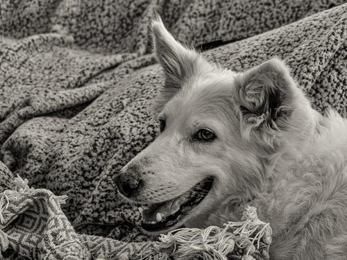
    The dog has character and is nicely sharp against the background, with plenty of detail in fur, eyes and mouth. I also like its unusual position in the frame for a portrait, by occupying the lower right quarter. This means the dog has space to look into and does not appear cramped, and gives it a sense of freedom, with all that space to roam into. That space also means the background takes on a more important role, and the blanket or rug is an excellent choice. It is probably made of wool, which links to its sheepdog breed, and the waves of fabric emulate the rolling hills of a sheepdog’s workplace. It is also a symbol of homeliness and the new existence, no doubt much appreciated by a feral dog.

    Pete

  • Members 523 posts
    July 23, 2023, 11:40 a.m.

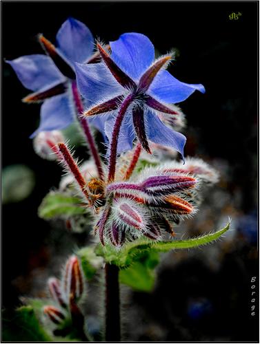
    Often, hobbyist photographers seem to forget about the fascinating structure of the "back" side of flowers. This fuzzy, colorful specimen is a delight to view. I could imagine a grouped study of it from several angles. Beautiful!

  • Members 523 posts
    July 23, 2023, 11:45 a.m.

    Every week I look forward to your alternate-universe images. As a nature lover who also enjoys playful processing, these creations engage me both for the subjects and the effects (camera + you).

  • Members 523 posts
    July 23, 2023, 11:46 a.m.

    I'm very grateful for your time and analysis, Pete!

  • Members 523 posts
    July 23, 2023, 11:53 a.m.

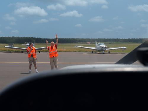
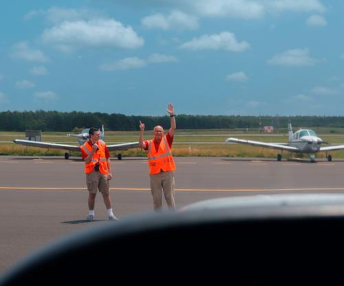
    The depth of field of #2, along with the reflections on the right side, help with the feeling of small space of those aircraft (my brother was 1/4 owner of a two-seat Piper Cub - I think it was.) #1 is a nice action shot from the pov of the pilot, while adding context via the parked planes. A great opportunity for a longer series of storytelling photos.

  • Members 533 posts
    July 23, 2023, 12:02 p.m.

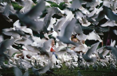
    This is a very good illustration of chaos!
    It is a little bit schizophrenic. It is as innocuous as pigeons in the park, but, at the same time, since we are immersed by the telephoto lens, we are right in amongst them, and we cannot make out any pattern or plan, which causes unease, then the angst created by Hitchcock is recalled as we take in the sheer numbers of birds, and a mild terror takes over. At the heart of all this is a little boy, with his mouth wide open, but whether in fear or in laughter we cannot tell, because he is out of focus. It is like a dream, which we are inclined to enjoy, but are worried it may turn out to be a nightmare.
    The lack of sharpness is an important part, and stops us enciphering the whole thing, especially the boy, and the rolling off of near sharpness to total blur is attractive.

    Pete

  • Members 1556 posts
    July 23, 2023, 2:48 p.m.

    Two nice additions to the Snake Wall collection. The first is more like the one that shows the wall from the other direction, in composition and in editing, so they make a nice pairing. I do think the cyan could be reduced a bit as the sky is something of an eye magnet here, and the skies in these two are definitely not the focal point. The purple flower is exquisite in its color and detail, and photographing it from its back instead of its face is a significant part of its magic. Truly beautiful in form, color, light, and definition.

  • Members 704 posts
    July 23, 2023, 3:39 p.m.

    Thanks, Pete. That's quite an imagination!

    Rich

  • Members 1556 posts
    July 23, 2023, 4:27 p.m.

    Thanks to all of you who commented!

    Pearl is an excellent nap-dog. I have countless photos of my grandchildren piled up on her for naps. She is happy to serve as a pillow for hours. As for the processing, I am a heavy handed user of the silver slider in Silver Efex. I think it must remind me of something I did in the darkroom hundreds of years ago.

    She is rather outstanding, especially considering how near death she was when we first met her.

    I actually cropped a square of it and preferred it. But I'll probably use it as a page in next year's calendar for her "parents" so I went back to this format

    I hoped to capture her gentle character and her wise-old-matron look.

    We don't know her life before my son took her in and nursed her back to health, but it appeared she'd been severely abused in whatever place she'd found herself. She was never bitter and anxious like some mistreated dogs though, just content and protective. She doesn't have Pyrenees in her gene analysis (I had to look up "patou") but instead the smaller Swiss shepherd
    www.thekennelclub.org.uk/search/breeds-a-to-z/breeds/pastoral/white-swiss-shepherd-dog-imp/

    Pearl definitely values freedom, and can get out of any fence or sneak away from any supervisor. She always comes back though, knowing where her prosperity is. I was undecided about the backgrounds, but her fur seemed to work in contrast to the fabric patterns. The other dog, a toller, looks best in grass backgrounds.

  • Members 855 posts
    July 23, 2023, 7:21 p.m.

    That ia a great image of this flower. The bright colours against the dark background work really well.
    Very sharp and nicely composed!

  • Members 1556 posts
    July 23, 2023, 8:32 p.m.

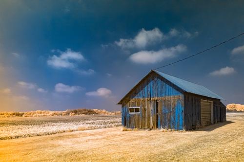
    This is interesting. I love photos of old buildings like this. I realize the colors in this may look very different from the original scene but it is perceived as sitting in a dry field of dead grass on a sunny blue sky day. I'm curious whether the building is partially painted blue or whether the blue is achieved in post The spots of gold haze may be lens features or dust devils. All told, it is a pleasing and accessible composition of an interesting building, effective leading lines, a good sky, all presented with pleasing complementary colors.

  • Members 533 posts
    July 23, 2023, 10:32 p.m.

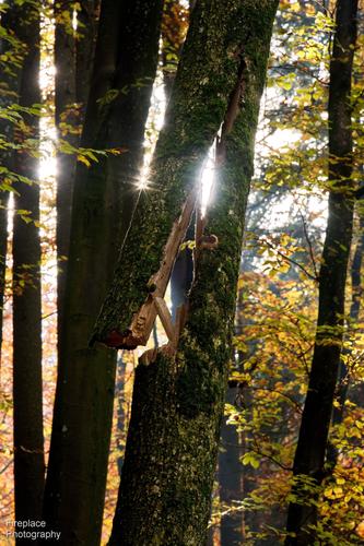
    The Sun stars are delicate and the translucent leaves seem fragile against the sturdy tree trunks, but it is a trunk, which has fractured and become a danger in this beautiful scene, and this mixture of beauty and potential danger sum up a forest perfectly.

    Pete

  • Members 1376 posts
    July 24, 2023, 6:43 a.m.

    I agree with Simplejoy and the suggestion for a small improvement.
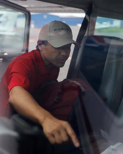
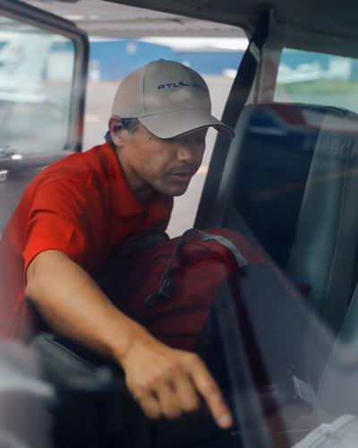
    It's worth spending some time on this shot. Very unusual. An everyday moment. Many broad rules are broken and it doesn't matter. It works extremely well and is a wonderful example of how a photographer can see the everyday and turn it into something compelling.
    A case is being put into(or taken from) a car. The zig zag bline that goes from the extended tip of the finger to the elbow, turns back to the shoulder and neck where it splits into two, is what makes the shot. A line like that gives sharp movement. The in and out of focus and blur moments along the line give depth. There are enough facial details for us to share the brief concentration. The contrast between arm and bag helps establish the line. The framing of the head and shoulders in the door opening is outstanding. A moment of real life is frozen, there's nothing posed in the shot, we feel that the photographer caught it.
    You may or may not have cropped to get the image as we see it here. Whatever, it is perfectly framed to create the diagonal line and the framing of the head. I even like the bright little corner, front right. Sometimes such a point might distract. Not here. It adds a small interior detail and gives balance to the brighter areas on the left.
    A stand out photo.

  • Members 1376 posts
    July 24, 2023, 7:32 a.m.

    "Beautiful got me thinking." He (or she) is right. I would never have thought of doing what Lou has done here in photographing the reverse of a flower. It certainly worked. The dark red whatever the botanical name for the stars is, stand out against the blue of the petals. The dark red and the blue provide a wonderful backdrop to isolate the tiny white follicles.
    Very nice lighting. The subject is isolated from the background. Enough light goes through the blue and green to give it glow and depth and of course the follicles are brought out.
    It's an elegant composiion, slightly off centre with the unopned buds and the green leaf on the right giving balance to the weight of the blue.

  • Members 1376 posts
    July 24, 2023, 7:48 a.m.

    First I saw the sunset photo and I keep scrolling looking at more photos. Then I bumped into minniev's notes. Not for the first time I found she was making much the same points as I was about to make. Then I came to Open Cube's response and I rethought it all.
    A contradiction. The scene needs to be looked at large to bring out the foreground flowers but looking at it large brings up too much grain.
    What do you use for processing OC? If it is Lightroom, LR now has a grain reducer that works pretty well. You can also get a free trial version of Topaz DeNoise to Topaz A1. There are free tutorials around online as well if you haven't tried these. This shot would be a perfect example to experiment with a free trial.
    I note the camera. Wonderful camera in its day and that explains the noise. Are you still using that camera or do you have many images taken with it that you might want to process? If so, a modern denoising program could be a good investment.

  • Members 533 posts
    July 24, 2023, 11:26 p.m.

    Welcome, and I hope you return and learn as much as I do from this regular thread.

    Like the other commentators, the second photo is my favourite, and I can only second what they have said already. The leading lines of finger and arm, the use of sharpness and blur to good effect, the good crop, Simplejoy’s suggestion to improve the face, but the best thing is just the choice of an unusual pose of a man reaching right into the photo, which really catches the eye.

    I think the first can be improved by a crop. My approach would be to decide what is important in the image, what is the photo about? I would suggest it is the men and their signals seen from the cockpit. The important elements are the men, the planes to show we are at an airfield, the dark shape of the cockpit interior to show we are inside the plane and the pretty blue sky, which is kind of important for a plane. The inside of the cockpit in shadow takes up too much space, so trim off a bit from the bottom, and if you have a line leading to the edge, then having it point to a corner is usually a good choice. The propellor and other black thing on the right are distractions and or necessary to identify we are in a plane, as the planes outside and the dark cockpit edge do that, so crop that off too. (If you are a bit of a plane geek like me, you may find it hard to crop off the wing tip, but it does make a better photo in my opinion!)
    This is what I mean….
    mg-3329-edit.jpeg

    Pete

    mg-3329-edit.jpeg

    JPG, 292.5 KB, uploaded by PeteS on July 24, 2023.

  • Members 533 posts
    July 24, 2023, 11:32 p.m.

    This is a lovely scene of an old barn or shed in a cornfield, whose yellow complements the blue of the barn and the sky. The shed has an attractive patina, and this is reproduced on the image with the yellow patches.

    Pete

  • Members 861 posts
    July 27, 2023, 7:49 a.m.

    Barn is red, all the grass is green. Full spectrum camera, HoyaR72 filter, and post production to help with the magic making.