Wow, a waterfall with a bridge across the front! I bet that was difficult to build.
Good shot , especially when looking at the high res version.
It looks like a great place to visit, unless, of couse, you are a heartbroken lover :-(
-
-
-
Good reply!
I agree that everyone should stay true to their style, and why should anyone change their brush, if they are happy with it.
My comment was directed more at me. As you have no doubt noticed, I enjoy looking for meaning and stories in a photograph and no doubt often read things into an image, which are neither there nor intended and it sometimes leaves me looking a bit foolish. As your photo was very obviously about the processing, I was unsure whether you were trying to get another message across as well. I went ahead with my interpretation, because that is how I read the image and just as the artist is free to create the image as seen fit, so too is the viewer free to interpret it at will, although hopefully also seeing what the artist intended. So I was hoping I had interpreted what you intended, rather than inventing something, which was never there, hence my comment about hoping it was not just meant to be visually pleasing. Actually, I used the term eye-candy, which some might take as a put down, but it wasn't intended that way, as I use the term freely, including for my own photos, if their sole intention is to be visually pleasing. It is a perfectly acceptable goal, although if I can also tell some visual story, I am pleased, as it gives another level to explore in the image.Pete
-
@Bryan has written:
Yesterday was my first day out with my camera for two weeks - was suffering withdrawal symptoms... 😄
Those withdrawal symptoms are painful, and just going through the motions of looking for and composing a photo and then pressing that button are a great relief, even if the photos are only worth the delete button afterwards. Luckily not the case here with this classic shot of a seed head. The white filaments of the seeds are nice and sharp and the background, despite being quite busy with grass and leaves, is nicely blurred and does not distract. It is nicely exposed, and the white details have not been blown.
Pete
-
@Bryan has written:
Long shot across a small valley
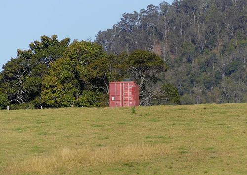
I like the quirkiness in this one. A container literally slap bang in the middle of a natural setting. It is positioned perfectly, as the centre does not imply motion, so gives the container an air of "... and I am not going anywhere ..." which is amusing. It leaves the viewer pondering questions about why it is there, or when the lorry will arrive to prove it is going somewhere.
Pete
-
@JimKasson has written:@simplejoy has written:
Fascinating that you were a drum scan operator. We've had one in the company I was working years ago, but I wasn't interested in photography at the time... Now I would love to know more about them. Do they have lenses in them? And if so, do you know who manufactures them?
I had a drum scanner, too. Manufacturers included Scitek, Crossfield, Dai Nippon, Hell, Optronics, and Howtek. I had an Optronics ColorGetter. Spinning glass drum. Light source on one side. Lenses, beam splitters, filters, and masks on the other side. Then photomultiplier tubes and ADCs,
Thanks a lot! Have you ever tried adapting such a lens onto your camera? Some of the film scanning lenses are among the best macro lenses ever, so it would be interesting to know what a drum scanner lens would be capable of… unless they have some image circle restriction.
I even have a Dainippon Screen (Cezanne) lens, but that‘s from a pretty massive flat bed scanner if I‘m not mistaken.
-
@Fireplace33 has written:
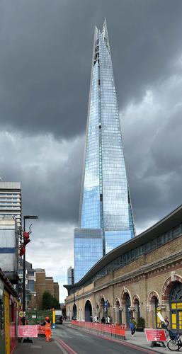
In No. 2 the glass building is capturing the light nicely and shines out bright against that dark foreboding sky.
I feel that it would also work as a long tall crop, with all of the red crane and the bright yellow wall chopped off from the left hand side, giving full attention to the magnificent Shard tower.Please let me know if it allowed to edit with sugestions and post back shots like this ?
In No. 5 the building is well framed with those interesting dark shapes
Yes, it is quite alright to edit and repost, in fact it is in the rules of the thread in the first post.
I like your crop, which simplifies the image and that is rarely a bad thing. I cropped the way I did for a few reasons. The first reason is valid. I wanted to contrast the sleak tower in the top right with the jumble at the bottom, with the tower rising above that for better or worse. The other two are not good reasons. The crop is more or less as I saw it, and I found it hard to abandon bits. The other was I did not want to get rid of those giant red ants crawling over the bottom left, as they made the the jumble slightly surreal and gave the tower an even greater contrast. However, nobody commented on the ants, so either they were not noticed, or nobody felt them worthy of comment, so it was probably not worth leaving them in, except to satisfy myself! In any case that probably means that your crop is more appropriate than mine.
-
@OpenCube has written:
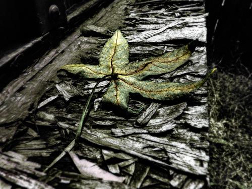
This has a wonderfully morbid feel to it. It looks dark and wet. Ironically, the green of the leaf gives a slight feeling of life and hope, even though the leaf is dead or dying, and will soon be as dark as its surroundings. A very cool image.
Pete
-
@Bryan has written:
Yesterday was my first day out with my camera for two weeks - was suffering withdrawal symptoms... 😄
It's not healthy to go too long without taking a photo!
The main appeal for me is the bright light, with a feeling of warm breezes on a perfect summer day. However, I guess it's not summer where you live? 😁
-
@Bryan has written:
Long shot across a small valley
.
I'm reminded of those little tests that ask you to select which item does not go with the others. Quite a find, and quirky I think someone said? It's fun to ponder the possible story behind this!
-
@OpenCube has written:
Moody, but hopeful in that nature will survive whatever humankind throws at it? Visually compelling.
-
@PeteS has written:@OpenCube has written:@PeteS has written:
But maybe it is just supposed to be eye-candy, which would be a shame.
I love painting with this brush, but what it is truly useful for, I wish I knew.
Good reply!
I agree that everyone should stay true to their style, and why should anyone change their brush, if they are happy with it.
My comment was directed more at me. As you have no doubt noticed, I enjoy looking for meaning and stories in a photograph and no doubt often read things into an image, which are neither there nor intended and it sometimes leaves me looking a bit foolish. As your photo was very obviously about the processing, I was unsure whether you were trying to get another message across as well. I went ahead with my interpretation, because that is how I read the image and just as the artist is free to create the image as seen fit, so too is the viewer free to interpret it at will, although hopefully also seeing what the artist intended. So I was hoping I had interpreted what you intended, rather than inventing something, which was never there, hence my comment about hoping it was not just meant to be visually pleasing. Actually, I used the term eye-candy, which some might take as a put down, but it wasn't intended that way, as I use the term freely, including for my own photos, if their sole intention is to be visually pleasing. It is a perfectly acceptable goal, although if I can also tell some visual story, I am pleased, as it gives another level to explore in the image.Pete
A thoughtful, instructive, much appreciated "explanation." LOVE this forum!!
-
@Fireplace33 has written:@Rich42 has written:
Carlsbad, CA
Rich
If you were a beginner with a point and shoot, I might glibly say , "Try aiming a bit lower next time" :-)
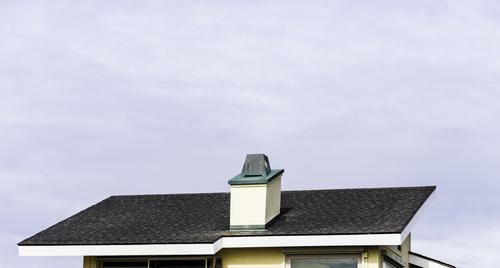
But the other responders have found a deeper meaning in the shot and compared it, among other things, to an artist's palette with the thumb sticking through the hole in the middle, and rejoicing in the use of negative space.
So I guess it has something, but it's not really my cup of tea :-)Fireplace,
Thank you, thank you, thank you!
Finally, a response to this image I can really sink my teeth into.
You are absolutely right! The image is too low in the frame! What's up with that? Where's the rest of the house???? What's with all that empty cloudy sky? (It's actually "Southern California Marine Layer" - just ordinary ol' fog - hanging on the coast line with momentary glimpses of sun/sky breaking through.)
I always worry how my images will look on others' monitors, compared to the way I view them. I have a 27" 5K ("Retina") iMac and an old 42" plasma screen TV.
I view the iMac from "normal" working distance (14-18") and as I'm editing an image (always in Photoshop), I frequently cycle with the "F" key, toggling into full screen mode with a completely white background, as though the image is sitting in a limitless white mat surround. Primarily because, the destination of my images is almost always as a print on matte art paper, framed in a white mat with large borders. Occasionally I glance at the 42" monitor which is across the room, just for secondary reference.
I always "worry" that others will be viewing the image in some completely different visual environment, such as at a rather small size, on a computer monitor on which there may be a myriad of competing windows and visual elements. It's just not going to look the same. And frankly, I am pleasantly surprised that I get some of the positive responses I do, knowing that there are so many visual environments in which we all ingest the Internet.
I intended the minimalist composition of this image. The rest of the building just did nothing for it. It's actually a 38" x 22" print on Canon Photo Paper Premium Matte from a Canon Large Format pigment printer. It's behind a white mat with 4" borders, so 48" x 30." No plastic or glass cover. It's a very sharp image (as I've commented earlier). At the large size, in the mat, the image is quite a bit more compelling "in person" than seen here in its JPG version. IMHO it comes across better as the graphic I hoped it to be.
But wait. There's more!
This is just one of five "companion" images. Three others are the same size, the fifth is 32" square. The other images are situated in their mats much as this one, repeating the theme of the top edge of a particular beach bungalow/condo low in the frame with expanse of sky above. The group is meant to be displayed together, though each can stand alone. The repeating graphic treatment of the group emphasizes the appearance of each individual frame. They all are buildings recognizable to "locals" of a particular SoCal beach town, presented in an unusual way.
"Repetition begets legitimacy."
"Repetition begets legitimacy."
A long time ago, in my struggles with learning to play a musical instrument, I was advised that (one) of the distinguishing characteristics of a pro vs an amateur, is that a pro never worries about making a mistake. An amateur, on playing a wrong note or chord, frequently becomes embarrassed and unnerved, tries to cover up, backtracks, and immediately tries to correct, to re-play the error, only bringing additional attention to the problem and embarrassment, increasing his/her anxiety.
A pro just goes on with the line, even holding the "wrong" note, seemingly unconcerned, then sliding into the correct one as though the sequence had been planned. Even circling back and repeating the entire "wrong sequence" one or two more times, exactly as it occurred the first time, "because no one will ever believe you could make the same mistake repeatedly. You obviously meant the piece to go that way." And, amazingly, it does sound "right" on repetition!
So maybe, making five prints, all with the same "misplacement" of the images in the frames, will convince someone that the technique is right. 😜
A gallery manager here, on seeing my large matted images thought they would be compelling on a wall devoted just to them. They have both local and wider-spread appeal (she thinks). Her partners, not so much. An entire wall devoted to one artist is a lot to ask for a small gallery. We're negotiating.
Rich
-
@LindaS has written:
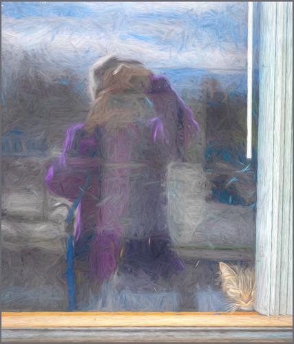
Me and Stella
Linda I agreed with Whynot to correct the white Slats vertically but also the hawker bench slightly. May I assume the processing is DAP.
Lou
-
@LindaS has written:@LouHolland has written:
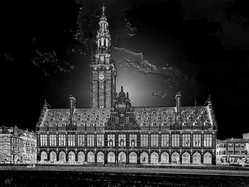
University library located on Monseigneur Ladeuzeplein in Leuven - Belgium with a view on arches of the long corridor below.
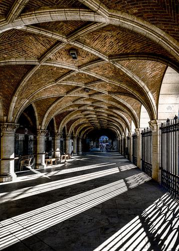
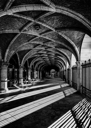
The long corridor of the University library behind the facade on ground level.
Enlarge >click image> click downarrowFrom my personal perspective, the impact of each is lessened when shown together.
The pp on the first reminds me of the solarization filter in Nik Color Efex. I'm not in love with the clouds (if that is what we're seeing), but the rest is fascinating and attention grabbing for the light-dark, repeating patterns, and details.
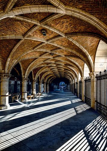
The second composition overwhelms my aging brain. A photo of mostly the ceiling, and a separate photo of mostly the shadows and light of the walkway become two high-impact photos. The architecture of the ceiling is gorgeous and your position great for that feeling of its going on a long distance. The angled shadows on the floor are a pleasing ordered geometry, with the columns and a glimpse of ceiling leading us all the way in.
Linda,
The PP in the first place it's not a solarizing filter as I don't use Nik filters. It is a night shot with a professional treatment to reveal all the details and make it ready for etching on metal. The image is only added to get an impression of the length of the corridor on the ground floor and nothing more. Furthermore, a comparison difficulty is associated with one being Mono and the other being in color.
Personally I would have been better off giving comments like that of Pete who sees the cloud as the effect of an empty bucket of water. Something that is quite a disrespectful comment.
I know this is a CC thread and the majority are possibly hobbyists who are quite easily offended by some CC comments and that could be why comments are mostly positive with less genuine commentary.
That is also my reason for being humble when giving comments.
Lou
-
@LouHolland has written:@LindaS has written:
Me and Stella
Linda I agreed with Whynot to correct the white Slats vertically but also the hawker bench slightly. May I assume the processing is DAP.
Lou
Lou, is DAP Dynamic Auto Painter? If not, I'm not familiar with the abbreviation. I used a Topaz Studio 2 filter for the main effect. Thanks for your time!
-
@LouHolland has written:@LindaS has written:@LouHolland has written:
From my personal perspective, the impact of each is lessened when shown together.
The pp on the first reminds me of the solarization filter in Nik Color Efex. I'm not in love with the clouds (if that is what we're seeing), but the rest is fascinating and attention grabbing for the light-dark, repeating patterns, and details.
The second composition overwhelms my aging brain. A photo of mostly the ceiling, and a separate photo of mostly the shadows and light of the walkway become two high-impact photos. The architecture of the ceiling is gorgeous and your position great for that feeling of its going on a long distance. The angled shadows on the floor are a pleasing ordered geometry, with the columns and a glimpse of ceiling leading us all the way in.
Linda,
The PP in the first place it's not a solarizing filter as I don't use Nik filters. It is a night shot with a professional treatment to reveal all the details and make it ready for etching on metal. The image is only added to get an impression of the length of the corridor on the ground floor and nothing more. Furthermore, a comparison difficulty is associated with one being Mono and the other being in color.
Personally I would have been better off giving comments like that of Pete who sees the cloud as the effect of an empty bucket of water. Something that is quite a disrespectful comment.
I know this is a CC thread and the majority are possibly hobbyists who are quite easily offended by some CC comments and that could be why comments are mostly positive with less genuine commentary.
That is also my reason for being humble when giving comments.
Lou
My comment about Nik was not at all meant as a crticism. I was only making a reference to a processing effect I'm familar with. I'm not understanding your meaning re "disrespectful comment" or being humble when offering feedback, or what might be "less genuine."
Because of my near-zero experience with formal critiquing and my lack of training and education, my contributions here are of minimal value, certainly. But from my own hobbyist pov and love of photography, I am as genuine and sincere as I know how to be. No agenda!
-
@LouHolland has written:
The long corridor of the University library behind the facade on ground level.
I like this shot and while I initially thought I'd go for a different framing, I actually realized (when viewing the bigger version) that it's spot on. The thing which impacted my judgement was the color. The blue light coming from the back at the center of the image is gorgeous, but for my perception it's too small to make a real impact...
This is why I'd go for either
or
b.) an edit with stronger colors plus a bit more balance between them:
Of course I'm not sure if either would suit your style preferences, but that's my conclusion. Great work on the composition/capturing of the lines and I love the shadows.
