It's such a massive thing and as it can be seen from almost anywhere, then a series is probably the best choice. A range of angles is what you have. Those with clouds that are big and bold enough to counter the presence of the Shard appeal to me. Probably that's because I don't like the thing.
Maybe that's why I like two the best. It has the clouds. It has something of old London (including low level, horizontal lines and arches that are totally opposite to the thing. We have few humans. Nice to see them in this context. Then we have reminders of the engineering required. Best of all, the Shard doesn't look real here. It resembles an artist's rendition for the planning stages. A warning of what is coming.
No3 baffles me. what is the tower to the left? I can't see it in the other pictures. Whatever it is, it must be hidden in those shots. Looking at the big glass face of the building on the right of 2, I think that the slim tower must be behind The Shard in 1??? Possibly it is the wa lens and low angle that make the column appear to be so tall?From the sky, I think 3 must have been taken on a different day.
Re 5. Could the clouds be darkened a little to match them to 1,2 and 4? The positioning of the Shard so it thrusts up through the rent in the roofline makes a statement. As do the railings that are more or less horizontal and their pedestrian connection to the lower level buildings.
Still, The Shard is a welcome relief from London Bridge and I note how careful you were to keep it out of the shots.
-
-
A pleasure. It's another of those Saturday Evening Post type scenes that gives a peep at the soul of the USA at it's best.
A folksy, woodsy comfortable room. The wine glasses say it has been a pleasant, low key meeting. An interaction between generations around something technical (and I noted the old bit of intergenerational technology through the window behind Dad's chair. Dad's concentration from the eyes to the poised arm is caught. The assumed son waits patiently, chair pulled back a little from the table. The empty chairs are a nice touch. This is about Dad and Son but there are other members in this family.
The charcoal drawing effect is a good choice. It's a statement about time as well.
Michael Moore? -
Thanks for your interesting thoughts. Fascinating that you were a drum scan operator. We've had one in the company I was working years ago, but I wasn't interested in photography at the time... Now I would love to know more about them. Do they have lenses in them? And if so, do you know who manufactures them?
I'm glad you found a great lens in the 110/2 and am looking forward to more of your results with it. I agree that sharpness/detail can be lots of fun in and of itself. Which adapted Zeiss lenses do you mean btw.?
I also agree that sharpness isn't necessary for everything. For example: I tried to take this shot with one of the sharpest lenses (a scanner lens by Nikon) I own and then with a 90 year old uncoated Zeiss lens. I clearly preferred the look of the latter, despite the clear lack of sharpness:
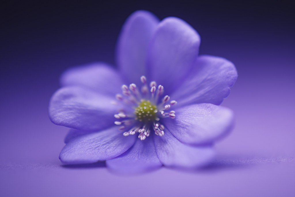
Hard to be soft in a good way... by simple.joy, on Flickr -
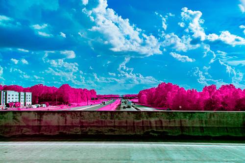
The magenta against the blue gives heaps of impact. After that, I'm at a loss. This image simply doesn't trigger responses from me or give me anything I can begin to analyze constructively.
Let's see what you conjure up next week. -
Rolling back through the shots I came across the simplejoy version again and once more I was laughing.
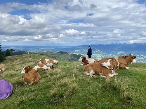
Look at the number of live things in the photo that seem to be looking at the purple cow. Others seem to be deliberately distancing from it. This may be a photo of considerable value to sociologists.
Any chance that a purple cow might turn into a swan or butterfly? -
@MikeFewster has written:@MikeFewster has written:@simplejoy has written:@JimKasson has written:
I think this is really nice, but were it mine, I would lose the cow rump on the left.
I agree with Jim! The alternative would be to emphasize it and make it a curious new center of interest... 😅
I see what Jim and Simplejoy are getting at. It doesn't bother me too much though and I don't mind the line it gives from the corner to the group of cows above it. I'm also happy to have the larger bit of cow which then tapers down to the smaller cows to the rear as this adds distance in a landscape where fore to distance is important.
SimpleJoy, I nearly fell off my chair laughing with you at your suggestion.Rolling back through the shots I came across the simplejoy version again and once more I was laughing.
Look at the number of live things in the photo that seem to be looking at the purple cow. Others seem to be deliberately distancing from it. This may be a photo of considerable value to sociologists.
Any chance that a purple cow might turn into a swan or butterfly?The purple cows make the milk for delicious chocolate since 1972
Here's the full story,...
chocolatemarketaudit.wordpress.com/2018/10/26/the-story-of-a-purple-cow-milka/ -
@simplejoy has written:@Rich42 has written:
Simplejoy, Chris, Minniev,
Thanks for looking and commenting.
Other than the graphic quality or composition of this image, which may or may not work for anyone else, a very compelling aspect is the rendering of the GF 110/2 lens on my GFX 100s here at f/6.4, right in the center of its wheelhouse for sharp.
I've made a point, before that sharpness is a highly overrated aspect of photography. I really believe that.
Except when it isn't. And then, it's really everything and can carry an image for no other reason than, well, the sharpness.
I've done a lot of LF work. Mostly 4x5 but also a fair amount of 8x10. As a drum scanner operator, I've handled many thousands more LF images from other photographers, ranging from reproductions of artwork destined for limited edition print runs on offset lithography, to original landscapes, portraits, still life, abstracts.
One of the things the photographer strives for in LF work is sharpness. After all, there's really no point in setting up the huge beast if you aren't going to focus the darn thing. Even in an image deliberately composed to have very shallow DOF, the lens is focused somewhere, and that image plane is sharp. For reproduction of artwork, aside from accurate color, the camera and film have to get out of the way and use sharpness to convince the viewer that the reproduction is the original.
Sharpness in a LF image is different from sharpness in a small image. The lens is being "taxed" very little. A 4x5 image reproduced at 8x10 is only magnified 2x. Even at 16x20, it's only 4x. LF images look simultaneously sharp yet relaxed. They have a stateliness, a dignity. Technically, they are riveting while simultaneously, quiet.
Small images can also be very sharp. Sometimes sharper than LF images. But they hardly ever have the quiet, relaxed quality that a very sharp LF image can possess. They look strained, nervous in achieving their sharpness.
The sharpness of a LF image can be extremely pleasing to view in its own writ. The original thing itself being imaged is right there in front of you. The more you look, the more you see. Every detail of the original is easily discerned. Quietly and effortlessly, not surprisingly in a field of grain or noise, but smoothly and pleasingly.
The GF 110/2 lens, as well as a few other GF lenses and adapted (Zeiss) lenses come very close to a LF "look" on the 100s. As soon as I looked at this image in Photoshop, I was struck by the easy, relaxed, but sharp detail in the patina on the metal cladding of the chimney and in the roof shingles. Want to see more detail? Just look longer. It goes on and on and on. Effortlessly.
I have more GF110/2 images where image detail alone makes the image very enjoyable, beyond any other image attributes. IMHO. I'll post them in coming weeks.
Rich
Thanks for your interesting thoughts. Fascinating that you were a drum scan operator. We've had one in the company I was working years ago, but I wasn't interested in photography at the time... Now I would love to know more about them. Do they have lenses in them? And if so, do you know who manufactures them?
I'm glad you found a great lens in the 110/2 and am looking forward to more of your results with it. I agree that sharpness/detail can be lots of fun in and of itself. Which adapted Zeiss lenses do you mean btw.?
I also agree that sharpness isn't necessary for everything. For example: I tried to take this shot with one of the sharpest lenses (a scanner lens by Nikon) I own and then with a 90 year old uncoated Zeiss lens. I clearly preferred the look of the latter, despite the clear lack of sharpness:

Hard to be soft in a good way... by simple.joy, on FlickrDrum scanner optics were essentially microscope objectives. But not in necessarily recognizable "standard" mounts.
Adapted lenses on the GFX 100s - Zeiss Milvus 135/2, Nikkor 180/2.8, SMC Pentax-A 645 Macro 120/4 (at 1:1 for "scanning" transparencies and negatives).
Rich
-
@LindaS has written:@WhyNot has written:
TIP
....
WhyNot
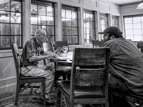
Great title, fantastic pov. A frail gentleman wanting to get it right, and the burly son or grandson becoming impatient to leave (his chair is pulled back from the table). The line of windows is a terrific setting, the black and white processing highly engaging. I rarely take photos of people, but I love, love, love this one!
@minniev has written:@WhyNot has written:TIP
....
WhyNot
Really like this image partly because it is nicely arranged with the older gentleman getting top billing with a full view, partly because it is interestingly processed, partly because we get to make up our own story and stories is much of what I find interesting in photographs. The older fellow is carefully considering the tip while his son or buddy is staring off into the distance as if used to waiting and possibly as bored as Linda's cat. The details highlighted by the extra contrast are interesting and take us from checking out his crossed feet in their sneakers to the half empty water glass to the items on the other side of the windows. The angle invites us into their world (or table) so we are a part of the transaction. Well done.
@MikeFewster has written:@WhyNot has written:TIP
....
WhyNot
A pleasure. It's another of those Saturday Evening Post type scenes that gives a peep at the soul of the USA at it's best.
A folksy, woodsy comfortable room. The wine glasses say it has been a pleasant, low key meeting. An interaction between generations around something technical (and I noted the old bit of intergenerational technology through the window behind Dad's chair. Dad's concentration from the eyes to the poised arm is caught. The assumed son waits patiently, chair pulled back a little from the table. The empty chairs are a nice touch. This is about Dad and Son but there are other members in this family.
The charcoal drawing effect is a good choice. It's a statement about time as well.
Michael Moore?Thank you all for your kind comments .... much appreciated ...
I enjoy doing "Street" but COVID and personal problems has me out of practice for the even small amount of practice I use to get. Also, not living in a large city where such photography is experienced more can also be a problem and limitation. ...
About the picture .. This is taken in a Tavern that has a beer garden seen in the background .. Beers from all over the world and a separate whiskey bar are found here .... Great Chicago Dogs and Kolsh at a table outside is often my lunch ...However, some recent problems with vertigo has my wife restricting me to water, as she thinks I have enough balance problems without adding to them with one beer!!! ....
Water comes in a regular glass so the one seen on the table is a beer glass .... There is a regular group that meets for lunch at that table so I assume these two are the last of the group to settle up and leave. Their relationship is unknown to me ...
The technique is left over from my childhood when my mother regularly got the Saturday Evening Post and I saw and admired many of Norman Rockwell's works .. A few years ago a Norman Rockwell exhibit was seen at the local Art Museum and I did a series of photographs there and developed this look emulating his for that series .. I like the results and think it gives my street people a bit of anonymity so I have kept it .....
More than you ever wanted to know!!! ..
WhyNot
-
@WhyNot has written:
...The technique is left over from my childhood when my mother regularly got the Saturday Evening Post and I saw and admired many of Norman Rockwell's works .. A few years ago a Norman Rockwell exhibit was seen at the local Art Museum and I did a series of photographs there and developed this look emulating his for that series .. I like the results and think it gives my street people a bit of anonymity so I have kept it .....
More than you ever wanted to know!!! ..
WhyNot
No, not more than...I'm very interested to learn your personal story and the photo's story, and especially about Norman Rockwell being your influence. Thanks much!
-
@LouHolland has written:
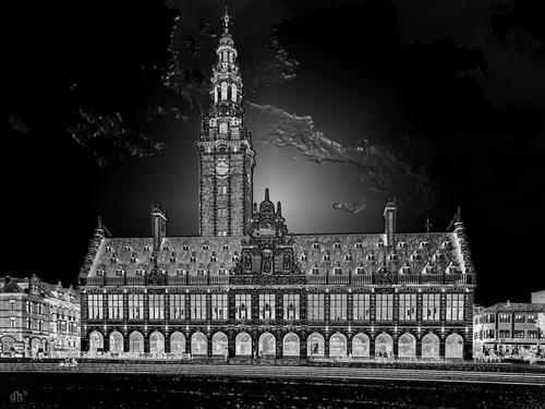
University library located on Monseigneur Ladeuzeplein in Leuven - Belgium with a view on arches of the long corridor below.
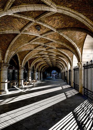
The long corridor of the University library behind the facade on ground level.
Enlarge >click image> click downarrowFrom my personal perspective, the impact of each is lessened when shown together.
The pp on the first reminds me of the solarization filter in Nik Color Efex. I'm not in love with the clouds (if that is what we're seeing), but the rest is fascinating and attention grabbing for the light-dark, repeating patterns, and details.
The second composition overwhelms my aging brain. A photo of mostly the ceiling, and a separate photo of mostly the shadows and light of the walkway become two high-impact photos. The architecture of the ceiling is gorgeous and your position great for that feeling of its going on a long distance. The angled shadows on the floor are a pleasing ordered geometry, with the columns and a glimpse of ceiling leading us all the way in.
-
@LindaS has written:@ChrisOly has written:
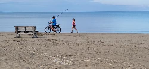
Run, bike or sit...
Your title told me the story. Pete's and Minnie's critiques gave me more information on what to appreciate about the composition and content. It appears you had little time to consider the possibilities (that everything came together somewhat spontaneously). I'm wondering whether your shot is a result of instinct that it would be successful, or did you actually have to wait a long time for the "decisive" moment, or did you determine after the fact that you had something good?
I just saw this photo op coming and having only few seconds, took aim, framed and pressed shutter.
-
@ChrisOly has written:@LindaS has written:@ChrisOly has written:
Run, bike or sit...
Your title told me the story. Pete's and Minnie's critiques gave me more information on what to appreciate about the composition and content. It appears you had little time to consider the possibilities (that everything came together somewhat spontaneously). I'm wondering whether your shot is a result of instinct that it would be successful, or did you actually have to wait a long time for the "decisive" moment, or did you determine after the fact that you had something good?
I just saw this photo op coming and having only few seconds, took aim, framed and pressed shutter.
Thanks! I appreciate your keen eye and instincts.
When I was regularly driving around the countryside in search of photo ops, especially raptors and other wildlife, I would get quite an adrenalin rush from "having only a few seconds" - 😁
-
@LindaS has written:
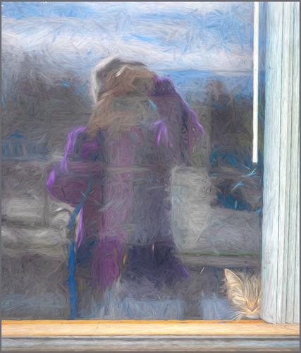
Me and Stella
Looking at the small version, I thought the filter was applied to the reflection of you, but not to Stella, the cat, or the window frame, which I thoiught was rather cool. On looking at the full size image, I was disappointed to find that was not so, but maybe that would be an idea to try?
In any case I think the filter works very well here and I like the resulting image very much. It shrouds you and the reflected world in mystery, but the cat is clear and straightforward, even with the filter, and her look underlines that feeling.
As to using filters or not, I am open to them. They are just another tool to change the original, like cloning, changing the lighting or colour, converting to B&W etc. etc. So like all PP, I can only judge the result, which can enhance or ruin an image.Pete
-
@Rich42 has written:
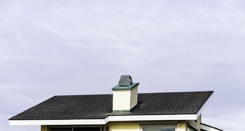
Carlsbad, CA
Rich
Again, an unusual composition outside the norms makes us stop and think, and the negative space of the sky means we should look at the roof, even if it is at the bottom of the frame. It is quickly identifiable as a house, but the crop is so severe, we should obviously look at it as just a roof or, more likely, a geometrical study - a pattern. The geometric shapes have enough irregularity and there is enough texture to keep the viewer interested, and the complementary blues, yellows, greys and blue-greens are very harmonious.
It is an unusual image, which attracts and rewards attention.Pete
-
@JimStirling has written:
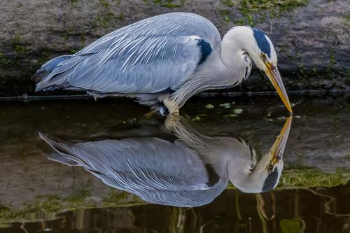
I have been considering a long tele lens to perhaps dabble in the world of birds and wildlife with either the new Nikon 180-600mm or one of the m43 options being in the running.The only options I currently have are my Panasonic 100-300mm and my wife's RX10 IV. I feel the RX10 IV has a better lens { even if it takes half an hour to fully extend 😀} . Anyway here is a Heron , a great option for would be bird shooters, it is relatively huge and often stands very still
Now this is a beauty. It is a very good study of a heron, with a perfect reflection in the water.
When the reflection is that good, you really do get almost the same above and below the horizon line of the reflection, so where to put that line? Personally, I find an exact symmetry between the object and its reflection a bit boring, and would usually choose to show more of the reflection than the real world, as you have done, because it is less usual. The information about the background and the heron's environment is there anyway, but in the reflection.Pete
-
@Sagittarius has written:
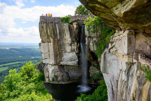
This waterfall is in the Rock City Gardens, GA. From the top of this cliff you can see 7 states.
This looks like a great place to visit, and your photo does it justice.
I like the rocks and overhang on the left to give a foreground, leading to the middleground of the waterfall and outcrop and onto the distant countryside. This creates a nice feeling of depth. The exposure and colours are good and the people give scale. You seem to have ticked all the boxes!Pete
-
@OpenCube has written:
The processing certainly makes this image stand out and makes the viewer stop and think about the story or message being told, or whether it is simply supposed to be pretty. The bright pink highlights the trees in no uncertain terms, so they are no doubt the main subject, at least below the sky. The rest is man made road, concrete walls and buildings and vehicles, so they take on a lesser role or even that of the opposition. The wall across the frame hinders the viewer's eye from moving freely into the frame, but the call of those pink trees is stronger.
So I interpret this as a struggle between man made objects and nature. But maybe it is just supposed to be eye-candy, which would be a shame.Pete
-
@WhyNot has written:
TIP
WhyNot
The processing is unusual, like a black and white oil painting, so I was interested to read the story behind it. The effect works well in this image.
The younger man is partly covered by a chair and his clothes blend in with the surroundings but he is looking at the older man, who is obviously the main subject. We see him clearly and his brighter clothes helps him stand out. He is totally engrossed in the action of paying the bill and, maybe, concentrating on the challenges. Is the bill correct? Why won't it accept the card? Have I got my PIN correct? Has the signal failed or did the transaction go through? How much should I tip? Should it be for the quality of the food or the efficiency and friendliness of the waiter/waitress? Maybe service is included, but do I care? Yes we have all been there and recognise it on our main character, which endears him to us.
It is an everyfay situation, but well seen and presented.Pete
