Yes, the original continues with another musician to the left, another full face above (you can see his eyes and nse in the crop) the full head of the trumpet player and it goes down to around his waist. When taking this I knew I was going to crop it. The reflection had to be big enough, detailed enough and positioned so that viewers would look carefully at the reflection and it needed to be big enough for details of the buildings to be apparent.
When I came to do the cropping I wanted the tuft of hair . I also wanted the forehead line to pick up the trumpet curve and I liked the eye and nose repetition on the face behind. I cropped where I did to bring those things together, especially the position of the tuft of hair and the forehead/ trumper curves. If I increased any of the borders I thought these details were diminished by other lines and the viewer's exploration of the extra details.
So, all of that but most importantly, the reflection lost the detail and prominence. It began to look like an accidental extra that might or might not have been picked up when looking at a photo of a band.or musician.
The above decided on, there was a lot of thinking about the hand. Was it too disjointed? I could have cropped higher or removed it. It didn't take long to decide that I liked the framing effect around the trumpet bowl of the sliver of face above, the face to the right and the hand, IMNHO, this framing brought the eye where I wanted it to the off centred reflection.
July 26, 2023
203
-

-

Many thanks for your detailed response. I didn't take the time to look at the sliver of face behind the instrument, so I missed the repetition you speak of. Very instructive information, much appreciated!
-

You hobnob with kings and fools. Enjoy the company.
-
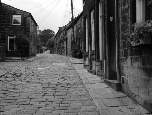
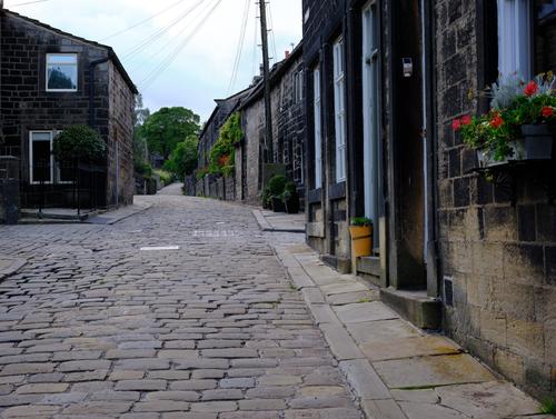
I produced these two photos - I quite like the B&W one - but for me, the colour one works better. Which do you prefer?
-

Nice shot - I personally prefer the B&W version!
-

Hi Rich,
That is quite a thought provoking post.
Here’s my attempt at a reply, but I’m not particularly good at rhetorical responses, so this might appear a bit less than profound.
Anyway,…
I agree, a photographer is an artist, and one of the most important characteristics of any artist is self-confidence.
Without that, you might begin to experiment, but would give up as soon as the first person says he doesn’t like it.
The approach to embrace little mistakes and incorporate them into your version of your image is what Bob Ross had always encouraged his aspiring painters and viewers to do.
The same would apply to your example with the musician, and indeed that “embracing” does seem to get easier when you have more experience.To create a style, or series, then display it boldly, defend it , and stick to it over a period of time, would probably convince a “susceptible” audience.
And if the price is high, that audience might be even more easily convinced that this new style is something special.
Giving those images a high-end treatment, printing large and repeating the process could certainly help too.
That would be the world of expensive art galleries. There are some quite provocative works to be seen there with such new “art works”.
Basically, if one says an image is a work of art, then it is! It would be up to others to prove it isn’t and that task is of course more or less impossible.
It is difficult to say “Look, the Emperor has no clothes” and get away with it 😉Yes, local content is popular
I have an open-air gallery in our small village. 28 images are printed big on weather-proof Aluminum, plates 100 x 70cm and 130 x 90cm. It's free for everyone and open 24/7.
We change the photos once a year and then have a re-opening event. The event atmosphere is fun, a bit like a “Village fare” with a champagne reception followed by a 3.5km walk around the circular path where the images are permanently displayed. There’s music playing along the way; this year we had an accordion and tuba player. A second photographer and myself then describe our pictures and answer any questions.
It’s been running for 8 years now, and so far, the pictures have mainly been landscape type scenes with a few unusual shots thrown in.
It is definitely the shots that were taken locally that are most popular. The locals love to see how beautiful their local countryside is, perhaps caught by us in a slightly unusual way.
So the local villagers here think I’m a “great photographer” , but personally I always find things in my photos that could be improved. I guess I just need more self confidence !Good luck with your negotiation with the local art gallery manager!
Trevor
-
I'll go for the colour version :-)
It seems more bright and cheerful -
I should add that I didn't see all this as I took the shot. I had seen the reflection and I wanted the player's profile. I knew I was going to crop but everything else came under consideration once I looked at what I had on the monitor at home. I certainly hadn't seen the tuft of hair for example.
-
The red and green catch my eye and not only entice me to look to the end of the lane, but they make the scene warm and inviting. I am interested to know what you enjoy most about the black and white version - to see it through your eyes.
Not being familiar with the location, if I hadn't seen the color I would find it difficult to discern some of the details and wonderful textures hidden within the somewhat limited tonal range. In other words, I'd probably do more with selective contrast. Just personal preference.
-

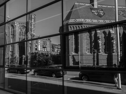
Reflective image of het Pope Leo XIII Seminary with ecclesiastical roof shields. Higher Institute of Philosophy.
Beautiful building and still in use as a seminary and student accommodation.
I have seen such coats of arms also on the roof of chapel Leo XIII seminary before on a church roof in Zagreb Croatia.
Lou
enlarge: >click image>click downarrow
-
Alan, I agree, the version with some modest colour gives more pleasure to look at. Fine shot.
Lou -
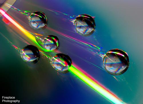
High speed cosmic attack
Here's a second post this week. Maybe something along the lines that Simplejoy might enjoy :-)
captured this about 2 years ago with the 105 Nikkor Macro lens .
-
Indeed - I like it a lot! Very creative and interesting. Are those drops on a CD or something completely different?
-
Thanks, You got it immediately!
Yes, water drops on a CD with a torch shining directly at them. It was fun to play with the reflections and all the colours you get -

I know what you mean. Sometimes we get desperate and will take pictures of anything, I've photographed even a shriveled sweet potato. Fortunately you have a much better subject here than a sweet potato! It looks like our dandelions though probably not quite the same. You've captured very appealing detail even deep into the fuzzies and down to the seeds themselves. It carries the "feel" of the bright warm sun and fresh air.
For the fun of it, try converting it to monochrome and have a play. I did a quick play in the free mobile ap snapseed and it looks great that way too!
-
This one is a bit of a puzzle Bryan. I admit to being a novice when it comes to shipping containers (none of those here in central Mississippi) so I'm not able to surmise why one is set off far from port in what looks like farmland. Color contrast (red/green/blue) of primary colors works. What's kind of mysterious (besides the container itself) is the blotches in the right half of the phot that aren't present in the left half. There's a blur on top of the container and another to the right, then a bunch strewed in the trees of the right side. If it's not already a crop, I think I would crop it in from the right to get rid of as much of the blurry area as possible and get the container off center.
-
I really like this subjectively. It is a little dark symbolically and visually but it works well that way. The slightly withered leaf and the rotten planking have visual detail, and the leaf has lovely delicate veining and coloring. Both suggest death and decay but not in a morbid way to me, more as a solemn recycle of life. The diagonal boards on the left intersect with the more horizontal boards on the light to provide leading lines to guide us visually to the leaf and on through to the "other side" whatever that may represent. I am puzzle by the right edge. It does not look like a natural part of the image that occupies the main part of the frame, it's too sharply cut off, and it's not a foreground object because the leaf appears to extend over it. I don't really object to it, as it doesn't conflict with the theme and adds to the mystery, but I would like to know what is happening there.
With many of your creations, I have to step outside my own head and try to see them very objectively because alternate colors is not the "brush I paint with" to use the very elegant turn of phrase that's been passed around in this week's thread (not sure if you or Pete were the originator). With this one I can respond subjectively as well! I really like it very much.
-
Welcome, Alan. Please come back again, share your photos and your thoughts on the others you find here. We have quite a variety.
I think they are both effective interpretations, but very different. The monochrome has a more artistic feel to it, and a more vintage look which matches the subject. We notice the rectangular building blocks of the photo more: buildings, doors, windows, stonework, paving blocks. The excessive array of wires almost looks like ship's rigging in this one.
In the color version the geometries are less obvious and instead we pick up the cheery color details of pots, flowers, foliage to brighten up the dark architectural elements.
In both, the leading line of the road curving out of view at its vanishing point is an effective compositional centerpiece. I do think that both might benefit from some minor adjustment in the highlight/shadows to bring down the sky (and reveal more detail) and light the shadows in the buildings.