• Members 1662 posts
    Aug. 2, 2023, 9:30 p.m.

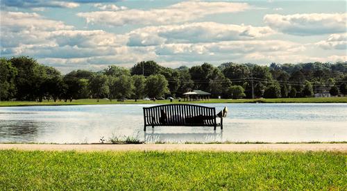
    It's an interesting shot. I like the composition and the image makes us question the reasons for taking a nap there... perhaps it's part of a routine: "The influencer clearly said: Run 10 miles, then rest for 3 minutes and listen to the Rocky soundtrack. Buy a supplement pack from my website, drop a like on my newest video and then run another 10 miles" or something like that. 🤔

    I think I succeeded in changing the story btw. but I'm afraid it's not to the benefit of anything... 😅

    WhyNot_Edit.jpg

    Your brighter edit works great btw! 👍
    WhyNot_Edit.jpg

    JPG, 796.3 KB, uploaded by simplejoy on Aug. 2, 2023.

  • Members 676 posts
    Aug. 2, 2023, 9:58 p.m.

    It's an interesting shot. I like the composition and the image makes us question the reasons for taking a nap there... perhaps it's part of a routine: "The influencer clearly said: Run 10 miles, then rest for 3 minutes and listen to the Rocky soundtrack. Buy a supplement pack from my website, drop a like on my newest video and then run another 10 miles" or something like that. 🤔

    I think I succeeded in changing the story btw. but I'm afraid it's not to the benefit of anything... 😅

    WhyNot_Edit.jpg

    Your brighter edit works great btw! 👍
    [/quote]

    Thanks for stopping by and the critique ... This not the first person I've seen stretched out here! .. Not sure what the attraction of this bench is ... there are others here .... Not even sure this is the only time I've taken a picture of it's occupant. ... But this day I was walking along a steam, just a bit behind me here, when I saw this scene and walked over and took the picture ... I believe my first thought was to center the bench but then I thought it was too static and since I wasn't quite standing directly behind it I thought it looked out onto the small lake and looked better on the left .... maybe encouraging him to get up and jog some more ... Centered and static might make him sleep longer .... a different interpretation ...

    WhyNot

  • Members 1369 posts
    Aug. 2, 2023, 9:58 p.m.

    Trainspotting. is closer. The window was filthy and a lot of PP clean up was required. I should have used "trainspotting" as the caption.
    Beaches were only one of the subjects played with through the window. Others will turn up here in due course.
    Usually I try shots like this at slower shutter speeds but here I wanted a little more recognizable detail in the beach hardware.

  • Members 196 posts
    Aug. 2, 2023, 10:15 p.m.

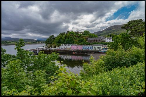
    Portree , Skye , July has been a bit of a washout Aug has started the same , with a dash of blue sky left over from Jun which was lovely 😀

    1545.jpg

    1545.jpg

    JPG, 30.9 MB, uploaded by JimStirling on Aug. 2, 2023.

  • Members 689 posts
    Aug. 3, 2023, 12:01 a.m.

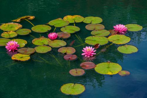
    Water lilies from Gibbs Garden
    Gibbs Gardens 220612 - 52.jpg

    Gibbs Gardens 220612 - 52.jpg

    JPG, 2.7 MB, uploaded by Sagittarius on Aug. 2, 2023.

  • Members 132 posts
    Aug. 3, 2023, 12:40 a.m.

    Sagittarius,

    Beautiful photo, really beautiful. However, it must be enlarged to properly observe all the beautiful details.

    Lou

  • Members 689 posts
    Aug. 3, 2023, 12:43 a.m.

    @LouHolland
    Just click on it and it will be displayed bigger.

  • Members 132 posts
    Aug. 3, 2023, 1:44 a.m.

    I know and for that reason it was my tip for the next viewer 😄

  • Members 701 posts
    Aug. 3, 2023, 1:54 a.m.

    I agree. Very, very beautiful.

    Rich

  • Members 1075 posts
    Aug. 3, 2023, 2:50 a.m.

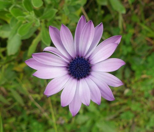
    A daisy next door

    P1040484a.JPG

    .

    P1040484a.JPG

    JPG, 1.5 MB, uploaded by Bryan on Aug. 3, 2023.

  • Members 861 posts
    Aug. 3, 2023, 5:52 a.m.

    dscf0725 copy_$25_72dpi_web.jpg

  • Members 533 posts
    Aug. 3, 2023, 7:46 a.m.

    Inspiration

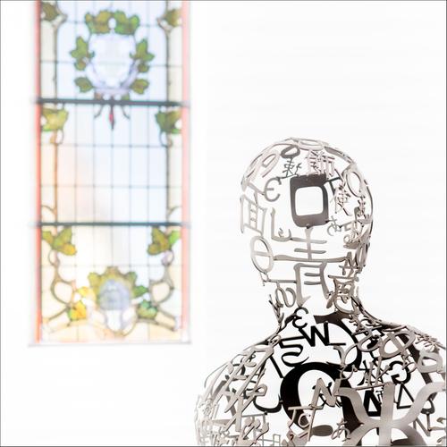
    The Jakobshallen in Bad Homburg was built as a church for the French Reformed Church in 1724, but was later used by the Catholics, until their new church was completed, when it fell into disuse. It found new sporting life, and was used as a gym for over a century, before falling into disuse once more. Ten years ago, it was bought by a gallerist, who renovated and adapted it for use as a gallery, keeping elements from both its previous lives. It is now a source of inspiration.

    The photo shows a sculpture by Jaume Plensa and one of the original windows.

    Pete

    D3112780-1.jpg

    D3112780-1.jpg

    JPG, 889.2 KB, uploaded by PeteS on Aug. 3, 2023.

  • Members 533 posts
    Aug. 3, 2023, 8:05 a.m.

    This is a great portrait. The man stares out at the viewer from the midst of a dreamlike world. The reflections or double exposures mean the viewer is drawn to the sharp face and those searching eyes, but the multiple reflections of the watch subtly gives it weight and suggests it is important to the owner. The colours are muted but complementary and do not distract from the face.
    Superb.

    Pete

  • Members 533 posts
    Aug. 3, 2023, 8:11 a.m.

    The flower has been nicely exposed, keeping those subtle shading changes in the colour. The centre of the flower is sharp, whilst the edge of the petals show a very attractive hint of softness and the background nicely blurred, whilst still giving an idea of the surroundings.

    Pete

  • Members 533 posts
    Aug. 3, 2023, 8:26 a.m.

    A lot has come together here to make this such a success. You managed to find an attractive group, and form a good composition, with the flowers nicely balanced through the frame. The water surface is perfect, with enough ripples to dampen the reflections and allow the subjects to stand out in sharp contrast, and the fact that they are dark also helps highlight the flowers.The stems are barely visible through the water, but help link the pieces and give the composition an attractive shape. The exposure is spot on, and the flowers really burst out from their surroundings and the image is very sharp, with plenty of fine detail.
    Nice one.

    Pete

  • Members 1662 posts
    Aug. 3, 2023, 9:03 a.m.

    I like it - it's a very interesting and effective composition. I also like the bright look, but feel liket he window is a little bit too bright. If the intention was to make it feel 'aetherial' it's fine, but then it would perhaps need to be slightly more blurred in my opinion... Either way, a wonderful image with lots of room for interpretations.

    Oh, and speaking of 'inspiration': If you haven't added some of your sources of inspiration in the thread I created for that topic a while ago, I would be very interested to know:

    dprevived.com/t/what-are-your-biggest-inspirationsmotivation-boosts/4292/

  • Members 1662 posts
    Aug. 3, 2023, 9:13 a.m.

    It is indeed a great portrait. I was wondering why it wasn't among the favorites I mentioned in the other thread you posted a couple of those portraits in... and after some thought, I realized that it's the colors. It's only very minor tweaks (and I guess colors will always be very subjective) but for me the color of the shirt plus the yellow above it doesn't work very well, particularly because it's missing some balance in my eyes.

    Here's how I would change it:

    OpenCube_Portrait.jpg

    That being said - I already realized when opening the file in photoshop, that the colors on display in the browser are ways off from what the file contains, so it might have a lot to do with that as well...

    You certainly got a great feeling for strong colors, as many of your landscape/architecture shots clearly show! 👍

    OpenCube_Portrait.jpg

    JPG, 1.3 MB, uploaded by simplejoy on Aug. 3, 2023.

  • Members 300 posts
    Aug. 3, 2023, 9:51 a.m.