Wow, this is amazing! An image I'm unlikely to forget for some time. I find I have no interest in the backstory or origin of the pieces because I just want to stare and think of meaning: science vs. nature, mankind and religion...on and on.
-
-
Beautiful.
A bottle and spoon?
Rich
-
A delicate beauty, well seen and photographed. Simplejoy's edits of the background increases the impact.
-
Thanks very much, Chris. I've posted a new one. This time I tried out the Topaz Studio 2 black and white filter instead of Nik Silver Efex. It has fewer controls, but offers sliders for each color. The attached has a bit of additional dodge/burn. There are so many ways to process this shot, it overwhelms me!
@Bryan has written:Hi Linda,
the b&w version has higher contrast in the hills which helps, but I think I like the coloured version better. I don't know if it is possible to bring up the colours in midground, but I think that would add a lot to the scene.I very much appreciate your feedback, Bryan. I've attached a new version that has more color so you can see what's available. My primary concern is the foreground is pretty ugly (shot during a colder-than-average late spring in flat light).
@simplejoy has written:I like both but while I appreciate the higher contrast of the B&W version, the one with color provides a very nice balance between green and grey tones. I'd personally add a little bit more contrast overall, just like @Bryan suggested as well. Really beautiful and atmospheric shot though - excellent work!
Thank you kindly. Two new edits below. This is the first time in more than a year that I wish I'd kept the raw file! I do have a psd, but I'd love to start truly over. Every time I make an adjustment to this photo, something else pops up with an issue (like the smooth roof of the shed along the fence line).
I went from having kept far, far too many bad images, with no catalog system, to currently deleting too many too soon. Now that I've found you folks, and a couple of other promising places to receive feedback, or just to play, I am going to keep more files.
-
@RoelHendrickx has written:
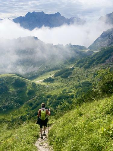
Into the Clouds
(OSTERFELDERKOPF towards HOCHALM)First, I must apologize for not having done my duty in last week's edition.
I started the thread and posted an image (and I thank you all for your comments) but I failed to post any comments on anybody else's image.
That is not the way it should be and I am sorry.
But I was away all week and often in spots without WiFi or decent cell phone provider coverage.
Please accept this as my excuse.
More importantly, I am now back and happy to see that our thread is thriving:
last week we saw so many great contributions and equally useful comments and suggestions.
That is what it is all about, so this really gives me great pleasure.My contribution this week is an image from the day before yesterday, early in a very long and exhausting hike.
This image helps to explain why I have been off the grid last week...Click to see at full size.
For those interested:
Our 19km hike was mostly downhill (starting at 2000m elevation, at the top end of the Alpspitzbahn, which does not really go to the Alpspitz but from the valley, in the direction of that high peak, but ending at Osterfelderkopf).
But although it was less exhausting than doing the same hike uphill, it was still pretty strenuous because of the terrain that requires constant attention.
Moreover, we strung three individual hikes together in order to get a really great full day (Osterfelderkopf to Kreuzeck over Hochalm; Kreuzeck to Höllentalangerhûtte and Höllentalangerhûtte through Höllentalklamm to Hammersbach and then on the the valley station of the Alpspitzbahn at 750m elevation).
Total altitude difference 1250m, but with some ups and downs along the way.
We had a blissful day with great weather.Love this. It has the vibe of one of my favorite paintings, Friedrich's "Wanderer Above the Sea of Fog", en.wikipedia.org/wiki/Wanderer_above_the_Sea_of_Fog though the "wanderer" is set on a lower plane and is clearly still on the move rather than at the pinnacle. The layers of mountains and fog convey the same mystery, and a similar set of symbols suggesting the journey of life, the rutted path, the hills and valleys, the fog of the unknown. Yet on the surface it is also a supremely well constructed and enjoyable image with great colors and composition, which doesn't require any deep analysis. Excellent!!
-
@MikeFewster has written:
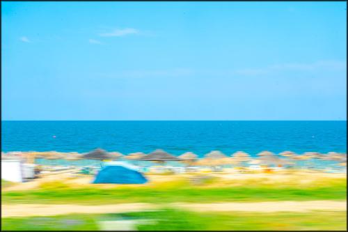
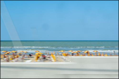
Creatively shot. I relate to the necessity of creativity when shooting from various conveyances that will not slow down and in which you cannot clean or raise the windows. We read the image because we have seen similar scenes, and can translate what we do identify into what we suspect is there - the beach furnishings of various umbrellas and chairs and towels and huts, the beachgoers, the humans, the waves, the unforgiving summer sky, the vivid summer colors. I think it's quite appealing, and I like Simple Joy's version where everything is bent to a curve. Linda and I have an acquaintance who is a wonderful photographer and is still exhibiting, now in his 90s, new photos that he calls Drive By Shootings, all taken from the windows of a fast-moving car. These remind me of his work.
-
@simplejoy has written:
Here's something abstract with another title influenced by space... showing something which I assume everyone knows too well:

Cracks in spacetime by simple.joy, on FlickrYou present us with the most exquisite puzzles. The lengthwise piece is either glass or metal, but the round part looks mechanical, so I would guess a blender though it doesn't quite match up. The contrast of the shapes and rich and interesting color palette of cyans and oranges, the light on the left side all combine to make an intriguing visual presentation. As usual, well conceived and carried out.
-
@LindaS has written:
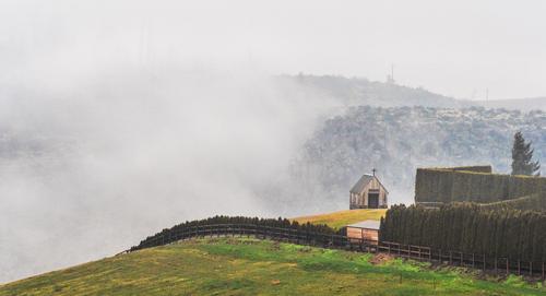
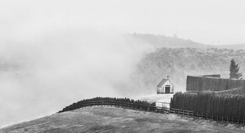
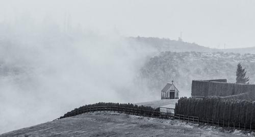
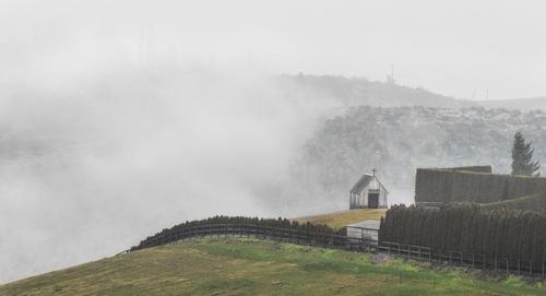
Fog rising from a small canyon in early morning
A few of you might have seen my separate thread in critique forum in April. I've done many edits and versions, partly based on input (dprevived and elsewhere), and partly my own explorations. My preferred is the monochrome, though I'm not positive the selenium toning is best.
Though the color one has a nice set of hues, the black and white wins my vote any day. It captures the mood and the mystery of that tiny chapel set on the edge of nothing, surrounded in mist and fog. The monochrome benefits from the increased contrast you were able to give it without sacrificing the mystique. Beautifully crafted. A wonderful image that deserves to be printed.
-
@ChrisOly has written:
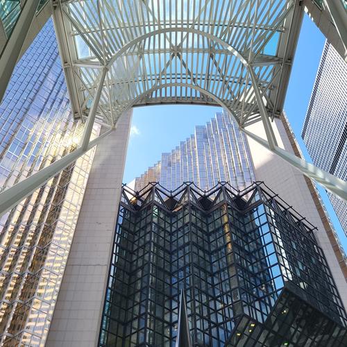
Downtown variety.
And that is a cacophony of shapes and lines and forms, in different tones and textures, all clustered around the big blue triangle of sky in the middle. Triangles, rectangles, X's, arches, V's, run every which way, yet seem in harmony with each other. Well spotted and taken.
-
@WhyNot has written:
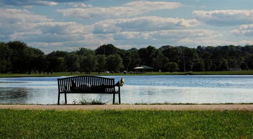
Summer
WhyNot
At first look I thought it was a good image of a lonely bench then I realized the bench was not lonely, it has a supine occupant, presumably someone who's stopped for a rest on a hot day. I glanced ahead and saw a revision where you brightened the shadows and warmed it a bit and I like that version best because it gives more information about the background setting and brings wonderful liveliness to the clouds (which are nicely detailed). Well done.
-
@LouHolland has written:
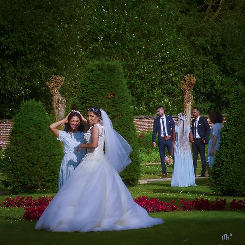
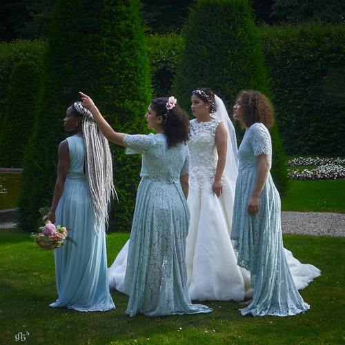
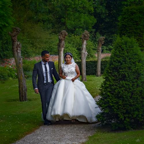
De Wedding ....
Thanks for looking, Lou
I do believe you have scored a first on this submission Lou. In all the years I've been following this thread I don't think anyone has ever posted wedding images, and now I wonder why not? Weddings are wonderful opportunities for both posed and candid shots, there's all minds of moods and emotions and colors and context. These are lovely, and I'm sure the couple will appreciate them. The editing you've done presents the scenes in rich colors with an evocative warm glow that's perfect for weddings. Very nicely done.
-
@JimStirling has written:
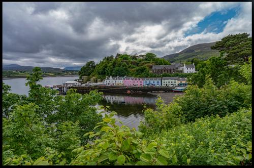
Portree , Skye , July has been a bit of a washout Aug has started the same , with a dash of blue sky left over from Jun which was lovely 😀
I'm jealous of you being in the Hebrides no matter the weather, what a magical place. Beautiful shot of the old village set on the edge of the harbor with a nice slice of reflection in the still waters. The sky is characteristically a mix of threatening clouds with a teaser of sun. The most eye catching element to me is the inverted V of lush summer foliage in which the reflection rests. I love this, in part because it's a good image but in part because I love the place it captures so well.
-
@Sagittarius has written:
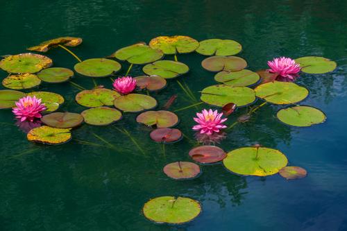
This is a beautiful image. I have photographed a lot of water lilies and I've never come up with a composition this lovely. The flowers are placed perfectly to bounce the eye from one to another, left to rightmost, then exiting the frame stage right. Even the submerged stems and leaves play a role. The details are incredibly sharp, and the colors rich. The subtle greens and blues in the water are a perfect backdrop. I trust you have printed this one.
-
@Bryan has written:
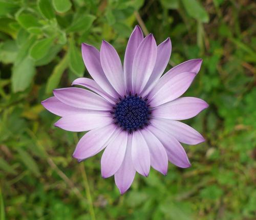
A daisy next door
.
What a pretty thing you've found! I do like flowers centered like this when there's nothing for them to share the frame with. It lets the flower itself take the stage without distraction. The purple is a great contrasting color against the slightly OOF green background. Nice find.
-
@OpenCube has written:
Super impactful portrait. The expressive eyes and facial expression are magnets that draw us in and allow us to process the parts of the image that are different exposures with conflicting details. You have found the perfect dividing line between the details and colors that need to be clearly presented and the parts that can afford creative interpretation. That is no easy task. I'd be interested to know more about your planning and your implementation.
-
@PeteS has written:
Inspiration
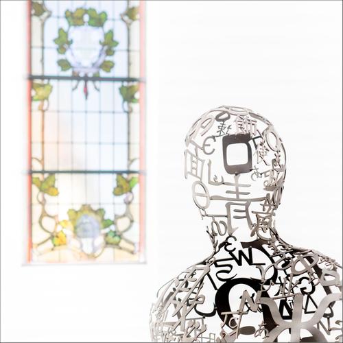
The Jakobshallen in Bad Homburg was built as a church for the French Reformed Church in 1724, but was later used by the Catholics, until their new church was completed, when it fell into disuse. It found new sporting life, and was used as a gym for over a century, before falling into disuse once more. Ten years ago, it was bought by a gallerist, who renovated and adapted it for use as a gallery, keeping elements from both its previous lives. It is now a source of inspiration.
The photo shows a sculpture by Jaume Plensa and one of the original windows.
Pete
That's just grand. The thinking man created by modern art pondering the artistically designed window of an ancient faith. From which side is the light coming? Both are bathed in light, and I am assuming that is how you captured or edited it. The choice seems perfect to me.
This week has brought us a treasure trove of images that deserve to be printed. Yours might need the most careful thought in preparing for that.
-
@Bryan has written:
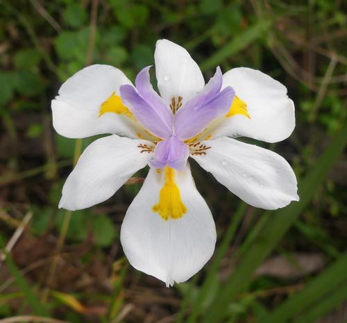
Fortnight Lily, African Iris (Dietes iridioides) or Fairy Iris (Dietes grandiflora) I can't tell.
It was a bud yesterday, opened today so not sure about tomorrow. There was little sunlight left so this was the best I got. Hopefully there will be more in days to come..
Whatever it is, we don't have these around here. It's lovely and perfect, unlike my end of summer relics. Great detail and color, and what makes it quite special is those water drops.
-
@Rich42 has written:
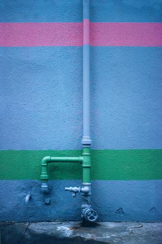
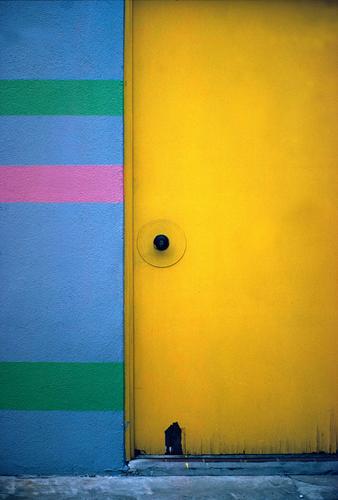
1980-81. A foggy morning in an industrial part of Santa Ana, CA.
Kodachrome 25 (ASA 25), Daylight. Olympus OM-1 SLR. Zuiko 50mm/1.4. Unknown exposure. Drum scan.
A trick with transparency film in low contrast situations was to under-expose by 1/3 to 1/2 stop, then compensate in the scan, increasing saturation, sometimes dramatically. But it never looked forced.
Rich
Fabulous geometry and colors. Finding art in the artifacts, particularly industrial artifacts, is an art in and of itself. Well done.
