• Members 517 posts
    Aug. 6, 2023, 7:51 p.m.

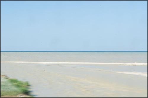
    I enjoy taking photos from moving transport, both frozen and deliberately blurred, in fact I almost posted a blurred scene from a train this week, but it was taken on a snowy winter’s day and didn’t feel appropriate at the moment.
    Your photos are recent, so they match the current season, of course. I like how the motion blur leaves enough information to work out what we are seeing, but leaves enough to the imagination to make that a bit of a puzzle. Or we just imagine the blurry scene as it is, and feel ourselves lost n thoughts at the window, mesmerised by the scenes scrolling past.
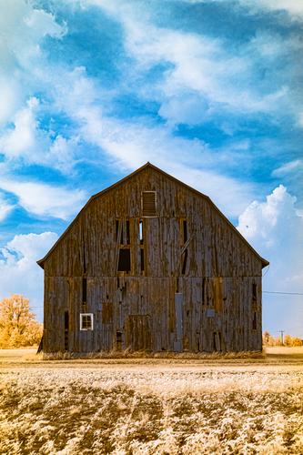
    The beach scenes are unusual, since it is usually other landscapes, which are shot this way. They are flat, so the images are basically horizontal bands, which adds to the sense of motion. I think the first works best, as the detail on the Sun-shades is horizontal, which plays well with the motion blur. The second has more fine and vertical detail, which is more challenging to capture, so the image cannot be quite as blurred or abstract as the first.

    Pete

  • Members 517 posts
    Aug. 6, 2023, 7:59 p.m.

    This is another excellent travel photo from your journeys through outer space. As always, the selected plane of sharpness is very sharp and the lighting dramatic, tasteful and well-executed. I thought it was the surface of a liquid in a glass or a bottle, but couldn’t make the edges fit that theory, and didn’t think of a crack, which is actually a choice of subject showing creativity and showing skill to make it work.

    Pete

  • Members 517 posts
    Aug. 6, 2023, 8:15 p.m.

    It is a lovely scene, and I think either is a worthy candidate for a wall, and, seeing them both, my choice fluctuates between them.
    High contrast and brightness are magnets for the eye, and in the B&W both apply to the point where the hedge meets the mist, so our thoughts are drawn to the landscape, and we think about the landscape and then we notice the church later.
    Bright colour is another eye magnet, and in the colour version yellow is the brightest colour, so we see the church and think about that and then see it as part of the surrounding landscape.
    The difference is subtle, but affects the way the viewer reads the image and may be a reason for a preference of one over the other, as well as the more obvious colour versus monochrome choice.

    Pete

  • Members 517 posts
    Aug. 6, 2023, 8:26 p.m.

    This is a very graphic image, and with so many interesting lines and few colours, I would normally say it would probably work better in B&W, but I don’t think that is the case here. The subtle shades of blues and purples are attractive in their own right and also help organise and separate the different parts of the structures, and, since there are so many lines and layers, that is important.
    You have managed to find an angle, which shows this multitude of lines and structures in a pleasing composition and without it becoming a mess, so well done for that, and also for seeing the possibilities of the scene in the first place.

    Pete

  • Members 517 posts
    Aug. 6, 2023, 8:37 p.m.

    A nicely seen little scene.
    I agree with others that the brighter and slightly less yellow sky is an improvement.
    Mentally, I played with a version cutting off the sky altogether, leaving the water and bench as the filling in a green sandwich, but I discarded it. Graphically it was interesting, but it made me realise the importance of the sky, which seems to symbolise sleep and dreams. In fact the large cloud in the middle of the sky can be seen as the person sleeping on their back! Obviously this is important to the theme of the photo.

    Pete

  • Members 523 posts
    Aug. 6, 2023, 9:15 p.m.

    Many thanks for your informative, interesting comments, Pete!

  • Members 1185 posts
    Aug. 6, 2023, 10:51 p.m.

    Normally I try motion blur at 1/15 second. You are correct, it was the flat horizontal bands of beach, sea, sky that at first had my interest. Then I found I wanted a little more human influence detail so I increased the shutter speed. One other thing is going on. Have a look at 2. See that dark blue line across the horizon. That's the usual ocean colour. There was a disturbing amount of grey/brown water runoff into the ocean near every large town. I wanted that to form a band of its own before we get to blue ocean. The brown layer is too wide here to get what I really wanted in the shot which was a statement about beaches, people and ocean pollution.
    I'll sort through the shots (lots of them) and I may find one that shows it better.

  • Members 1185 posts
    Aug. 7, 2023, 3:34 a.m.

    Image one is unusual. There is a very narrow plane of focus and that's where our eyes head. That plane is at the furthest edge of what we are seing in a close up shot. We have the insect, some petal and the edge of a leaf. The leaf/petal edges are highly detailed and we look at those details. What the subject is gets a little confusing. The wall of green across the bottom third is also unexpected but helps isolate the insect. If the shot had been taken from above to show the more orthodox view of the flower, the edges would probably have been lost against the background. The selected angle places them against the sky. The title suggests that the edges get more attention. I don't know the flower or insect but I guess that the insect may have been chewing the edges and is being pointed out as the culprit.
    Shot 2 again has a flower with imperfect petals. It is a more conventional photo and it is photo 1 that means we give more attention to the edges here. Satisfyingly strong colours and contrasts. I like the positioning of the lower petal with its point towards the viewer.

    Minniev, here's hoping family matters sorted out over the weekend.

  • Members 1185 posts
    Aug. 7, 2023, 3:44 a.m.

    I love photos like this. Flat blocks of colour like the paintings I like of Mondrian. It's hard to explain why. I seem to soak them in rather than interpret them in any way.

  • Members 517 posts
    Aug. 7, 2023, 7:17 a.m.

    Formal wedding photos are just that, formal, and a lot of effort is spent defining the group, rounding up Auntie A and cousin B and tactfully telling Great Uncle C that he is not required in this one, and all that tension is often visible in the results. These photos are different and very relaxed. Maybe some or all of them are staged, but, if so, they have been done very well, and the wedding party are at ease and enjoying themselves. The formal photos are important, but it is these informal photos that the wedding party will like the most.
    The dresses of the Bride and Bridesmaids are beautifully captured, showing details of their embroidery and lace, and the soft, flowing silk. The garden helps here too. It is beautiful, but is not overloaded with colourful flowers, allowing the dresses to be the centre of attention. The slight under exposure helps as well.
    Excellent photos, Lou.

    Pete

  • Members 1185 posts
    Aug. 7, 2023, 7:59 a.m.

    Water Pollution.jpg

    I found one that shows the pollution a bit more. I don't know what it is but I wouldn't swim in it. Quite liked the extra stripe for photo purposes though.

    Water Pollution.jpg

    JPG, 58.4 KB, uploaded by MikeFewster on Aug. 7, 2023.

  • Members 720 posts
    Aug. 7, 2023, 12:39 p.m.

    Hi Pete,
    Thank you for a comment that was simultaneously thoughtful, pointed, poetic and funny.
    (I have never realized that I was married to Frodo Baggins! Thanks for clearing that up for me.)
    Roel

  • Members 663 posts
    Aug. 7, 2023, 1:33 p.m.

    I love photos like this. Flat blocks of colour like the paintings I like of Mondrian. It's hard to explain why. I seem to soak them in rather than interpret them in any way.
    [/quote]

    Thanks Mike.

    I like geometric shapes, repeating patterns, color and juxtapositions.

    Rich

  • Members 517 posts
    Aug. 7, 2023, 7:27 p.m.

    We have similar weather here in Germany at the moment. It was roasting in Germany whilst I was shivering in the rain in England, but I stupidly brought the lousy weather back with me.

    The bleak hills and especially the weather look threatening, but Portree looks snug behind its little hill and the harbour wall. The cottages and most of all the coloured ones make it seem even more welcoming, and placing it in the centre of the frame, gives it a further sense of peace and stability.
    We catch a glimpse of this scene through the low point in the trees and bushes, and imagine ourselves on a walk, looking forward to its welcome. Or it could be a last wistful glimpse before braving the elements. The choice would be dependent on personality or mood, but either way it is a delightful image.

    Pete

  • Members 517 posts
    Aug. 7, 2023, 7:41 p.m.

    I hope your crisis has been soothed, and it is something which can be brought back to normal quickly. Any crisis is distressing, but family crises are the worst.

    I think I have said before, that I enjoy photos of imperfect flowers. Is it something to do with aging, that I now find beauty in imperfection? I am not sure I would have done aged 20.
    Both satisfy that liking, but I really like the first. The flower is past its best, but the unusual camera angle, for a flower shot, makes it stand above the leaves, still tall and proud. The insect is a welcome inclusion, and personifies the attacks the flower has so far withstood, although time is not its friend.

    Pete

  • Members 517 posts
    Aug. 7, 2023, 8:01 p.m.

    The large blocks and bands of saturated colour are very tasteful. They are satisfying as abstracts, and we see them that way for a while. Since they are appealing images, the photos invite the viewer to study them further. But why? What is there, apart from walls, a door and pipe-work? I think that is what makes the viewer want to study them, attracted by the colours and composition, we scour the frame to see if there is more, and find the fine detail. The texture of the wall, cracks and imperfections, details in the pipe-work, nuances in the colours, and, even though they are small enough things, we see them as rewards for looking. They are details we would normally never notice, and is a sign of these photos’ power and ability to lead the eyes , where they would normally never go.

    Pete

  • Members 517 posts
    Aug. 7, 2023, 8:08 p.m.

    That is a great idea to base the image around the dangling sign, and seeing the world from its point of view.
    That looks like a thumb below the speed limit sign, so presumably the required speed is by rule of thumb too?

    Pete