I like that one most. Just 1 human against nature...
-
-
-
The gray weather sets the mood so that I can't help but think the chairs look a bit sad and lonely. On the other hand, I'm reminded of a shot I took of children's toys in the rain that I titled "Anticipation." So if one were feeling optimistic, your shot could be "Tomorrow there will be sunshine!"
Aside from any interpretations, the composition and content are engaging and make me linger. A great find with that uniquely designed wharf and perfectly aligned colorful chairs. Interesting and enjoyable photo!
-
Minnie, your keen eye always finds the pesky telephone pole 😁 Thanks for your always instructive and enjoyable feedback!
-
@MikeFewster has written:
This is miserable.
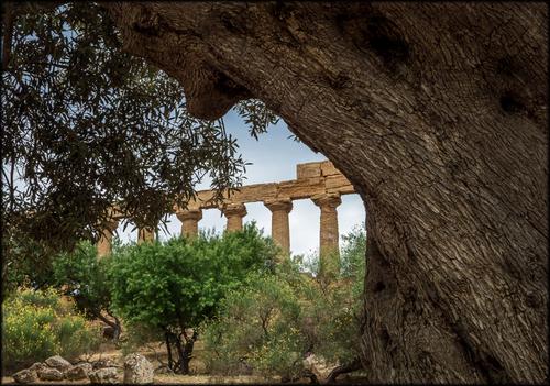
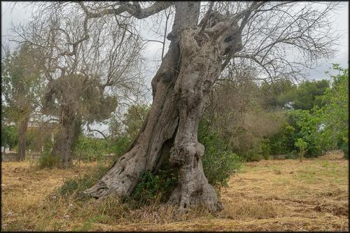
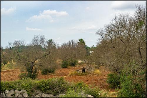
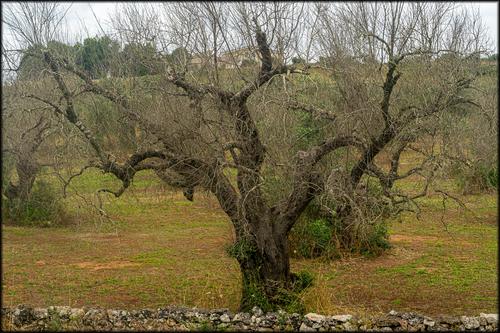
In the Lecce region of Italy, the olive trees are dieing. Magnificent old specimens are being chopped down and burnt to try to stop the disease spreading. Unfortunately, the disease continues to advance. I decided I had to do this as a series.
The first shot is an ancient olive as it should look. I took this shot ten years ago in Sicily.
It is a devastating loss for the whole region.
Your first image (the one from 10 years ago) seems to have been made in Agrigento in Sicily. I think I recognize the temple there.
The other images make me sad. We have seen this disaster first hand when we were there last year.
Photographically, the historic image is the most interesting, with its natural framing.
The others are good journalistic shots of the crisis. -
@OpenCube has written:
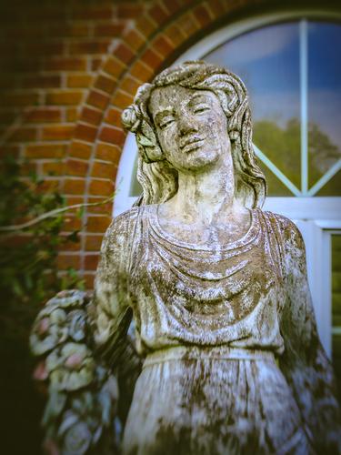
Your colour treatment creates a sense of nostalgia, emphasized even more by the vignetting.
Together, they breathe life into the statue. Well done. -
@Fireplace33 has written:
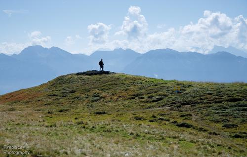
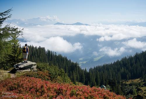
Hiker on a hilltop
My wife has this picture, as a screensaver, on her laptop, so I see it almost every day and it's growing on me :-)
I took it on an Autumn day, while on a hike to Schneeberg (which translates to "snow mountain")
A fairly simple image, but has something special for me, it's just a older hiker standing proud on a small hilltop, not too far from the summit, he's looking out and pondering the view beyond and he's contrasted nicely against that band of mounatins in the background.Being so small the person also gives the scale to the large expanse, so typical of the scenes up in the mountains.
This first one would be the single image to comment on,
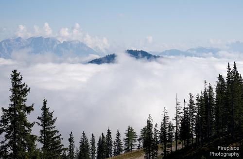
...but just to set the scene on that day, I've incuded a few more shots from that hike :-)
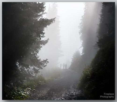
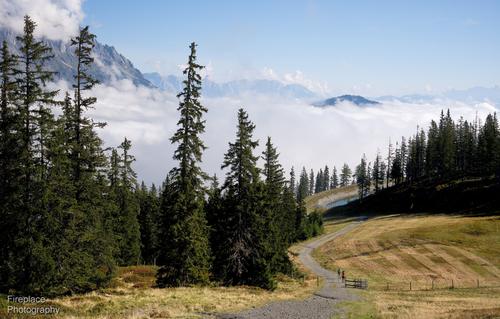
It started out quite foggy, but cleared as we got higher.
While you only asked for comments on the first image, let me tell you that I like all of them.
The first one is a real gem, because of all the reasons you have already stated yourself : the lone figure brings scale to the landscape and exudes a sense of exploration and conquest. Those clouds behind him that lay a blanket over the hills, are a perfect backdrop: the human figure seems all the more present (in your mind's eye : imagine this image with just a full clear blue sky - it would just not be the same).
My second preference is the final image, again because of the human figure. Although she does not stand out as well against the sky (taking a vantage point more to the left would have done that: maybe she could even have been positioned above the V-shape of the tree line...), there is still that same quality of scale and sense of exploration. We have come to this point and enjoy the view from the altitude we have conquered : and now the road ahead leads us into the clouds (much like my image of last week).
The two other images with road, hills, clouds and trees are similar, but stand a notch lower for me.
Special mention though for the second in the row : those humans coming towards us through fog, making their way through a clearing between mysterious trees, are another really fine image. -
@simplejoy has written:

Lavender fields by simple.joy, on FlickrAlong a path
through the lavender
four trees are lined up
tall and slenderTheir shadows are
so it is said
fork-shadowing
what lies aheadA photograph for photographers. Full of wit and creativity.
Those of us who have hung around photography for a while will have seen multiple takes on the rows of lavender bush subject. I'm not knocking such photos, the subject is such a delirious blast of colour and shape and shade patterns that of course it has to be photographed. I'm envious that I have never had an opportunity to try it.
Simplejoy has turned the "you have to try it anyway" cliche on its head.
Love it, love it. I can't wait to see your take on "layers of receding hills" or "road receding into the woods." -
@OpenCube has written:@simplejoy has written:@WhyNot has written:
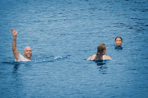
Summer 2
WhyNot
It's a nice summer shot! The waving man looks friendly, I wonder why he has his shirt on though... I think the composition works well, but I'd probably crop it slightly at the top and bottom unless it's important to you to show that they are a bit out in the water.
For some reason the woman looking out of the frame makes me think that something's approaching from the right side... and as my mind tends to wander into fantasy land, I came up with this:
Hope you don't mind. 😅 Just to make it clear, because there was some confusion in the last thread:
This is just my stupid interpretation, no official re-edited version by WhyNot! 😉
How did you make that edit warp like that? Reminds me of ES wobble.
Wow. This is a great take of a couple about to catch a huge wave and ride it to the shore. The poor fella on the left hasn't seen the wave approaching and he's going to be dumped in a big way.
-
@LouHolland has written:@MikeFewster has written:
This is miserable.
In the Lecce region of Italy, the olive trees are dieing. Magnificent old specimens are being chopped down and burnt to try to stop the disease spreading. Unfortunately, the disease continues to advance. I decided I had to do this as a series.
The first shot is an ancient olive as it should look. I took this shot ten years ago in Sicily.
The rural character of the last two photos appeals to me. The latter for its beautiful shape and colors and the third also for its colors. In the third picture there seems to be a bonus, namely the pile of stones with an entrance. That's in that photo what looks like an archaeological question mark. The atmosphere in which this olive garden seems to come to an end will undoubtedly be followed by rejuvenation. Beautiful series.
Lou
I hope you are right about the rejuvenation Lou but I wasn't seeing any sign of it. Attempts were being made to plant new olive orchards but some of these didn't look too happy either. As I understand it, the disease continues to spread. All Italy must be watching with consternation. As might be expected. major scientific work is underway.
-
@OpenCube has written:
The statue is the subject. Interpreting it as presented in the photo is a different matter.
The vignetting curve picks up the curve in the brickwork and the white of the arch in the window. They combine to frame the statue and especially the face and neck. I feel that there is a very slight green cast to the lighting on the stone and this increases the impression of age on the figure. The statue though is of a young girl. The expression on the face might be many things but I feel it reflects sadness. A contemplation of the passing of time. By including only part of the statue and selecting lighting that takes us to the head area, the photographer has inclined us to see the image as an interpretation of thoughts. -
@MikeFewster has written:@simplejoy has written:

Lavender fields by simple.joy, on FlickrAlong a path
through the lavender
four trees are lined up
tall and slenderTheir shadows are
so it is said
fork-shadowing
what lies aheadA photograph for photographers. Full of wit and creativity.
Those of us who have hung around photography for a while will have seen multiple takes on the rows of lavender bush subject. I'm not knocking such photos, the subject is such a delirious blast of colour and shape and shade patterns that of course it has to be photographed. I'm envious that I have never had an opportunity to try it.
Simplejoy has turned the "you have to try it anyway" cliche on its head.
Love it, love it. I can't wait to see your take on "layers of receding hills" or "road receding into the woods."Thanks a lot for your kind words! I'm not sure I ever created one of the scenarios described, but I recently recreated quite a famous site in the mountains of Northern Italy (South Tyrol), called the "tre cime", which has also been photographed countless times:
Here's the original

Linkand here's my macro version (not created after the exact image above, but perhaps it's similar enough) 😉

Tre cime... again. by simple.joy, on Flickr -
@ChrisOly has written:
That's an eye-catching image, with those happy little Adirondack chairs in primary colors sitting an a deck that looks like it was made by IKEA but perched in a gray colorless lake on a gray colorless day. My eye goes right to the red one, the symbol of Canadian national parks that I'm so familiar with. But then it runs leftward through the crayon box to appreciate them all. Compositionally you have a great leading line to take us out there, and we can watch the gray Nothing waiting for a better day.
-
-
@LindaS has written:
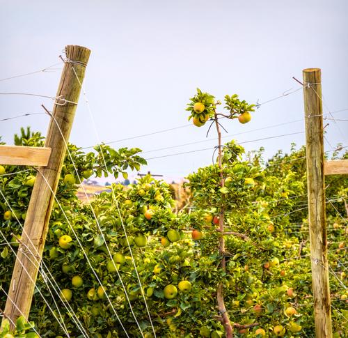
Not our Grandmother's Apple Trees
This is one of the trellis-style commercial operations that have become common in the past 10 - 20 years.
The image is strong enough to stand alone however it is better with the title. The heading adjusts our responses to what we see and the point of the image. The man made poles are compared with the slim trunks. The wires aren't an intrusion, they are an importan tcommercial aspect. We understand why the bushes are shaped as they are.
The single stem reaching above the pack and its framing by the two poles make the shot. Having taken that in we can explore the rest. While we do it, we are cued in by the title to note the thinks that make these trees different to Granny's. The point is taken. -
@Rich42 has written:
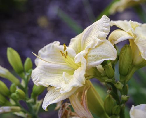
I generally don't post images of flowers. I love images of Calla Lillies, as they are so beautiful and I have said that it's impossible to take a poor picture of a Calla Lilly. But images of flowers are more about the flower than the image itself. The "creation" is already there, and for better or worse, the photographic image is just a reporting of that creation by Nature, not by me.
I'm posting this image as I had almost forgotten about it until I posted it a few days ago on another site simply as an example of the functioning of a particular adapted lens on a particular camera. It was my first ever image on my GFX 100s camera two years ago. The light was just magical that early evening in May when I took this in my garden. It was just a quick focusing exercise without any effort at composition, but the beauty of the Lilly just took my breath away when I brought it up on my monitor.
I was especially struck by the similarity of the edges of the petals and sea foam.
Rich
The positioning of the flower shows the interior stamens, the base structure of the flower and the whipped cream of the petal edges. As a bonus there is the diagonal line. That's an achievement in the one photo. It's beautifully lit with a lighting angle that brings out the fine textures on the petals. Apricots against purples and greens are luscious. It's a fine flower study.
While I see the frothy edge in the second shot, it is such a different image that I don't feel that they belong together. Two is hard edged and modern. Straight lines with blocks of colour and daring colour combinations. I very much like it but not alongside 1. -
@simplejoy has written:@MikeFewster has written:@simplejoy has written:

Lavender fields by simple.joy, on FlickrAlong a path
through the lavender
four trees are lined up
tall and slenderTheir shadows are
so it is said
fork-shadowing
what lies aheadA photograph for photographers. Full of wit and creativity.
Those of us who have hung around photography for a while will have seen multiple takes on the rows of lavender bush subject. I'm not knocking such photos, the subject is such a delirious blast of colour and shape and shade patterns that of course it has to be photographed. I'm envious that I have never had an opportunity to try it.
Simplejoy has turned the "you have to try it anyway" cliche on its head.
Love it, love it. I can't wait to see your take on "layers of receding hills" or "road receding into the woods."Thanks a lot for your kind words! I'm not sure I ever created one of the scenarios described, but I recently recreated quite a famous site in the mountains of Northern Italy (South Tyrol), called the "tre cime", which has also been photographed countless times:
Here's the original

Linkand here's my macro version (not created after the exact image above, but perhaps it's similar enough) 😉

Tre cime... again. by simple.joy, on FlickrIt's similar enough. Shapes, colours, textures on the face. Congratulations. I think you have launched a whole new photography genre.
-
@MikeFewster has written:@simplejoy has written:@MikeFewster has written:@simplejoy has written:

Lavender fields by simple.joy, on FlickrAlong a path
through the lavender
four trees are lined up
tall and slenderTheir shadows are
so it is said
fork-shadowing
what lies aheadA photograph for photographers. Full of wit and creativity.
Those of us who have hung around photography for a while will have seen multiple takes on the rows of lavender bush subject. I'm not knocking such photos, the subject is such a delirious blast of colour and shape and shade patterns that of course it has to be photographed. I'm envious that I have never had an opportunity to try it.
Simplejoy has turned the "you have to try it anyway" cliche on its head.
Love it, love it. I can't wait to see your take on "layers of receding hills" or "road receding into the woods."Thanks a lot for your kind words! I'm not sure I ever created one of the scenarios described, but I recently recreated quite a famous site in the mountains of Northern Italy (South Tyrol), called the "tre cime", which has also been photographed countless times:
Here's the original

Linkand here's my macro version (not created after the exact image above, but perhaps it's similar enough) 😉

Tre cime... again. by simple.joy, on FlickrIt's similar enough. Shapes, colours, textures on the face. Congratulations. I think you have launched a whole new photography genre.
I agree with everything that Mike has said on the "Lavender fields" (wonderful creativity in working with light, shadow and simple everyday objects: the rows of lavender plants are an immediate throwback for me to the Abbaye de Senanque (near Grasse) in the French Provence.
But I am even more impressed by your ultra-creative recreation of the famous "Tre Cime" (Three Peaks).
I can't find enough superlative words for my praise.
