Thanks so much.
So pleased you enjoyed, Chris; thanks! I had a very hard time choosing among the 100+ photos I took that outing 😁
Thanks so much.
So pleased you enjoyed, Chris; thanks! I had a very hard time choosing among the 100+ photos I took that outing 😁

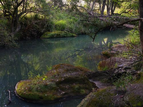
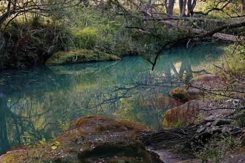
This is a lovely sylvan scene, Aussie forest style. The angles of both shots is engaging, with nice smooth water, gentle light and reflections to work with. I'd be drawn to spend a lot of time with it. It seems that the canopy is thick enough that you could shoot there even when the light is not friendly. You have some overbright spots in the second one that are eye magnets. Both might benefit from some editing. Cropping would remove at least part of that nice rock in the second shot, so I'd try something else. I don't think you mind people tinkering with your pictures, so I experimented with #2 using the new Photoshop Beta to fill in the bright spots and preserve the entire rock. Beta did a fair job on the leftmost spot, and threw a broken limb in the water to make it realistic. It failed on the brighter spot so I did that one by hand using a sample from the far shore. (You would probably never guess that I like playing with pictures).
Well composed and well captured image.The color shift is less profound (well, the trees are purple but they are not viciously so, the purple is subtle). The colors of the water, trees, and sunset are realistic, which makes us more willing to go along with the purple trees. Good use of a common prop (picnic table) as a compositional anchor. It's an equivalent of a lonely bench so to speak. You may have a little halo'ing going on long the treetops, or at least the impression of such.

Both very nice and calm shots - I like the water surface, its color and relfections in particular. That's why I would focus more on that. Here's an (significantly more unrealistic looking) and also cropped version of the second shot to show what I mean:
No need to overdo it like that of course, but something to that effect or (if you prefer a more realistic looking version) perhaps try to get the reflections out more clearly and make everything a little bit brighter.

There is something about red and white checks that is the complete soul of the feelings associated with kitchens and comfortable domesticity. The warmth of reds and the unpretentious simplicity of basic checks? In this photo, the curtains with those associations dominate the image. There's much more. The angle of the white benchtop draws us into the image and the curve of the curtains continues in taking us out to the garden. The vase is simple, we feel it is snipped from the garden behind. There is the much same luscious purple/green/apricot combination that has also been used by Rich 42 this week.
The one thing I don't like here is reflected shape of the bowl. The reflected shape doesn't seem to be related to the bowl. It looks too dark and too large and overpowers the bowl. The central position of the shadow shape makes it too prominent in the image.
The pp look feels hand made and "painterly" (without artificial brush strokes.)
Thanks for including the steps taken in building the photo. I can't envisage why each step was taken and what each added on the path to the final result but I get more appreciation of what was involved. It was worth it.
As it happens, I recently did a lot of shots where I was trying to get flying birds and shadows against stone backgrounds (in my case it was old buildings but the challenges are the same.)
Getting the exposure right to freeze the action while keeping details in the background, isn't easy. Most of my attempts were discarded. I think you have done well.
Two and three could be cropped to give the bird shadows more prominence but I can also see an argument for leaving them small against the scale of the rockfaces. A detail to be discovered with pleasure by a viewer. The planes and textures of the rocks works well as a backdrop for the birds and shadows.
Shot 1 feels overwhelmed by the dark area. Looking at it on larger view is better because more detail can be seen in the shadow area. Looking at the image as a print or on a different monitor to mine might well be a very different experience. Perhaps experiment with taking a bit off the top and bottom of the frame so the gash in the cliff face gives a dominating horizontal line to the shot? Possibly raise the shadow levels in this image a little more?
Art, and photo, with attitude. The eyes and baseball bats pointing to the door sign are brilliant. It works so well that the thought occurs that maybe the building owner is in cahoots with the artist? I'd like to hear an interview with the owner. Probably there have been unauthorized additions to the original piece. There's a slight spray can over rum from the black tag on the right to the door.
Was it a cloudy day? The colours are bright here and I think they could take a bit more "pop." I'd take a sliver off the top as well to get rid of the buildings and many short lines behind. The glimpse of footpath below does a good job in showing that the wall and door are the same building.
Serenity says it and photo says the same. Green upon green and a repetition of semi rounded shapes of all sizes. Then it all gets repeated in the perfect reflections. Even the break in colour with the reddish brown bush has the same shape and this is repeated in the carefully positioned boulders. The Japanese are good at this and the photo puts is all together.
It's a beautiful garden and I followed up by searching to find out where these gardens are. That was a surprise.
I have just been looking at the post this week from Saggitarius. Your photo is also predominantly green but the effect is quite different. I think it's the shapes. Saggitarius's shot is full of repeating curves. Yours has all the jagged and leaning trunks. The trunks aren't uniform in the directions they add. This landscape feels peaceful but it isn't safe and predictable.
This works in a quite unusual way. Like the empty bench genre, it is what is absent that presses the buttons. We imagine the scene with the missing people and we feel their absence. Chris has added some extra layers. Not only is there a row of chairs lined up, the platform they sit on parallels and repeats the form of the chairs. The platform and the chairs look warm and inviting in an almost uniformly grey world. This is a double and triple whammy of absentness.
On the horizon, top left is a little dot of black. It's enough to distract and we can't make out what it is. Remove it?
The tiny red buoy is another matter. Yes, it distracts but it also adds. It's the same red as the chair. It looks lonely and lost, when we eventually find it. This is in keeping with the feel of the photo. I'd leave it as it is.

Thank you for valuable comments.

Error on my part. Unable to delete.

[quote="@MikeFewster"]
This is miserable.
In the Lecce region of Italy, the olive trees are dieing. Magnificent old specimens are being chopped down and burnt to try to stop the disease spreading. Unfortunately, the disease continues to advance. I decided I had to do this as a series.
The first shot is an ancient olive as it should look. I took this shot ten years ago in Sicily.
......
[/quote
I like this set as an editorial commentary with the narrative .. not sure I'd like any one as a stand alone ... sorry about that! ....]
WhyNot
I confess this picture took me a bit of time to appreciate... Looking at it in the largest size on this site it appears to be more of a painting than a photograph and I like that effect and would want this printed very large ... A few niggles... at that scale there are few fixes that might be needed at the pixel level (ie a small scratch to the right .. ( ... makes me think this was scanned from film!) .. at the photograph size I had a problem with that shadow around the center ceramic pot -- I saw it a dog, or other animal, lying there .. not so much enlarged ... I had to spend a bit of time with this picture but I like it when viewed very large! ....
WhyNot
I just read your commentary! .... I find that sharing here on the Internet that I sharpen a bit more than I would normally but it seems detail is valued higher than composition by many here ... or ,maybe I"m just getting old and ... well .....
I think it is the door that makes this most interesting for me as the graffiti image seems to be expecting someone to step out! ...
WhyNot
Mike, you've addressed issues I often have: what story, exactly, am I trying to tell? In this case, I was not expecting the birds to be there. My intention was to make studies of forms, shadows and light. In culling and editing, I was attracted to some of those features but I couldn't ignore the birds 😅 I really should have chosen and edited two separate sets - so that I'd have strengths of whichever, instead of a mishmash. Many thanks!
Thanks, and I can honestly say that processing is as much fun for me as taking photos. The deeper in the weeds I get with editing tools, the more fun I have. I don't really worry about whether the end result is a photo or an art piece or just a crazy bit of fun.
Glad to know that about the name for the curtains. My husband, who has Dutch heritage, is pleased to know we have Dutch curtains in the kitchen! Glad you like the processing.
Thanks, Linda. I am glad the photos of the old house have acquired some sort of conjoined message. My memories are part of why I find so much pleasure in being there. I spent a fair portion of the first two decades of my life there. Our lives were simple but somewhat charmed, and I try to capture that when I can.
I have "done up" a couple of artistic images from photos I've taken there and printed them on canvas and hung them in the rooms that are pictured. I may do this one as well. My grandson especially likes the one in the living room, which shows the print of the living room, which shows the print of the living room....
That was just what I was hoping someone would take note of, the visible wind I was trying to capture! Thanks!
Thank you Chris. When I'm in the house, I am living in both past and present. I think you described that quite well in your comments.
Thanks for the detailed feedback Mike, It will help me get this one ready for a print, which I have about decided to do. The dark thing you see along the right edge of the counter is not a shadow but my black iron frying pan. I see how it could be taken for an errant shadow. I will add back a little detail so it's more recognizable. Adding brush strokes by hand takes a little more time but it keeps software under my control rather than its own. I use a wacom tablet and an art pen, and a variety of mixer and regular brushes.
Thank you Why Not for your time and comments, and I appreciate your taking a long hard look at it. I'll take a look at that scratch (probably an artifact from the texture). I know what you mean about the shadow of the little sugar bowl which is mixed up with the shadows of the flowers and vase. I have not tried to alter it from how it was in the photo but I may need to. I'll try some "things". It will be printed on canvas which is very forgiving, so if I blunder it may still be OK.
Yes, I agree there is a high standard of sharpness among most photography folk, but I just don't buy into it and since I'm not trying to impress anybody but myself I'll stick to my own preferences. I fell in love with the Orton effect when it was done only in the darkroom, and use it on lots of my images, usually on just one layer that's blended with layers with other effects. I seldom sharpen a photo unless it is somewhat "troubled" and OOF, then I'll try Topaz sharpen on it. But then I'll soften it again!
Hi Minniev. Like WhyNot, I was talking about the sugar bowl shadow, not the pan at the back. The sugar bowl shadow seems too dark, too large. The bowl gets mixed up with the shadow and I agree with Why not that it becomes animal like. Figuering it out intrudes into the photo. The shape of this quite dark area doesn't seem to match the areas that create the shadow. Can the shadow be lightened to a density closer to that from the curtains?
I hadn't noticed the pan at the back. Perhaps lighten the shadow area in it a touch but it is the shadow in front of the sugar bowl.
I read Lou's comment on the lace. He's totally right and the lace is wonderful.