• Members 861 posts
    Aug. 17, 2023, 3:51 p.m.

    I wish this camera was not the Linhof of Sony cameras.

    dsc00467_$40_72dpi_web.jpg

    dsc00467_$40_72dpi_web.jpg

    JPG, 1.9 MB, uploaded by OpenCube on Aug. 17, 2023.

  • Members 701 posts
    Aug. 17, 2023, 4:18 p.m.

    This!

    This is sublime.

    This is a, "I wish I had taken this image, image."

    "The smoothness of the GFX images keeps tempting me to shoot colour." Yes it does! It consistently beats what I used to think I could accomplish with 4x5 film.

    Rich

  • Members 523 posts
    Aug. 17, 2023, 4:43 p.m.

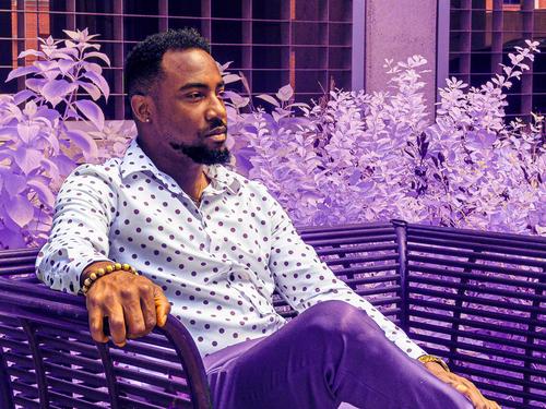
    Is your camera reference regarding what seems to be distortion of the hand? I'm familiar only with an ultra-wide angle lens on a Canon consumer dslr.

    I am mesmerized by this photo. I see someone who is completely comfortable and supremely confident in his style - and presumably his life. It's quite a sexy photo!

    The purple encourages one to enter a world of fantasies and wishes. Whew! 😁

  • Members 861 posts
    Aug. 17, 2023, 9:54 p.m.

    No. I'm talking about the 15 seconds between shots required to shoot raw with this thing. It is painfully slow to shoot with this camera.

    He's actually wearing black and white....full spectrum makes things fun.

  • Members 1361 posts
    Aug. 18, 2023, 3:15 a.m.

    Help. This photo has me in knots. It presents a question that is central to many discussions of critiquing in the arts in general. What is the role of prior knowledge that the person doing the critique might have? To be more specific. How far should I (indeed "can I") look at this image without being influenced by previous work I have seen from Minniev on the same subject?
    Answer. I don't know.
    I have been enthralled by the Dam Bird series since I first saw them years ago. This one isn't gelling with me because of that prior knowledge.
    The water is different. The slower shutter speed is creating a veil effect. I miss the power of the frozen cascades and torrents. The bird feels all wrong. It's sharp and that feels incongruous to me against the long exposure of the veil of the water. Then there's the bird's shape. I'm used to the elegance of the locals here and this guy is letting the team down.
    On the other side of the ledger, the neck/beak line continues the angled line of the concrete block and the lines of water. It's that inconsiderate bird again. If he had the decency to be about twice the size I might have forgiven him and been happy with what the line does here.
    Minniev, this is the problem with success. The fans get very picky.

  • Members 1361 posts
    Aug. 18, 2023, 3:37 a.m.

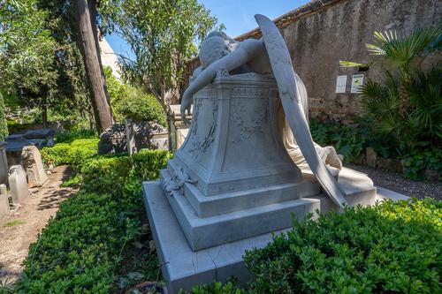
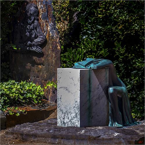
    It's a remarkable and disturbing statue. The grief is tangible. The statue and emotions are strong enough that in this case I don't feel that the PP darkening is needed. Given the prominence of the second statue in the image, I wanted to be able to make out a little more of the detail there and see it alongside the other statue.
    In Rome there is an "English cemetery." Within is a famous statue from a different era but with a similar concept . The Grieving Angel. I took this shot a few months ago.
    Grieving Angel.jpg

    Grieving Angel.jpg

    JPG, 1.0 MB, uploaded by MikeFewster on Aug. 18, 2023.

  • Members 1361 posts
    Aug. 18, 2023, 3:46 a.m.

    All the fellas together. There's a "bonded" vibe to the group and image.. The dog leash size/line works with the frame of the seat in drawing the characters together.
    Sorry, but here I go again with cropping. How would you feel about moving the left edge considerably closer to the dog?

  • Members 676 posts
    Aug. 18, 2023, 3:58 a.m.

    Thanks for stopping by, Mike ..... I think I place them to the right to give them some distance to look out but on trying out moving the left border I noticed that I also used the diagonal of the thirds grid with the dogs head and one of the other heads on the crosses ...... So maybe a bit too contrived but then ....

    WhyNot

  • Members 1361 posts
    Aug. 18, 2023, 4 a.m.

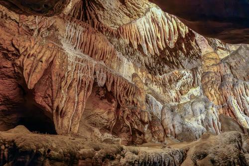
    The shot comes to life as soon as you see it large size. The intricacies of the stalactites, their textures and colour variations are spellbinding. The photographer has set the camera to make the most of those details and exploring them is rewarding.
    Viewed as a whole, there is a satisfying curtain like sweep to the wall. The photographer has achieved this by stepping back into an overhang that frames out the top right and left hand corners. It adds drama to the image.
    I don't know where this was taken but I know that trying to get the exposure right in caves can be very difficult. The artificial lighting tends to highlight features in the dark. Avoiding clipping highlights and shadows isn't easy.
    Well done.

  • Members 1361 posts
    Aug. 18, 2023, 6:42 a.m.

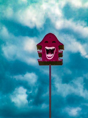
    We are looking at a bird coop? I assume it is. It's a bizarre design for such a homely, comfortable object. The structure shrieks of attitude and the pp raises the volume further. I don't like the colour combination so I'd take that as a sign that the image works.
    Keeping the lines simple here is a good thing. The in-your-face quality doesn't need additional bits around. The storm clouds and their weird colour are ominous. This is the bird coop Batman's nemesis might have made for his pets.

  • Members 1361 posts
    Aug. 18, 2023, 7:11 a.m.

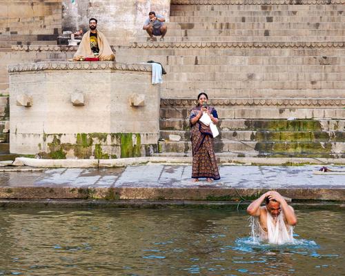
    The perfect caption. It took me a while to recover from that and start to look at the image seriously.
    An extraordinary place that turns a Westerner's preconceptions of religion inside out.
    In this image I think all people are Indian. The woman photographer is almost certainly the husband of the devotee in the river. She's holding his towel.
    Because they are all Indian and comfortable with cameras being there we know it is OK. If this had shown Westerners photographing personal rituals up close and we didn't know the place, we might have felt less comfortable.
    It feels relaxed. I like the repeated towels throughout the shot (including what I think is a cloth over the shoulders of the bather.)

  • Members 855 posts
    Aug. 18, 2023, 9:26 a.m.

    That's a cool shot!

  • Members 855 posts
    Aug. 18, 2023, 9:26 a.m.

    agree
    +1

  • Members 132 posts
    Aug. 18, 2023, 11:19 a.m.

    Mike,

    Thanks for your comment. However, many comments focus on changing colors or light and dark.

    It is my belief that the abstraction of the experience enhances and makes the emotion more visible and that the shift of the light contributes to this and it is for these reasons that the abstraction and the shift of the light give me the conviction to do as it is displayed. Photography is not only imagining but also translating the emotion of how an image enters, after all we also need to be able to recognize the artist that could be in every photographer.

    Your photo is beautiful, but it shows a different era in which it evokes a different, more figurative image, and it is precisely here that we miss the human emotion that should reflect that. After all, the imprint here is the religion and less the human experience at issue, and it does not reflect the same emotion in expression, but more a picture of the times.

    Lou

  • Members 782 posts
    Aug. 18, 2023, 12:18 p.m.

    This is a PERFECT collaboration right here: * very good image from Mike * first intervention suggesting how to get rid of distractions that do not further the theme * second intervention making the sight even more impactful by drawing us closer into the scene and concentrating on essentials.

    I am so pleased with this interaction.
    And I could not agree more with the whole to-and -fro.
    Doesn't it make you LOVE what we are doing here?

  • Members 782 posts
    Aug. 18, 2023, 12:24 p.m.

    I agree with most of what you say.
    I am only not so sure that the second photographer (the one at the top) is an Indian person nor related to any of the others.
    With his shorts and sneakers and general posture, this looks more like a tourist/traveler to me who has seen a photo opp and jumped on it (like Pete himself, of course).
    (Zooming in close reveals that he may indeed be Indian, but that does not mean he is spiritually involved. The tourist vibe lingers.)

    This does not alter my perception of the image.
    Photographing selfies but also other people in public places has become so universal, that I don't think twice about that aspect.
    (There are boundaries of course, but I don't feel those being broken here. And of course, if a person enjoys a private moment and would prefer that scene not to be recorded, he/she can always speak up and the considerate photographer will oblige. The image does not have to be deleted if it is for private use or if it is newsworthy, but I personally would refrain from showing it online if the person depicted had asked me expressly not to.)

    Anyway: it is a great catch with a great title.
    I especially like the patterns and rhythms of placement of the four subjects.

  • Members 782 posts
    Aug. 18, 2023, 12:28 p.m.

    Wonderful.
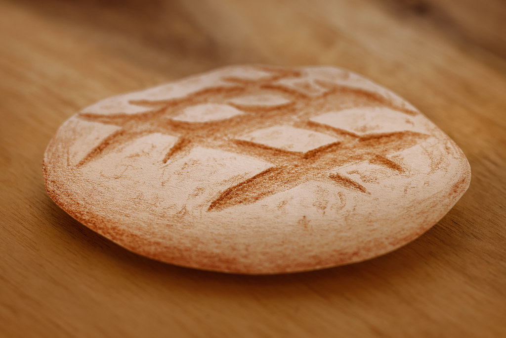
    Your explanation gives it away (the drawing is actually totally convincing, but if we look close, we see your pencil strokes), but that does not lessen my admiration.
    The drawing is placed PERFECTLY in order to create a real shadow that suggests volume and mass.
    A real magician's trick.

  • Members 523 posts
    Aug. 18, 2023, 12:39 p.m.

    I did not see the upper right as foreground until after reading Mike's comment. It's one of those eye tricks where one moment it's the foreground and the next moment it's the background - at least in my brain!

    The pov and result change for me now that I've been alerted. Cool.