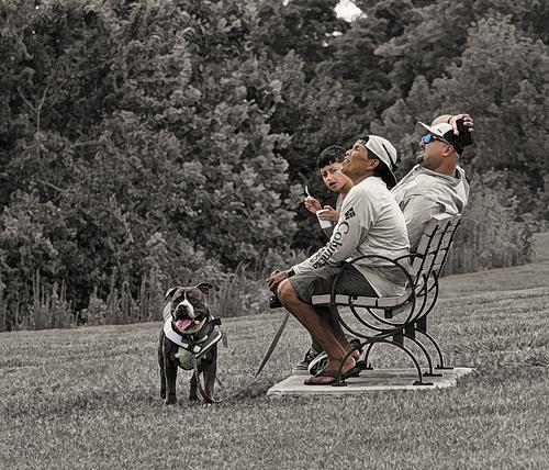
You humble me as always. Yours connects the viewer to the image way more than mine did. Just because my eyes and brain are what they are, what exactly did you do? Desaturate the man and bench a tad?
-
-
Thanks Andrew.
USA vehicles have never been my favourites but I've always had a softspot for Pontiacs. Must be something to do with the chrome bonnet strip they all have.
If a photograph is to be done of an American car, it has to get the chrome right. It has to be shiny with good blacks. It has to avoid clipping. It's at its best with some readable reflections. You got it. -
A small aside first. In recent weeks I've had a number of discussions with friends about the state of the photography market. I make a part of my income from selling landscape photos, although these aren't what I usually share here. A theory. Selling photography gets harder and harder. Thanks to camera phones and the net, we are drowning in images. The general public are now far more aware of digital processing on computers and this has further devalued the market. I suspect that there is a swing to classic black and white because it still looks like "art." That's preferable if you want something to hang on your walls for the admiration of viewers. Along with this I suspect that photographers at least, are enjoying "playing" with their cameras and the processes. As compared to taking photos. I'd cite the interest in such images and experimentation in this thread and also on the DPRevived Abstract, Minimalism and Creative genre group.
Which brings me back to Jim's photo.
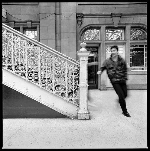
It has got both. Classic B&W plus deliberate movement blur. It's recognizable as a "photo". It goes beyond the recording of a scene but we feel it was done in the photography, not the PP. I like its chances of having public appeal.
I'm pretty sure we have a meeting between two people here and they are glad to be meeting. The movement adds intensity to the meeting. Plus the feet in mid air. Hands reach out. We have enough face detail to see real pleasure and excitement.
The solidity and monumental nature of the surrounds accentuates the humanity and movement of the people. The downward slope of the railings positively pushes her into his arms. The surrounds suggest a railway station so perhaps a meeting after an absence? Add a memory of a residue of hundreds of 40s and fifties films with important moments between characters at travel points.
I'd enjoy it over and over on my wall. -
It isn't surprising that travel there is slow.
Is there some sort of record for the greatest number of receding hills one can manage in an image? This has to be a contender.
Perfect light for the effect. Especially note that the second layer of hills nack is in complete shadow and then we have more sunlight arriving through the mist so a second wave of hills begins the receding trick again. I don't recall another receding hills shot that has done this. It's a glorious mist/light combination that lets enough light through building the shapes. I like the dark band, top right, that breaks up what otherwise would have been a large expanse of bright featureless cloud.
Greens don't get lusher than that and suggest plenty of rain which is further guaranteed by the picture.
Is this from a film camera?
Definitely a hardship posting. -
@19andrew47 has written:
[quote="@LindaS"]
LOL, did you just happen to have that puffin photo in your files, or did you run down to the store to take the picture for me? 😁 So cute!What an incredible work of art is the Pontiac's design. I don't know your title's reference; are you a collector of antique automobiles and this is your latest acquisition? The color works better for me because in the b&w I find the details of the busy sky somewhat intrusive. I also think the color reflection on the front bumper adds interest, picking up the blue and being easier to see the overall details within.
The title was in reference to the 800th edition Linda. I have posted a number of car images in the past for 100 numbered editions. There is an 800 in the image on the car. As to the puffins, yes I had it in my image collection from a trip we took about this time last year to Newfoundland in the gift shop of 'The Rooms', a small museum of sorts and an attractive new building. An image below of The Rooms and another taken inside The Rooms, not in the gift shop.
Andrew
Right from the start I suspected there was an 800 link in the photo. I was thinking more about models. I searched the image looking for cryptic shapes in the grille. Nope?
Having read this posted clue I went back again. Eventually I found it. -
@LouHolland has written:@MikeFewster has written:@LouHolland has written:
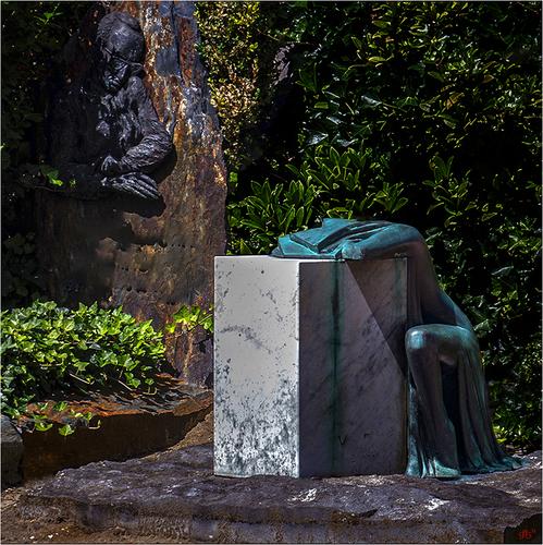
The Grief
Pure Art at the graveyard, Leuven, BelgiumEnlarge >click image>click downarrow
Names have been removed for private reasonsIt's a remarkable and disturbing statue. The grief is tangible. The statue and emotions are strong enough that in this case I don't feel that the PP darkening is needed. Given the prominence of the second statue in the image, I wanted to be able to make out a little more of the detail there and see it alongside the other statue.
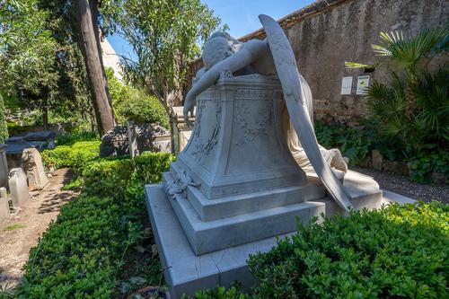
In Rome there is an "English cemetery." Within is a famous statue from a different era but with a similar concept . The Grieving Angel. I took this shot a few months ago.
Mike,
Thanks for your comment. However, many comments focus on changing colors or light and dark.
It is my belief that the abstraction of the experience enhances and makes the emotion more visible and that the shift of the light contributes to this and it is for these reasons that the abstraction and the shift of the light give me the conviction to do as it is displayed. Photography is not only imagining but also translating the emotion of how an image enters, after all we also need to be able to recognize the artist that could be in every photographer.
Your photo is beautiful, but it shows a different era in which it evokes a different, more figurative image, and it is precisely here that we miss the human emotion that should reflect that. After all, the imprint here is the religion and less the human experience at issue, and it does not reflect the same emotion in expression, but more a picture of the times.
Lou
I'd agree with all that Lou. Ref my response to the photo from Jim Kasson this week.
I'd agree about my shot as well. I thought the statue was remarkable and I wanted a photo of the statue and had no thought of adding any interpretive layer of my own.
Even so, there is a close similarity in the vision of the two sculptors. I don't recall another memorial statue that is similar. I wonder if the Dutch sculptor had seen the statue in Rome? The Rome statue has been famous for many years. Visitors come to see it and the grave of Keats close by. -
@OpenCube has written:@simplejoy has written:
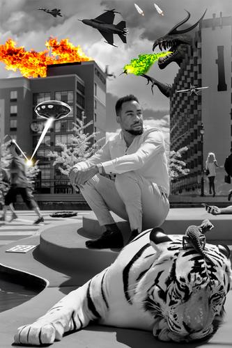
You humble me as always. Yours connects the viewer to the image way more than mine did. Just because my eyes and brain are what they are, what exactly did you do? Desaturate the man and bench a tad?
Glad you think it works - of course there might be different ways to do that... in my example I adjusted the tones of the bench (desaturate, a bit darker and a slight change towards red) and the pants (similar, but even less).
-
@JimKasson has written:
Hasselblad 501c, 40 mm lens, TX.
We are in a train station. A man is in movement and thus blurry.
Classic B&W composition. Good positioning of the man in a natural (door)frame in the background.
A "decisive moment" captured : this image would not have been as good a fraction of a second earlier or later.
I feel like this is a nod to Henri Cartier Bresson's famous image of a man jumping a puddle at Gare St Nazaire (at least I think it was THAT train station).
The only thing missing is a reflection. -
@MikeFewster has written:@JimKasson has written:
Hasselblad 501c, 40 mm lens, TX.
A small aside first. In recent weeks I've had a number of discussions with friends about the state of the photography market. I make a part of my income from selling landscape photos, although these aren't what I usually share here. A theory. Selling photography gets harder and harder. Thanks to camera phones and the net, we are drowning in images. The general public are now far more aware of digital processing on computers and this has further devalued the market. I suspect that there is a swing to classic black and white because it still looks like "art." That's preferable if you want something to hang on your walls for the admiration of viewers. Along with this I suspect that photographers at least, are enjoying "playing" with their cameras and the processes. As compared to taking photos. I'd cite the interest in such images and experimentation in this thread and also on the DPRevived Abstract, Minimalism and Creative genre group.
Which brings me back to Jim's photo.
It has got both. Classic B&W plus deliberate movement blur. It's recognizable as a "photo". It goes beyond the recording of a scene but we feel it was done in the photography, not the PP. I like its chances of having public appeal.
I'm pretty sure we have a meeting between two people here and they are glad to be meeting. The movement adds intensity to the meeting. Plus the feet in mid air. Hands reach out. We have enough face detail to see real pleasure and excitement.
The solidity and monumental nature of the surrounds accentuates the humanity and movement of the people. The downward slope of the railings positively pushes her into his arms. The surrounds suggest a railway station so perhaps a meeting after an absence? Add a memory of a residue of hundreds of 40s and fifties films with important moments between characters at travel points.
I'd enjoy it over and over on my wall.I love this kind of urban street shot with motion blur. And the ambiguity leaves space for interpretation. At first glance it is a prosaic shot of someone running for their train, but there is enough space here for all sorts of fanciful interpretations that keep the viewer interested and wondering. As a species we love making up stories, and this is a nice playground for that.
-
-
@OpenCube has written:
Nicely played.
-
@OpenCube has written:
Your experiments are full of imagination and just pure fun.
-
-
@DavidMillier has written:
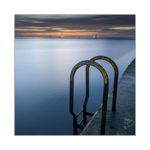
Tidal pool, Margate, UK
I'm kind of getting bored with this set now, having spent so much time editing and posting in various places over the last few days. They work better as a set than individual images IMO. I've tweaked this one a bit to fix the bent horizon and bring out the yellow paint a little. This'll be the last of this set I post on this site, I think. I'll be putting the whole set up as a gallery on my website in due course. I usually prefer making long exposures as B&W's but the smoothness of the GFX images keeps tempting me to shoot colour.
Hey, anyone noticed how the images on this site look a lot better if you click the thumbnail and view in a separate tab? Much better.
p.s.
I must be getting old. Climbing up onto the pool wall and walking along it with the pool on one side and the sea on the other in the dark made me feel quite tottery. And Not to mention stepping down off the wall at the end. I stared at that 3 foot drop for a loooonnnnggg time...
This is another gem, and I am anything but bored with the series, even if you are.
It ticks the same boxes as last week's. It has a great composition, snd the colours are actually quite strong, but the reduced palette gives it the impression of subdued colours. Again, there is a lovely contrast between the softened water and the textures of the hand rail and concrete.
The highlights on the water and on the ships or oil/gas rigs on the horizon are well controlled too.Pete
-
@LindaS has written:
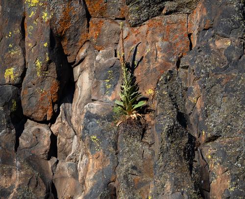
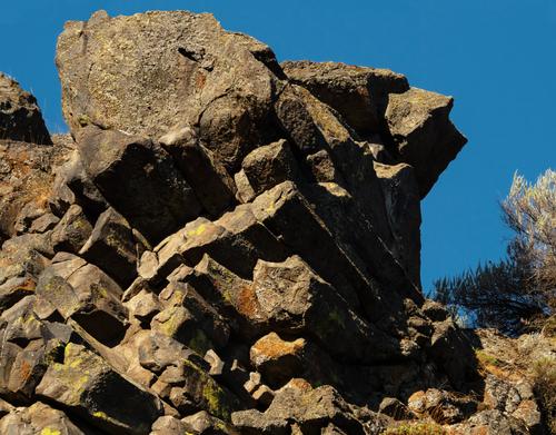
Basalt 2
I was inspired by feedback from last week to take new photos that concentrate just on shapes and shadows, maybe for editing as monochrome. Turns out I'm too in love with the colors of the lichen to go b&w, so here are two new color shots for your appraisal.
These rocks are indeed welcoming subjects. Unfortunately I ran out of time to comment on your photos last week, so I will just belatedly say I enjoyed them now, especially the shadows of the birds, which I noticed long before the birds themselves, which was rather neat.
These photos don't play those tricks and I prefer the first one, with the plant(and its shadow) in the centre. I think the shapes are more interesting, the colours more subtle and the patterns less repetative than the second. Actually, I think the second might even work better as B&W.Pete
-
@minniev has written:
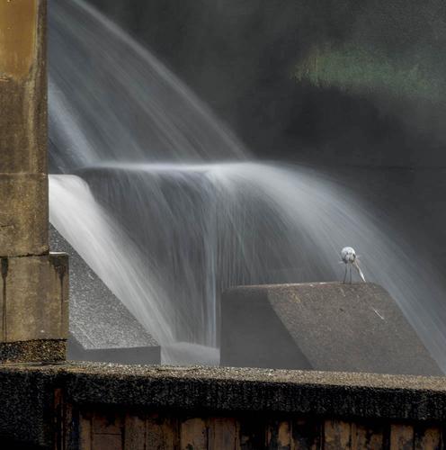
A Bird's Backside
The dam is my go-to place when there is nothing else I can find, and sometimes I experiment with unlikely things like hand held slow exposure (tripods are both impractical and impossible for this project). So here's one.
The slow shutter and softened water makes quite a difference to the feeling of the Dam Birds. The threatening and violent water, which is usually found in your series, has been replaced with this tamed and delicate flow. I think this different feel is actually quite cool and will make some very nice contrasts within your collection. You could even consider going a step further and removing the brutalist concrete in the foreground. It gives an interesting contrast within the photo, but I think a totally soft version, with just the concrete under the flow, would make a very interesting contrast within your series.
Pete
-
@LouHolland has written:
The Grief
Pure Art at the graveyard, Leuven, BelgiumEnlarge >click image>click downarrow
Names have been removed for private reasonsThis is very powerful. The woman is totally deflated, and the man seems to look on in pity or concern. The strong colours and sharp shapes of the rocks, foliage and sculptures give it an expressionist feel. The emotions seem to run very high, which is a contrast to the usual soft, pastel melancholy seen on graveyard photos.
Pete
-
@WhyNot has written:
Summer 3
WhyNot
I like the processing and limited palette, which is just enough to emphasise the subjects. It works very well in this image.
Pete
