It's been a while since I took a nice trip, too. With 100 degree heat for weeks on end, the cool temps of the coastal rainforest would be welcome.
I was glad the roulette wheel picked a cool-looking image. Glacial water is always such a nice color.
Thanks Mike. It is interesting how much more we can do with old, problemed shots. I'm glad I don't throw much away. It's fun to revisit the older ones when you've been as housebound as I have of late.
It hasn't let me down yet though I am sure one day it will give me an impossible image, there's definitely some in there! I thought this one might be it since it was almost completely black when I landed on it.
When you are as old as dirt like me, you've tried a lot of stuff! It reminds me of one I took of a reflection in a car hood, and really liked. We gotta try everything!!
There's a limit (theoretically) to how much time I can spend at my computer enjoying images. To deal with the world I have a self imposed limit that means I very rarely get involved with more than one image per person per week. Open Cube and the discussion hooked me with this one. exploring skies and clouds is one of the great joys. I have nothing further to add to the thoughts on the image itself and the reflections on playing with images, except agreement with both.
Yep, I can relate to all said above.
Mike‘s self-imposed limit to allow time to deal with the world is cool. I just wish the world would reciprocate sometimes, because I have just been buried since returning home on Sunday.
Most importantly, I enjoyed this image. Even if the secret was quickly revealed, it is still an image, which invites the viewer to stop, think and be creative whilst interpreting it.
Having just spent an afternoon at a dinosaur park with my young grandson, and before that a visit to the dinosaur skeleton section of a natural history museum, I instantly recognise the subject matter. My mind has been programmed in that direction.
I like the original and also Simplejoy’s reworked version.
I would have guessed Bryce too. It is certainly a fabulous landscape, and an extra star for not being Bryce or one of the other well-known places.
The shapes and colours in the rocks are gorgeous and I love the fact that the colours in the trees are similar.
I agree. Also the fact that the subject, I.e. the statue, is plain and dark, which allows it to stand out against the pale, colourful and busy background, which is the opposite of most images and makes it even more appealing.
I’ve never come across yellow raspberries either, just green unripe, red ripe and blue and white furry well beyond ripe varieties.
The yellow one is nicely sharp, but agree that having at least one normal red raspberry in the same plane of focus would actually emphasise the difference between the varieties.
Actually, I would never have guessed 2 featured boats if you hadn’t posted 1. Not that it matters, I enjoy 2 precisely because it is abstract, with lovely transitions of light and colour.
Keeping the image low key works well, although since it is ICM, I expect a high key version would work well too.
I enjoy taking ICMs from time to time, because, no matter how hard you try to pre-visualise, there is always the child-like excitement to see how the finished version actually turned out.
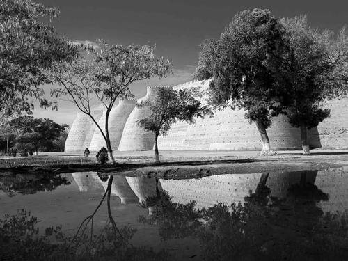
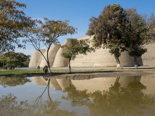
Thanks for the comments. A number of you rightly picked up on the poor noise reduction in the posted version, and Lou and Fireplace33 even went to the trouble of posting an improved version, so thanks for going to that effort.
Anyway, I decided to revisit it and did a quick rework from scratch, using the original raw, and posted it below.
For interest's sake, and because Mike wanted to see the original colours of the walls, I have posted the original straight out of camera, except for using the same crop.
Pete
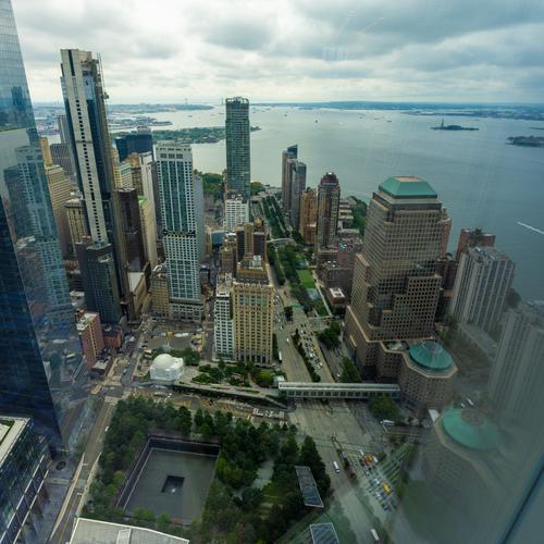
Couldn't control the glare on the window. The only thing I could think of would be to bring a black back drop and cover the things that are reflecting if I get to shoot here again.
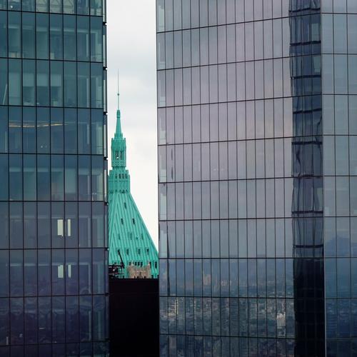
Maybe over-saturated? I wanted to keep the reflection of the city on the right and look through the windows on the left.
The second B&W version is much more worthy of the subject, though I have to confess that I prefer the colour even more! Thanks for taking the trouble to revisit this,
Welcome to the weekly critique thread! Hope you'll come again, share more images, comment on those of other folk, and join us earlier in our week, which starts on Wednesday. I'm worried that your submissions here today won't get enough feedback because this time of week, we are winding down and waiting for Roel to post a new thread tomorrow. You may want to repost these, or one of them, in the new thread tomorrow, or post some other photo you have questions about. We are a jolly, interactive group, so I predict you'll have fun here once you get the hang of it.
The first is a nice angle to take a photo of NY harbor and the Statue of Liberty. The photo seems sharp enough all the way from the bridge to Lady Liberty, and in to the buildings around you. The glass has made a bit of a mess that you probably can't get rid of. Photoshop would help you with the reflections in the sky, or at least some of them, but it would be awfully tedious to try to deal with the other reflections made of dotted lines. I might just do some creative processing, maybe even monochrome, and tuck a texture over it to hide the flaws and make them look intentional.
The second one isn't afflicted with glare, and it looks good! I don't think it's over-saturated (of course I haven't seen the original so have no comparison), but it seems to have plenty color detail, no halos, and it's well within the realm of believability. A really nice image.
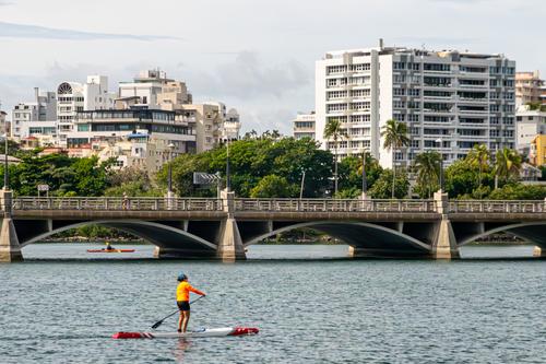
The third is a quite nice image of a summer day in the city with people enjoying a day on the water. The bright yellow of the paddleboarder's shirt calls our attention to him, and he is well positioned in the frame. The frame itself is nicely divided into 5 identifiable horizontal sections: water, bridge, trees, buildings, sky. Each is well placed in relation to the other. The slightly different heights of the buildings and trees offset the straight lines of the bridge and water. Well done.
I agree about the second B&W version but we differ about the colour version. In the B&W, to me, the lines feel stronger and I feel that they are very significant in the image.
Thanks for the colour version, I had anticipated that the walls would be more orange/brown.
I don't remember seeing that angle on NY with the Statue of Liberty out there.
Re the reflection. It doesn't bother me at all. You have a splendid reflection on the tall building on the left. It has many little rectangles that are similar to your window reflection on the right. Consider making the reflections a feature of the image by making them more prominent with adjustments to the contrast and highlights. Then they become a framing of the scene.
It doesn't strike me as oversaturated. I very much like the concept here of a reflecting wall and a wall where we look inside and I think this image is worth some further experimentation. It might be possible to selectively adjust the tones in the building on the left to make it more obvious that we are peeking inside. To me, the green spire feels a little high in the image. Consider an experiment with cropping a bit off the bottom. A B&W version or maybe B&W with the spire left green could be striking as well.