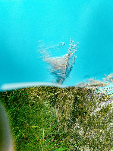
I love Lou's response about feeling a person could walk out from the sea onto the beach. I very much like the triangle of water separating beach from sky. More impactful than horizontal lines of all, I think.
-
-
@minniev has written:
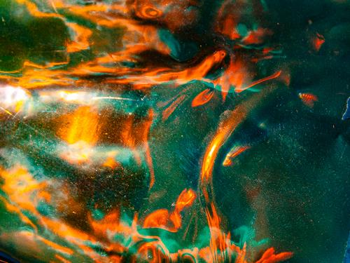
This is really appealing. The colors are rich and strong, the design is artfully abstract, the tones are distributed in a way that lends readability across the frame. I am pretty sure you did this at least mostly in camera, since that is what you typically do. But you've flummoxed me this time, I can't imagine what it was before you waved your magic coloring wand over it. I suspect that if it's not layered, it is some kind of reflection or double exposure, since some tones overlay others in a way that suggests transparency of some elements. You've discovered something intriguing, and I hope you'll explain what this was and more about how you did it.
All in camera. The only post work was color shifting and contrast stuff. It's the same process as the last one with a dichroic sheet of vinyl on top. I need to try some ICM ideas with this and figure out how to get better control. I need something less fun house mirror to start with.
-
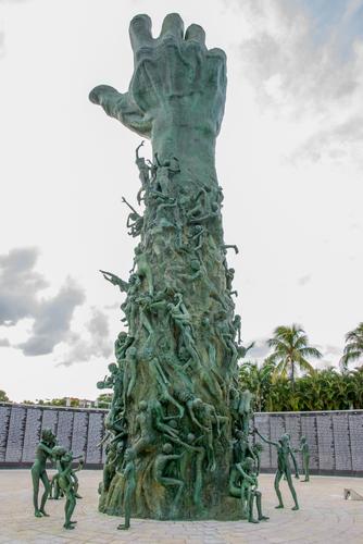
Thank you everybody who looked and commented on my images. There is one more image from inside that well. Took me 7 years to come back and take this one. The writings on the wall are names of the people killed during Holocaust. You can submit names and they will put them on the wall. My mother's in law parents have been killed in the ghetto in Ukraine. Now their names are on this wall.
-
@Sagittarius has written:
Thank you everybody who looked and commented on my images. There is one more image from inside that well. Took me 7 years to come back and take this one. The writings on the wall are names of the people killed during Holocaust. You can submit names and they will put them on the wall. My mother's in law parents have been killed in the ghetto in Ukraine. Now their names are on this wall.
Wow... a great capture of what I perceive as an impactful and devastating monument! Don't have much to say honestly... it's just that: devastating, with all those names in the background, each one robbed of all the potential. I'm really sorry to hear your family has been affected by it as well. Great that you got their names on.
-
@Fireplace33 has written:
Red rock river
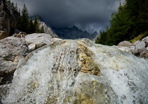
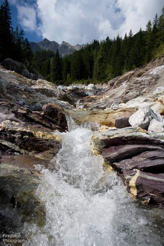
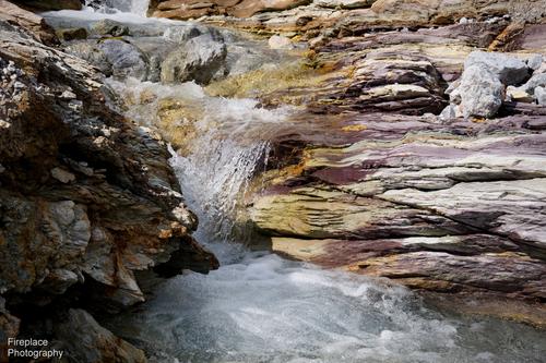
Everytime I hike to the place we fondly call the "red rock river," I get another opportunity to take photos of the water cascading and splashing over the rocks. Occasionally, the sunlight plays a magical role, transforming the water's appearance into something quite different.
On this particular occasion, there were also dark, clouds looming over head.Each of these benefits from being viewed at a larger size.
1 & 2 give scale.
3 has textures I like in the water in the pool. The water fall into the pool is like a sheet of slumped glass that becomes a bubbling froth. Maybe consider coming in to make these two things dominant in the image?
The incoming sky of 1 contrasts with the rush of water and suggests that more is on the way. -
@MikeFewster has written:
Really interesting shot, creating a lot of questions and inspiring to think about possible scenarios. To me it seems highly likely that someone took the 'brick and mortar store' descriptor too literally... 😉
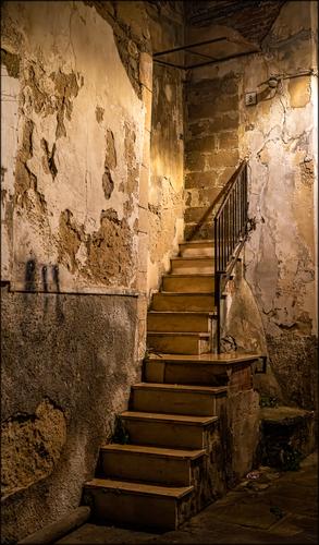
I like the light and composition as well as the overall mood of the image. The shadow of the rail onto the bricks is a striking detail, surely worthy of a separate image from a different angle (which perhaps you even took...) I would try how it looks if the bricked-up doorway would be placed completely parallel to the frame... might work, might not!
[/quote]
You are right. I took a second version but it is quite different. Still thinking Led Zep. The stairway not chosen.
[/quote]MY ADDITION (ROEL) :
I like the secondary images actually much more than the one originally posted.
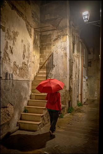
The figure (Suzette?) in striking red, with a red umbrella, used indoors, creates a weird but wonderfully mysterious effect that adds not only scale to the environment, but also human interest and a strong focal point. -
@RoelHendrickx has written:
INDIAN SELF-PORTRAIT
Pete's image of worshippers (and photomakers) in an around the Ganges from a few weeks ago, inspired me to dig up this one from our trip to India.
On the first days there, we were in Mammalapuram (or Mahabali Puram), a city on the Bengal coast close to Chennai (aka Madras).
That city is known for a few architectural highlights of Hindu culture and religion : a few temples hewn from sheer rock, and a Shore Temple, that sits almost right at the beach because the shoreline has changed over the ages. There were a lot of pilgrims there. Clearly a place where people come in groups to worship but also to enjoy themselves, and for many a first encounter with the ocean.At first light, I went out and found the beach already crowded with groups, many in religious red and orange, but others also in just their festive attire.
There was a small fairground with oldfashioned (handpowered) merry-go-rounds, food vendors, a guy with a horse that had a business of letting people sit on that horse to get their photo taken etc. Many were already using smartphones, but definitely not the majority.
To cater to the people without smartphones and cameras, a couple of enterprising locals roamed the beach, armed with a small compact camera and a portable printer that is used for "instant" photos. They offered their services to provide pilgrims with family portraits on the beach, made and printed on the spot.
Obviously, I was interested in their activities and made some images of their operation, as part of the general atmosphere, thrilled to see and experience all that on our very first morning on the subcontinent. I had a blast of a time.
A white European guy roaming that beach between 5.30 and 7.00 AM long before breakfast and before more tourists would show up, I drew some attention myself.
I was asked to pose with several small groups of people.One young lady went a step further and wanted a photo with me solo, standing as close as possible.
She went and found one of the photo vendors to get our portrait made and buy it.
This transaction enabled me to catch this "selfie by proxy":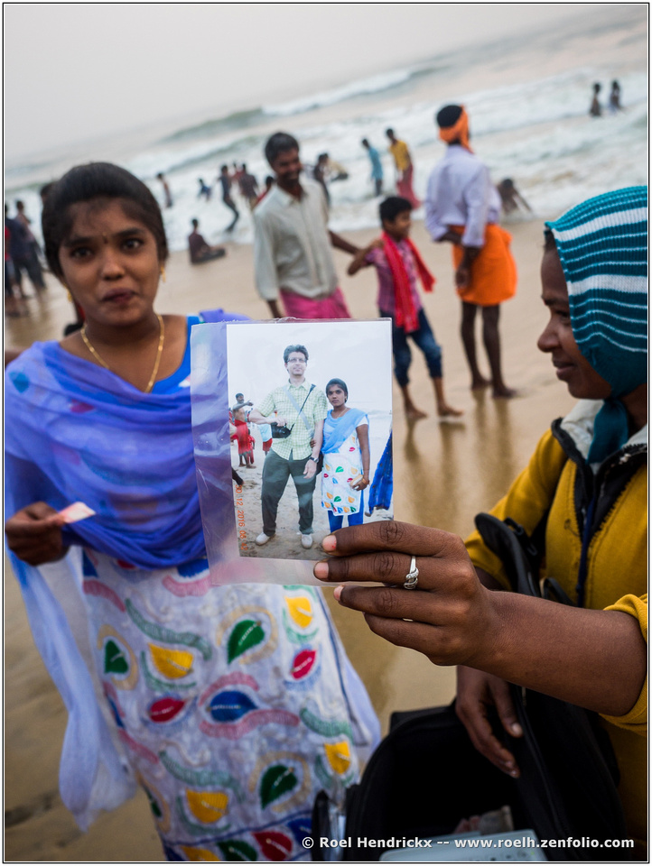
This wouldn't have worked nearly as well if the photographer had posed the subjects with vertical people and a level horizon. It would have felt static.
Here are lines coming in from the corners in both the foreground and background. The association of the photo with the subject can't be missed.
Definitely a photographic moment. -
@minniev has written:@Rich42 has written:
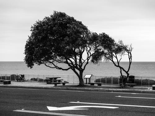
Even the trees get in on the act around here.
Rich
I love a good wind-sculpted tree. They are found near the ocean so I don't get to photograph them very often, particularly now that I don't travel much, but we do have a few on our small coastline compliments of the hurricanes that pass through with some regularity. The sculpting gives them more character, and more stories. Lining this one up with the arrow and a proper naming is smile-generative, but at the same time we are in awe of the forces of nature that can bend a tree to its will. Monochrome allows the shapes much more visibility, and makes the stark white turn arrow more noticeable, so the conversion (or film choice) is effective. Nice image.
Agree.
Superb image in which the addition of what usually would be considered an unwelcome distraction (traffic indications on the ground) is a stroke of genius.I have found that in urban environments, traffic paint on the roads can often be used as a geometrical element in the frame.
(Zebra crossings in particular can be excellent diagonal leading lines when shot with wide angle and close enough.)This takes that idea and dances a tango with it, taking it a step further.
-
@minniev has written:@RoelHendrickx has written:
INDIAN SELF-PORTRAIT
Pete's image of worshippers (and photomakers) in an around the Ganges from a few weeks ago, inspired me to dig up this one from our trip to India.
On the first days there, we were in Mammalapuram (or Mahabali Puram), a city on the Bengal coast close to Chennai (aka Madras).
That city is known for a few architectural highlights of Hindu culture and religion : a few temples hewn from sheer rock, and a Shore Temple, that sits almost right at the beach because the shoreline has changed over the ages. There were a lot of pilgrims there. Clearly a place where people come in groups to worship but also to enjoy themselves, and for many a first encounter with the ocean.At first light, I went out and found the beach already crowded with groups, many in religious red and orange, but others also in just their festive attire.
There was a small fairground with oldfashioned (handpowered) merry-go-rounds, food vendors, a guy with a horse that had a business of letting people sit on that horse to get their photo taken etc. Many were already using smartphones, but definitely not the majority.
To cater to the people without smartphones and cameras, a couple of enterprising locals roamed the beach, armed with a small compact camera and a portable printer that is used for "instant" photos. They offered their services to provide pilgrims with family portraits on the beach, made and printed on the spot.
Obviously, I was interested in their activities and made some images of their operation, as part of the general atmosphere, thrilled to see and experience all that on our very first morning on the subcontinent. I had a blast of a time.
A white European guy roaming that beach between 5.30 and 7.00 AM long before breakfast and before more tourists would show up, I drew some attention myself.
I was asked to pose with several small groups of people.One young lady went a step further and wanted a photo with me solo, standing as close as possible.
She went and found one of the photo vendors to get our portrait made and buy it.
This transaction enabled me to catch this "selfie by proxy":
And thus you became a part of the culture, and of this young lady's story. The story told in the background of the photo is of the culture and the people enjoying their fellowship and their celebration, dressed in traditional garb in a traditional location, but the foreground story is the determined and serious young lady who wanted to incorporate a foreign stranger into her story. Who knows what story she has told herself and her friends about you, or what role you play in her ongoing story, or whether others she's met share the stage with you. To me, the image embodies the intriguing way we weave our human stories together across culture and geography.
Minnie,
Your comment made my day (and that day wasn't half bad to begin with).
If my photography of succeeds once in a while to "embody the intriguing way we weave our human stories together across culture and geography", then I will die a happy and satisfied man.
For me, there is no greater purpose to photography than just that : to show how diverse the population of this earth is, and still how fundamentally the same everywhere.You could not have given me a nicer compliment.
(Like I say it on my web pages :
My main passion and focus is to show authentic people in extraordinary situations.
That is what really makes my heart beat faster.) -
@simplejoy has written:

Putting bokeh into perspective... by simple.joy, on FlickrI suppose the title should be enough of a description... Only thing I'll add: it was in equal parts challenging and fun to create this. 😅
I cheated. Trying to get an insight into what you did here, I went to the FlickR page and snooped around. Some clues, but it didn't help much. The lens choice is probably important as well?
Nothink like a story comes to mind. Just lines and colour that are pleasurable. -
@RoelHendrickx has written:@minniev has written:@RoelHendrickx has written:
INDIAN SELF-PORTRAIT
Pete's image of worshippers (and photomakers) in an around the Ganges from a few weeks ago, inspired me to dig up this one from our trip to India.
On the first days there, we were in Mammalapuram (or Mahabali Puram), a city on the Bengal coast close to Chennai (aka Madras).
That city is known for a few architectural highlights of Hindu culture and religion : a few temples hewn from sheer rock, and a Shore Temple, that sits almost right at the beach because the shoreline has changed over the ages. There were a lot of pilgrims there. Clearly a place where people come in groups to worship but also to enjoy themselves, and for many a first encounter with the ocean.At first light, I went out and found the beach already crowded with groups, many in religious red and orange, but others also in just their festive attire.
There was a small fairground with oldfashioned (handpowered) merry-go-rounds, food vendors, a guy with a horse that had a business of letting people sit on that horse to get their photo taken etc. Many were already using smartphones, but definitely not the majority.
To cater to the people without smartphones and cameras, a couple of enterprising locals roamed the beach, armed with a small compact camera and a portable printer that is used for "instant" photos. They offered their services to provide pilgrims with family portraits on the beach, made and printed on the spot.
Obviously, I was interested in their activities and made some images of their operation, as part of the general atmosphere, thrilled to see and experience all that on our very first morning on the subcontinent. I had a blast of a time.
A white European guy roaming that beach between 5.30 and 7.00 AM long before breakfast and before more tourists would show up, I drew some attention myself.
I was asked to pose with several small groups of people.One young lady went a step further and wanted a photo with me solo, standing as close as possible.
She went and found one of the photo vendors to get our portrait made and buy it.
This transaction enabled me to catch this "selfie by proxy":
And thus you became a part of the culture, and of this young lady's story. The story told in the background of the photo is of the culture and the people enjoying their fellowship and their celebration, dressed in traditional garb in a traditional location, but the foreground story is the determined and serious young lady who wanted to incorporate a foreign stranger into her story. Who knows what story she has told herself and her friends about you, or what role you play in her ongoing story, or whether others she's met share the stage with you. To me, the image embodies the intriguing way we weave our human stories together across culture and geography.
Minnie,
Your comment made my day (and that day wasn't half bad to begin with).
If my photography of succeeds once in a while to "embody the intriguing way we weave our human stories together across culture and geography", then I will die a happy and satisfied man.
For me, there is no greater purpose to photography than just that : to show how diverse the population of this earth is, and still how fundamentally the same everywhere.You could not have given me a nicer compliment.
(Like I say it on my web pages :
My main passion and focus is to show authentic people in extraordinary situations.
That is what really makes my heart beat faster.)Perfect minniev.
-
@Fireplace33 has written:@MikeFewster has written:
For the Led Zep true believers.
Good and interesting shot. I keep looking back at it !
It would certainly be disappointing to climb the staircase up to heaven, only to find out it was all bricked up years ago :-(Or that perhaps some paths turn out not to be the best route?
-
-
@OpenCube has written:
I thought the previous one was more tasteful and resembled a Karel Appel from the Dutch Cobra group and Karel Appel has also made a name for itself in America. This one strikes me more as an aquarium with small goldfishes. Anyway a good try.
Lou -
@WhyNot has written:
WhyNot
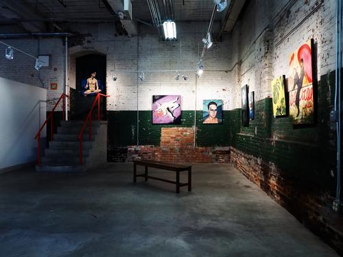
Stairway to art! Very nice shot of an authentic art hideaway, taken from a perfect angle to capture the space itself as art. Excellent
-
@MikeFewster has written:@Fireplace33 has written:@MikeFewster has written:
For the Led Zep true believers.
Good and interesting shot. I keep looking back at it !
It would certainly be disappointing to climb the staircase up to heaven, only to find out it was all bricked up years ago :-(Or that perhaps some paths turn out not to be the best route?
Sometimes, it just leads nowhere, bridge to nowhere, barrier to entry, do not pass go, do not collect $100.
I like this image is squared and the light both pulls you into the stair but the darkness in the corner helps make it feel denied.
I think the feel could be enhanced by one of two ways. Make it 2D and have the stair end in the upper right of the image.
Example I found on the web with a different subject:alternatively, just move the stairs into the upper right of this image and maybe cut them off partially, so the viewer can't see everything to add tension and make the image more unsettling.
Example I found on the web with a different subject: -
@MikeFewster has written:
You are right. I took a second version but it is quite different. Still thinking Led Zep. The stairway not chosen.
[/quote]Nothing spices up a shot like a woman with a red umbrella. Only after you posted this version was I sure this scene was not shot indoors like Whynot's. The first could have been either.
On another photo forum far far away we once ran a fun share thread for about a year where we practiced compositing by each participant adding a red umbrella to some scene we'd shot, and a few lines of story to explain the mystery, romance or crime involved. When I see red umbrellas I still find myself thinking up a story line.
-
@OpenCube has written:
It does look like a miniature tornado. I think I would do some cropping so the little guy would have more impact. I'd crop the blurred arc on the lower left and most of the grass, ending up with a square composition
