Excellent creative work - you‘ve created a tornado! 😱
-
-
I like the one with more shadow detail revealed. I am a big fan of raising shadows and lowering highlights, it is the only preset instruction I give for Lightroom to implement. But I know lots of folks do prefer to allow their shadows to stand as-is, and that's a personal decision of the photographer. The monochrome is a great version where we are no longer distracted by the vibrant color of the grasses or the distant background elements, and the entire focus is on the bones of the animals. The ones on the right gains considerable form and structure when the grasses no longer hide them. It is fascinating how thoroughly you can alter the story a picture tells by altering color, without adding or removing anything.
-
A provocative portrait simplified down to an almost Warhol-style look, this is "almost" a painting. A young main with what is probably the ubiquitous smartphone looks at us with an inscrutable but somber expression. We have interrupted him. Perhaps annoyed him. Maybe surprised him. It's an effective capture, presented in a creative, pared-down manner with no visible environmental cues except the small shadow of Spider-Man behind him, a remnant of a child's hero. Good work here.
-
Excellent set of a very powerful monument I have not seen or heard about. The first and third are the prettiest pictures, with the beautiful clouds, palm trees, and water reflections. But the second gives us a clear if troubling understanding of the monument and what it represents. We see the details of the wrist tattoo and the emaciated suffering bodies of the lost. The framing you chose with the single bright powder puff cloud beneath the drapery of the larger darker cloud mass is an effective compositional choice and implies hope. Well taken collection.
-
I love dramatic lighting! For me, #1 best shows the rugged, dangerous and beautiful terrain. The water coming down so sharply, nearly directly at me, has great impact. The third photo has some very pleasing lines and colors that could make a lovely abstract.
-
Unique, provocative and fascinating. Shiny new-looking steps leading to a brick wall?! As folks have already written, there are lots of ways to interpret this scene, and of course your title is delightful.
-
Oh wow! I didn't see this 'til after writing about the first. Isn't that jaw-dropping amazing how different these are. A master class in storytelling via composition.
-
Ultra-charming. Such a delicate looking kitten dressed in her silky red going-strolling attire. Alert to all the new sights and sounds, and casually strolling to take them in. No pulling on the leash for her. Stop and smell the you-know-what, folks!
-
The first and third provide the setting, though with so much available on the internet, I wonder if they're actually needed? #2 is an incredibly powerful work, and in the soft light with no humans in the frame, says all that's needed. It must have been a very moving experience to visit.
Since nothing is in direct sunlight, the upper right corner is a magnet that distracts. I'd perhaps attempt to lessen the brightness. I have occasionally had semi-decent results by cloning other bits of cloud over an area, using low opacity.
-
I love a good wind-sculpted tree. They are found near the ocean so I don't get to photograph them very often, particularly now that I don't travel much, but we do have a few on our small coastline compliments of the hurricanes that pass through with some regularity. The sculpting gives them more character, and more stories. Lining this one up with the arrow and a proper naming is smile-generative, but at the same time we are in awe of the forces of nature that can bend a tree to its will. Monochrome allows the shapes much more visibility, and makes the stark white turn arrow more noticeable, so the conversion (or film choice) is effective. Nice image.
-
Beautiful image of a beach under at least the threat of stormy conditions. Its broad expanse is largely empty except for the "lonely benches" and the lone seagull. There are a few tiny humans off in the distance but they are barely noticeable. The water is clear and inviting but looks a bit cold. What makes the image is the impressive cloud structure, which may explain why the beach isn't more crowded (the footprints and human touches give evidence it has been more crowded rather recently). Nice shot. It appears to be slightly tilted to the left so I think I'd straighten it a bit.
-
What a fun find! The black and white is perfect for keeping the distractions minimal. This is an example of a photo I might run across (unlike the travels to Inda or mountaintops or deep caves), so part of my attraction to yours is to contemplate whether I'd have been able to see what you saw. That's a fun exercise for me and helps me stay alert to everyday sights as potential art.
-
Motion, energy, little bits of nearly recognizable elements floating in and out. Love it!
-
This is really appealing. The colors are rich and strong, the design is artfully abstract, the tones are distributed in a way that lends readability across the frame. I am pretty sure you did this at least mostly in camera, since that is what you typically do. But you've flummoxed me this time, I can't imagine what it was before you waved your magic coloring wand over it. I suspect that if it's not layered, it is some kind of reflection or double exposure, since some tones overlay others in a way that suggests transparency of some elements. You've discovered something intriguing, and I hope you'll explain what this was and more about how you did it.
-
I like the first very much; it's quite compelling for the otherworldly point of view, unexpected angles, and the way you've presented.
-
The complexity is powerful and fascinating. The colors and light are so pleasing.
The top half looks like a brick building under dark threatening skies. And, could that possibly be a telephone pole in the background? 😆
I thought someone posted a crop that was just the bottom half, but I can't find it in the thread at the moment.
-
Thank you Lou ... appreciated!!! ..... About our "affairs" .. I suspect we are both a bit ancient and have relatively fixed ideas about art and life .. I grew up in WWII Chicago and have been doing this photography off and on for 70 years and I assume you have similar history .. I do want you to know that I do enjoy your work but think its best if I continue to enjoy it in silence .... as we don't seem to communicate well!!! .... I do hope this was better said ...
WhyNot
@minniev has written:@WhyNot has written:Looking at Me? #1
[![Looking at Me 1.jpg]
......
WhyNot
A provocative portrait simplified down to an almost Warhol-style look, this is "almost" a painting. A young main with what is probably the ubiquitous smartphone looks at us with an inscrutable but somber expression. We have interrupted him. Perhaps annoyed him. Maybe surprised him. It's an effective capture, presented in a creative, pared-down manner with no visible environmental cues except the small shadow of Spider-Man behind him, a remnant of a child's hero. Good work here.
Thank you for your kind interpretation and critique .... This didn't start out as a portrait but as a moment in life ....and then he turned .... But speaking about Warhol ...
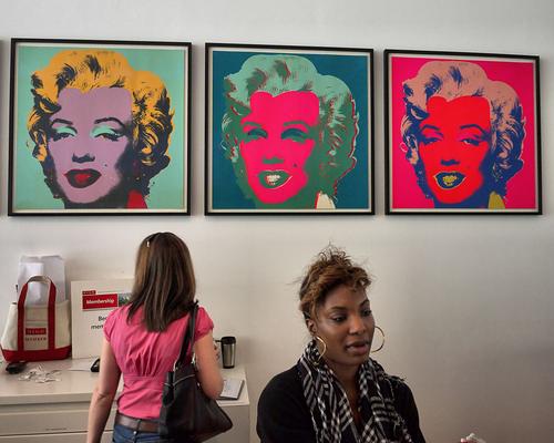
She just didn't look up so doesn't qialify for this set .....
WhyNot
-
@JSPhotoHobby has written:
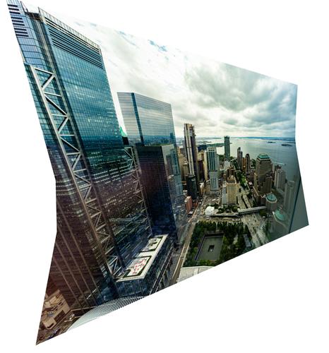
I was attempting to make a composite image, but I was so excited when I was shooting I used the wrong lens/focal length and didn't get enough images to make a complete view. Despite that, I think it came out pretty interesting, if not just a novelty.
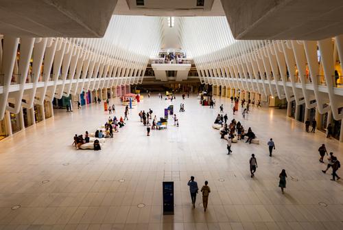
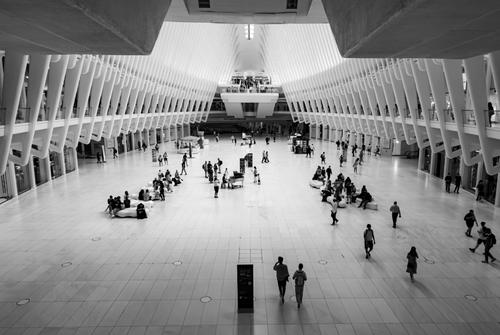
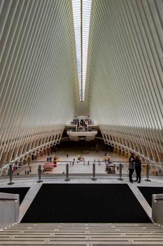
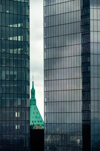
A few obligatory shots from the oculus
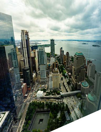
Several weeks ago Jim Kasson offered up some images that were stitched in irregular shapes, and he used the stitching as part of the composition. If you didn't see those, you might want to look for them, you'd enjoy them. These two images have a lot of reflective artifacts that inhibit their being traditional images of the New York harbor, but those same quirks actually contribute to the overall interest when it's clear that the image is more in the creative category than the traditional.
Love the oculus images, especially the monochrome, which I think would be a good choice for all 3, especially the third one.
