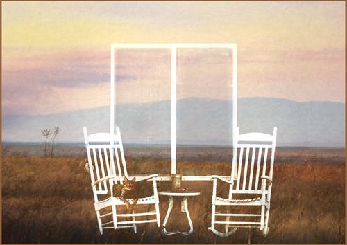
"Come Sit Awhile"
-
-
-
Talk to me about this. AI used? How did you get that soft, painterly feel on the images behind the chairs - in camera, post effect?
-
Great atmosphere here. Superimposed I reckon. And the cat in a very prominent location. There is a touch of melancholy...
-
Interesting colour combination. People will notice this image.
-
Beautiful is not enough of a word to describe this image. Love the sunset and the piers. Excellent! Take the rest of the day off...
-
A guided forest tour
Last week my wife and I joined a free forest tour, organised by the Austrian national forestry organisation ("Österreichische Bundesforste")
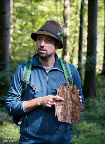
About 20 people turned up for the hike to learn more from an expert about "forests of the future".
After many hikes, over the years, most of what the guide presented about the forests and how they are taken care of here in Austria was already known to us, but we learned some new things too.Looking after a forest is a long term mission !
Here's a few photos.
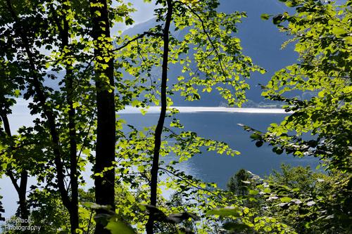
A view through the forest to the Lake Mondsee
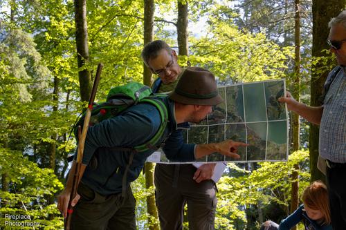
A detailed paper forest map. Most of the details are digitalised in internet these days but the paper maps are always good when the reception is poor in the mountains
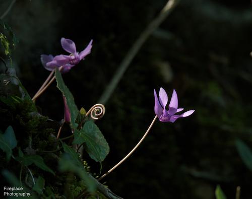
Lots of pretty flowers along the way
BAD BEETLES!!
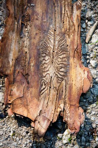
they can creep under the bark, lay their eggs and the larva feast on the the soft layer between the bark and wood---> killing the tree :-(
typical pattern left by the beetles under the bark
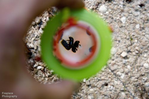
the culprits in a small jar, fitted with a magnifying glass lid
There are lots of efforts to find the "infected" trees and remove them asap before the beetles can spread further.
It would be easier to use poison to kill them, but that's not done here beacuse it has so many unwanted side effects on the health of the rest of the forest ! -
@ChrisOly has written:
Great atmosphere here. Superimposed I reckon. And the cat in a very prominent location. There is a touch of melancholy...
Thank you very much, Chris! I hadn't considered melancholy, but I see it now.
@OpenCube has written:@LindaS has written:"Come Sit Awhile"
Talk to me about this. AI used? How did you get that soft, painterly feel on the images behind the chairs - in camera, post effect?
Hmmm, I'm thinking OpenCube once advised me to keep the magic a secret 😁 Of course I'm more than happy to discuss how a result was achieved in my digital darkroom!
My original inspiration was nothing more than scrolling through some recent photos to see what I could use for a creative composite. No AI was involved, just three separate images of my own (plus my cat), some basic layer work with blend modes, and Topaz Studio 2 presets.
Some folks get a lot of satisfaction from learning advanced brushwork and other techniques, while I just like to click on presets and fuss with blend modes, to see where they lead me.
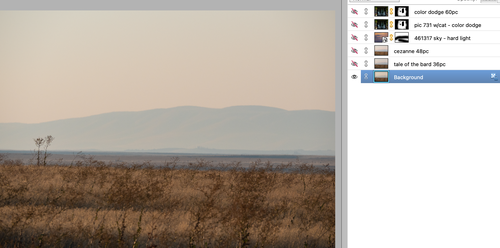
The image in the screen print below is a file I edited slightly in PS Elements' version of Adobe Camera raw.
The next two layers are Topaz Studio 2 presets at reduced opacity. All their creative presets have options to make adjustments, such as removing a texture if there's more than one, deleting a vignette, changing colors, etc.
The next layer is from my folder of clouds (clouds I shoot for use as overlays, textures, or to add a bit of definition and/or color in a white or plain sky). I used hard light blend mode here.
The chairs are from a heavily shadowed front porch of a random house I happened to drive past when I was looking for the theme "in shadow." I had already plopped a photo of my Queen Stella into one of the chairs. When I placed that photo into my layer stack, I discovered when going through the list of blend modes that "color dodge" removed a lot of stuff I didn't want. This was great to see because I really, really hate doing "selections" of specific elements. The remaining extra stuff I simply masked out. I did a second layer of same to give it more definition.
Many thanks for your interest!
-
enlarge> click image> click downarrow
-
@LindaS has written:
Hmmm, I'm thinking OpenCube once advised me to keep the magic a secret 😁 Of course I'm more than happy to discuss how a result was achieved in my digital darkroom!
And if you wish to not, that's fine. I respect everyone's right to hold what makes their work unique chest tight. I learned a gold leaf technique once. The story of how boils down to "what harm could it do to teach one American my secret of gold leafing said a French artist"...as we're being taught it in a class by that American. That unintended lesson stuck. So I get not letting all the cats out of the bag, especially in this digital era. So I appreciate the curtain pullback. It's not much different from what I do currently, just with different tools. I'm just strangely obsessed with getting that painterly feeling...and I want it in camera, not post. It has to be possible somehow. I'm admitted kinda laughing at also having something like my own clouds folder...all 57 gigs of it.😂
-
@OpenCube has written:
I'm just strangely obsessed with getting that painterly feeling...and I want it in camera, not post. It has to be possible somehow.
Yes... I'm sure it's possible somehow.... Here are two suggestions:
1.) some old lenses display a lot of painterly look (depending on what you mean by that... after all there are lots of different styles!):
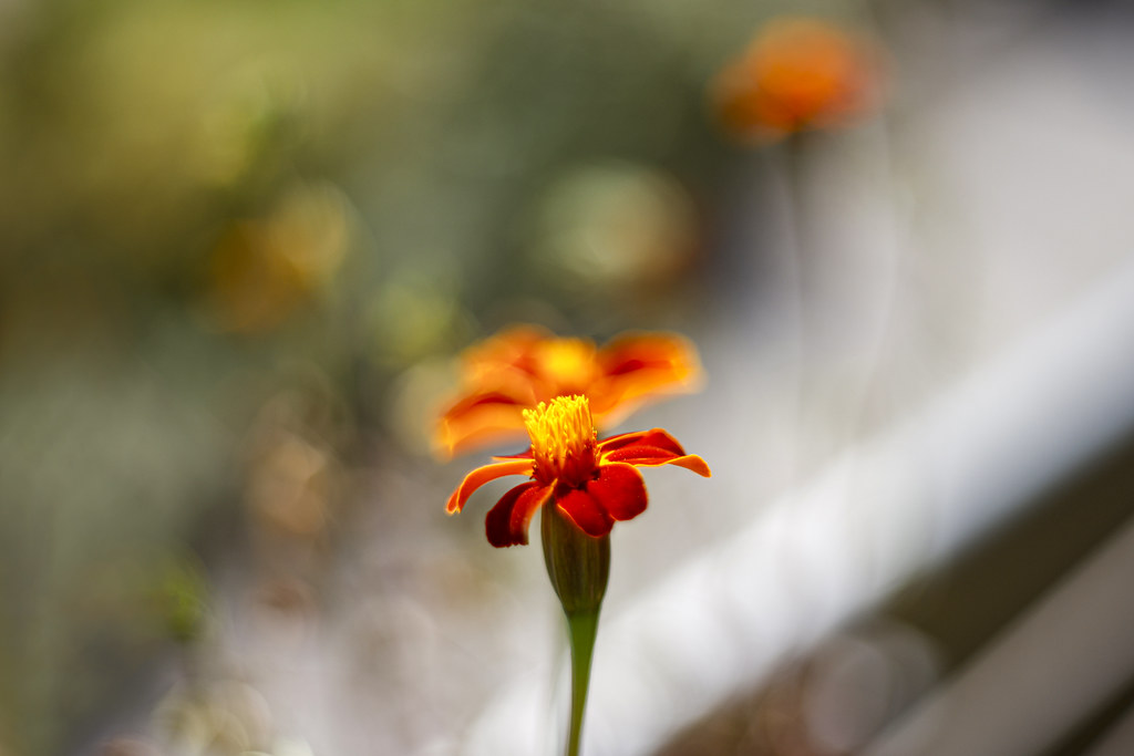 What if it isn't a reflection... but a parallel universe? by simple.joy, on Flickr
 Don't be another brick in the wall. Stand out! by simple.joy, on Flickr
Imgrassionism by simple.joy, on Flickr You think that makes you an artist? by simple.joy, on Flickr
 Is there a point to all this noise? by simple.joy, on Flickr
 In pour taste by simple.joy, on Flickr
It's very dependent on the kind of light though and I feel like for painterly clear bokeh highlights (rings/bubbles/shapes) need to be avoided for the most part.
2.) You can try getting a transparent or glass (an old filter?) and scratching it... then hold it at different distances from the front of your lens and see what it does. There may be a way to provide some textured feel to your image (like a canvas or paper tend to show). Experimenting with different sized scratches and patterns could yield interesting results.
This isn't exactly the idea described above, but a little bit similar in its approach:
 Trying to bokeh hole in my idea? by simple.joy, on Flickr
I've never really tried to go for completely painterly, so all of that contains a lot of speculation. I'm sure you can find a way though!
-
-
-
-
@LouHolland has written:
Norwegian Dawn, leaving harbour.
enlarge> click image> click downarrow
Wow.
I love this.
Rich
-
@LindaS has written:@ChrisOly has written:
Great atmosphere here. Superimposed I reckon. And the cat in a very prominent location. There is a touch of melancholy...
Thank you very much, Chris! I hadn't considered melancholy, but I see it now.
@OpenCube has written:@LindaS has written:"Come Sit Awhile"
Talk to me about this. AI used? How did you get that soft, painterly feel on the images behind the chairs - in camera, post effect?
Hmmm, I'm thinking OpenCube once advised me to keep the magic a secret 😁 Of course I'm more than happy to discuss how a result was achieved in my digital darkroom!
My original inspiration was nothing more than scrolling through some recent photos to see what I could use for a creative composite. No AI was involved, just three separate images of my own (plus my cat), some basic layer work with blend modes, and Topaz Studio 2 presets.
Some folks get a lot of satisfaction from learning advanced brushwork and other techniques, while I just like to click on presets and fuss with blend modes, to see where they lead me.
The image in the screen print below is a file I edited slightly in PS Elements' version of Adobe Camera raw.
The next two layers are Topaz Studio 2 presets at reduced opacity. All their creative presets have options to make adjustments, such as removing a texture if there's more than one, deleting a vignette, changing colors, etc.
The next layer is from my folder of clouds (clouds I shoot for use as overlays, textures, or to add a bit of definition and/or color in a white or plain sky). I used hard light blend mode here.
The chairs are from a heavily shadowed front porch of a random house I happened to drive past when I was looking for the theme "in shadow." I had already plopped a photo of my Queen Stella into one of the chairs. When I placed that photo into my layer stack, I discovered when going through the list of blend modes that "color dodge" removed a lot of stuff I didn't want. This was great to see because I really, really hate doing "selections" of specific elements. The remaining extra stuff I simply masked out. I did a second layer of same to give it more definition.
Many thanks for your interest!
Linda,
The landscape alone is the image. It stands on its own.
(Straighten the horizon 😉 )
Rich
-
@RoelHendrickx has written:
LEUVEN VELODROME ON HERTOGENSITE
First, I need to apologize for my extremely limited participation last week.
I have been (actually still am) in the grips of a combination of too much work, fatigue and (not serious but exhausting) illness.
I'll aim to do better this week.For this week, I'll show you again an image or two that have been submitted to the publisher for the Guide on Leuven.
That book will be in bookstores next week and will be festively presented in the Leuven City Hall on Sept 26.The images both show a temporary installation on the big construction site of the "Hertogensite" where new offices, residences and public spaces will arise.
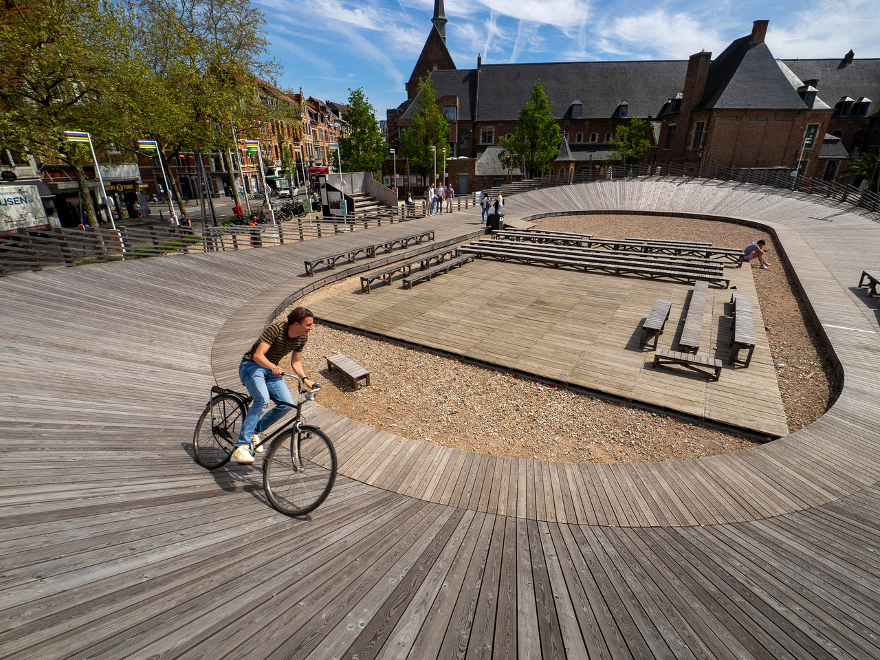
The installation on Brusselsestraat has the shape of a classic wooden velodrome, honouring the tradition of cycle racing in Flanders.
(I believe it was erected in 2021, coinciding with the UCI world championships in Leuven.
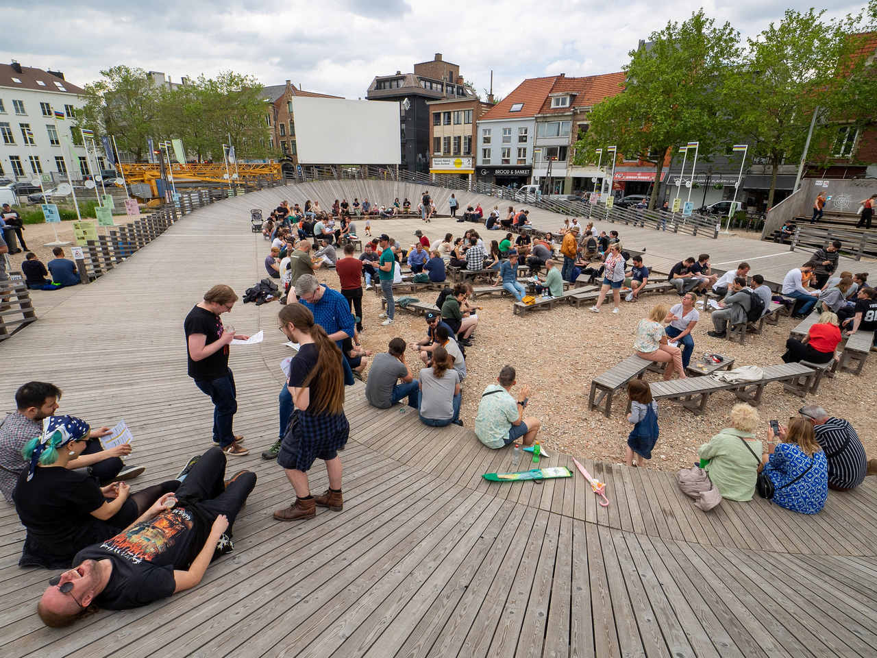
It will be taken down as the building site takes over the space.)It can be used as a real (albeit small) velodrome, but is also a gathering place for cultural performances, open air cinema and other events.
I visited the site twice to present the publisher with several options : shots from different angles and in different conditions.
Both shots were made with my (old, first gen) E-M1 and the wonderfully versatile Zuiko 8-25mm lens, at its widest focal length (of course).On my first visit, the velodrome was empty, but I convinced an eager passerby to ride his bike there, for some action interest.
On the second visit, the site was in use for a craft beer festival and the velodrome was a resting place to relax heads full of malt and hops.
These shots from Roel and my photo this week tell a story about perception. Roel discovers (or they follow him about) leading lines that miraculously emerge on diagonals from the lower corners. I tend to see flat blocks of colour (although not when I'm using B&W.) Curious.
The temporary track is a most creative idea to utilize the space. A nod to previous history and a recreational facility. The good folk of Leuven should be proud of the idea and it's an excellent inclusion for the book. It tells quite a lot about the city. -
@simplejoy has written:
some old lenses display a lot of painterly look
I've got f0.95 glass. It doesn't get much softer, but even that's not really what I'm going for. The bokeh is getting there, but it's all out of focus. That Domiron 50mm bokeh is freaking gorgeous. Adding it to the stack of lenses I wanna buy some day.
@simplejoy has written:You can try getting a transparent or glass (an old filter?) and scratching it...
There might be something in this thought. I wish I was more mechanically inclined. I keep dreaming about lens filters I wanna make and experiment on. Need to make some alerts for lens filters on the cheap.
