LEUVEN VELODROME ON HERTOGENSITE
First, I need to apologize for my extremely limited participation last week.
I have been (actually still am) in the grips of a combination of too much work, fatigue and (not serious but exhausting) illness.
I'll aim to do better this week.
For this week, I'll show you again an image or two that have been submitted to the publisher for the Guide on Leuven.
That book will be in bookstores next week and will be festively presented in the Leuven City Hall on Sept 26.
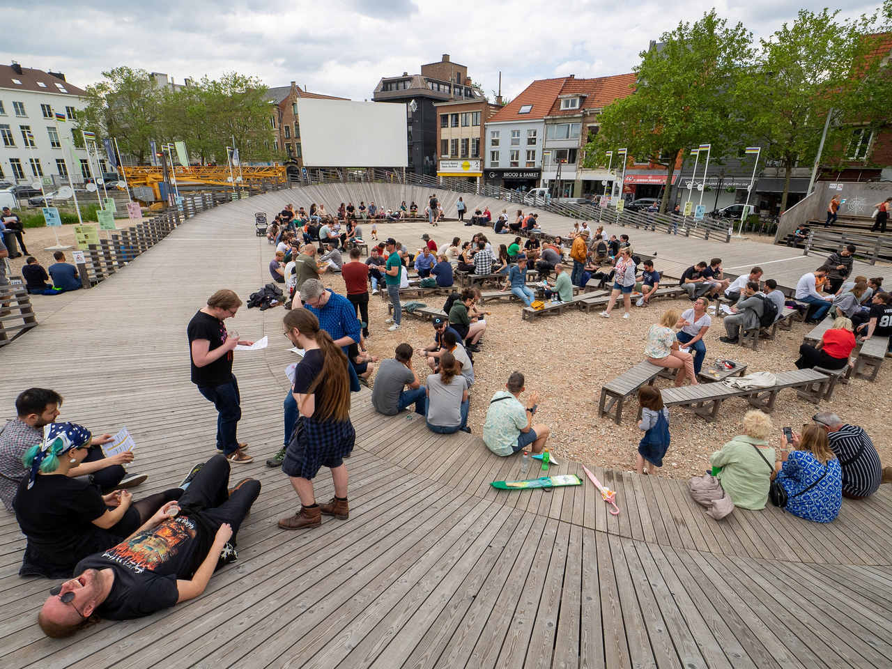
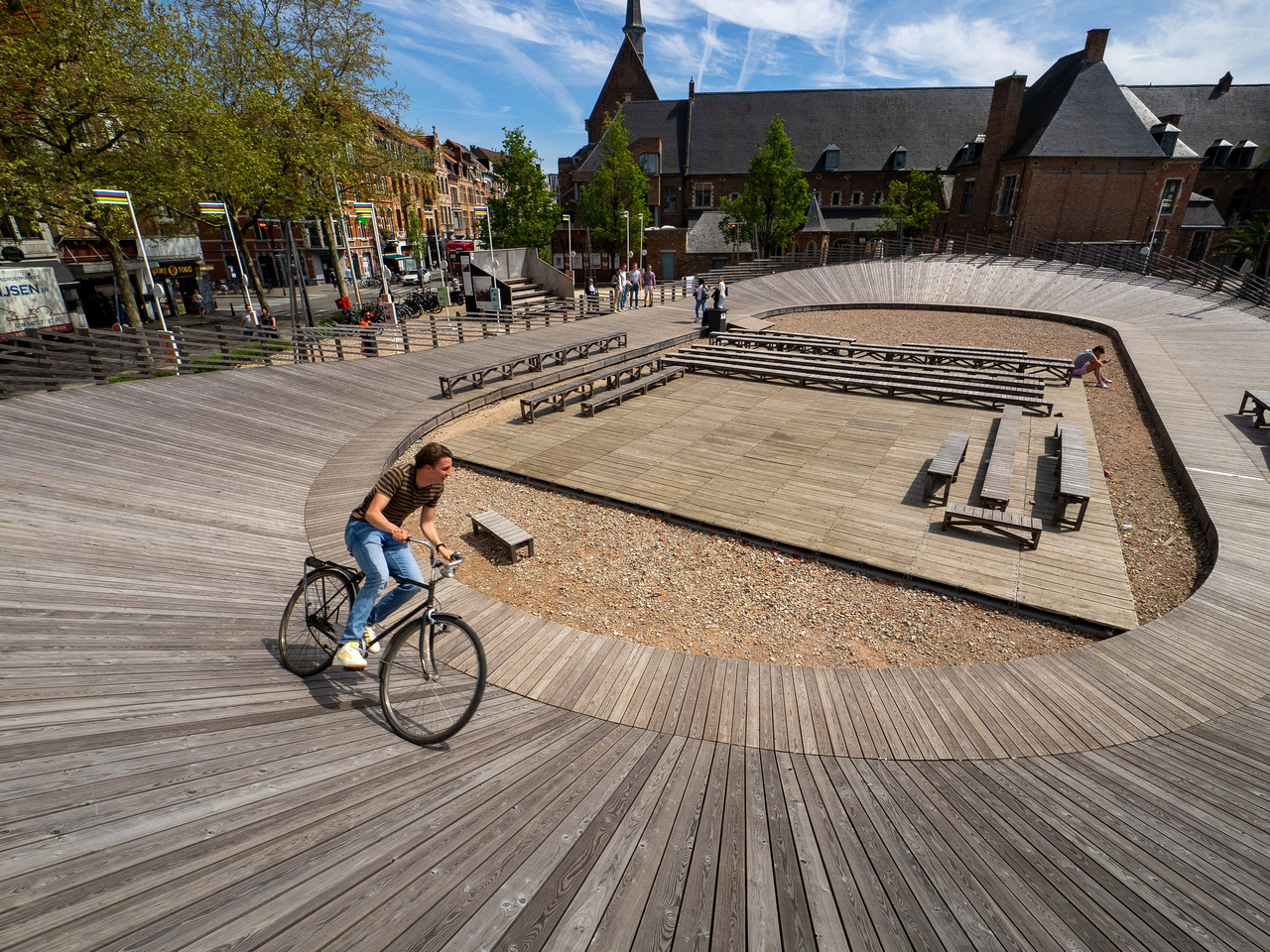
The images both show a temporary installation on the big construction site of the "Hertogensite" where new offices, residences and public spaces will arise.
The installation on Brusselsestraat has the shape of a classic wooden velodrome, honouring the tradition of cycle racing in Flanders.
(I believe it was erected in 2021, coinciding with the UCI world championships in Leuven.
It will be taken down as the building site takes over the space.)
It can be used as a real (albeit small) velodrome, but is also a gathering place for cultural performances, open air cinema and other events.
I visited the site twice to present the publisher with several options : shots from different angles and in different conditions.
Both shots were made with my (old, first gen) E-M1 and the wonderfully versatile Zuiko 8-25mm lens, at its widest focal length (of course).
On my first visit, the velodrome was empty, but I convinced an eager passerby to ride his bike there, for some action interest.
On the second visit, the site was in use for a craft beer festival and the velodrome was a resting place to relax heads full of malt and hops.