How old and what type of camera is that in the photo?
-
-
That particular one was used in the late 1800s and early 1900s. I don't have the name of it with me (I'm traveling). The particular set up of camera and lens was specifically used to take pictures of large gatherings: DAR conventions, Veterans' groups, church congregations. That thing it's sitting on is a ladder tripod about 8-10 fit tall so the photographer could get up high and get photos that showed the face of every member of a large group. He would shoot the event, make a temporary darkroom in the hotel bathroom, develop shots overnight and return to the gathering the next day to sell prints. This particular camera was also used to shoot cityscapes, tall buildings, etc that were needed for commercial purposes.
-
-
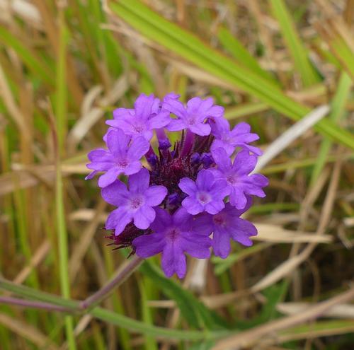
Great separation from the background. I always enjoy square crops when there's a single subject like this. Background greens/yellows could be desaturated a little, but for me, it works well this way for the color contrasts and that feeling of determination that this lone bloom is leaving the messiness below 😁
-
Thank you very much, Mike!
The first time I saw an entire orchard of mature apple trees bulldozed and piled in a heap waiting to be burned, I was shocked and saddened. Then I realized you can't compare that event to destruction of old-growth forests (a true travesty). The apple trees were simply a crop that was planted for eventual sale, like wheat or corn.
However ugly and unnatural they are, trellis-style is common. It's about getting the most yield out of the landscape at the least cost. 8+ billion on the planet? How many generations before all nutrition comes out of the chemistry lab? 😒
A little humorous aside: I'm reminded of the first few years there were Christmas tree farms in Maine. It took people awhile to realize those were simply "crops" also, and it was morally acceptable to cut and buy one 😄
-
@OpenCube has written:
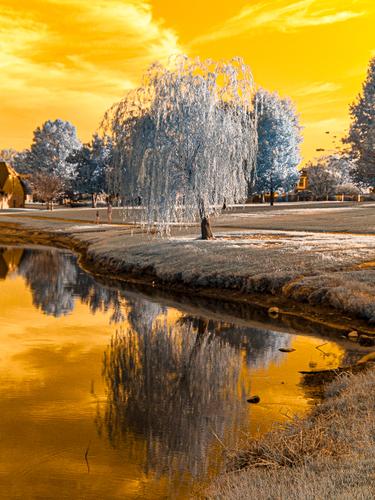
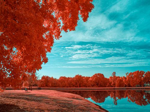
Generally I don't like photos with radically altered colours, but this one I do.
The silver grey and gold is really pleasing. If we are going to change colours to this extent, I much prefer a limited range of harmonious colours rather than a kaleidoscope of complementary and opposing shades.
I like the composition as well. The reflection fits perfectly into the curve of the bank. The darker gold gives weight to the bottom of the frame. The curved bank draws the whole image together. -
@minniev has written:@Rich42 has written:
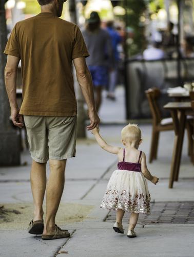
Hang on tight, little one. The road ahead is very long.
Rich
You capture a lot in the subtle workings of their hands and feet. Their feet quite match. She is walking in lockstep with him. And the angle lets us see the grip she has on his finger. The poignant little tuft of canary-feather hair is the icing on this cake. Tender moment, well caught.
Minniev has nailed it.
One small further comment. You have caught something that I love about children. Dad looks on down the road. The child is engrossed in studying what is immediately before her. The wonder of the new world as they see and touch what is immediately there.
An image that will bring a smile to everyone. Full of revealing details. -
@LouHolland has written:
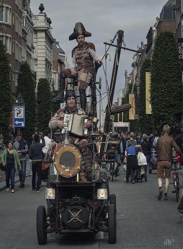
We find a description of this Belgian revelry in the contribution of Roel Hendrickx.
This colossus is built on the frame of a Deux Chevaux and yet wonderfully stable. This took place in Leuven, the university city of Flanders, Belgium.(to enlarge click image>click downarrow)
Due to private matters I am currently absent but hope to be back next week.
LouWhat has me blinking is that no one shows any interest whatsoever in this extraordinary musical contraption and its crew. I conclude that these things must be commonplace. Remarkable.
Lou, between you and Roel, I'm becoming concerned about the welfare of those who live in your part of the world. I think you should both stay inside and lock the doors. -
@minniev has written:
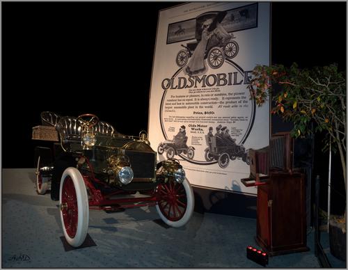
Local Photography History
Mine is a rural state and there weren't that many photography studios in the early days, mainly transient photographers who carried their equipment on their back so to speak. Last week I went to a presentation where a local researcher has gathered cameras, tripods, slides, and prints and other materials over the past 30 years. Descendants of these roving photographers have been happy to give himthe materials so there can be a historical display developed in the state museum to commemorate that work. This shows one of the weirder cameras and a shot of one of the roving photographers with all this stuff strapped to his vehicle, ready for a road trip.
I saw your post and had to go looking Paula, because I thought I had something similar, but no, if I do I could not find it. I did find three images shot at The Toronto International Autoshow in 2015 that were not shot to make a pano but I decided to give it a go anyway. It did not come out perfectly but I liked it anyway. I have included it below as image inspired by yours.
It is not a straight pano since some removal and fill was done in post but all the articles in the image were there together as shown
Andrew -
@Bryan has written:
That's quite pretty. Good separation from background, and you've done a nice job of getting that rather deep flower in focus. I usually miss something and end up with a less satisfying shot than this. I like how the grasses seem to encircle the flower and wrap themselves around it.
-
@19andrew47 has written:@minniev has written:
Local Photography History
Mine is a rural state and there weren't that many photography studios in the early days, mainly transient photographers who carried their equipment on their back so to speak. Last week I went to a presentation where a local researcher has gathered cameras, tripods, slides, and prints and other materials over the past 30 years. Descendants of these roving photographers have been happy to give himthe materials so there can be a historical display developed in the state museum to commemorate that work. This shows one of the weirder cameras and a shot of one of the roving photographers with all this stuff strapped to his vehicle, ready for a road trip.
I saw your post and had to go looking Paula, because I thought I had something similar, but no, if I do I could not find it. I did find three images shot at The Toronto International Autoshow in 2015 that were not shot to make a pano but I decided to give it a go anyway. It did not come out perfectly but I liked it anyway. I have included it below as image inspired by yours.
It is not a straight pano since some removal and fill was done in post but all the articles in the image were there together as shown
AndrewThanks for adding to the story! That's really an interesting display with the camera and car and it works well in your pano regardless of how you put it together. I wish the real car had been in mine! Yours is so elegant. Those old bellows cameras are such workhorses, and many of them are still functional. The guy that put this presentation together uses these things in his own photography, and the results are incredibly beautiful.
-
@simplejoy has written:@RoelHendrickx has written:
In this case, your lighting adds a spectacular character, because it really does look like the fiery trail of a comet flying.
IDEA : if you turned this image 90° counterclockwise, it would look like a object entering the earth's atmosphere and trailing a blaze of flames behind it.
Thanks a lot - I'm glad you like it!
I think if I turn it like you suggested I would also mirror it... Interestingly enough I have created two slightly similar images to what you describe:

O, NO! by simple.joy, auf Flickr
Starry nigh by simple.joy, auf FlickrThe second one is quite similar, but actually way smaller, so it was significantly harder to create interesting lighting...
The fiery ring is pretty amazing. I can't fathom how you think up these miniature scenarios and make them come to life. Much admiration.
-
-
@OpenCube has written:
An "autumn" color times 1,000! And a sky that creates a yummy contrast, but demands equal billing. The reflection in the water and the curve of the near bank add to my enjoyment. I really love that there are just two colors; otherwise, I might feel overwhelmed by the magic 😀
-
@Bryan has written:
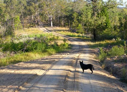
Late afternoon stroll along my new driveway
If that is your driveway then you must live on a big and interesting piece of land, with lots of nature.
I like how the dog, perfectly placed and not entangled in the background, provides a strong focal point that makes us rest the eye halfway along the meandering road. -
@LindaS has written:
Apple Futures
 The Future by Linda Shorey, on Flickr
What makes this image most interesting to me, is the juxtaposition of what is ultimately very organic, with a strong and rigid geometry.
Your specific vantage point is well chosen, because it provides us with several very different perspectives. Straight on, there is a classroom example of a vanishing point, while more to the left, the same structures create a nice play of overlaps, crossroads and triangular shapes.
Just imagine what this would have looked like if you had been standing straight in front of one of the rows of young trees. You would have had symmetry on either side of that row: also nice but not half as interesting or filled with tension. -
@PeteS has written:
Automatic Title
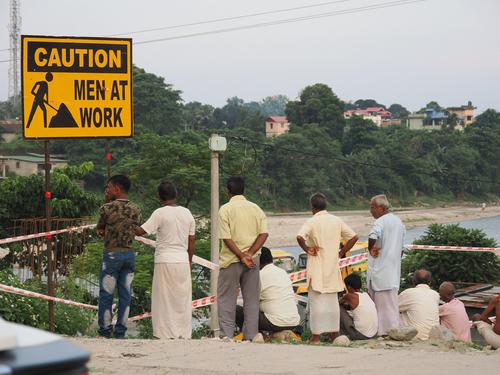
Sometimes I think hard about a suitable title, which is appropriate, gives clues about why I took the photo without spoiling the fun and giving too much away, and ideally it should have a touch of humour. But occasionally it is all so easy and I don’t need to waste my time thinking of a title, as it is all so obvious from the photo itself.
This is one of those photos. It was taken just after leaving the airport at the start of our adventurous car journey to Darjeeling and Sikkim in India. At that time we were innocent of the roads ahead, decimated by landslides from a later and heavier than average monsoon, and the sketchy sections of road with running water over the surface, which had half disappeared down almost vertical slopes into the valley, sliding in mud, trying to find the last inch or two of stable roadway to get past oncoming traffic. And no, of course we didn’t have a 4x4 vehicle, but we did have an excellent driver. Now THERE was a real man at work over the last few days. All I had to do was take photos and persuade my wife and sister-in-law there was no danger.
Tomorrow we are promised torrential rain for our day long journey through the mountains, with up to 13 litres per square meter per hour. Ideal for fresh landslides. I can hardly wait. It is my own fault, but I wouldn’t swap this for a comfortable week on a beach for the world.Now that was almost totally off topic, and what I should have said is that the photo is straight out of camera, so probably has deficiencies.
A very classic, but very effective example of a winning strategy in street photography: juxta position and contrast between what a sign tells us, and what the people in the shot portray. Those finds never fail to bring a big smile.
-
@Rich42 has written:
Hang on tight, little one. The road ahead is very long.
Rich
It's a simple shot of a (presumably) father and his young daughter, but it is made effective by three aspects:
1) good use of shallow DOF to distinguish the pair from the busy background
2) a nice synchronicity in movement, making us realize that these two are in tune with eachother
3) an effective geometry, because the little girls waist is almost exactly at the height of the edge of the father's shorts.On top of that, I like it that you have not included the whole of the father's head (I might even have cropped lower, to get rid of the top brightness).
The father is a supporting actor here, and the girl is the star.
Moreover, doesn't every father lose half his rationality and brain power when confronted with the miracle that is a daughter? -
@RoelHendrickx has written:@Bryan has written:
Late afternoon stroll along my new driveway
If that is your driveway then you must live on a big and interesting piece of land, with lots of nature.
I like how the dog, perfectly placed and not entangled in the background, provides a strong focal point that makes us rest the eye halfway along the meandering road.Hi Roel,
I took a bit of license saying "my driveway" as I live there but don't own it... Not as much wildlife as in more recent locations but nature seems to provide the odd opportunity when one looks.
I was happy when she stopped there and it was just a matter of time before she looked down the road.
