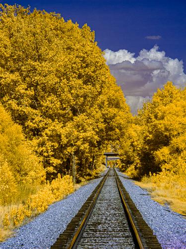
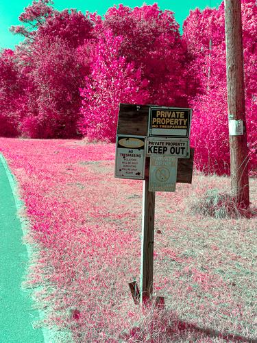
It is, what it is, is probably just the suburbs in my area. The only edit is color shifting, and reflective surfaces. Not sure which one this was, but I've been finding various materials on ebay and craft stores. There, magic trick revealed.
-
-
Fully agree with @minniev - looks like a shot from space, the clouds where stars are born. Really excellent work! 👍
-
@Bryan has written:
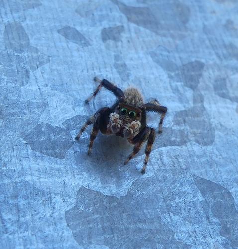
Put 'em up
Jumper on gal
I am a huge fan of spiders, and the jumpers are the cutest. I'm thinking that's your reflection in her eyes? Whatever the cause, the wide-eyed look is priceless! Gal = galvanized steel? (only thing Google would spit out) This is an ultra-charming photo!
-
@LindaS has written:@Bryan has written:
Put 'em up
Jumper on gal
I am a huge fan of spiders, and the jumpers are the cutest. I'm thinking that's your reflection in her eyes? Whatever the cause, the wide-eyed look is priceless! Gal = galvanized steel? (only thing Google would spit out) This is an ultra-charming photo!
It took me a while to work it out. The end of the lens was resting on the galvanized steel (a letterbox) for stability, but angled down sharply because she is so small. At first I thought maybe sky but it's not blue enough, and not vegetation because there was only sky behind me, and not me because she is only a couple of cms (~1") from the lens. So I decided the pupils are obviously the end of the lens, and the apparent irises are the reflection of the galvanized steel off the lens then off her eyes.
-
@Bryan has written:@LindaS has written:@Bryan has written:
Put 'em up
Jumper on gal
I am a huge fan of spiders, and the jumpers are the cutest. I'm thinking that's your reflection in her eyes? Whatever the cause, the wide-eyed look is priceless! Gal = galvanized steel? (only thing Google would spit out) This is an ultra-charming photo!
It took me a while to work it out. The end of the lens was resting on the galvanized steel (a letterbox) for stability, but angled down sharply because she is so small. At first I thought maybe sky but it's not blue enough, and not vegetation because there was only sky behind me, and not me because she is only a couple of cms (~1") from the lens. So I decided the pupils are obviously the end of the lens, and the apparent irises are the reflection of the galvanized steel off the lens then off her eyes.
You've managed to create a real life EMOJI SPIDER!!
-
-
@minniev has written:@WhyNot has written:
Looking At Me? #3
......
WhyNot
I often feel a kinship with the scenes you shoot, as they scream "Southern USA" to this fellow southerner.
Thank you .... I have spent a considerable time in the South and I have considerable family down here ... but then ....
@minniev has written:A very regional restaurant/bar scene with folks gathered at the counter with football games on the overhead screens (looks like the Saints are on the closest TV, and Saints fans are a special breed).
Actually this bar opens onto the street and I am photographing it from a public sidewalk .... I don't really follow Pro or even college football closely except as entertainment ....
@minniev has written:I like the severity of the contrasts between the lights and darks, which give the photo a look reminiscent of old film cameras (like those used for high school football games). The expression of the fellow on the right is priceless. My first thought was that he is the bouncer and he's casing you out to see if he needs to throttle you and rip out the camera card.
I suspect he is suspicious but fortunately not convinced that I am taking his picture .... Thanks for the critique ....
WhyNot
-
@LindaS has written:
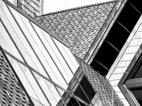
Geometry
I like the picture and yet .... I'm having a problem with many entries such as this which are abstract , geometric, color field-like .... with subjects that are like admiring a beautiful equation or a theory of everything ... When l lived near and spent time in Chicago I use to stand in front of paintings by Seurat, Pollack, Mondrian ..... but today I think I would prefer El Greco, Goya, .... but still Picasso ..... as a result I'm having difficulty, beyond that of this flat view, in critiquing many of these pictures ... Sorry about that ....
WhyNot
-
-
@JSPhotoHobby has written:
I don't feel like I'm capturing an interesting compositions. I think I need to focus more on it.
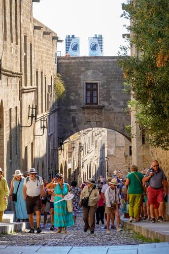
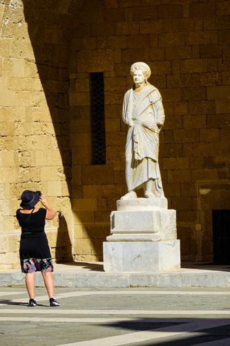
I see nothing wrong with these compositions, . ... I might have wanted something a bit different -- another frame or two from the first picture on the right to follow the road around the city (if that was in fact possible and since I wasn't there I can't tell...), I would crop the second a bit different to take out the half woman in yellow but again I wasn't there and it is your decision, .... One could think that composition might be discussed here in a C&C thread but that doesn't happen ... at least not in any depth ... My thought is that there are three types of composition -- contemplative, reactive and creative ... your seems to be that of reactive photographer .... and as such I see nothing that I would change ... much .....
WhyNot
-
@JSPhotoHobby has written:
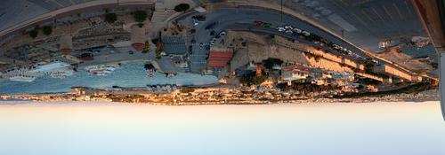
I like this one very much. Is it a panorama? Where? Perhaps the sharpening is a little too aggressive on the skyline.
David
-
-
@WhyNot has written:
I see nothing wrong with these compositions, . ... I might have wanted something a bit different -- another frame or two from the first picture on the right to follow the road around the city (if that was in fact possible and since I wasn't there I can't tell...), I would crop the second a bit different to take out the half woman in yellow but again I wasn't there and it is your decision, .... One could think that composition might be discussed here in a C&C thread but that doesn't happen ... at least not in any depth ... My thought is that there are three types of composition -- contemplative, reactive and creative ... your seems to be that of reactive photographer .... and as such I see nothing that I would change ... much .....
WhyNot
The view was limited by the ship I was on. I left out the ship at the edges. But I see what you mean by a little more.
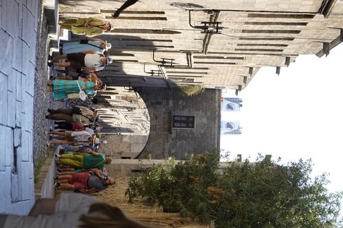
It is copped, I took out a different half a woman which resulted in another. Was trying to give a feel of community by not hiding it was an organized tour. Here's the original.
Could you explain reactive/contemplative/creative? I haven't heard this reference before. Or suggest a website or book?
Thanks for the feedback, I appreciate it.
-
Rhodes Greece
In cellphone shot.
I edited on my phone so I probably did over sharpen, tough for me to tell on this screen.
Thanks for the feedback. -
@JSPhotoHobby has written:
I don't feel like I'm capturing an interesting composition. I think I need to focus more on it.
For me the compositions all work. The first is quite nice as a phone pano, showing old and new elements of the city's architecture, and a healthy swath of the harbor. I don't think you really need the edge of that tall thing right on the left border, it doesn't add, but neither does it much detract. You'd have more leeway with editing with a photo from your regular camera, I think. I know it's that way for me.
I like the tourists trudging uphill through the portal, with the ship's stacks in the background. The Telltale Sign-On-A-Stick explains that this is a cruise ship tour group, and very likely those filing past them are from a different tour. Most of us have had this experience and easily recognize it - the hasty glimpse of some exotic city in an exotic country we may never have seen and may never see again, where we come armed with cameras ready to make the most of our short stay and take home our memories.
The image of lady and the statue is nicely arranged, the two humans, one flesh and one stone, facing off in the bright sun. The lines and shadows support the composition and there are here no distractions, just the two figures, facing one another across the centuries.
I share your general sense of frustration though. It is nearly impossible to choose our best compositions while we are trying desperately to keep up with the woman with the Sign-On-A-Stick, since losing her could get you lost from your group, or your way back to your ship, in a place where you may not speak the language or have any familiarity with directions. I always set my camera on auto, grit my teeth and snap away, hoping for good luck rather than good sense.
-
@OpenCube has written:
This is pretty funny. It merits the exotic, garish colors you've created for it. The three lines hold it together compositionally but the wording is what makes us smile. Well spotted.
-
@OpenCube has written:
Yellow and royal blue always work as a color scheme, and railroad tracks always work as leading lines. The big puffy nature of the trees and clouds work well together. I am not sure I wouldn't get rid of the pagoda-looking thing that goes over the tracks, its disappearance into the trees is a little too jarring, and there's some other spots of gray around it that bother my eye if I look too close.
-
@JSPhotoHobby has written:@WhyNot has written:
....
WhyNotThe view was limited by the ship I was on. I left out the ship at the edges. But I see what you mean by a little more.
It is copped, I took out a different half a woman which resulted in another. Was trying to give a feel of community by not hiding it was an organized tour. Here's the original.
I like this second as I prefer the half person walking away rather than toward me!! ... Maybe a personal quirk ....
@JSPhotoHobby has written:Could you explain reactive/contemplative/creative? I haven't heard this reference before. Or suggest a website or book?
Thanks for the feedback, I appreciate it.
I think of composition from the perspective and inclination of the photographer. A bit of amateur psychology that we are predisposed to one of these three approaches ... As far as I know I have made these categories up but I'm sure I'm not the first to have done so -- I've just never run across this approach .. Early photography was closer to painting and the view camera required some effort to set up and use. Adams, Weston and others of this group were best known for landscapes and still life's much like the late 19th century painters who worked on site This approach requires site, time and intent and making adjustments to a selected scene by burning and dodging (in early days) rather than with a brush .... Leica introduced us to reactive photography -- reacting to the scene in front of us -- with war and street photography. Photo-grams have been around for a while but with photo tools -- Man-Ray and Moholy-Nagy are the ones I associate with it. More recently with digital it has become easier to combine multiple photo and use the digital tools of the Post Processing software -- and thus the abstract and color fields we often see here -- creative -- creating something not seen by the camera alone ... Not sure how this helps but I find that the compositional elements I use seem to depend on which approach is being used -- and I rarely do anything but react myself ...
WhyNot
