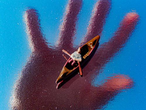
If you've seen Deliverance, you'd know I wasn't smiling looking at it.
-
-
@OpenCube has written:@minniev has written:
Suspecting this is another reflective image, I'm curious about what is reflected, whether you created or edited the reflection, and how it was done.
It is, what it is, is probably just the suburbs in my area. The only edit is color shifting, and reflective surfaces. Not sure which one this was, but I've been finding various materials on ebay and craft stores. There, magic trick revealed.
What a terrible avatar, this one invites us to stop looking at your photos. Pity
Lou -
@LouHolland has written:
What a terrible avatar, this one invites us to stop looking at your photos. Pity
LouI assume this was directed at me...
Somewhere in a supermax prison, one of the worst humans living on the planet today, would probably be amused that someone found a cheap plastic plate with BBQ sauce smeared on it more terrible to look at than their face.
I'm sure around Nov 3rd it'll be something different again because October will be over.
-
@OpenCube has written:@LouHolland has written:
What a terrible avatar, this one invites us to stop looking at your photos. Pity
LouSomewhere in a supermax prison, one of the worst humans living on the planet today, would probably be amused that someone found a cheap plastic plate with BBQ sauce smeared on it more terrible to look at than their face.
I'm sure around Nov 3rd it'll be something different again because October will be over.
I assume this was directed at me...
Yes, you're right, it was my personal opinion. On the other hand, you are free to do so.
So I should have better kept my mouth shut. But freedom of speech makes it
possible to express myself this way, just as you are free to choose this terrible avatar ;).
So burn me down, I can handle it.Lou
-
@JSPhotoHobby has written:
(/a/thumb/FPcyHqKlm0XxdB7DbaLL4uY9CcX7kn6YMUWmX8BLt3EBVvOT4S1eZI0bh7xGVr0B/17135/?shva=1)](/a/FPcyHqKlm0XxdB7DbaLL4uY9CcX7kn6YMUWmX8BLt3EBVvOT4S1eZI0bh7xGVr0B/17135/?shva=1)[![_DSC5785.jpg]
I don't feel like I'm capturing an interesting compositions. I think I need to focus more on it.
JSPhotoHobby
That narrow street with all that colorfull peopleis is fantastic. The whole combination got an almost biblical appearance
and those two modern ship buildings above the arch makes it an almost surrealistic combination.However I like that shot a lot.
Lou
-
@LouHolland has written:
So I should have better kept my mouth shut.
I don't think so. It's an honest opinion. It's fine. I have no desire to burn you down. I find the whole thing amusing. Tad bit of blood and an image is disturbing, harmless looking photo of one of the worst people alive, no one batted any eye for months.
-
-
@OpenCube has written:
This is a nicely executed conceptual image that could be interpreted a number of different ways. I prefer to see it as a nurturing hand ready to save the boater if he sinks. That the boater is an obvious toy figure makes it even more poignant. But it could be seen many different ways, from protection to salvation or as a creepy threat, about to pull the boat and its occupant under and destroy them. Giving the viewer the freedom and the raw materials to form their own concept out of yours is a great way to approach photographic art, and one we don't see enough of.
From a critical perspective, you could lower the highlights a bit on the boater. But that is trivial and superficial advice.
This is really good. I continue to be impressed with the prolific nature of your creativity.
-
@minniev has written:@OpenCube has written:
This is a nicely executed conceptual image that could be interpreted a number of different ways. I prefer to see it as a nurturing hand ready to save the boater if he sinks. That the boater is an obvious toy figure makes it even more poignant. But it could be seen many different ways, from protection to salvation or as a creepy threat, about to pull the boat and its occupant under and destroy them. Giving the viewer the freedom and the raw materials to form their own concept out of yours is a great way to approach photographic art, and one we don't see enough of.
From a critical perspective, you could lower the highlights a bit on the boater. But that is trivial and superficial advice.
This is really good. I continue to be impressed with the prolific nature of your creativity.
Interesting.., I‘m pretty sure that boat is in grave danger! 😱 Very well done @OpenCube
-
@RoelHendrickx has written:@simplejoy has written:

Don't fret! Go where inspiration leads you. by simple.joy, on FlickrThat seems like it is light-painted, but I am wondering about the reflection on the surface of the guitar neck.
I don't think I remember ever seeing a "paint with light" image where the reflection of the painted light was so prominent (and wonderful).@minniev has written:I hope you'll tell us what that is - a guitar, yes, but how did you accomplish the lightning strike ricocheting off the strings? It seems to be vibrating in response to something, perhaps a played chord? I dunno, but it's fascinating, as your creations often are.
I'm sorry for not responding earlier to your question - forgot about it... Thanks a lot for your interest.
It's just light painted as @RoelHendrickx suggested. The reason why it's as prominent in the reflection probably is caused by the direction the I was holding the light. In order to not cause the lens to flare and loose contrast, I turned the (small) light source slightly away from the camera. That probably increases its intensity in the reflection. With the shapes of the light painting it's a bit of trial and error, but mostly about intuition/feeling which is quite fitting for the way I make music as well.
