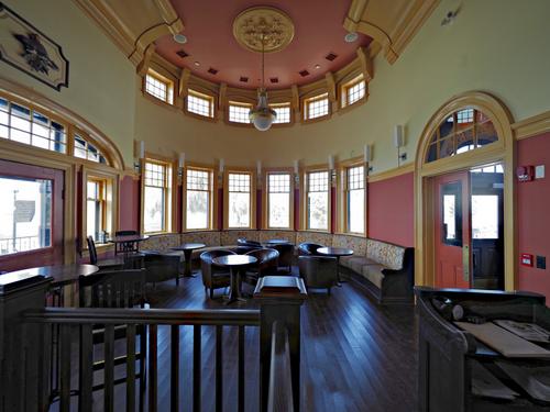
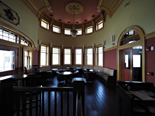
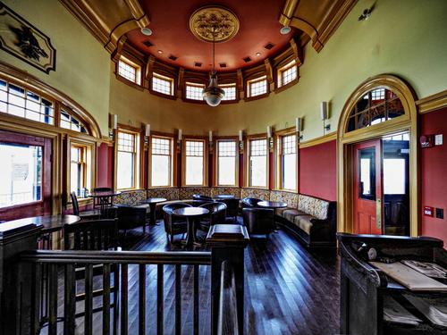
It's a challenging place to shoot, because of the big range difference between the bright light behind the windows and the extremely dark lower part of the interior (floor and furniture), with the walls and ceiling somewhere inbetween.
I feel like you have tried to reach a balance, in order to not blow out the highlights completely, but it really leaves the darkest parts too dark to be pleasant, and the middle tones are also a bit underexposed for my liking.
Since the windows will be too bright no matter which way you approach it, I would go all in on getting better exposure for the walls and that floor.
This is where the tools that allow you to brighten up selected parts of the images (not by masking, but by just concentrating on the dark tones) could probably work wonders.
-
-
-
@ChrisOly has written:
1907 Train station in Goderich, Ontario has been transformed to become a restaurant on Lake Huron. Needless to say it is fab inside...
I actually liked this the way you did this ... However after reading several critiques that thought it a bit dark I thought I'd give it a try .. a bit different than David's
Using Affinity Photo, Tone Map and some soft light ....
WhyNot
-
-
@RoelHendrickx has written:
THE AMAZING KATHLEEN
Another image from the small circus festival in Turnhout.
This performance was much more modest in scale.
A single woman doing fairly simple acrobatic acts, but with a great sense of humour about her "single mom/artist" situation.
(For instance: things "went wrong" and had to be improvised with a member of the audience,
taking calls on her phone in the middle of an act, from her babysitter who she had left home with her child, etc.)
Funny and ultimately very well done.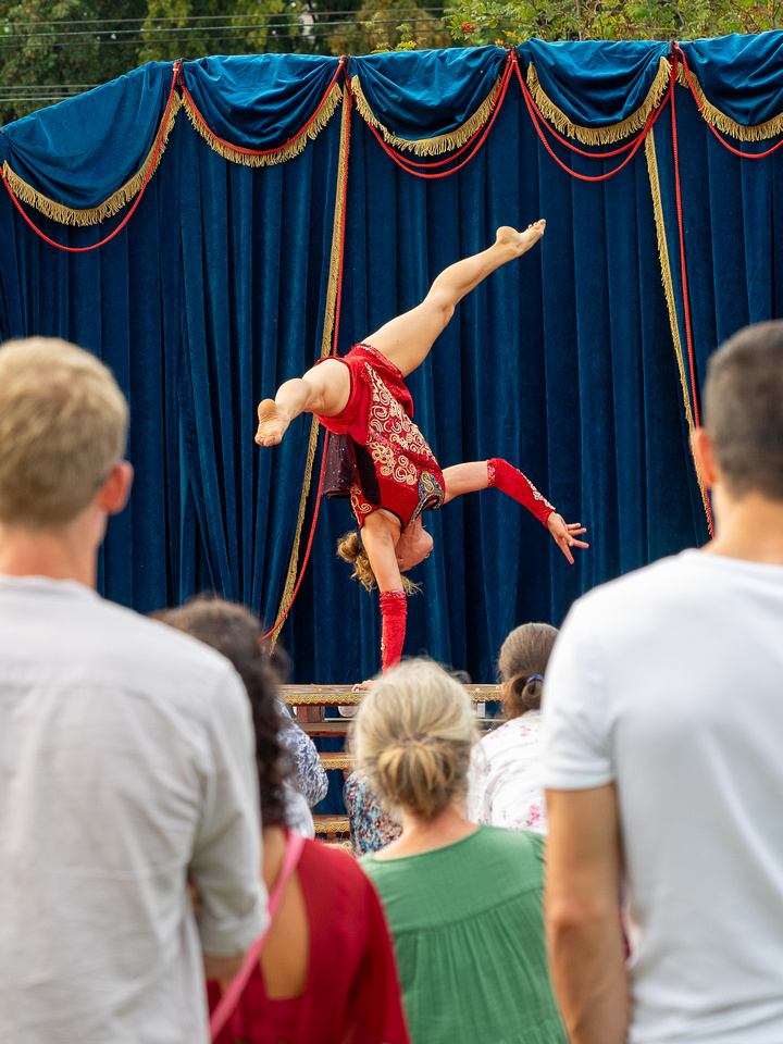
Remarkable balance caught at the perfect second. Her red spangled costume calls extra attention to her and is re-emphasized by the small triangle of red in the clothing of the observer. The lines of the curtain provide framing. I wish her balancing hand weren't obscured by the head of the onlookers, visibility there would make for a better image. I think I would crop down just a nudge to limit the effect of the overhead power lines some, leaving enough foliage to make it clear this was an outdoor event. Another interesting public event transferred into an engaging photo.
-
@JimStirling has written:
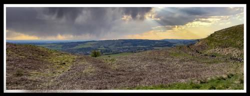
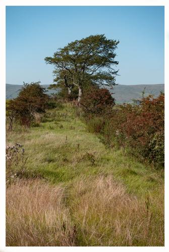
We recently moved house to near where I grew up . Since getting back on my feet I have been wandering about my old haunts the first is a view from the Campsie hills above Lennoxtown where I spent many happy hours. The next is just next to my old primary school where I spent many many hours 😀
Returning to old haunts can open an entire world of photographic opportunities, and I hope you'll keep sharing them here. I have had a similar experience in regaining my grandparents' farm and home, participating in its ongoing rescue, and discovering new and old treasures.
The first image has an absolutely glorious sky and a great angle of view. The landscape itself is less appealing than the sky, as it appears to be wearing its end of summer clothes, where lots of the greenery has dried up as it has where I live. It may yield more interesting foliage at different times of the year, but for now I might crop some of it even further, or shift the crop upwards if more sky is available in the shot.
The second shot is a gem. I can't imagine the pleasure of childhood schooling near such a spot, it would be like living inside a wonderful book or movie. There is a powerful leading line that runs from the right corner to tree and right up the twisting trunk and limbs of the tree. The grasses, which have a sensation of movement, help fan us rightward to that line and push us to follow it up the ridge. We see enough of the distant view to know it's wonderful, and it draws us toward that edge. The colors are of a slightly muted palette but still rich and visually rewarding. An exceptionally nice image.
-
@simplejoy has written:

Don't fret! Go where inspiration leads you. by simple.joy, on FlickrI hope you'll tell us what that is - a guitar, yes, but how did you accomplish the lightning strike ricocheting off the strings? It seems to be vibrating in response to something, perhaps a played chord? I dunno, but it's fascinating, as your creations often are.
-
@Bryan has written:
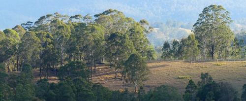
It's not a stitched panorama, but a heavy crop of the lower foreground. As such it's probably best viewed as is because at 1:1 is clearly oof.
This is quite a pretty landscape image. The haze and the crop and the resultant softening have rendered it into something more artistic than you might have intended when you spotted the scene, in which case you have a happy happenstance. It looks like an Australian version of a Hudson River School painting. The light is quite wonderful, and the contrast between the clearing and the trees, and between the foreground and the background are painterly in nature. At first glance I wondered if the fencing detracted, but I concluded it is adding to rather than taking from the composition, a small reminder of human occupation without intrusion. I think it might make a nice canvas print if you didn't go too large with it.
-
@Fireplace33 has written:
All you can eat, fish dinner
So how does a seagull catch a bottom living flat fish and bring it to the beach?
The water was quite shallow here, no big waves. 15 mins later the head was gone and it was still hacking away, making small holes through the tough skin.
That looks like a flounder and I cannot remember ever seeing a gull wrangle one of those before. Perhaps he found the flounder floundering on the shore and took advantage?? He's working pretty hard at the task. You caught the action quite well, with him dragging the unlucky fish through the surf and using foot and beak to dismantle it for consumption. The photos are angled well and sharply caught. When I watch birds work their prey I appreciate their ancestry and see the dinosaur inside. We underestimate their strength and tenacity as hunters because of their size, but when you compare their size to that of their prey, they are darned impressive.
-
@LouHolland has written:
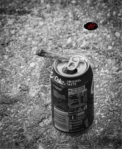
A can of coke and a joint seems pleasure forever 😇
(oh by the way, I don't smoke nor drink, it must be from one of the dock workers of course
because I have been there for a special occasion) LouI had to smile when I saw this because my first choice for posting this week was more than a little similar. Sometimes we seem to run into shared thinking across the thread. I'll hold mine for next week.
What people leave on dock tells a story of who they are and of the dock. It's a signature set up that proclaims how the owner spent his time there. Simple, unfiltered, presented in monochrome for further simplification. A photographic short story.
-
@ChrisOly has written:
1907 Train station in Goderich, Ontario has been transformed to become a restaurant on Lake Huron. Needless to say it is fab inside...
A gorgeous room photographed from a perfect angle to show off all its architectural features. It did benefit from the editing David and Whynot offered, both of which bring out the beautiful details in the woodwork, and balance with the brightness outside. It is probably a shot that might have done well with an HDR capture. Our Oly's do a pretty good job with the in-camera HDR, which I often try when faced with this situation (my old house is from a similar era and has the challenge of dark wood inside and great big windows that let in tons of light.
-
@WhyNot has written:
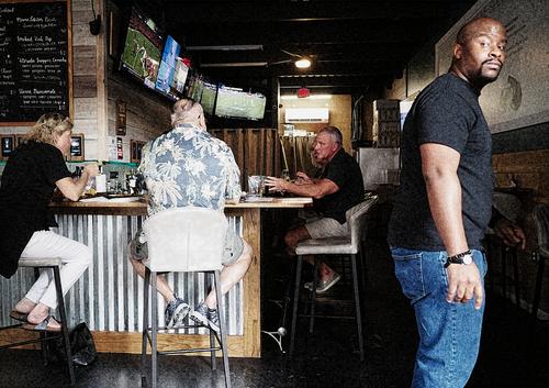
Looking At Me? #3
WhyNot
I often feel a kinship with the scenes you shoot, as they scream "Southern USA" to this fellow southerner. A very regional restaurant/bar scene with folks gathered at the counter with football games on the overhead screens (looks like the Saints are on the closest TV, and Saints fans are a special breed). I like the severity of the contrasts between the lights and darks, which give the photo a look reminiscent of old film cameras (like those used for high school football games). The expression of the fellow on the right is priceless. My first thought was that he is the bouncer and he's casing you out to see if he needs to throttle you and rip out the camera card.
-
@OpenCube has written:
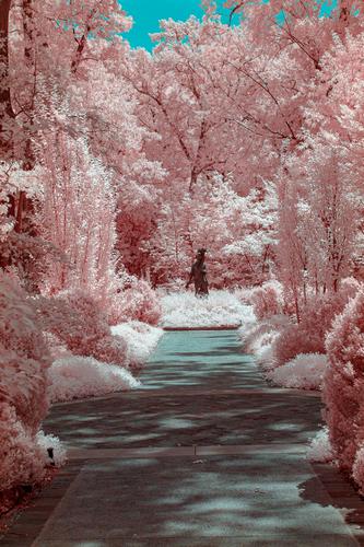
"Frozen" Meets "Strawberry Shortcake". The cotton candy "snow" as turned this garden into a fairytale world. The pink snow is shoveled from the walkway. Not sure what our princess is lugging around, it looks like a palm tree, but she is untouched by the pink frosting. It's a quirky image but it works. The pink snow looks great.
-
@LindaS has written:
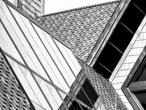
Geometry
You have a great eye for geometry! Not many of us would have spotted this opportunity. Angles of all varieties, filled with graphic design elements of multiple textures and tones, isolated thoroughly enough from the context to force us to view them for their own qualities rather than as a part of a recognizable whole. Monochrome does its job of simplifying the colors into the tones to help us digest the image as an abstract. Well spotted and well organized.
-
@Rich42 has written:
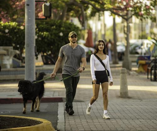
Do not even pretend to establish eye contact with this woman! Whew!
Rich
The first thing we note is how well - guarded this lady is - man and dog are both large, fit, intimidating in their presence, and made somewhat more intimidating by the lack of visibility of their eyes. They scour the scene for threats and we don't know where they are looking. Meanwhile, she walks on, confidently.
Well spotted and captured. The composition works, with the trio emerging between two posts and following a clear paving line. Use of color is nice, and the light is lovely.
-
@Sagittarius has written:
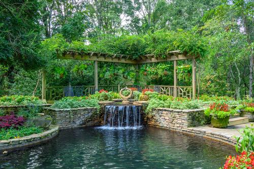
Another one from serenity place
The scene is calming, filled with lush greens, a splash or two of red to act as punctuation. The trickling waterfall adds dynamic movement. The composition offers a couple of stacked leading lines, first of the pool, then the flowing water, then the posts of the pagoda (or whatever that is). It is a visually very satisfying image. Since the sky is without color, I might crop down a bit to alleviate some of the white space that shows up between the limbs.
-
@OpenCube has written:
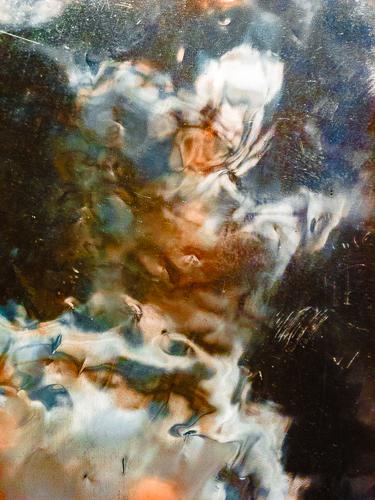
Suspecting this is another reflective image, I'm curious about what is reflected, whether you created or edited the reflection, and how it was done. It almost looks like one of those space telescope photos of distant galactic explosions. the colors are interesting and work well together (the blues and oranges always work). It's possible to find images inside such as this, as you would in clouds. I see a Squirrel King, carrying his scepter and sitting on a tuffet.
-
@Bryan has written:
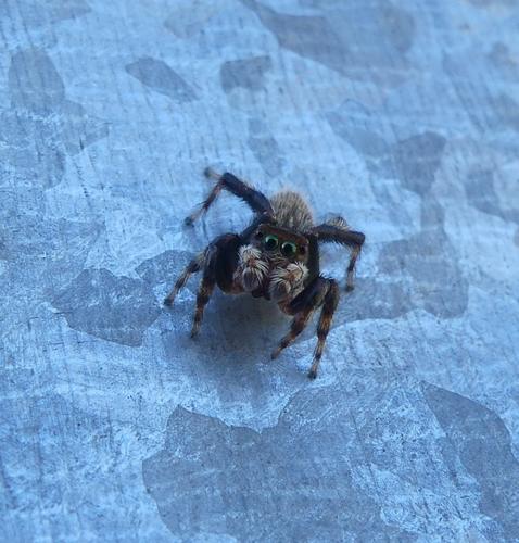
Put 'em up
Jumper on gal
She's a cutie! Almost comical as she sidles along across whatever that mottled blue surface may be. Definitely, face forward is her best angle. I think I might crop a bit off the top to get her out of dead center and make more of her sidewinding pose.
