For me it works a charm.
I am not in the camp of those who think that the dancers are too small in the frame.
The dancers are interesting in themselves, but the context of the temple (and especially the technique of using a reflection in a puddle - really one of my favourite party tricks!!) adds so much more.
I think that probably this would ultimately work best in a series of photographs: one of the whole scene (like you made, cleverly avoiding the spectators for the most part), and then follow-up images of the dancers in true closeup, but also maybe some abstracts of angles on the temple.
-
-
@MikeFewster has written:
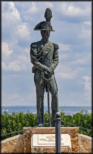
Everybody loves Italian ice-cream, if only they can remember where they put it!
A very amusing take on a very ordinary statue, which just proves it doesn’t have to be Bernini or Michelangelo to be interesting, if you have the right frame of mind.
Pete
-
@RoelHendrickx has written:
THE (FAIRLY) STRAIGHT AND NARROW
In 2011 we decided to travel to Iceland for a hiking vacation.
The idea was to go the volcano that had caused a major air traffic meltdown in 2010.
We wanted to go thank that volcano for having extended our vacation in North-Vietnam with another 10 days, spent in Singapore.
And unexpected but happy discovery.So we round up a group of friends, hired a driver and guide and went on our hiking tour.
One day trip had us really hike over the sides of the volcano, where digging just 10 cm into the earth, made us experience the residual heat in the lava ashes.This is a photo from that hike:
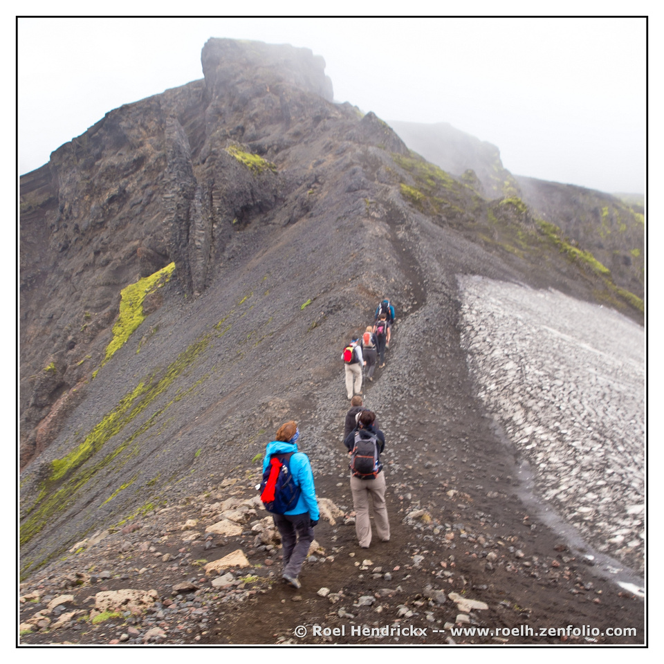
(I can hardly believe that in those days, I carried a backpack and a hip bag with not just my hiking essentials, but also an Olympus E-5 body with grip and extra batteries, three quite heavy lenses and a smaller spare camera body...)
Quite the leading line you have there, alive and moving up the snake like trail towards the cloud covered summit. The supporting lines all lead to the main one, forcing us to climb with them. The specks of red in the backpacks help keep us on track. Good image.
-
@Bryan has written:
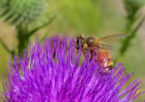
Good one! The bee is sharply in focus, as is the nicely rounded arc of the colorful thistle (?) he's working on. We can even see a few bits of loose pollen he hasn't tucked away thoroughly. The catchlight is a nice inclusion. There's nothing in the way, no barriers to seeing the main characters, and the background is nicely blurred but not unrecognizable.
-
@MikeFewster has written:
The ice cream cone on his helmet looks supersized. Of course it's set against a sky full of whipped cream clouds so the comparison works easily. Well exposed and focused, he stands against a backdrop of sea and foliage, well lit for detail despite the bright sun.
-
@ChrisOly has written:
Skinner's Bluffs
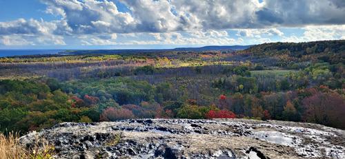
Nostalgic ritual - every year in the Fall I visit a very unusual place where amazing and beautiful bright Autumn colours can be seen. This year's sampling...
Looks like a place I'd want to return to as well - richly colored early fall foliage, a nicely textured rock cliff to stand on and view it all, what looks to be a distant shoreline, magnificent skies providing great photogenic lighting. If I were you I'd be puzzled about how to deal with the leveling of this one. It has an impression of leaning leftward, but because the coastline is straight, I think that is just an illusion caused by the way the clouds are, and the slope of the land.
-
@Fireplace33 has written:
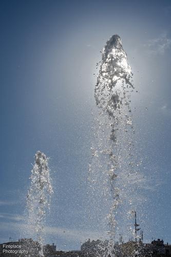
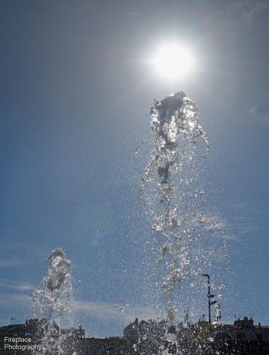
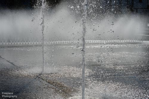
Millions of water droplets
It was hot on this day in Portugal. Nice to sit by a fountain and watch the light shining in all those little droplets.Interesting and creative images made almost entirely of water. I like the edits offered by SimpleJoy and Linda as well. The detail in the upward burst of water is what makes the image have such visual appeal so I'd leave off the background context and just stick with the water and the feeling it creates in the viewer. The blue sky in the first two makes a great backdrop but the almost monochrome palette in the third works well for its abstract nature. Nicely spotted/caught.
-
@simplejoy has written:

Molecular cooking by simple.joy, on FlickrAs usual I have no idea what you have done here, but it's intriguing and makes me imagine a gigantic machine having created a new planet to the universe and carefully placing it in its orbit. The colors, ranging yellow to orange to red, are set against a blue background for a pleasing color contrast. The framing of the metallic "arms" seem to be gently releasing the new world, leading the eye from the left to the subject on the right, taking us through the whole image. Very nice.
-
@OpenCube has written:
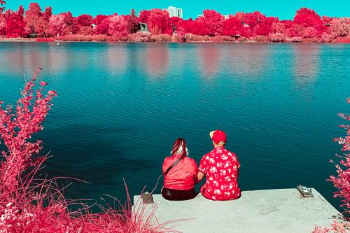
There is humor in this one, and the color shift has probably added humor to the couple's outfits. Having it simplified to two basic color groups seems to help keep all the disparate elements coherent. A nice composition with the subject lower right, but harnessed between horizontal lines that are pretty uniform and offer a balanced feel. I'm not sure I wouldn't have doctored on her hair which is a bit skunk-like. There is some odd haloing around the couple that I can't guess the cause of but I would try to figure it out and mitigate it if I could.
-
@RoelHendrickx has written:
THE (FAIRLY) STRAIGHT AND NARROW
In 2011 we decided to travel to Iceland for a hiking vacation.
The idea was to go the volcano that had caused a major air traffic meltdown in 2010.
We wanted to go thank that volcano for having extended our vacation in North-Vietnam with another 10 days, spent in Singapore.
And unexpected but happy discovery.So we round up a group of friends, hired a driver and guide and went on our hiking tour.
One day trip had us really hike over the sides of the volcano, where digging just 10 cm into the earth, made us experience the residual heat in the lava ashes.This is a photo from that hike:

(I can hardly believe that in those days, I carried a backpack and a hip bag with not just my hiking essentials, but also an Olympus E-5 body with grip and extra batteries, three quite heavy lenses and a smaller spare camera body...)
Compositionally quite interesting - the off centre view of the path works, as does the choice to go for realism with contrast and colours.
-
@OpenCube has written:
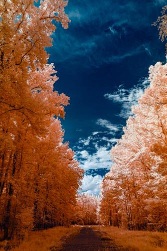
This one is quite mad. It works. I don't know why, but it works for me. Infra red or achieved through post processing?
-
@LindaS has written:
Spider Silk
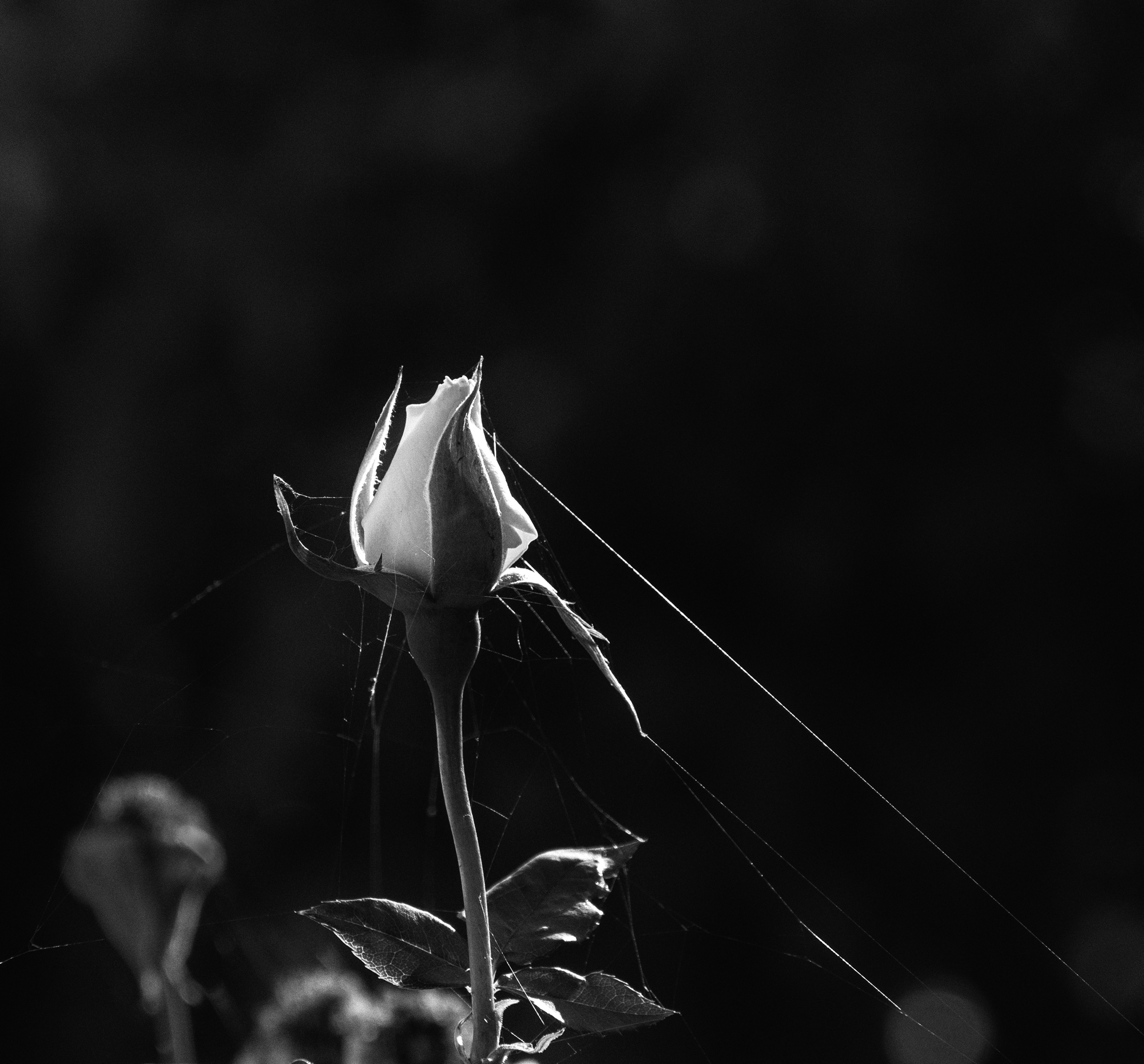 Spiders love rosebuds too by Linda Shorey, on Flickr
This is exquisite. The beautifully rendered rose, not yet fully open, is in gentle directional light that also illuminates the delicate strand of the spider web. We follow it up from the right lower corner and discover the spider has done her work even more delicately on other parts of the rose and perhaps has already snared a tiny snack or two. None of that detracts, because of its subtlety, and actually makes the story richer and about more than simple beauty. The monochrome treatment is perfect, silvery, and consistent with the subject matter. A wonderful, frameable image.
-
@JSPhotoHobby has written:
I stitched to make a pano. 3rd largest existing colosseum. this one is in Croatia.
The Black and White version is my favorite. I wish I had a few more images so the first image in color could have been the final product.That's a pretty amazing structure and one I'd never heard of. Nicely put together from however many captures you got - it all fits and works. I agree with you on the monochrome if for no other reason than to minimize the intrusion of the tourists. The two in the light would have been fine - they add scale and interest - but the big groups on the right and across the structure don't really add anything.
As for wishing for more photos to get more out of the first pano, you might get a decent result from AI by asking it to fill in what's missing. It looks like one AI might do well on.
-
@tinternaut has written:
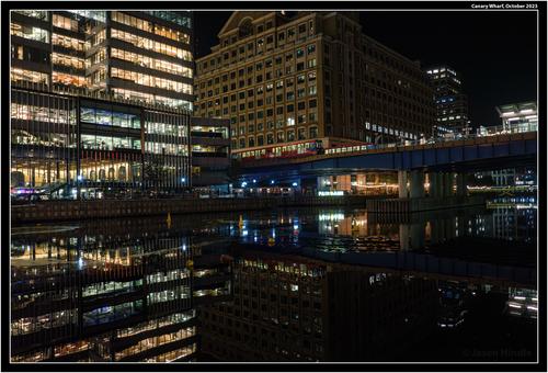
Canary Wharf at night. High ISO shot messed about with Adobe’s latest de-noise and Topaz Sharpen.
Welcome home, Tinternaut! Glad to see you back. This is an intriguingly complex image with all sorts of hidden treasures. Because it's a night shot the reflection point is less discernible and we have to search it out. The different kinds of glass and lighting in the buildings creates more color variation than would be expected so we have that to puzzle on too. There are sharp angles that get confusing below the water line. The new tools from Topaz and Adobe served you well (I use both, and am grateful for them for solving problems I've needed help with for years). This would make a confounding jigsaw puzzle.
-
@Sagittarius has written:
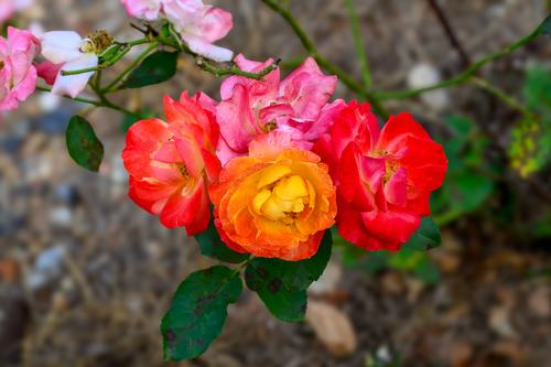
This rose has been planted by my 6 years old granddaughter earlier this year and it is blooming now. Interesting that there are different color flowers on the same bush.
Anyone who's looking at this one without clicking on the larger more detailed version is missing a treat. The roses are so beautifully detailed and the colors so rich. I don't know that I've ever seen such different colors on rose blooms on the same bush. The ground beneath them might benefit from more blur since it's not that pretty. I might try to blur it more or crop in closer to focus more on those gorgeous and beautifully photographed flowers.
-
@minniev has written:@tinternaut has written:
Canary Wharf at night. High ISO shot messed about with Adobe’s latest de-noise and Topaz Sharpen.
Welcome home, Tinternaut! Glad to see you back. This is an intriguingly complex image with all sorts of hidden treasures. Because it's a night shot the reflection point is less discernible and we have to search it out. The different kinds of glass and lighting in the buildings creates more color variation than would be expected so we have that to puzzle on too. There are sharp angles that get confusing below the water line. The new tools from Topaz and Adobe served you well (I use both, and am grateful for them for solving problems I've needed help with for years). This would make a confounding jigsaw puzzle.
Believe me, I would come back more often but the day job has been crazy (in one part - amazing in the other two) this past year.
-
@LouPhoto has written:
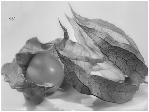
Physalis peruviana / ananaskers = pineapple cherry
Thanks for looking
My name is LouHolland but I could no longer log in, so I now have a new registration with the name LouPhoto.
SorryTo Enlarge, click image, click downarrow
Well, I'm glad you were resourceful enough and determined enough to get back in! I bet if you email the admin AlanSh he will help you solve the login problem, but we are glad you're here no matter which Lou you come in as.
I am not sure what a pineapple cherry is but you have presented us with a fine artistic photograph of it. The featureless light background is the perfect backdrop for such a fragile botanical specimen. The berry or fruit itself looks as delicate as a soap bubble and the dried leaves curled around it and nearby are translucent but full of detail. Even the shadows become part of the artistic whole. The range of tones is complete.A really beautiful piece.
I want to go to an art show that has yours and Linda's offerings printed and framed along with other similar offerings in the same category.
(I am not crazy about the placement of your logo, though I'm sure you have your reasons for choosing that spot. I'd have relegated it to the bottom so it didn't snatch my eye from this lovely thing.)
-
@Bryan has written:
.
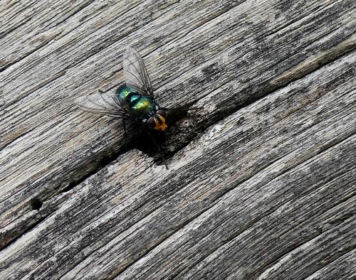
You have having a bug week, Bryan. This one is interesting too, with all his iridescent greens, blues, and yellows. He is apparently extricating something (probably lunch) from the hole in the wood. He and the wood are well in focus, even the wings and the hairs on his rear end. Nice choice compositionally to have the lines in the wood running from the lower left to upper right corner, perfect for visual perception. You might could mitigate the "black hole" look beneath his head by raising the shadows a bit. That much blackness is a bit of an eye magnet.
