• Members 523 posts
    Oct. 13, 2023, 11:01 p.m.

    It's very eye-catching! I love the idea of you and the other locals watching the scene over time as nature reclaims what's hers.

    I'm thinking that non-local people viewing for the first time might require an explanation, however, and that their response might include a little head-scratching 😀

  • Members 1662 posts
    Oct. 13, 2023, 11:05 p.m.

    After having re-viewed your image again a couple of times, I take back my recommendation of cropping it... I think it works very well as it is. Not every image has to scream "THIS IS THE MAIN THING, LOOK HERE!" and your composition works well with the colors being nicely balanced! 👍

  • Members 44 posts
    Oct. 13, 2023, 11:12 p.m.
  • Members 1403 posts
    Oct. 14, 2023, 12:01 a.m.

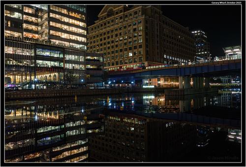
    An excellent example of how to balance large areas to one side with a longer horizontal line and small object to the other side. Archimedes' lever and fulcrum principles work visually as well.
    The decreasing brightness in the buildings adds depth and interest.
    All the fine edged detail really lifts against the black. Topaz Sharpen is great for subjects like this however I'm curious about your choice of Adobe de-noise instead of the Topaz equivalent. Whatever, it has done a fine job here. The clarity and sharpness of the image is a key part of its success.

  • Members 1403 posts
    Oct. 14, 2023, 12:07 a.m.

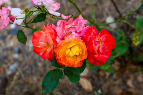
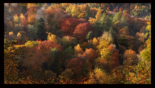
    A feast of rich colour. A number of lines in the background converge on the spectacular centre that also draws attention to itself with the transition tones from the darker reds to the brilliant yellow. The combination of movement with lines and tones is exceptionally well done.
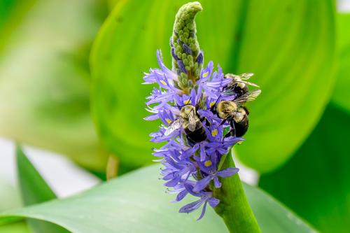
    Apart from the visual appeal, I'm intrigued by the flower variation from the same bush.

  • Members 1403 posts
    Oct. 14, 2023, 12:30 a.m.

    Hi Lou. As the poet said, "What's in a name?"
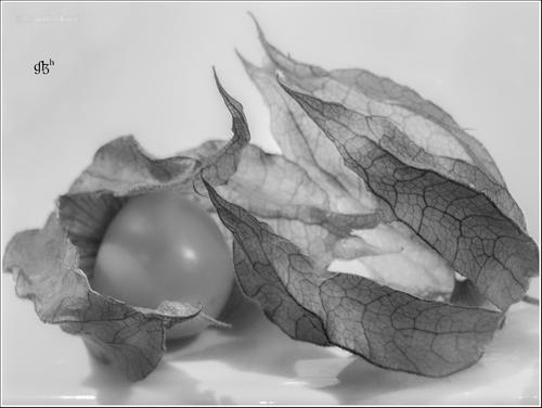
    I like the subject and the possibilities of the various layers of translucency and fine lines. Ditto for the composition and lighting. However (and this may be my aging eyes) the focus looks a fraction off. This is an image where the contrast between the fine black lines and the translucent areas is all important. To me, those black lines need to be razor edged and possibly have a little more contrast ( I'm not talking about those further away.) I might be wrong, if the focus is off, it's only just off. Have a look at your original at full size and tell me what you think.

  • Members 1403 posts
    Oct. 14, 2023, 12:41 a.m.

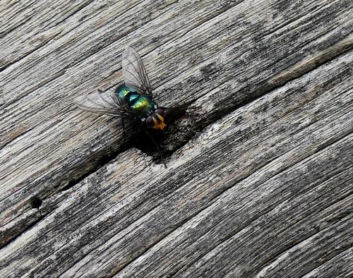
    You might need to be Australian to appreciate this one from Bryan. "Appreciate" is the wrong word but I couldn't come up with a better.
    I zoomed in as far as I could and "appreciated" the results rather more. This way the lines in the wings and a relationship to similar lines in the wood became more apparent. As did the incredible fly eyes. I'd like a little less shadow around the front end of the fly to bring out the head, front legs.
    I'm at Yulara as I write this. We have a few more of these around here if you'd like to further these studies Bryan.

  • Members 196 posts
    Oct. 14, 2023, 1:42 a.m.

    It was a lovely place to live Lou Perthshire is for me the loveliest part of Scotland , though my wife missed a bit more buzz we lived in Edinburgh for several years , hard to compete with that . We are now within a couple of miles of both kids and very near where I was born and grew up. On the upside my internet has went from 40-1130 Mbps wonderful for all the exciting online scrabble games I play 😀

  • Members 1083 posts
    Oct. 14, 2023, 2:58 a.m.

    Another gem from Gibbs Gardens. If they let me loose in there I reckon they would have to drag me out in a straight jacket. I never thought I would ever visit flower gardens but I think it's time...

  • Members 1083 posts
    Oct. 14, 2023, 3:49 a.m.

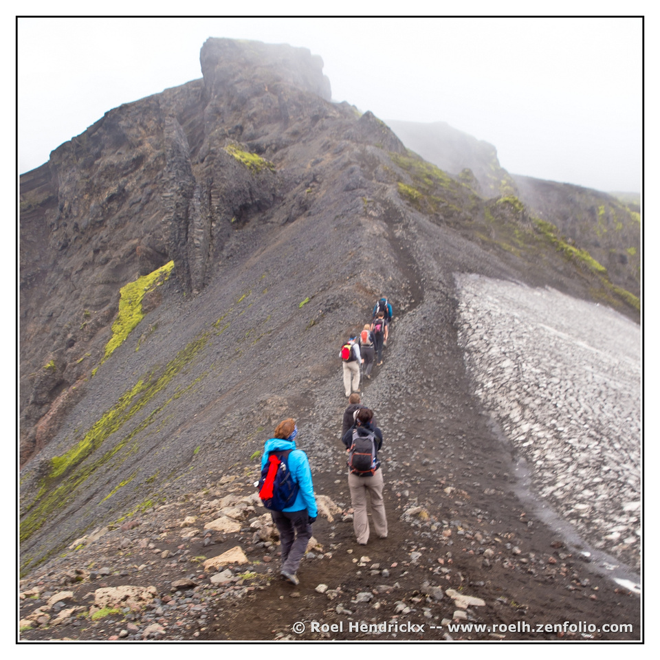
    The photo shows a possibly perilous, but I am sure safe, path to the summit. I assume the yellow patches are sulphur deposits? We visited Mt Bromo in Indonesia many, many years ago. It had vents spewing sulphur gas all over the place. Not the best stuff to breathe... None the less the local tribes-people harvested the rock sulphur to sell.

  • Members 1083 posts
    Oct. 14, 2023, 4:04 a.m.

    I am often bemused by the regalia some armies come up with for their uniforms. Initially I read the plaque as 1914 but it looks more like 1814 (Napolean era). Was chock chip gelato even a thing back then???

  • Members 1403 posts
    Oct. 14, 2023, 9:18 a.m.

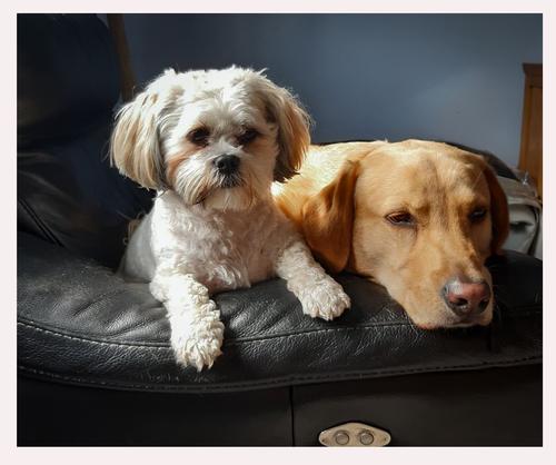
    One has the tonal effects of an old Dutch master painting. Deep, rich colours lifted by golden light.
    Magnificent country and captured to make the best of the scene. The wealth of detail says nature is abundant.

    Two has more of the Dutch master painting touch. This time, we are more in still life territory with a composition along those lines -objects within a somewhat enclosed circular space. Again, we have large dark areas with pools of warmer tones. The result feels comfortable and homely. - and we haven't even begun to consider the main characters as yet.

  • Members 1403 posts
    Oct. 15, 2023, 12:32 a.m.

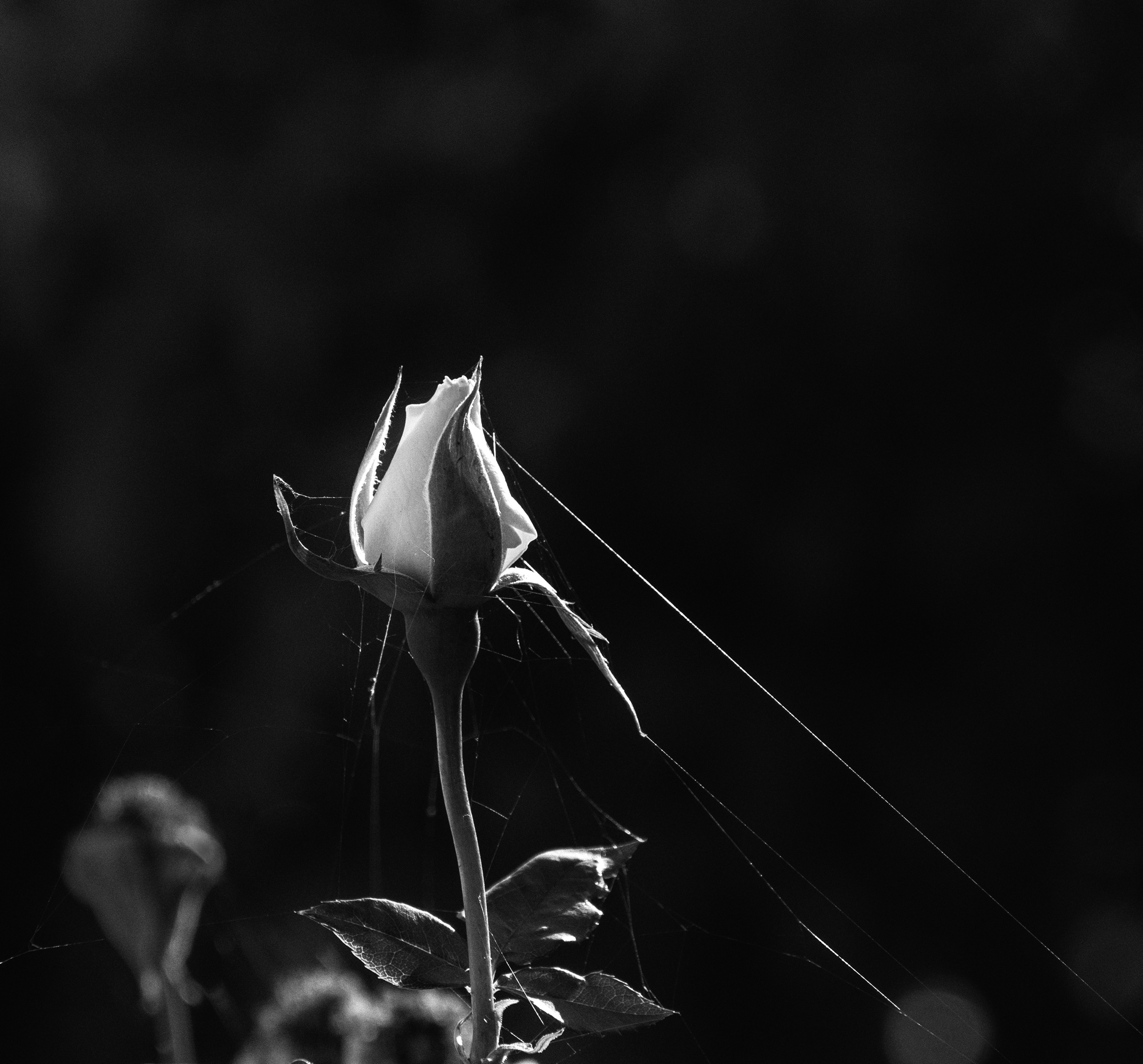
    The composition feels unbalanced to me with too much to the bottom left. Fine lines can give balance to larger objects (ref my response to Tinternaut's Canary docks image this week) but here the downward slope of the lines doesn't seem to have the same effect.
    On the other hand, the rim lighting is beautiful. The fine lines augment the delicacy of the subject and pick out the web to perfection.

  • Members 54 posts
    Oct. 15, 2023, 3:07 a.m.

    Thanks all. I'm still away from home and having spotty internet coverage.
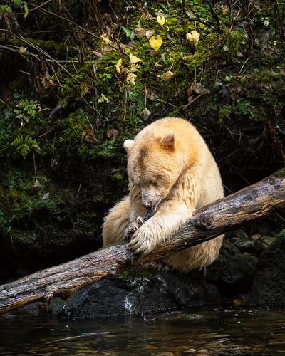
    Actually, Roel, she wasn't particularly pensive, but she was definitely savoring one of the MANY salmon she caught while we were watching (maybe 5-7 total hours with her in the wild over the 4 days we were there). This was her favorite fishing hole. I may have more shots of her to post in the future.

  • Members 196 posts
    Oct. 15, 2023, 5:35 a.m.

    Thank you Mike I appreciate your comments

  • Members 523 posts
    Oct. 15, 2023, 1:03 p.m.

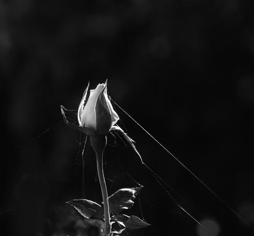
    Thank you, Mike. Just yesterday, on a forum where I posted this photo more than a week ago, someone suggested I clone out the bud on lower left. I liked the idea. So here is that way, with also a bit of clean-up on the ones closest to the subject, though that was kind of quick just to get an idea of how it would look.

    P9300949 bw.jpg

    P9300949 bw.jpg

    JPG, 1.2 MB, uploaded by LindaS on Oct. 15, 2023.

  • Members 689 posts
    Oct. 15, 2023, 1:28 p.m.

    Thank you Mike. What do you think about a cropped version with darkened background I've posted later.

  • Members 1403 posts
    Oct. 15, 2023, 9:50 p.m.

    Yes, I'd thought about the bud on the left as well for two reasons - the extra weight to the left and the lighting which doesn't use the rim lighting that works so well in the rest of the image. The fuzzy, diffused light on the left bud distracts from the punch of the rim lighting.
    Maybe now crop some off the left and some off the top?