-
-
Novel idea to pp. I like it. Suspend lamp is good too.
-
Interesting close-up. Colours are great.
Well captured.
-
I fully agree with @ChrisOly - great shot and it really shows an artistic eye/mind at work. I get your feeling of "jumping around".... I often feel like my photographic experimentation is all over the place and lacks any kind of consistency, style or red line. However, on a regular basis, people tell me that they recognized one of my images immediately as mine before looking at the name, so I guess it's sometimes better to not trust your own perception fully, when it comes to things like that.
Great to see that you have fun experimenting! I'd guess these are wind chimes?
-
-
@Sagittarius has written:
Gorgeous green and brown and yellow. The contrast is fab and it is showing ...Great pp.
-
@Rich42 has written:
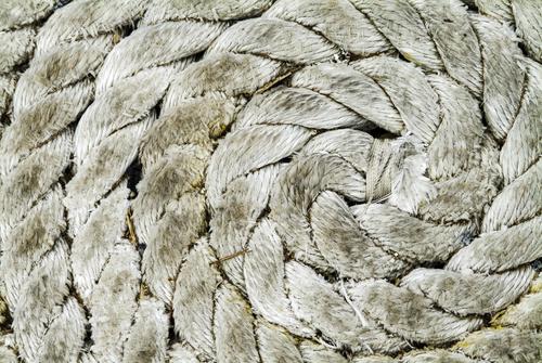
I like the idea and composition of the image a lot! It seems a bit too bright for my taste though, so I would go for a different post processing:
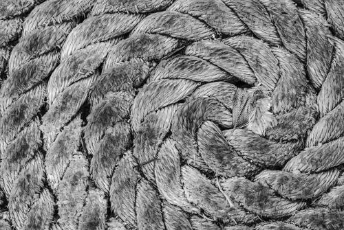
Either B&W:
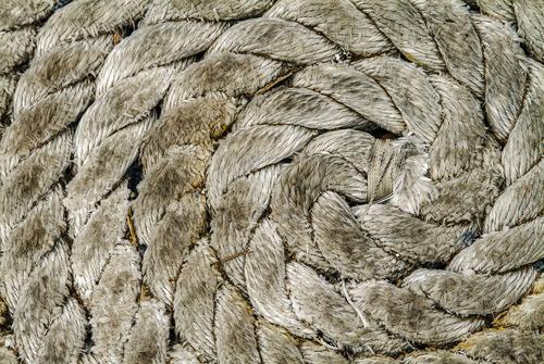
Or with increased texture and color:
If that feels too extreme there's a lot of 'inbetween' as well or course...
Anyway - a great capture in which I really appreciate the simplicity and good eye for composition!
-
@Sagittarius has written:
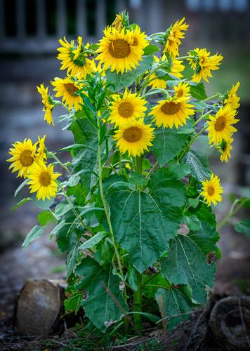
Wonderful shot with great colors - like it a lot! Is the vignetting cause by the lens or added in post? Either way, it's very appropriate and effective.
-
@simplejoy has written:@Sagittarius has written:
Wonderful shot with great colors - like it a lot! Is the vignetting cause by the lens or added in post? Either way, it's very appropriate and effective.
Thank you. Vignetting has been added in post. Background blur has been added using new LrC lens blur feature.
-
@ChrisOly has written:
Gorgeous green and brown and yellow. The contrast is fab and it is showing ...Great pp.
Thank you
-
@simplejoy has written:@Rich42 has written:
I like the idea and composition of the image a lot! It seems a bit too bright for my taste though, so I would go for a different post processing:
Either B&W:
Or with increased texture and color:
If that feels too extreme there's a lot of 'inbetween' as well or course...
Anyway - a great capture in which I really appreciate the simplicity and good eye for composition!
Simplejoy,
Thanks for taking all that time to find other renditions of the image. I always know an image affects someone when they try to modify it. I can't think of more sincere appreciation.
I, too have experimented with monochrome versions of the image and I've done a lot of tone variations. But the one I've presented here is the one to which I always return.
The image is high-key but it isn't lacking in full tonal range. My equipment is calibrated and, on my monitor, I'm confident it is the closest to the way the rope coil looked lying there on the dock in the blazing afternoon Molokai sun. It was bone dry and bleached bone white, undisturbed for at least several years of brutal ultraviolet rays. It may look different on a non-calibrated monitor.
It's dramatic as a large print and quite a bit more effective than when viewed on screen.
Rich
-
-
@RoelHendrickx has written:
DE PANNE
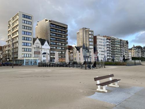
Two (iphone) images of the coastline in De Panne, the western-most village on the Belgian coast, at the French border.
Belgium does not have a long coastline. Many people want to live there or have a holiday home with seaview.
There was also the spirit that this should not be reserved for the (rich) happy few, but that any middle class family should be able to have such a holiday home.
This has resulted (especially in the '60s -'90s of last century) in a building frenzy with not the most appealing of apartment blocks.This is a view on the result (it gets worse in other coastal towns, but I happened to be in De Panne last weekend).
Few remaining coastal "villa" type dwellings are under constant pressure of the higher buildings.I wonder how the change in focal length (wider) and aspect ratio (16:9) affects the viewer's impression.
[
]
Two quite interesting pics. The first one grabs me. I had to think why. It is the sky blue reflections in the windows providing some relief to the greys, browns and creams of the larger buildings. That and the large tiles of the path and bench seat breaking up the expanse of sand. Normally I might look at a picture like this and bemoan the loss of the old to the new, but somehow the period architecture sandwiched in between the squares / rectangles of the new holds it together.
I find the second one comical. The building on the left is doing it's best leaning tower of Pisa impression, sinking into the sand. The buildings to the right appear to be leaning backwards in fear / anticipation of some approaching threat like a large tsunami.
There is also the colour palette of both pics. It all seems to blend together in a pleasant way, in what could be an otherwise cold and stark view. Even the sand seems to match the sky.
-
@MikeFewster has written:
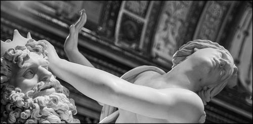
Persophone and Hades.
I have shared photos of the Bellini statue here previously. Here's a different interpretation.The statue is amazing!
Your image is very good, it captures the two characters very well and has a fitting background that doesn't disturb but rather enhances the image.
The B&W processing is spot on, lovely tonality! -
@Fireplace33 has written:
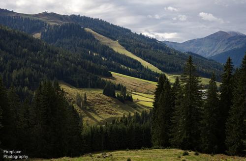
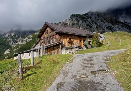
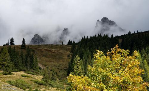
I like old wooden chalets. They invoke a sense of warmth and protection from winter's elements. The one in the sun doubly so. In both shots viewed 1:1 there is a lot detail in the buildings of the shingles, shuttered windows and planter boxes. In the second the buildings are well separated from the foreboding looking cliffs behind which appear a lot closer with the change of perspective.
-
@RoelHendrickx has written:
DE PANNE
Two (iphone) images of the coastline in De Panne, the western-most village on the Belgian coast, at the French border.
Belgium does not have a long coastline. Many people want to live there or have a holiday home with seaview.
There was also the spirit that this should not be reserved for the (rich) happy few, but that any middle class family should be able to have such a holiday home.
This has resulted (especially in the '60s -'90s of last century) in a building frenzy with not the most appealing of apartment blocks.This is a view on the result (it gets worse in other coastal towns, but I happened to be in De Panne last weekend).
Few remaining coastal "villa" type dwellings are under constant pressure of the higher buildings.I wonder how the change in focal length (wider) and aspect ratio (16:9) affects the viewer's impression.
[
]
I prefer the first one, but why?
Starting with the second, I see the buildings as an unattractive row, but, since they are smaller, I don’t take in the individual buildings as much as I do in the second. Also the leaning doesn’t work for me. I find that works well, when the buildings are closer to the camera, because we see the buildings that way anyway. It also works as an artistic touch or as a compositional tool, but neither apply here, as they are too far away and not dominant enough. The buildings could be straightened, but there is another thing too. The bright clouds on the left are beautiful and would work well in a different composition, where they could be the subject, or at least a major part. Here their beauty simply draws the eye away from the buildings, making them even more insignificant, and act as a competing focal point to the bench in the foreground. A crop of the top left quarter or so would work better, but the best part of the idiosyncratic buildings would be missed.
So I prefer the first, where the bench is a good visual fixed point, and I like the subtle hint of it turning its back on the architecture behind it, preferring the (unseen) attractions of the beach, sea and sky. Also the buildings themselves have a more important role, and we can appreciate their wildly different sizes and styles in horror or with a smile.
In both, but particularly the first, we don’t see much of the natural surroundings, so I appreciate the sand drifting over the paving by the bench, making a quiet statement that nature can never be tamed completely. Also the light is sublime, with its pastel tones of blues and greys and yellows.Pete
-
@minniev has written:
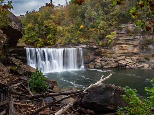
Cobbled together enough internet via weak cell connection in the tiny hamlet of Alderson, West Virginia to try to post an entry, apologies if it doesn't work. This was taken yesterday at Cumberland Falls, Kentucky. Real camera, no computer. I think some of those with faster shutter/ less of a milky look will be better but getting one in the chute to post was a chore so I'll leave it at that.
There is a lot of warmth in the colours in your shot (perhaps brought about by humidity? - it is pretty dry here and the scenery is looking quite washed out and harsh). It has a soft painterly look - perhaps a touch of motion blur with the long exposure or soft focus? There is a lot of driftwood clutter in the bottom left but that has never bothered me... 😉 You may be right that a shorter exposure will have less milkiness in the waterfall. It is a nice scene, I hope there will be more to come.
-
@simplejoy has written:

Even squares like me can fly! by simple.joy, on FlickrThere is a saying that you can’t make a silk purse from a pig’s ear, but you prove week after week that it is not true, and turning the phrase making something of nothing from an insult into a high commendation, with great vision and creativity.
This photos is yet another example of how a subject, most would throw at a rubbish bin, can be transformed into something of beauty and interest with the creative use of depth of field, bokeh and colour. That is what makes your work so recognisably a leader in the Simplejoy style.Pete
