• Members 779 posts
    Oct. 22, 2023, 10:21 a.m.

    Your previous offerings often got their main attraction from a close-up with shallow DOF and then great lighting on the actual physical subject.

    This one is different in that the main subject, for me, is not the physical object (the sheet of paper with square cuts), but the very peculiar square shaped bokeh (or light projections?) in the background.
    The physical object acts merely as an anchor, a baseline, and a visual echo.

    The mundane nature of the sheet of paper is transformed into light and magic in the background.
    And that makes your title (with the lovely pun) more than appropriate.

    It is a different offering from what you brought before, but I like it just the same: a neat and clever idea, wonderfully executed.
    Creativity to the max.
  • Members 779 posts
    Oct. 22, 2023, 10:23 a.m.

    It's funny how one man's leftovers can be another man's feast.
    You curse yourself for not having captured this bird in majestic flight.
    I would be over the moon with spotting a creature like this one, perched so admirably against a lovely contrasting background, for a tack sharp portrait as you have captured here.

  • Members 779 posts
    Oct. 22, 2023, 10:25 a.m.

    Clearly a lovely hiking area.
    I like the full sequence of images that take us with you on the walk.
    But if I have to pick one favourite, it is certainly that first image, with a great mountain, rising grey and rocky out of lush green vegetation, and getting its head into the clouds.
    It makes me pull on my hiking boots, throw on a couple of merino sweaters and get going to conquer the giant.

  • Members 779 posts
    Oct. 22, 2023, 10:27 a.m.

    Lots of lovely eye contact in this image. The people talking, and then the dog ignoring them but interested in the photographer.
    A nice catch.

  • Members 779 posts
    Oct. 22, 2023, 10:29 a.m.

    I would be prepared to travel long and far to be able to be in such a spot and witness interaction and behaviour like that.
    About your observation on humans vs bears :
    "There is enough for everybody's need, but not for everybody's greed."

  • Members 779 posts
    Oct. 23, 2023, 7:44 a.m.

    I like what you did here with the solarized texture of the surfaces.
    There is potential for abstract art there.
    So in order to maximize that potential, I would consider getting rid of the elements that anchor this image in reality: the tops of the roofs against empty sky, the dangling lamp etc. Making a square crop from close to the bottom upwards, just to the edge of the first sliver of sky, might achieve that.
    The "Hans Anders" letters are a definite problem: they really make this look contemporary and mundane.

  • Members 779 posts
    Oct. 23, 2023, 7:46 a.m.

    This extreme closeup makes us realize just how weird looking these fellas are.
    At first I thought I saw an unexplainable patch of bokeh in this mouth, and then I thought it was a cork, but it is probably some kind of compressed food?

  • Members 779 posts
    Oct. 23, 2023, 7:47 a.m.

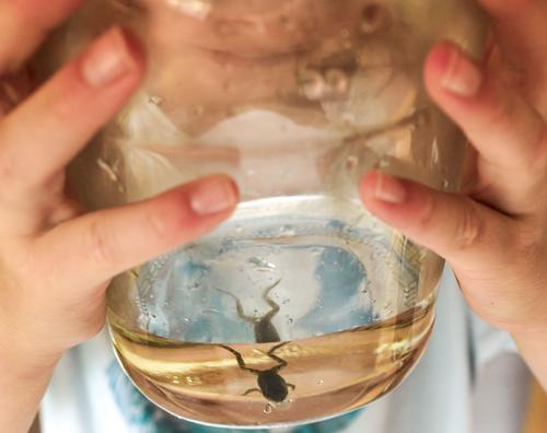
    I love how the breaking of the spectrum by the water surface treats us to two frogs (almost).
    Showing young girlie hands but not a face, adds to the fairytale mystery vibe of the image.

  • Members 779 posts
    Oct. 23, 2023, 7:52 a.m.

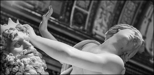
    Bernini's sculptural masterpieces are an endless source of visual inspiration.
    Just when you might have thought all possible angles had been explored and shown, new ones present themselves.
    This extreme closeup of just the faces, eliminates all the movement and flurry of the body shapes, which are normally considered its main characteristics.
    Oddly, the dynamism of the statue survives: we look at the eyes now, with the male gaze wanting to devour the woman but being averted by a strong female hand, while the female look is one of desperation, not wanting to watch the scene it is involved in or maybe looking outside for some kind of rescue.
    There is NO eye contact here, and that is probably the best way to depict a scene of what amounts to sexual violence.
    Thank you for a fresh perspective on a statue I thought I knew.

  • Members 861 posts
    Oct. 23, 2023, 3:34 p.m.

    dsc00275_$33_72dpi_web.jpg

    dsc00275_$33_72dpi_web.jpg

    JPG, 388.9 KB, uploaded by OpenCube on Oct. 23, 2023.

  • Members 676 posts
    Oct. 23, 2023, 4:29 p.m.

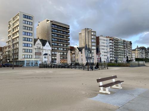
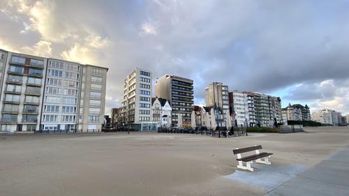
    From a very subjective viewpoint -- I don't like the bench, particularly if the story is the beachfront ... I think the first image is the better but the second image conveys the beachfront better but could use some perspective correction and be posted so that we can go to the "gallery" view, which is always better on this site .Because of the beachfront construction I don't get the empty beach story from these .. maybe my lack of imagination ...

    WhyNot

  • Members 676 posts
    Oct. 23, 2023, 4:38 p.m.

    I like the title -- it make the picture work for me ...
    WhyNot

  • Members 1343 posts
    Oct. 25, 2023, 12:30 a.m.

    The hands are clearly those of a child. The spread fingers and thumb position tell us that the child is looking at the frog. The wonder of life and the life process is being pondered. The split image adds to the suggestion that an inspection is underway - it magnifies.

    A photo that is brimming with childhood memories for me. Looking at it, I get huge satisfaction from feeling that kid's today share the same light bulb experience.