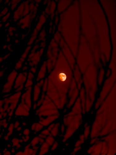
Hard to imagine a more perfect time of day for those colors, shadows and reflections. Exquisite!
-
-
Wildlife thriving in a city, while some humans are without homes. Emotional subject for me, therefore a big impact.
-
Here you go. Just don't look too closely because there are still a few floating wires :)
Though I find this freshly scrubbed version rather boring, I do respect your distaste for all the "stuff" that is common to my corner of the planet, where the contrasts of semi-city and barren countryside and lush commercial orchards are endlessly fascinating to me 😀
-
I love it! Your editing skills are soooo much better than mine. At some point when I'm not so busy I need to take some editing classes or something.
-
@LindaS has written:
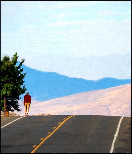
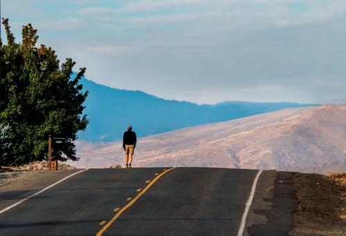
At the Edge

At the Edge by Linda Shorey, on FlickrI feel like the image works really well as it is and it's a special capture, even more so because it's so real (with all the elements) and yet surreal at the same time! Excellent work!
@JSPhotoHobby has written:I'd love to see a version of this with just the guy and the road and a sense of disappearing.
Just for fun, I've tried to do what you described... not sure if it comes closer to your vision and it's certainly overdone and a different image overall:
-
@JSPhotoHobby has written:
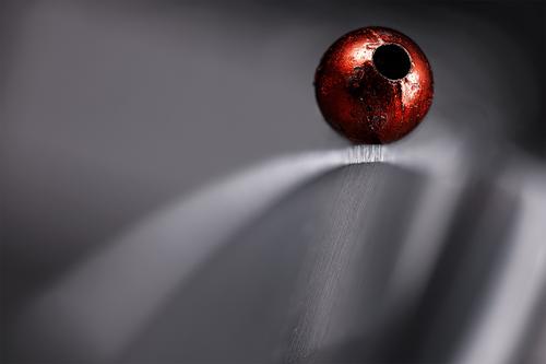
I want to see the knife edge straight up and the red thing balanced on it with the point of the knife nearly directly toward the camera. So it would feel like both us and the red thing are balanced on the knife's edge.
Okay... here you go:
It's as far as I was able to get there without loosing the knife's edge completely. Setting it up wasn't hard (as expected), but the challenging thing is getting enough DOF to still make it clear that this is a knife. I would probably need additional 50-80 shots to get anything close to the original. It can be done of course, but takes a considerable amount of time and adds work for post processing clean-up. Also the reflections and shadow on the blade are lost of course, so it would probably be worth it to consider a slightly different lighting to make up for that.
Anyway - thanks again for the suggestion! I was surprised to see that the line-thing could actually work out fine. Wouldn't have guessed it.
-
@simplejoy has written:@JSPhotoHobby has written:
I want to see the knife edge straight up and the red thing balanced on it with the point of the knife nearly directly toward the camera. So it would feel like both us and the red thing are balanced on the knife's edge.
Okay... here you go:
It's as far as I was able to get there without loosing the knife's edge completely. Setting it up wasn't hard (as expected), but the challenging thing is getting enough DOF to still make it clear that this is a knife. I would probably need additional 50-80 shots to get anything close to the original. It can be done of course, but takes a considerable amount of time and adds work for post processing clean-up. Also the reflections and shadow on the blade are lost of course, so it would probably be worth it to consider a slightly different lighting to make up for that.
Anyway - thanks again for the suggestion! I was surprised to see that the line-thing could actually work out fine. Wouldn't have guessed it.
Wow! I'm surprised that was so easy for you! I still can't imagine how to do it.
If you ever get a finished product I would love to see it! And if you are willing a "how I did it."
I would totally try and copy it if you didn't mind. -
@simplejoy has written:@LindaS has written:
At the Edge

At the Edge by Linda Shorey, on FlickrI feel like the image works really well as it is and it's a special capture, even more so because it's so real (with all the elements) and yet surreal at the same time! Excellent work!
@JSPhotoHobby has written:I'd love to see a version of this with just the guy and the road and a sense of disappearing.
Just for fun, I've tried to do what you described... not sure if it comes closer to your vision and it's certainly overdone and a different image overall:
Wow, you guys really nailed it with the editing.
Makes me think he is looking into the abyss, the long unknown empty. -
@ChrisOly has written:
Excellent capture. Like the beaming sun and the colours.
Thank you Chris
-
@RoelHendrickx has written:
COTSWOLDS SUNRISE
I am reacquainting myself with some older images, because Zenfolio is going through changes (not all of them welcome).
Here is an image from a drive and short walks around sunrise through some sleepy villages in the Cotswolds (UK):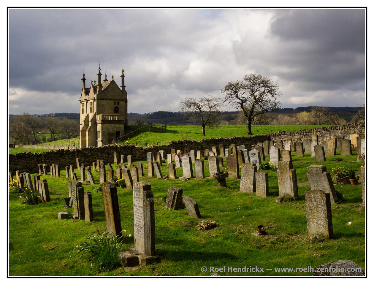
(My approach to adding a border and signature to images was a bit more heavyhanded then than it is now.)
What hasn't changed is your eye for diagonals. Beautifully done here with the lines of tombstones heading to the building. The trees, reducing in size, do likewise. The house adds another shape complementing the tombstones. There's a lot more here as well in the composition and lighting.
It exudes the essence of English countryside and the weight of history. -
@simplejoy has written:
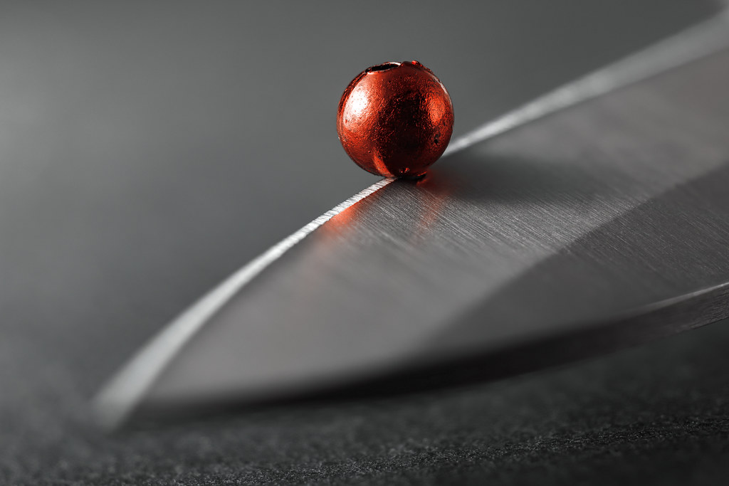
A lot on the line by simple.joy, on FlickrColour and line. The rich red lifts from the grey tones. Even when blurred, the line on which it rests is distinct and its diagonal gives tension to the balancing act. The sharp edge where the bead? rests has our attention. Many metaphors become possible. A potent image.
-
@JSPhotoHobby has written:
Doing some editing to relax when Studying gets too frustrating.
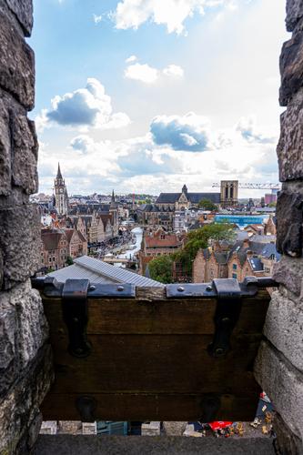
I suspect at this rate, I will still be editing pictures from my trip when I'm on my next trip.The device between the wall intrigues. It's old, it pivots. What is it? The prominence in the image is offset because too much of it is dark and a little out of focus. Lots of historic building details in the background. I'd have preferred either more of or more detail on the foreground with the background a little out of focus. This might be because I don't recognize the foreground shutterish thing. Those who know what it is might well feel quite differently.
-
@ChrisOly has written:@MikeFewster has written:
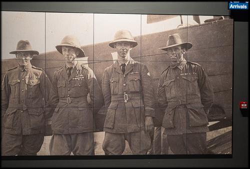
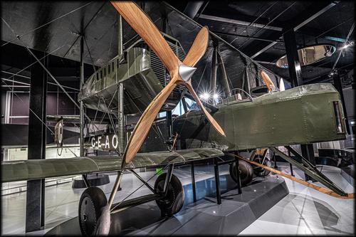
Those Magnificent Men in Their Flying Machines
GEAOU
It's a good story. From 2019.
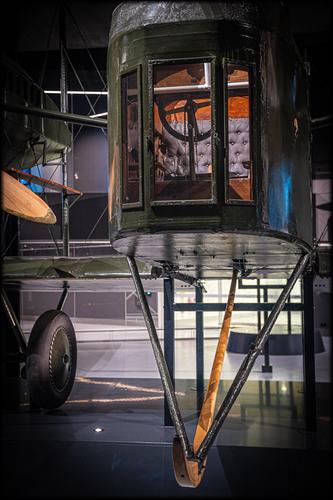
www.adelaideairport.com.au/vickers-vimy/discover/the-vickers-vimy/Those historical details and memories remain. I like that last shot of the cockpit.
They flew that thing from England to Australia in 1919. It was quite a journey requiring many stops and refuelings. Often they had quite vague knowledge of where the next stop would be and what the landing/refuelling realities would be found once they got there.
I think the front panel was for a crew member to do spotting when landing on dubious terrain. That thing at the front isn't a wheel, it's a kind of skid to come into play if the plane pitches forwards.
Check the timeline for details of the adventures along the way. I think this flight deserves to be far better known.
www.adelaideairport.com.au/vickers-vimy/discover/timeline/ -
@MikeFewster has written:@JSPhotoHobby has written:
Doing some editing to relax when Studying gets too frustrating.
I suspect at this rate, I will still be editing pictures from my trip when I'm on my next trip.The device between the wall intrigues. It's old, it pivots. What is it? The prominence in the image is offset because too much of it is dark and a little out of focus. Lots of historic building details in the background. I'd have preferred either more of or more detail on the foreground with the background a little out of focus. This might be because I don't recognize the foreground shutterish thing. Those who know what it is might well feel quite differently.
I feel the same way about it. I tried to include too much and it loses a clear subject.
The image is looking over a medieval castle's rampart through an arrow defensive piece.I think I should have used a longer focal length to compress the background into one to three objects and no more, which would have served to reduce the excessive sky and make the wooden arrow defense smaller.
Instead I tried to show the town with it's impressive old churches and the importance on the River. I also used the arrow shutter to hide most of a modern building in the foreground. -
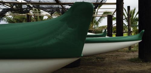
Ocean-Going Racing Canoes, Molokai, HIThe prow of the near boat is 10 feet above the ground. The boats are 50 feet long. I was pressed against the side of the enclosure with a 24-105mm zoom lens at 24mm on an APS-C camera, and this was the best composition I could create. There was nothing I could use for sense of scale in the scene.
These canoes are used for races through the Kaiwi channel between Molokai and Waikiki on Oahu, HI. Such races have taken place for hundreds of years for the pleasure of Hawaiian kings. Legend is that losers of long-ago races lost more than just a day out on the ocean.
The Kaiwi channel is one of the most treacherous bodies of water in the world. Wind and wave energy that travel unchecked over thousands of miles of open North Pacific Ocean between Alaska and Hawaii, creating the highest surf in the world when they slam into the north shores of Oahu and Maui, roar through the 70-mile-wide channel, and can, and often do, capsize such canoes as well as the largest sailboats made.
I met some crew members. All of Samoan-Hawaiian descent. I didn't know such huge human beings existed. Nice guys, though. A team of five easily carried one of the canoes to the water. I couldn't lift even one of the oars.
Rich
-
-
@Sagittarius has written:
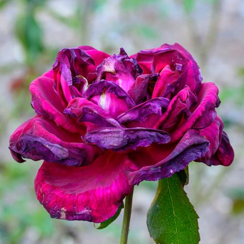
This rose has been planted by our grandson earlier this year and now blooming
Flowers that have begun to deteriorate are hard to ignore. The symbolism is all too apparent. When the bloom is as rich and lush as this example, the messages are all the stronger. You got it at the point of maximum impact. The flower is still erect and most of the petal shape survives. The inevitable decay has begun and a viewer feels the full significance. behind the rose, the fresh green heightens the drama.
-
@JSPhotoHobby has written:@LindaS has written:
At the Edge
 At the Edge by Linda Shorey, on Flickr
For me, the signs and poles and the tree and the hydrant are all distracting elements. It took my eyes a few seconds to find the guy, his colors are too similar to the trees and poles. I'd love to see a version of this with just the guy and the road and a sense of disappearing.
Yes, the wires are also irritating. I have similar obstructions in my city, though the USA is worse for ugly poles, cables, signs, etc, that completely spoil any beauty that the photo would otherwise have. I remember Stonington, CT, which is a completely disfigured little fishing village. Without the poles and cables it would look like a village in Cornwall from 100 years ago.
Tourists are another bane of my life: they just stop and stand in front of me with their phones, and have no awareness of their surroundings — while I wait to click the shutter!
David
