I love graveyards, the older the better. They hold so many stories. I could wander in one for hours. You have given us some visual wandering in different kinds of cemeteries. The Scottish one is my favorite, the one taken from behind the stones as the stones stare out to misty sea on a typical Scottish day of mixed cloud and sun.
-
-
Fascinating story and the photo illustrate this nicely. Though museums are not realistic backdrops for flying machines, they do safeguard the stories for future generations. To think how this really worked out in the 1920s with such primitive, in our current view, directional knowledge is pretty amazing. As for the photos themselves, the color tones are what holds the set together - olive and khaki have their own impact on how we perceive photos of things that fly, roll, or fight. They speak of bold adventure.
-
I am torn about this one. The city view is lovely (Ghent is a pretty wonderful city) though the upper right area is a tad overexposed. The wooden swinging door apparatus is interesting but it does serve as both a magnet and a visual block to the scene, and it is hard to interpret looking at it from this angle. It hides something you wanted hidden, but we as viewers naturally resist blocking and want to know what's there. The little bit we can see is interesting making us want to see more. I'd sure experiment with some cropping from bottom and top, and see if you can get a version where the mystery and magnet of that slit view is less distracting, and the city view is more clarified.
-
My favorite flower photographs are those that show the imperfections as well as the beauty. This one has both qualities. The rich colors are still there, and the obvious fullness of the bloom. But the edges are withering and discoloring, reminding us of the transitory nature of beauty and life. Nice angle, and good choice of how much blur to introduce in the background. Well done.
-
Beautiful concept, as the flower conforms to the imaginary sphere that is barely visible to us somewhere deep in the image. I'm wondering if several images are composited? It seems that the focus is both foreground and at some depth with the middle ground OOF, but I may be misinterpreting what I think I see. It is an image with several mysteries, and that's OK, it's what makes us look longer and that is success.
-
I'm always trying to capture the sun in the frame and it is a challenge. Seems you've done well with this one, we get the impression of an orb rather than a white hole, which is about all we can do most of the time. The colors of blue and orange go so well together (the color wheel is right about this pairing). We get a sense of early fall foliage here and there. I think I would crop from the bottom to eliminate the building in the lower right which is cut off in such a way that we can't make out much of it, but it's too much to ignore so I'd get rid of it and let the photo be almost entirely about nature.
-
You have given us a nice one that's fun to discuss, as you often do! I've read all the comments and your replies so far, so I'm up to date on the conversation (and even though flat view is not conducive to discussions, we're having one!). I like it very much just as you've presented it, lines, poles, signs, and all. I am of mixed minds on these distractions. I hate them when they get in the way of a story I want to tell and I love them when they illustrate that story as they do here.
A man walks stiffly through the ugly accoutrements and clutter of modern culture, over a mysterious hill and into the haze covered mountains of the Real World. Will he check his mail? Put out a fire? Obey the signage? Will he leave his own mark? I prefer to think he is headed for the trail, to be redeemed.
-
This is a nice, calm color conversion that has some appeal as an almost-abstract mixed with an almost-still-life.
-
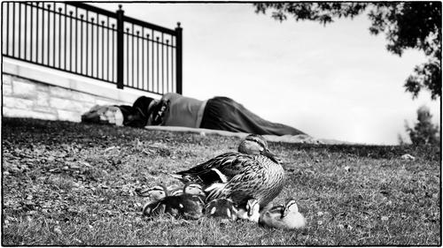
Poignant and impactful, a subtle study in contrasts. A beautiful proud mother nurtures her adorable family with confidence in a public park. Beyond her, in negligible detail, lies a human, bereft of home, comfort, sustainment, or companionship, lies nurture-less. But that human was once a child, once had a family to gather up with.
This is a powerful fine art work that illustrates a complex concept in a simple way. Excellent work. (Monochrome in simple straightforward processing is definitely the best choice here, allowing the story to tell itself).
-
Well being deep into my 2nd childhood and a newbie with Affinity -- I'm entitled!!! .... at 15 I was using a speed graphic and a darkroom to do post processing !!! But thanks for the comment .. I was wondering how this would be received ...
WhyNot
-
@minniev has written:@WhyNot has written:
Ducks ....
WhyNot
Poignant and impactful, a subtle study in contrasts. A beautiful proud mother nurtures her adorable family with confidence in a public park. Beyond her, in negligible detail, lies a human, bereft of home, comfort, sustainment, or companionship, lies nurture-less. But that human was once a child, once had a family to gather up with.
This is a powerful fine art work that illustrates a complex concept in a simple way. Excellent work. (Monochrome in simple straightforward processing is definitely the best choice here, allowing the story to tell itself).
Thank you minniev ... I was beginning to think that my kind of photography had become a bit passe here ......
WhyNot
-
@minniev has written:
My favorite flower photographs are those that show the imperfections as well as the beauty. This one has both qualities. The rich colors are still there, and the obvious fullness of the bloom. But the edges are withering and discoloring, reminding us of the transitory nature of beauty and life. Nice angle, and good choice of how much blur to introduce in the background. Well done.
Thank you minniev for kind words. The background blur came from the lens, no artifical blur has been used.
-
@ChrisOly has written:
Fall
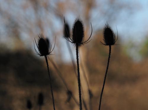
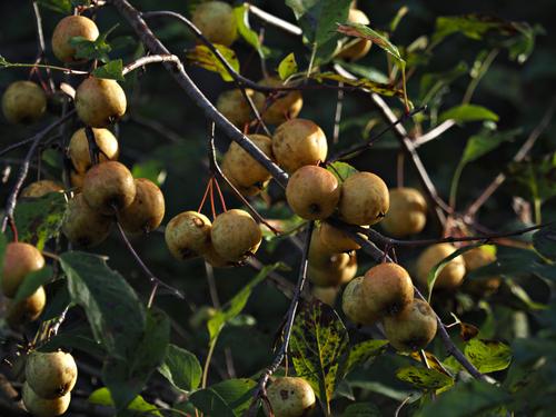
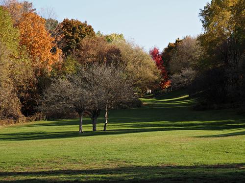
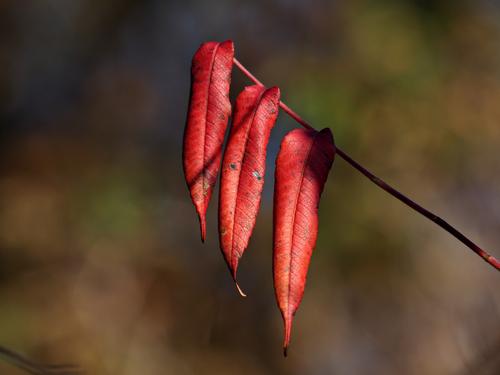
A lovely fall set. All four are well composed with simple design principles and the warm rich colors of a fall morning. I don't know what those things are in the first one, but I've always thought them very photogenic. If you want their structural detail to show, you could try raising the shadows a bit, but if you are going for the silhouette effect, they are good as they are. I think I would try to raise the shadows in the last one, at least in the area they are blocked up, but then I'm bothered by blocked up shadows and not everyone is. Artist's choice!
-
@Rich42 has written:
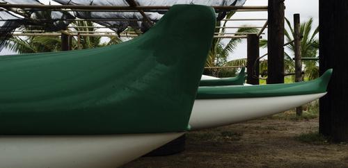
Ocean-Going Racing Canoes, Molokai, HIThe prow of the near boat is 10 feet above the ground. The boats are 50 feet long. I was pressed against the side of the enclosure with a 24-105mm zoom lens at 24mm on an APS-C camera, and this was the best composition I could create. There was nothing I could use for sense of scale in the scene.
These canoes are used for races through the Kaiwi channel between Molokai and Waikiki on Oahu, HI. Such races have taken place for hundreds of years for the pleasure of Hawaiian kings. Legend is that losers of long-ago races lost more than just a day out on the ocean.
The Kaiwi channel is one of the most treacherous bodies of water in the world. Wind and wave energy that travel unchecked over thousands of miles of open North Pacific Ocean between Alaska and Hawaii, creating the highest surf in the world when they slam into the north shores of Oahu and Maui, roar through the 70-mile-wide channel, and can, and often do, capsize such canoes as well as the largest sailboats made.
I met some crew members. All of Samoan-Hawaiian descent. I didn't know such huge human beings existed. Nice guys, though. A team of five easily carried one of the canoes to the water. I couldn't lift even one of the oars.
Rich
Gorgeous boats! They remind me of the canoes of the Haida, and probably for good reason, since the Haida are more likely to be culturally and genetically connected to the Polynesian people than any other group - huge seaworthy canoes with carved and/or painted artwork of family/clan heraldry. A history lesson for sure, in grand colors.
-
@OpenCube has written:
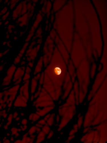
Would like some feedback about the believability of this image - does this look fake? Feel faked?
A spooky, Halloween-y image. Though the colors are not realistic, your colors rarely are and that does not seem to be a concern of yours when discussing reality/fake so I don't know that color is what you're asking about. It does look realistic to have an in-focus moon amid blurred limbs (or vice versa) since it would be impossible to have both in focus without compositing. The limbs look appropriately ghoulish, like spiders' legs, or skeleton hands reaching for the moon.
A realistic moon would not be red, and if you wanted more realism in color you could tone down the reds especially over the moon using selection tools.
-
@Bryan has written:
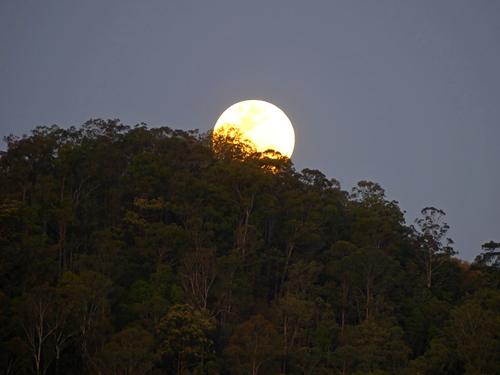
Taken on the last full moon. Hand held, full zoom, low ss... Lots of atmospheric effects, a little bit of pp to bring up the trees.
I love the lacework look of the foliage over the moon. You have lost a lot of detail in the moon's surface though. Is there some you can bring that back through editing? Shooting moons usually means significantly underexposing from what the camera wants, or even what makes sense to us. I've been told that you need the same settings you'd use for shooting the sun, but that is a bit extreme for me. I do have to go much lower in exposure settings than I would have imagined though, to get those nice craters and mountains to show up. Of course letting the moon go featureless can also be a legitimate approach, taking a more graphic-art type approach. Play with your image and see what you discover.
-
@WhyNot has written:
Drive By
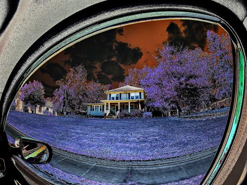
Interesting creative offering. I love the curvature of the rear view mirror capture. The lilac grass and orange sky are strangely compatible. I might have named it "A House For Open Cube". I've never explored color shifts but you two are showing us some interesting options.
-
@minniev has written:@WhyNot has written:
Drive By
Interesting creative offering. I love the curvature of the rear view mirror capture. The lilac grass and orange sky are strangely compatible. I might have named it "A House For Open Cube". I've never explored color shifts but you two are showing us some interesting options.
Thank you .. I had a dead period there for a month or so and just put the fisheye on the camera for two or three days looking for motivation .. and this resulted. That isn't the rear view mirror but the side window and no I wasn't driving!!! ... There were more but they seems to be better as a sequence with narrative so they'll be over on Weekly but they weren't quite so colorful ....
WhyNot
