Drop some money on a used lensbaby of your choice. You will never be bored with one at your disposal.
-
-
I looked at the many variations of those lenses over the years but so far none has made it's way to my toy box ... and I suspect won't .. but thanks for the thought ...
WhyNot
-
@minniev has written:@LouPhoto has written:
[![_6292261_2.jpg]
Flower in an imaginary glass sphereEnlarge click image >click downarrow
Both images are creatiesThank for looking LouPhoto
Beautiful concept, as the flower conforms to the imaginary sphere that is barely visible to us somewhere deep in the image. I'm wondering if several images are composited? It seems that the focus is both foreground and at some depth with the middle ground OOF, but I may be misinterpreting what I think I see. It is an image with several mysteries, and that's OK, it's what makes us look longer and that is success.
Although I am well known to not be a big fan of flowers and other similar images, I must say that I really really like this one.
It is pretty grand, in composition AND in processing.
For all the reasons already stated above here.This offering reminds me of Edward Weston, and as far as B&W still life of vegetation goes, that is a BIG compliment.
-
@WhyNot has written:@OpenCube has written:@WhyNot has written:
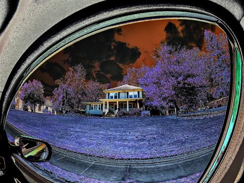
I had a dead period there for a month or so and just put the fisheye on the camera for two or three days looking for motivation .. and this resulted.
Drop some money on a used lensbaby of your choice. You will never be bored with one at your disposal.
I looked at the many variations of those lenses over the years but so far none has made it's way to my toy box ... and I suspect won't .. but thanks for the thought ...
WhyNot
I also own a very simple and cheap lensbaby.
I've not used it a lot (probably really not as often as I should).
But you can have real fun with them.They get the creative juices flowing, maybe even much more so than the latest and greatest in lens design with autofocus, special bokeh blades and IS.
You should really give it a try.
-
@minniev has written:@WhyNot has written:
Drive By
Interesting creative offering. I love the curvature of the rear view mirror capture. The lilac grass and orange sky are strangely compatible. I might have named it "A House For Open Cube". I've never explored color shifts but you two are showing us some interesting options.
I also like the experimentation on display.
For some reason, the colour shifts result in a (for me) sinister look, like something from a feverish nightmare. -
@RoelHendrickx has written:@minniev has written:@WhyNot has written:
Drive By
......
Interesting creative offering. I love the curvature of the rear view mirror capture. The lilac grass and orange sky are strangely compatible. I might have named it "A House For Open Cube". I've never explored color shifts but you two are showing us some interesting options.
I also like the experimentation on display.
For some reason, the colour shifts result in a (for me) sinister look, like something from a feverish nightmare.Thank you .... I actually had Halloween in the back of my mind as I did this .. but it is continued play with some tools I rarely use but have been recently exploring to see how they might contribute to an interesting story .. And, your advise about the Lensbabies will have me looking at them anew ...... but when not in one of these dead periods I usually stay busy .. for me ...
-
-
@JSPhotoHobby has written:@davidwien has written:@JSPhotoHobby has written:@MikeFewster has written:@JSPhotoHobby has written:
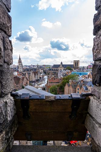
Doing some editing to relax when Studying gets too frustrating.
I suspect at this rate, I will still be editing pictures from my trip when I'm on my next trip.The device between the wall intrigues. It's old, it pivots. What is it? The prominence in the image is offset because too much of it is dark and a little out of focus. Lots of historic building details in the background. I'd have preferred either more of or more detail on the foreground with the background a little out of focus. This might be because I don't recognize the foreground shutterish thing. Those who know what it is might well feel quite differently.
I feel the same way about it. I tried to include too much and it loses a clear subject.
The image is looking over a medieval castle's rampart through an arrow defensive piece.I think I should have used a longer focal length to compress the background into one to three objects and no more, which would have served to reduce the excessive sky and make the wooden arrow defense smaller.
Instead I tried to show the town with it's impressive old churches and the importance on the River. I also used the arrow shutter to hide most of a modern building in the foreground.Actually, the resolution is quite good, and if you were to crop out the walls and the wooden structure at the bottom, you would have a much more interesting picture. Try it!
David
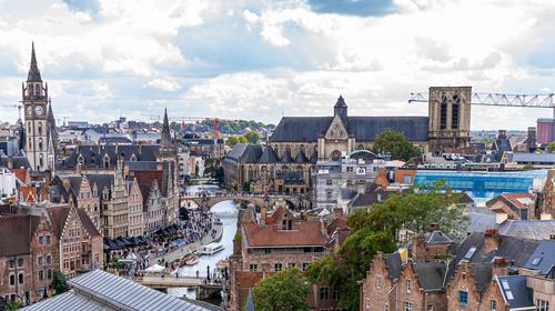
Something like this? I think I would need to tone down how far I pushed the colors, it doesn't look as good blown up.
YES! The details are wonderful. One could straighten up the LHS, and maybe sharpen a little in Topaz Sharpen AI. But I find the content fascinating. I would leave more dark clouds in view. (I also have problems with cranes all over the place in my city!)
David
-
@Fireplace33 has written:
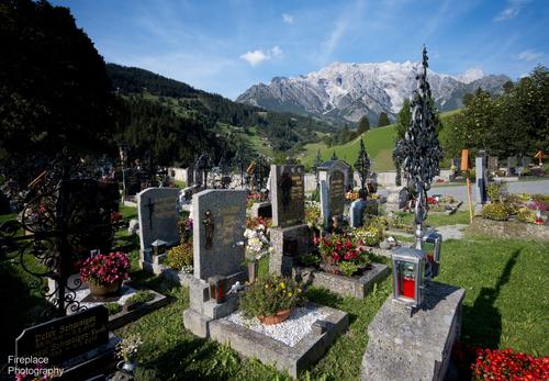
Roel's first post encouraged me to show a graveyard photo too, must be coming up to halloween time :-)
This one is from Austria and typical of the well tended graves, with a nice final view
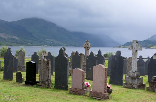
Here's another one, but from scotland. A bit plainer from the style but also with a fine, somewhat more misty, view :-)
An idyllic location. The view will be appreciated, certainly by the visitors.
-
@minniev has written:
My apologies for not commenting on last week's photos. I am winding up a little road trip and did not anticipate that the internet has not yet reached some parts of Appalachia. I'll be home tomorrow and promise to do better.
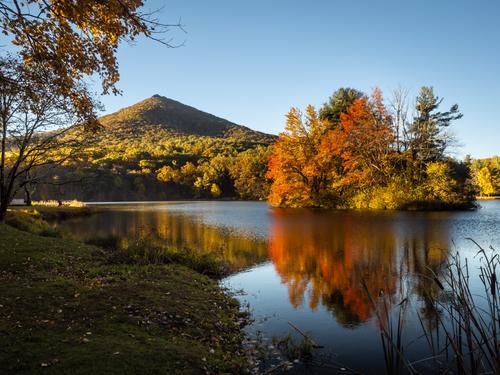
Here is one from sunrise at Otter Peak on the Blue Ridge Parkway. I can probably do a bit of improving in the editing when I'm home on a real computer with a screen I can see.
At first glance, it's the autumn colours that catch the eye. It's the repetition of pyramid shapes, some inverted, and one on its side, that make the shot different. A nice framing balance between the benches, top left and the reeds, bottom right as well.
-
@LouPhoto has written:
[![_6292261_2.jpg]
Flower in an imaginary glass sphereEnlarge click image >click downarrow
Both images are creatiesThank for looking LouPhoto
One of those "the more I look at it the more I like it" images.
B&W was a good choice because of the importance of the lines. I very much like the angle you have chosen for the bloom, the fitting of this form to the globe and then the fitting of the globe to the square. The solarization edges lift the curves that make the shot. -
@RoelHendrickx has written:@MikeFewster has written:
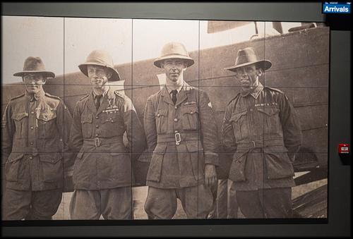
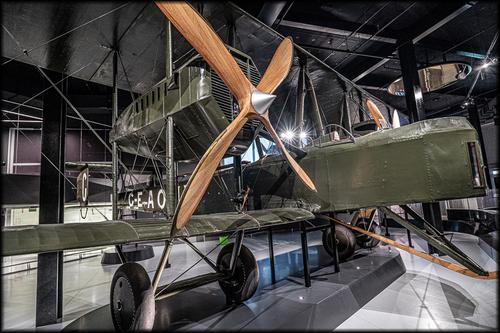
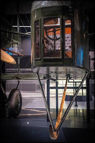
Those Magnificent Men in Their Flying Machines
GEAOU
It's a good story. From 2019.
www.adelaideairport.com.au/vickers-vimy/discover/the-vickers-vimy/That's cool stuff.
Intrepid Men and their Flying Machines : always a winner for kids (and adults) with vivid imagination.
I like the story and the images, but I am always sad that wonderful machines like these are confined to a small (always too small) space in a museum.
It needs to be seen on an airstrip to realize the magnitude of what is on display.100% agreement Roel. This plane is surprisingly large. Trying to take shots, I was hemmed in and couldn't get an angle that I felt did it justice. The story of the flight, the near misses, the ingenuity and casual bravery of the crew reads like Indiana Jones. They took many photos as well. The plane and the story are in a new adjunct to the Adelaide Airport. Not many people realize it is there. I took the shots on a busy night but I had this gem all to myself. It should have been placed centrally so that anyone arriving/departing in Adelaide couldn't miss it.
-
@Sagittarius has written:
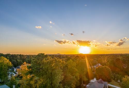
The ball of sun, the strong ray that runs from it and the horizon line are the key elements here. I feel that the lower house is distracting from them. If it was cropped out, Ithink it would feel unbalanced with too much sky so I'd consider taking an equal amount off the top. Thjis would strengthen the horizontal lines and make the slash of the sun ray even more prominent in the overall composition.
-
@minniev has written:@LindaS has written:
At the Edge
 At the Edge by Linda Shorey, on Flickr
You have given us a nice one that's fun to discuss, as you often do! I've read all the comments and your replies so far, so I'm up to date on the conversation (and even though flat view is not conducive to discussions, we're having one!). I like it very much just as you've presented it, lines, poles, signs, and all. I am of mixed minds on these distractions. I hate them when they get in the way of a story I want to tell and I love them when they illustrate that story as they do here.
A man walks stiffly through the ugly accoutrements and clutter of modern culture, over a mysterious hill and into the haze covered mountains of the Real World. Will he check his mail? Put out a fire? Obey the signage? Will he leave his own mark? I prefer to think he is headed for the trail, to be redeemed.
Let's keep this going as a conversation. I agree with minniev and I'd leave all the lines and poles in. Beyond the edge, another world, clear (well, as far as we can tell here) beckons. A prominent sign suggests that he should turn aside. The man's up right stance, with a small hint of a step makes me think he has made his choice and wont be looking back.
I can see this as a "motivational" picture, complete with an appropriate phrase, hanging on a wall in a public space. -
-
Quoted message:
Roel Thanks a lot and very appreciated.
@RoelHendrickx has written:@minniev has written:@LouPhoto has written:[![_6292261_2.jpg]
Flower in an imaginary glass sphereEnlarge click image >click downarrow
Both images are creatiesThank for looking LouPhoto
Beautiful concept, as the flower conforms to the imaginary sphere that is barely visible to us somewhere deep in the image. I'm wondering if several images are composited? It seems that the focus is both foreground and at some depth with the middle ground OOF, but I may be misinterpreting what I think I see. It is an image with several mysteries, and that's OK, it's what makes us look longer and that is success.
Although I am well known to not be a big fan of flowers and other similar images, I must say that I really really like this one.
It is pretty grand, in composition AND in processing.
For all the reasons already stated above here.This offering reminds me of Edward Weston, and as far as B&W still life of vegetation goes, that is a BIG compliment.
-
Hi Mike
Thanks for your comment. By the way, no solarization PP was used in this image. I also need to give you some clarity on your question from last week. I couldn't answer your question because the photo was taken at a very sad moment. Sometimes people leave this life at a very unexpected moment. I think I should leave it at that.
LouFoto
@MikeFewster has written:@LouPhoto has written:[![_6292261_2.jpg]
Flower in an imaginary glass sphereEnlarge click image >click downarrow
Both images are creatiesThank for looking LouPhoto
One of those "the more I look at it the more I like it" images.
B&W was a good choice because of the importance of the lines. I very much like the angle you have chosen for the bloom, the fitting of this form to the globe and then the fitting of the globe to the square. The solarization edges lift the curves that make the shot. -
@OpenCube has written:
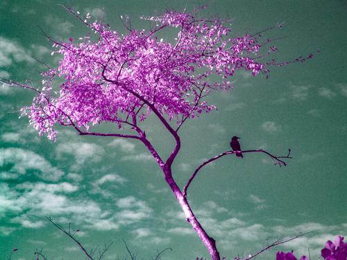
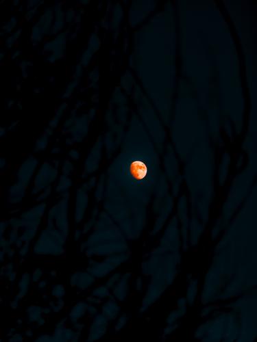
This stumbled out thanks to various suggestions.
Wonderful - I like it!
