This is a rare occasion where one of your images does not really speak to me.
I have been wondering why over the past few days.
Maybe it is the absence of a clear and strong geometry.
Maybe it is the odd open character of the bottom of the frame (with all that water that seems to be flowing out of the image).
Maybe it is the fact that the nearby autumnal tree is not grounded in anything.
All in all, I think that I would have been more enamored with just a telephoto capture of the far shore, shrouded in soft mist and with an even softer reflection.
The foreground does not add anything here for me.
-
-
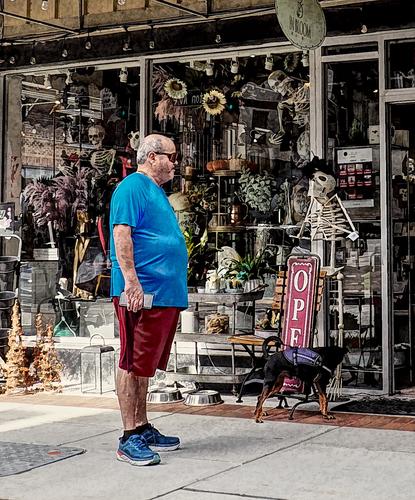
One could almost read this as a modern take on the classical art subject of the "memento mori".
Our well fed spectator is watching the skeleton and considering his ultimate fate. -
I wrote my own comment on this image before looking further down the thread (being systematic to make sure I look at everything).
Funny how we both made the same association. -
@Manuel has written:
I'm a bit clumsy with B&W, but I did my best 😀
The B&W is quite alright.
I usually process my B&W with more contrast, but that is a matter of taste.
This soft and gentle B&W fits the pianissimo rhythms of the image perfectly.Compositionwise, you did great.
I have made my fair share of images of beautiful classic (and modernist brutalistic) staircases, both pointing up and pointing down.
So I can really appreciate the effort it takes to get just the right angle and focal length to get the optimal view.
You did here: the curves are beautifully nested and the right angles of the stairs are like outspread wings.
I would probably have focused more on the center and the depth, but that would have been a mistake.
Your wider view is much better. -
@Rich42 has written:
Rich
This needs to be viewed very large in order to appreciate the simplicity of capturing these grasses and their movement in different directions.
This would look great on a really wide wall in a vegetarian restaurant or in a bakery. -
@LindaS has written:@WhyNot has written:
A Day Late
WhyNot
Ultra-delightful! The title takes the image to a whole other level, though I adore it as-is. The portly gentleman's posture and expression, with cell phone in hand of course! is priceless. It feels like the dog is about to raise its leg against the skeleton as soon as he is satisfied it won't fight back. I think your processing is absolutely perfect for the humor and unique scene.
@minniev has written:@WhyNot has written:A Day Late
…................
Well spotted. A portly gentleman surveys one who is nothing but bones. The dog looks quite suspicious of the bony one - his tail is curled and his back is raised as he sniffs about. But it doesn't end there, as there are so many other treasures to discover here, and the bony fellow has some several friends staring out from the store including one dangling from above. A fun urban street image.
@RoelHendrickx has written:@WhyNot has written:A Day Late
…...............WhyNot
One could almost read this as a modern take on the classical art subject of the "memento mori".
Our well fed spectator is watching the skeleton and considering his ultimate fate.I thank you all for your kind comments and sharing your take on what I offer. I always enjoy reading what others see in these photographs as I find more than any other genre that “street” seems to let the viewer bring his history and experience to those interpretations ...
WhyNot
-
@RoelHendrickx has written:@Rich42 has written:
Rich
This needs to be viewed very large in order to appreciate the simplicity of capturing these grasses and their movement in different directions.
This would look great on a really wide wall in a vegetarian restaurant or in a bakery.Minnie, Linda and Roel,
Thank you very much for the comments.
As to the size of the images, I have them printed at 24" wide and matted, waiting for framing. Fortunately I have a wall to hold them.
Rich
-
@Manuel has written:
I'm a bit clumsy with B&W, but I did my best 😀
LindaS, minniev, Rich42, RoelHendrickx
Thank you very much for your comments and suggestions.
I rarely do B&W, I don't know why but there's something in me that pushes me towards color. I shoot in RAW and convert to B&W but I'm almost always dissatisfied and in the end I go for the color version, but the strange thing is that I like seeing B&W photos. -
@Manuel has written:
I'm almost always dissatisfied and in the end I go for the color version, but the strange thing is that I like seeing B&W photos.
I completely get that and often feel the same way!
Your shot above is excellent though and works really well in B&W. So I would suggest it's worth it ignoring your usual instinct to go for the color version from time to time and just try it like you did here. I'm sure the results will look great given the apparently very good feeling for composition you have. Excellent work!
-
@Rich42 has written:@RoelHendrickx has written:@Rich42 has written:
Rich
This needs to be viewed very large in order to appreciate the simplicity of capturing these grasses and their movement in different directions.
This would look great on a really wide wall in a vegetarian restaurant or in a bakery.Minnie, Linda and Roel,
Thank you very much for the comments.
As to the size of the images, I have them printed at 24" wide and matted, waiting for framing. Fortunately I have a wall to hold them.
Rich
Sorry - forgot to comment, even though I absolutely wanted to the moment I saw it! I love your captures and the combination of them works really well. I often hesitate to shoot grass 'only' even though I enjoy doing that because some inner voice tells me 'but there must be something else of interest in there!'. Your wonderful shots reminded me, that this is certainly untrue and it's more than worth it to go for the grass, its patterns, movement and light as well. Thanks!
-
@Bryan has written:
I really enjoy the colors in your shot - it's so exceptionally well balanced and makes me think of the abundance of colors and impressions Nature often provides in spades. Just wonderful!
-
@WhyNot has written:@simplejoy has written:
A simple image from a simple man, trying to reach out from time to time...

Contact creator by simple.joy, on FlickrThanks! Yes - of course! A camera was involved. Had to look up photogram... wasn't familiar with that.
Interesting .. emulation of a photogram ... at least I assume a camera was involved ..??
WhyNot
@LindaS has written:Curious about the piece below the longer finger, and whether it's needed for the message or perhaps you wanted for compositional balance?
Yes, for balance reasons as well as giving a little bit of depth perception. I also generally enjoy the shapes and patterns bright light creates on our hands. While I won't claim I like the signs of aging, I find hands of all ages beautiful and interesting. They're such incredible tools...
Thanks to everyone for the interesting comments and interpretations. It may be my least liked image since years on flickr, so I'm glad you thought it's worthwhile... 😅
-
@WhyNot has written:
A Day Late
WhyNot
A moment to be enjoyed by a spectator. Street photography rather than fine art. We can try to think of witty and/or profound thoughts from either of the figures as they contemplate each other. The difference in body mass is full of possibilities. We could do the same with the dog and its interest in the bones. The low angle chosen by the photographer helps us to see things from the dog's point of view.
-
@minniev has written:@Manuel has written:
I'm a bit clumsy with B&W, but I did my best 😀
This looks anything but clumsy It's most graceful. It works marvelously in black and white. The visual puzzle of the spiraling stairway draws our eye down whether we follow the white, the gray or the filigree lines. Placing the composition at this angle makes the downward journey more rhythmic and thus more visually pleasing. It might could stand a small crop from the left to limit the white space to more of a triangle and keep the geometry more balanced. Lovely.
Once again, minniev has covered all the bases. I don't see it as clumsy either. B&W can usually benefit from a fine frame so the lighter tones don't run off into the surrounds.
-
@OpenCube has written:
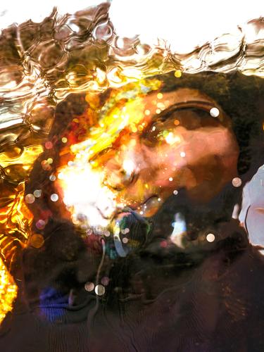
A few nights ago I watched an old movie with Tony Curtis as Houdini. Your image is disturbingly like the final scenes with Houdini in the water torture cabinet. It doesn't end well.
Even without the film, I think I'd have similar vibes from your photo. The bubbles and twisted features set the mood. There is a clear surface and the subject is below it. Disturbing but effective. -
@Rich42 has written:
Rich
Quite beautiful. i like the colours, patterns, movement small details in the photos individually and as a triptych. The arrangement of the three is takes us to the more vertical centre group. You might consider another version where the grass (wheat?) heads are all at the same size. ie., enlarge shots 2 and 3 a little and recrop them to equalize the grain head lengths with shot one. You would keep the same colors, lines and tripytch interaction while, I think, harmonizing the three shots together a little more.
-
-
@MikeFewster has written:@Rich42 has written:
Rich
Quite beautiful. i like the colours, patterns, movement small details in the photos individually and as a triptych. The arrangement of the three is takes us to the more vertical centre group. You might consider another version where the grass (wheat?) heads are all at the same size. ie., enlarge shots 2 and 3 a little and recrop them to equalize the grain head lengths with shot one. You would keep the same colors, lines and tripytch interaction while, I think, harmonizing the three shots together a little more.
Thanks Mike,
Rich
-
-
@simplejoy has written:
A simple image from a simple man, trying to reach out from time to time...

Contact creator by simple.joy, on FlickrTo be honest this pic didn't grab me at first, but reading some of the comments I saw it in another light. My mind actually imposed a face and life to the stick figure - the value of critique...
-
@LindaS has written:
Red Delicious
 Red Delicious by Linda Shorey, on Flickr
.One word - surreal
-
@Rich42 has written:
Rich
A soft and breezy capture of a very delicate grass. Some fine strands even appear to be diffracting the light
-
@ChrisOly has written:@Bryan has written:
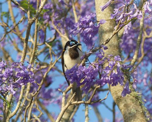
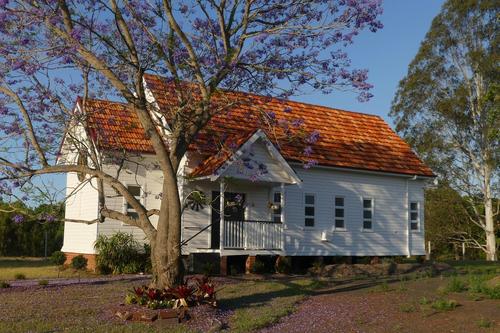
On my way home recently, I stopped to snap this little country church (now in private hands) and was pleased to find a few Blue Faced Honeyeaters enjoying the new Jacaranda blossoms.
First capture is a subject of a slowly vanishing world. Places like this are disappearing quickly. I am glad new owners will undoubtedly keep it going.
Second image contains amazing variety of colours. Well spotted.Chris there is quite a movement in my country for people to buy small country churches that have lost their congregation. So mostly they are maintained even if the inside becomes a dwelling. Thanks.
@LindaS has written:Is there one Australian bird species that isn't spectacularly gorgeous?! Posing inside the lavender tree is just too much beauty. Wonderful! The composition, colors, shadows and textures of the building make this an appealing image also. I don't know if you can straighten the perspective so the building doesn't lean downwards towards the right side; I think it would improve the overall serene feel.
Linda there are plenty of tawny, plain white, or dour looking birds. It's that I am on the lookout for the pretty ones. Sometimes I envy the pics I see of other continent's birds. I am enthralled by the metallic green neck of the mallard duck for example.
I had a look at the church pic with a view to straightening but I feel it's at it's best angle. The floor level is basically horizontal in the pic and it's the ground that slopes away to the left. The leading verandah post is almost vertical and altering that makes the tree on the right lean even more to the left. Perhaps if my viewpoint was higher it would have looked better (I will remember to pack my stepladder next time 😁).@Fireplace33 has written:That blue eyed bird looks quite fancy, especially in the lavender coloured blossom. Lovely springtime in Australia.
They can be quite raucous, nearly as much as parrots and some of their calls even sound similar.
@minniev has written:Nice pairing, tied together by the Jacaranda blooms that appear in both frames. The church is lovely, peaceful, and well caught in the best of light. The bird is equally lovely, exotic to most of us, though he appears to be looking at you with a disapproving expression. This is a very nice nature photo with the bird in near perfect position and no barriers to get in our way. The blooms are lush, full and sharply in focus in front but pleasingly blurred in the background. The bird's unusual mask is well visualized, as are the beak and eye, the two most important features birds offer us. There's even a charming little catchlight in his eye. I love it.
Thanks Minnie, it was indeed a fortunate capture. I was hoping the blooms would come out well but wasn't sure until I saw them on my computer.
@MikeFewster has written:I'd guess that the church has been extensively rebuilt and probably re-clad as well. The stumps wouldn't be original and possible suggest that this is a flood prone area. The photos give the feel of the place and a pleasant spot to live it would be. I like the bookending of the house between an Australian eucalypt and a South American Jacaranda. Pairing the photo with the second shot with the detail of bird in the Jacaranda was a good choice. The dawn bird chorus here would be worth hearing.
Mike I did find a pic on the website of the overseeing parish. It was painted a darkish cream that wasn't too appealing. The new owners have given it a much better look. I have no idea about other maintenance other than to say I am pretty sure it is above flood level. Looking at the roof pitch suggests it does go back to colonial times but the tiles are definitely 50's or 60's.
@simplejoy has written:I really enjoy the colors in your shot - it's so exceptionally well balanced and makes me think of the abundance of colors and impressions Nature often provides in spades. Just wonderful!
SJ, so many times I don't really know how my pics might turn out until I get home. I think the colour of the sky really helped in this case. Which I can admit was more good luck than management. But I am starting to get a feel for how time of day and light impacts shots.
Thanks to all.


