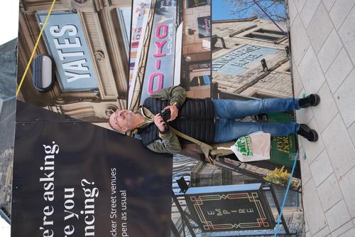
...your shot reminds me that I once took a photo of my wife while she was holding an ugly plastic bag a bit like this gentleman is.
I got severly told off for my oversight, that I didn't tell her put the bag down first.
I put the offending photo in a retouching forum and asked for someone to magically change the plastic bag for a Louis Vuitton handbag.
The results were very good, and much cheaper than buying the real thing ;-)
-
-
I think I've seen this statue photographed by you before. I liked the previous one and this version too.
The strange colours seem to fit here -
MInimalistic but very well composed, because the two mushrooms sit right on the edge of the place where sharp ground and hazy background meet. The bit of soil that they are standing on, devolves very smoothly into unsharpness.
-
This is a very successful image because the multitude of planes and layers make not immediately clear how background and foreground relate to each other.
Looking through glass with reflections and broken light, results in a nice puzzle. Just look at the missing hands of the hairdresser standing on the right. Where is he actually standing? Is he there or are we seeing a reflection.
The cherry on the cake is obviously the trompe l'oeil that takes center stage. The greyhaired man with the mullet seems to be looking in a mirror that is not a mirror but a painting. Is he looking at his abstracted self? -
Still good, but not as good as some of your previous ones.
It would be strange, wouldn't it, if I gave the impression that your curve is always pointing higher and higher.
There MUST be some that appeal less than the others. -
The motion blur on the animal is effective.
I don't have much else to add here. -
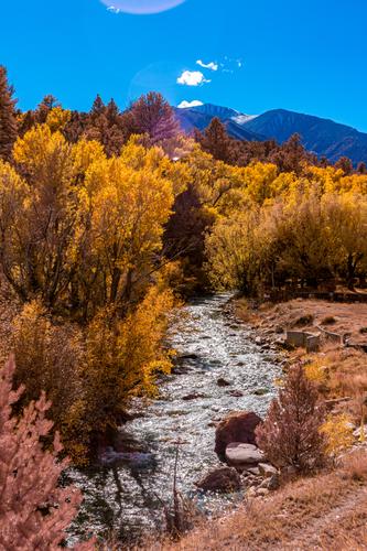
That is a beautifully situated old watermill and the autumnal colours enhance its attraction.
What I like most here, is that you did not place the watermill and its waterfall center, but that you divide our attention between this structure and the big tree (with surrounding nature in general) on the right hand side. -
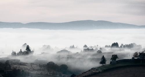
I really liked this image in its small thumbnail forum-post-embedded version.
And it is worth enlarging to better enjoy its best features: the fog swirling around around the trees and the rooftops.
But enlarging also provides us with a better view of some distractions, notably the features of the building facades (doors, windows).
I would almost be tempted to selectively darken those areas of the image, to create more of a true silhouetting impression. -
I think I would have preferred a shot (a bit sooner) with less overlap between the ship and the faraway pillars of the bridge.
-
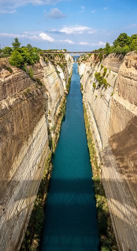
The two views are slightly different in "view" (I think you faced one direction for the first and the opposite direction for the other maybe?
I think, indeed, that the main tonal difference that we see, is due to shooting into (against) the light and with (in the direction of) the light.
It results in what looks like two very different processing treatments, with the first enhancing the drama in the sky, water and manmade cliff faces by liberal use of microcontrast (or sharpness).
Interesting.
(Please do correct me if I have this totally wrong.) -
That's a view we would all like to wake up to, don't we?
Great low clouds over the landscape.
There is a lot of frame (roof tiles, shutters) for a rather small section of landscape and sky, but I don't mind because it helps immersing us into the scene. -
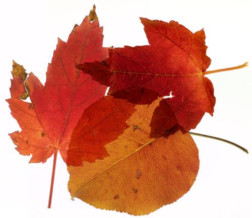
Nice idea, well executed.
A single leaf with all its fine detail would have made a good but slightly boring shot.
The overlapping of the leaves, creating variations in texture and shade, is what creates the tension here. -
I think I would have preferred this with less straight verticals and horizontals (of the window frame) to compete with the lines and curves of the model/statue.
-
@Fireplace33 has written:@AlanSh has written:
A picture can tell a story - or at least, ask questions.
I liked this picture. In itself, as a photo, it's nothing special. But the questions it asks are numerous.
So, what is he looking at? What's in the carrier bag? Why is there a glass at his feet? What's behind that hoarding? And so on.
...your shot reminds me that I once took a photo of my wife while she was holding an ugly plastic bag a bit like this gentleman is.
I got severly told off for my oversight, that I didn't tell her put the bag down first.
I put the offending photo in a retouching forum and asked for someone to magically change the plastic bag for a Louis Vuitton handbag.
The results were very good, and much cheaper than buying the real thing ;-)The benefits of photoshop!
-
@RoelHendrickx has written:
I really liked this image in its small thumbnail forum-post-embedded version.
And it is worth enlarging to better enjoy its best features: the fog swirling around around the trees and the rooftops.
But enlarging also provides us with a better view of some distractions, notably the features of the building facades (doors, windows).
I would almost be tempted to selectively darken those areas of the image, to create more of a true silhouetting impression.Thank you Roel. Here is a totally different edit and crop, though viewing large, I see I could probably work on a few more silhouettes. Also, this edit adds grain, and I might try a much softer effect ("impression"). Thanks for the ideas!
-
@Fireplace33 has written:@Rich42 has written:
In a real photogram I would have placed the leaves directly against a sheet of color film and exposed. No camera involved. I've done that with 4x5 and 8x10 film.
For this image I put the leaves on a light table, a real one - not an led panel, with a 30" x 30" glass top and banks of daylight fluorescent tubes beneath and shot with a digital camera.
At first I overlapped the leaves as they appear here, but that didn't work well at all. They looked OK visually - I got the translucency/transparency I wanted for the single layer part, but where the leaves overlapped, they just became extremely dense and opaque. So I shot them individually and combined/overlapped them in Photoshop, each on its own layer, with the layer blending type set to "multiply." That gave me exactly what I had pre-visualized.
Rich
That is a nice effect and a good looking result !
Thanks Fireplace33
Rich
-
@RoelHendrickx has written:
Nice idea, well executed.
A single leaf with all its fine detail would have made a good but slightly boring shot.
The overlapping of the leaves, creating variations in texture and shade, is what creates the tension here.Thanks Roel
Rich
-
-
-
@Fireplace33 has written:
[quote="@JSPhotoHobby"]
I like the second one best.
Not sure what I would have done differently. Without being there, it's difficult to say what other opportunities you might have had?
I'm guessing you are standing on a bridge looking down, and I suppose that ships come through, so it might have been possible and more interesting to see a ship there in the canal?
The sky looks a bit murky in the first.
One thing comes to mind for the second shot,... since you are pointing the back of the camera downwards you're getting a keystoning effect in the image that makes the telegraph poles and trees on the left (and right) hand side lean outwards and it also makes the walls of the canal look a little less steep than they were in reality.
I made a quick edit to correct the keystoning, and the shot becomes taller and thinner but also looks steeper.
Also made the interesting shadows at the bottom of the bridge you're standing on a slightly more prominent.
Not sure if it can be considered an improvement, but here is the result of the edit?I had not considered how a tilt-shift lens might change the image. I think you've hit upon something here. Thanks.
-
@RoelHendrickx has written:
The two views are slightly different in "view" (I think you faced one direction for the first and the opposite direction for the other maybe?
I think, indeed, that the main tonal difference that we see, is due to shooting into (against) the light and with (in the direction of) the light.
It results in what looks like two very different processing treatments, with the first enhancing the drama in the sky, water and manmade cliff faces by liberal use of microcontrast (or sharpness).
Interesting.
(Please do correct me if I have this totally wrong.)You are correct Roel. I tried to use a graduated filter in post to bring the sky back from being blown out and just over did it.
@MikeFewster I use Lightroom for editing, but outside using auto and crop I'm not very versed with iit.
I took 40 ish images from different positions with the sun in front and behind me. I was hoping it would look imposing and deep and enchanting with the glittering water. Fireplace is probably right, the keystoning effect of tilting the sensor plane downward distorted the image in a way I didn't expect.
