There are many small things here that contribute to the whole. The foreground examples of the tradesman's work and those in the background. The checked shirt and the [atterns in the window. The display of tools. The prominent hands and their association with the work. Excellent lighting/modeling on the face. The woman and the suggestion of home. We get an appreciation of the skills and the life of the subject.
The platform, lefthand side is a bit washed out and this creates a highlight that is unnecessarily eye catching.
-
-
-
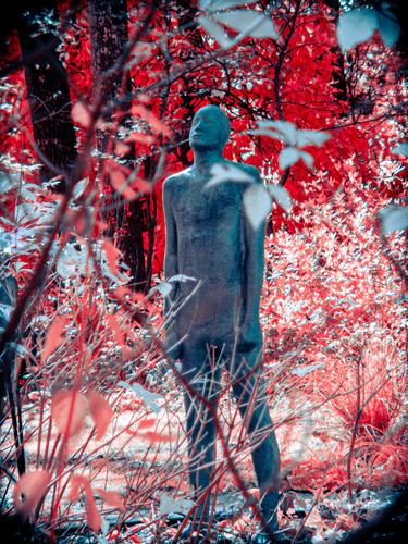
I really like it - excellent shot and title! The leaves in the foreground provide a great upwards motion, emphasizing the direction the figure is oriented towards. I'm not sure about the colors... if you want to go for something drastic it might be the right choice. I'd personally go for something 'light' in order to match the sky theme, but then again I don't know anything about the context of this figure and your idea behind the shot, so you're certainly the better judge of that.
-
This shot gas given me pause. I have come back to it several times because I thought I might feel differently about it with further viewing. I feel that there is a visual conflict between the highly detailed right hand side and the bright left with its large undefined areas. Those areas are so larhe and bright that they grab attention. Unlike the usual bokeh, they dont provide a background to the subject, they just compete. Some of that area also feels closer to the viewer and yet more out of focus that other back areas. It feels visually inconsistent and confusing and therefore intrudes into my viewing of the right hand side.
Centre and right, the overlapping fungi with the peek into the textures below and the contrasts between the smooth surfaces with the mosses is a delight. On the far right, at the top of the focused mosses, is another area where something weird seems to have happened with the stacking.
I'm not sure what happened here. It looks like some problems with the overlaps in the stack. Where it comes together, it's great. Well worth more experimentation, probably with the number of images in the shot and the dof of each.
Memo to self. Have a go at some image stacking. -
It isn't surprising that lots of photographers were here. A place with the lot. Autumn colours at their very peak, ye olde building with wooden shingles and water wheel plus waterfall.
You have done it justice. The zig zag path of the falls and rocks moves up ththrought hte shot tieing everything together with the mill. The autumn framing is impossible beautiful. Your dof is absolutely perfect with the foreground leaves slowly fading into a background but always retaining the feel of foliage.
Open the box and choose a chocolate. -
-
Either colour or BEither colour or B@W would work and it's interesting to consider how this might change the way we respond. Colour gives the art work on the wall more meaning. Your title also draws attention to the artwork so I think this is the right choice with your title. With B&W I'd crop to simplify the lines, right hand side, top and bottom and give more attention to the interaction between the two people and the mirror.
Either works. The delicate moment we all recognize when the hairdresser stands back and asks what we think. -
How dangerous are these critters?
I don't know anything about them but one of the things I kind of feel about them is the weirdness of all the bulk and muscle balancing on the little legs. Your shot suggests this. Usually we might feel that this photo is visually out of balance but here, all the bulk top left and the taper to a point, bottom right plus the leg, really conveys something of "pigness." The blur is fine as well. That's the kind of action that is part of these guys. -
An extraordinary sky. It would be nice without the trees but this doesn't matter. It's the stunning formation and the lightrays that this is about and you caught it.
-
I need help with the cryptic title. It's hard to beat this for colour impact.
-
A place still on my "to be visited" list and a place I want to see by night.
I'm not sure about the green patch though. I want to know the what and why of it rather than taking in the iconic spot with the bridge and ferry. Was this your intention? -
Manuel, I can see what you are getting at with the suggested crop. I had similar thoughts and tried it but I decided it didn't work. Even taking a very small slice off the top changed the proportions and, to me, it felt wrong. I think the height is needed for the extension of the implied line that comes up from the river and falls. Further, that small touch of sky that I tried to remove, balances with the pool at the base.
-
@JSPhotoHobby has written:
When I was shooting these, I really thought I had something. I've seen so many images of this canal I though I would get something similar. What should I have done different?
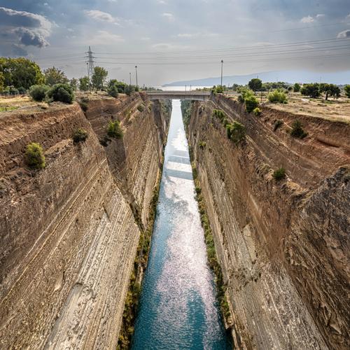
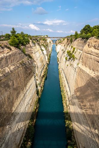
I don't think this is a "should you have done differently." Maybe with a different day, time of day or light it might have been different. Here I think you are working with what you saw and I don't think there are too many options.. You bring out the straightness, the depth and the stone textures that are the striking features of the canal. Perhaps you could have tried a diagonal tilt but this would have looked gimmicky and your angle has more integrity.
What you might do with post processing is another matter. The sky in 1 looks a little artificial. Given the symmetry of the canal, I think the SKU might have reflected much the same symmetry. Was the darkening to the sky left done in PP? Perhaps using applied vignetting would have been a better way to add darkening to the sky while emphasizing the symmetry of the whole image? There are other dramatic lighting changes that might be made but the only things I can think of would look artificial. I think that would be a mistake as it is the cut of the Corinth that is the point and you already have it. -
@OpenCube has written:
"I'm just doing time inside my mind and all I've got is Hank to keep me company."
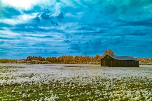
I feel as though I'm searching for a subject. My eyes go backwards and forwards between the bright spot in the sky and the dark barn. The sky is ominous and the barn mysterious. It might be a place where opening the doors wouldn't be a good idea.
-
-
-
@Bryan has written:@WhyNot has written:
Looking at Me? #5
….....
Taking in the sun with socks on - why not? 😎
@ChrisOly has written:@Bryan has written:@WhyNot has written:Looking at Me? #5
…....
Taking in the sun with socks on - why not? 😎
Must be different climate conditions.
@minniev has written:@WhyNot has written:Looking at Me? #5
…....
Smile-worthy image of a couple sailing in what looks like a purple velvet stage curtain, upon a sea of leaves. The simplified processing and color containment isolated them even further and she looks annoyed at being bothered. The guy is wearing neatly pulled up black socks which is a bit odd in its own right, and there's a blue thing on his sock that matches his madras walking shorts. And is that a squirrel sitting on the edge of the stage curtain? An image that makes us smile and also think.
Thank you all for your kind comments ….. Like most of this type of photography ” just a slice of life “ … As has become the nature of things in my region of the world an early frost quickly turned into some November days of 80+F .
I'm beginning to find this flat view here a bit tedious. I spend most of my time here revisiting pages I've already seen over and over .. and the necessity of including pictures in a quote to make sure we know who we are talking to gets old quick and I find makes it difficult to remember where I am … There must be a better way …. but then I may be lonely in these thoughts … so ..
WhyNot …..
-
@WhyNot has written:
Looking at Me? #5
Why Not
Why Not, would you consider posting a group of your Looking at Me? series together. I think the repetition of the idea would make each the concept stronger.
Deliberately choosing a proportion that complements that subject feels perfect. Horizontal lines convey calm. You get that here but the upright position of the woman breaks that calm. Exactly. Your composition supports her direct and challenging gaze and the interruption of the peace.
I like your colour treatment too. The couple and the rug blend with the background. It is the upright position of the woman that gets the attention. If this had been in natural colours, we might have felt more like observers of a moment. The non natural colours give more weight to the feeling that a statement is being made.
Great image.
