Classic American West. Love the layers of blues. The foreground helps with distance; however, I'm not a fan of the harsh sky. Similar to recommendations about cropping some of the sky out of my black and white fog last week, I feel less sky = more attention to the hills in yours.
-
-
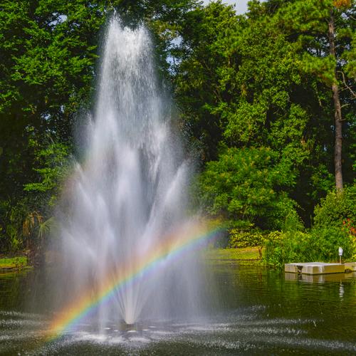
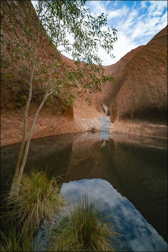
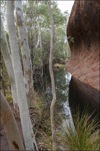
Water Feature
A smaller story than I usually attempt:
 Water Feature by Linda Shorey, on Flickr
.
-
Breathtakingly beautiful. I'm seeing suggestions of a sky replacement. Am I correct?
-
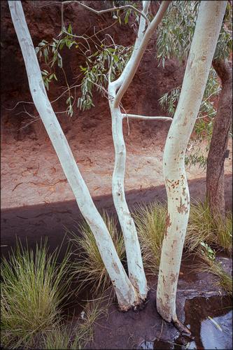
All are stunning in their compositions, rich colors and contrasts, and use of light. This one is my favorite, for the dappled light on the main tree's trunk + its impressive structure dominating the scene.
-
A great find! The soft sky enhances the leaves beautifully. I appreciate inclusion of the buildings to sense of place, but I sure do love the composition without them 😀
-
Wow, that is a beautiful majestic view in a bright and colourful time of the year!
Lots of details in the leaves and a great composition overall.
I also like the light on the river making it postively glow, and giving us a nice centre of attraction for the image!Seems like a good place to go back and have some fun exploring more of that new national park, is it far from home ?
-
-
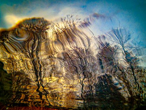
The gem-like yellow and red colors make this a standout for me. I have a slightly similar look from a tree reflection in rippling water. Flipped upside down per MinnieV's suggestion years ago. Mine was mostly mono to begin with. Yours, whether colors are introduced or were there, has far more impact.
-
Bubble, Bubble - great background together with wet rocks, yellow leaves and green vegetation and all basking in the sun.
Excellent image with nature at its best.
Love the shadows as well. It's all playing very well. -
Very fluid image with lots of imagination. Great colours add immensely to the final result. Excellent effort!
-
-
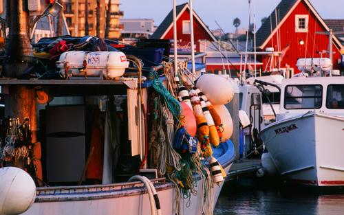
Great title. Eventhough there is a considerable amount of attachments visible
I am sure they all have their purpose.
The colours are truly amazing and so is the glorious light. You get an extra star for processing. Well done. -
Great shots! I like this in particular because it's very bold and effective in it's composition. Excellent work. 👍
-
Wonderful image. I love layered effects such as hills and mountain ranges. This is among the most effective I've seen.
I suggest cropping both sky and foreground by about 50% each - the hills and power line towers are the image. (Wish you had uploaded a higher resolution version).
Such an image would go straight from my monitor to my printer and onto my wall. No hesitation.
Rich
-
-
-
-
Thank you for the kind comments.
I understand your feeling about sky and foreground, but I really wanted a square format for this one.
However, I have also made a more rectangular version (different image, same spot, same moment).
Maybe you like that one better?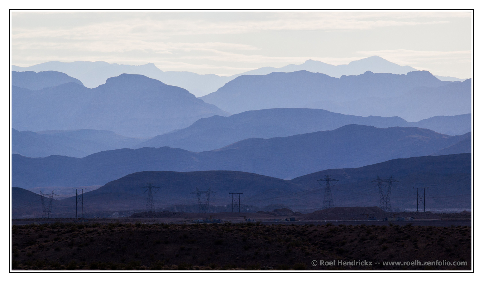
(As you can see, this image does not reach as far to the right as the square one, but a fair bit further to the left.
This tells me that I also could have gone even wider (also to the right), but for some reason I opted not to.)
