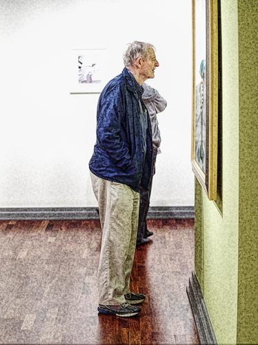
I like both honestly! Great work.
-
-
@RoelHendrickx has written:
ON OUR WAY TO VEGAS
A few of the landscapes in previous editions inspired me to dig up this older image of mine (from July 2013), taken on our road trip through SW-USA.
We were en route from Zion NP to Las Vegas in the afternoon, and the light was becoming ever more interesting.
This sight here made me stop the car, get out and grab a shot or two :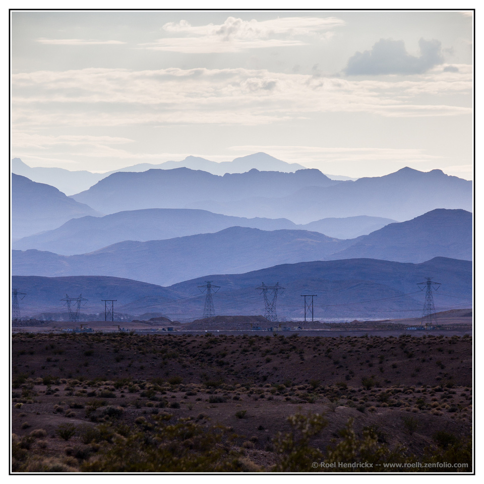
I like the picture but from purely a subjective viewpoint I would either open up that dark foreground or crop much of it out ...
WhyNot
-
-
@RoelHendrickx has written:
ON OUR WAY TO VEGAS
A few of the landscapes in previous editions inspired me to dig up this older image of mine (from July 2013), taken on our road trip through SW-USA.
We were en route from Zion NP to Las Vegas in the afternoon, and the light was becoming ever more interesting.
This sight here made me stop the car, get out and grab a shot or two :

[/quote]
I agree with rich42, the wide version looks much better. I also agree with WhyNot, if you want a square version I think you should cut out half of the foreground (it's boring).
-
@minniev has written:
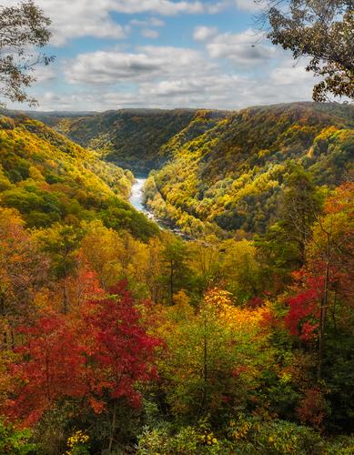
New River Gorge - This is the most recently added US national park, and I'd never seen it before. It has lots of pieces to explore, and one day didn't do it justice but it was a fun start.
Beautiful scene well photographed .. I had to look this one up .. looks like a few roads and lots of 4WD roads into the park ...didn't see any walking trail's marked out on their map. I'm no longer into travel for any distance so I'll rely on your next visit to see more of this park! .... Very nice ...
WhyNot
-
@RoelHendrickx has written:
ON OUR WAY TO VEGAS
A few of the landscapes in previous editions inspired me to dig up this older image of mine (from July 2013), taken on our road trip through SW-USA.
We were en route from Zion NP to Las Vegas in the afternoon, and the light was becoming ever more interesting.
This sight here made me stop the car, get out and grab a shot or two :
Now that's a rather wonderful image with those overlapping layers of mountains and all the varying tonalities involved. Though it would be nice in monochrome because of the tonalities, I like the purples and browns of the color version. This is definitely one where I'm not tempted to take out the power stanchions. They are essential to the story, delicately strung with wires and silhouetted across the plain at the foot of the mountain range, reminding us of the fragile connections and small boundaries between wild and tamed places.
-
@simplejoy has written:
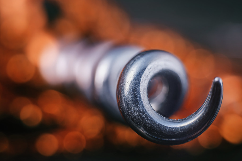
Break free! by simple.joy, on FlickrExcellent example of your special magic, the sharp focus on the foreground element that winds its way into blur by the third twirl. But the real beauty of this one is the scrumptious orange bokeh balls lavishly distributed underneath the coil.
-
@Fireplace33 has written:
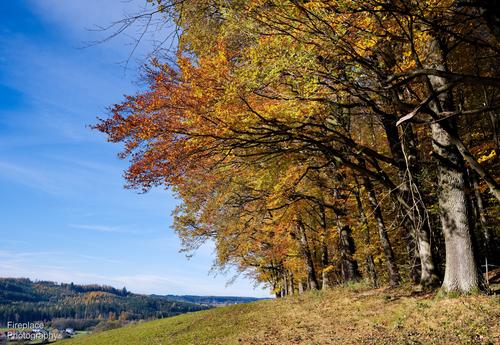
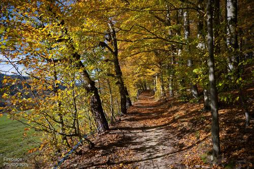
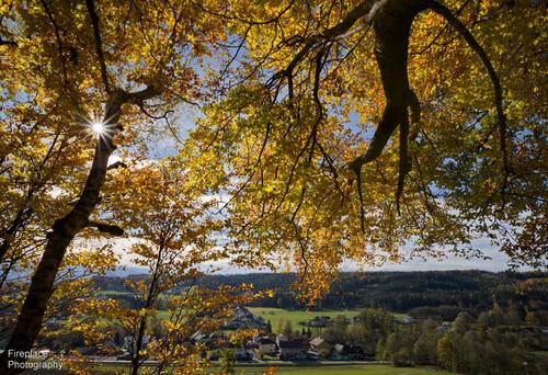
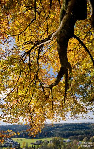
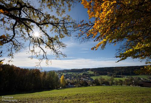
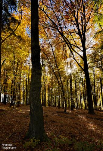
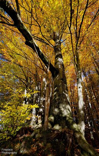
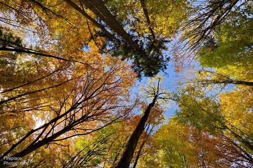
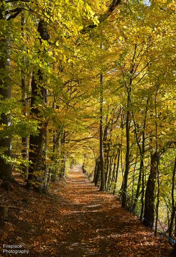
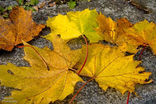
A sunny autumn day in the woods
This sunday was a lovely warm and sunny autumn day; so ideal conditions for a walk in the forest, up on the hill, overlooking the villages below.
Inside the forest it was somewhat darker, but, with the sun breaking through the branches in places, you can get some nice sun stars.
They give a bit more "sparkle" to the image :-)
(A high F-number and a good lens help for that effect
This was a mixed forest so there were lots of different colours; red, orange, yellow, green and with the blue sky behind it made for some really colourful images.
Autumn was bit late this year , but nevertheless arrived.Thanks for taking us with you on a wonderful fall walk in an old forest. You've given us the scenery in all its angles: distant, downwards, upwards, broken into elements, and close up. The last two, of the pathway and the leaves, are my favorites. Great sense of place.
-
@ChrisOly has written:
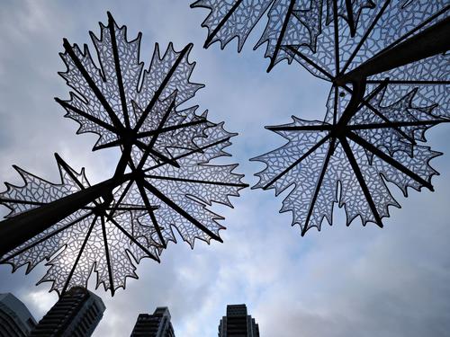
Trellis
Artwork in urban development.
Excellent capture of a great find, well photographed. The design element of a strong diagonal works here, even though the middle third of it is implied. but I think it would work better cropped from the bottom to eliminate the buildings, not because of distraction so much as because of interference with the diagonal. When I look at it, the buildings bother me visually because their weight keeps my eye glued to the bottom edge and prevents easy movement to "finish" the diagonal in the upper right. When I eliminate them my eye moves more easily and the composition becomes more balanced and lighter.
-
@LouPhoto has written:
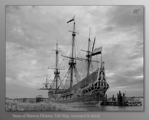
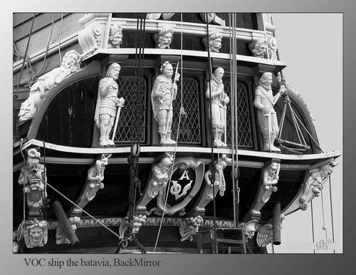
In response to the comments that the entire ship could be a little lighter, I complied. However, it does have an effect on the already given comments. "Terrible", what went wrong here is a mystery to me. Apparently the previously requested changes are not yet being worked on by the thread owner. But apparently it seems we can't have everything ;).
Thanks for looking and comments, LouPhoto
Both are quite wonderful. I actually thought the first one was an old vintage postcard. What an elegant ship! And beautiful captured/presented in a manner that does justice to beauty and age and grace. The three quarters angle is just perfect to display all the delicate features and lines. The closer up view of the carved figures gives us a snapshot of how rich that detail really is. Well done.
-
@LindaS has written:
Water Feature
A smaller story than I usually attempt:
 Water Feature by Linda Shorey, on Flickr
.
Small stories are often all I can find in my home turf, so I have an appreciation for them. This one is sharply caught, the light on the reeds suggests the time as very early or very late in the day. The water bubbles are caught in minute detail and in action. I am bothered a bit by the blocked shadows, which get me stuck especially in the upper left quadrant. The way we respond to black or near-black shadow areas is variable from person to person and leads into questions of how black, how much and where. There is no right or wrong. It would be interesting to have more discussion on this, as it is part of my response to Chris's image as well. Well caught, nonetheless, exactly as you meant it to be.
-
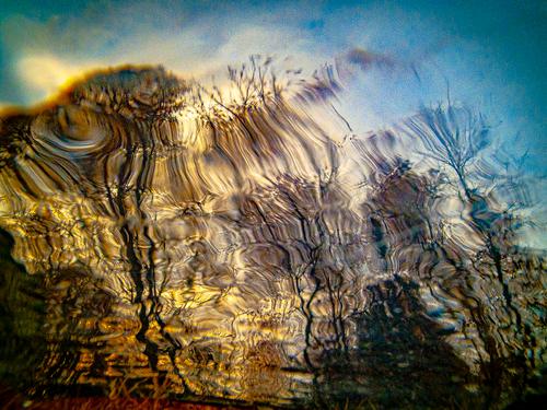
@OpenCube has written:
I quite like this abstracted image of what seems to be trees and/or other plant life against a blue sky with sunset behind. The abstraction may be from water somehow, or it could be from camera work or even post processing. Whatever you used to get to this place was well chosen. The colors, while subtly manipulated, are only slightly out of the range of the real and this lets the artwork become the subject rather than the color becoming the subject. The gentle movement of the lines is soothing rather than jarring. I like this one a lot.
-
@Rich42 has written:
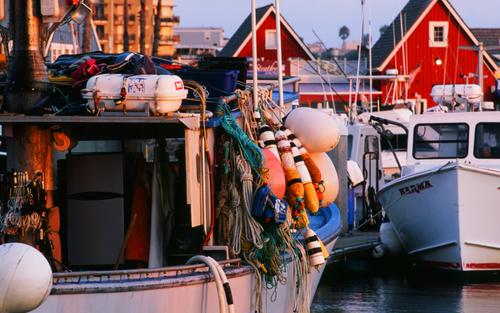
One of the Oceanside, CA fishing fleet at golden hour. She'll be out night fishing in a few hours.
Color negative film. Nikon EM.
Rich
Love it. I get obsessed with fishing boats and all their equipment, I must have worked on one in some prior life. The colors, the textures, the details, are all well captured and rendered here. We can even explore the darkened interior through that open door. Nice title, a correct one: everything has its place, and those who use those tools know exactly where they are. The two red triangles on the right anchor the composition and help keep us from getting lost in that chaos.
-
@Sagittarius has written:
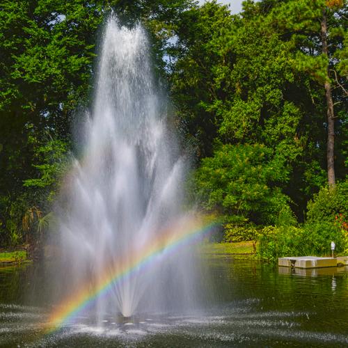
Nice clear fountain bow. You actually have two bows in there, the upper one being much paler (it could be enhanced if you wanted, in PP, creating an impression of a decorated Christmas tree.) I really like the way you've captured the water in this shot. I think the platform on the right and the pole extended from it are not necessary to the image, and are something of a distraction. If I were you I'd crop them out and leave the tree dead center (I don't have as many objections to centering as some folks do). Or if you like it where it is, I'd consider removing it in PS or similar.
-
@OpenCube has written:
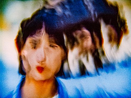
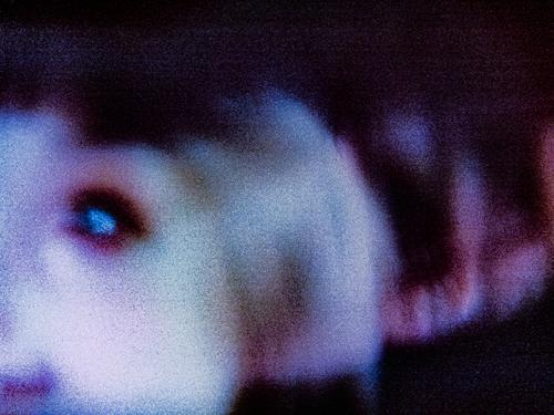
I think I found the Rube Goldberg infinite original image creation sensation making setup.
I think you're onto something good here and hope you'll keep developing this concept, whatever it may be. Love the first one. Love the colors and the movement.
-
@MikeFewster has written:
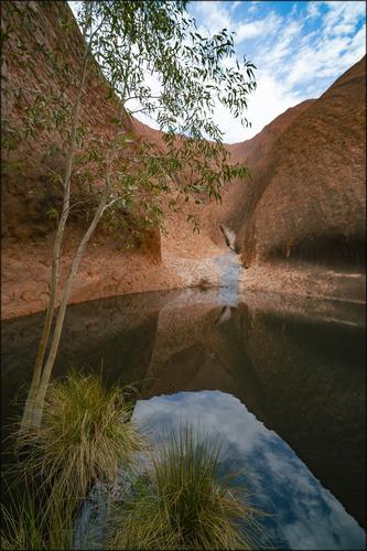
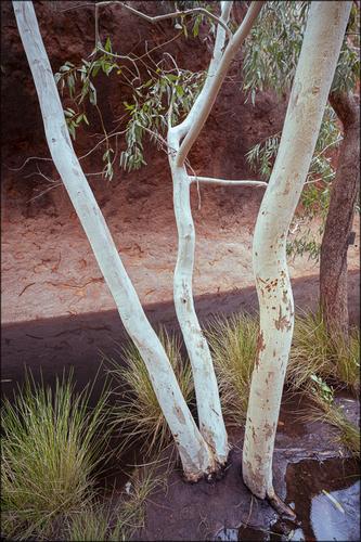
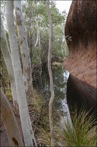
Mutijulu
A permanent water hole at the base of Uluru, central Australia.
Nice well-taken series more in the realm of intimate landscapes than large scenes. I tend to use vertical framing for such shots, and often end up liking them better than the traditional wide angle views. I like the way you've subtly incorporated the water into the second and third without letting it dominate the image, showing us more about the trees and grasses and well worn soil, yet we always know the water's importance. I imagine there are many tales this waterhole could tell. You hint at them but let us imagine. Well done.
-
@WhyNot has written:
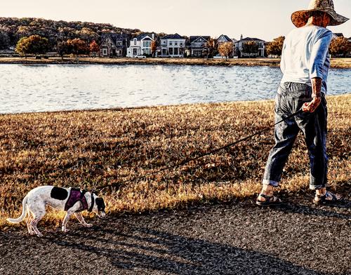
Reluctance
WhyNot
Well titled and fun. Pup seems less invigorated by the shoreline walk than his mistress. The subject becomes the leash that ties them together, bisecting the frame diagonally, and we feel the tension as she urges him along and he hangs back. The textures applied through your processing turn this more towards a Norman Rockwell art piece than a street photo, and makes me like it even more.
-
@minniev has written:@WhyNot has written:
Reluctance
….....
WhyNot
Well titled and fun. Pup seems less invigorated by the shoreline walk than his mistress. The subject becomes the leash that ties them together, bisecting the frame diagonally, and we feel the tension as she urges him along and he hangs back. The textures applied through your processing turn this more towards a Norman Rockwell art piece than a street photo, and makes me like it even more.
A reactive photograph …. what intrigued me the most was the compositional device of that leash that keeps my main character from walking out of the picture and seems to tie the picture together . . The “Rockwell look” has a couple origins – I saw many of Rockewell's Saturday Evening Post covers during WWII when my mother got the magazine regularly, a showing of Rockwell's work at the local Museum about 5 years ago, and some pp tools that got me going in that direction. I liked the effect and thought it gave my street people a bit of anonymity so I continue using it .. Your comment had me looking back to my series on that art show when I wasn't using that technique and has me thinking I should go back and rework it a bit …..
Thank you for the comment ..
WhyNot
