• Members 1546 posts
    Dec. 2, 2023, 12:26 a.m.

    The boxer we're looking at is pretty impressive. The look in his eye is chilling. If we fail to get the message, we can refer to the poster behind him for more information.

    The lost detail in the nearer boxer's hair is a minor distraction and doesn't really take away from the effect of that single focused eye.

  • Members 1546 posts
    Dec. 2, 2023, 12:35 a.m.

    As usual, I have no idea what this is you have presented to us. It looks like a mountain hidden in fog and the cut off tops of birdhouses. The cut-off look is a little bit of a visual bother to me, but then I don't know what I'm looking at anyway so I'm not really entitled to complain. The monochrome treatment is very nice and lends even more mystery. At some point you're gonna have to show us the rest of the picture or tell us the rest of the story!

  • Members 1546 posts
    Dec. 2, 2023, 1:08 a.m.

    Three excellent architectural images of a very interesting building. You've chosen compositions and angles that showcase the multiple arch elements but manage to convey both close and distant cumulative views of the structure. The light is just magnificent, so the colors are rich and strong, and the contrast is perfect. The sky is wonderful. The complementary colors of blue and yellow are a great duo. I think I would tone down the blues on the first two. But beyond that, this is a fantastic architectural series.

  • Members 1546 posts
    Dec. 2, 2023, 1:17 a.m.

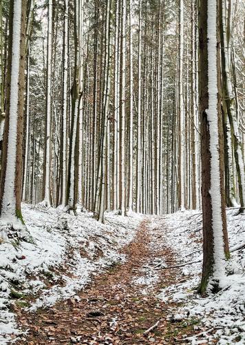
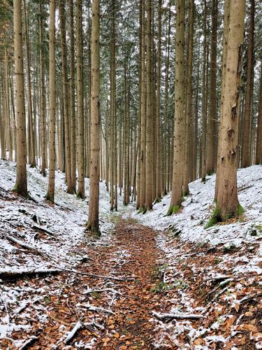
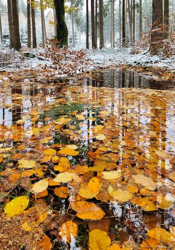
    Nice set built on recurring vertical elements. The trees are amazingly tall and you've conveyed their majestic height. Artistically, the third is a really nice creative image that mingles the reflections fo the Tall Trees with the gold carpet of leaves afloat in the water. There's a 3D effect that is quite captivating. This is a special image that deserves a print (maybe on metal or metallic paper).

  • Members 1546 posts
    Dec. 2, 2023, 1:26 a.m.

    These are excellent dragonfly shots. Because of their weird construction, it is SO hard to get enough of them in focus to make a good image. You did it! You found the angles necessary: face forward, angled in from the side to get a wing and all the rest, and angled from above. These are the positions that have worked for me too. We can count the hairs on his legs and appreciate the lace-like pattern on his wings. Your backgrounds are nicely blurred while retaining differences in tone and color so that it's clear he's in his natural habitat. I especially like the last; it's one of those compositions that's strong on rhythm.

  • Members 1546 posts
    Dec. 2, 2023, 1:33 a.m.

    And it's still just as beautiful as it was then. A classic winter scene that could grace a Christmas card. The iconic lone tree, dark and bare against the white landscape, evokes a sense of peace. The backdrop of snowy mountains gives dimensional support. But the thing that grabs me is the the graceful curve of the road rising slightly as it traverses the scene from one edge to the other in precisely the right position. It is perfect.

  • Members 1546 posts
    Dec. 2, 2023, 1:35 a.m.

    An astronaut who's been away too long?

  • Members 1546 posts
    Dec. 2, 2023, 1:39 a.m.

    I like the way the umbrellas are all a-tilt in slightly different directions. The contrast of the reds and blues is vivid and eye-catching. And yes, there is a sense of expectation and waiting for the event to begin.

  • Members 1546 posts
    Dec. 2, 2023, 2:03 a.m.

    Your dragonflies, like Bryans, are sharp and detailed, but yours are different in that they incorporate more context. The details of the flower, the extended backgrounds, the other critter all provide extra information about where these creatures live and what else inhabits their space. So while Bryan's are intensive closeups, yours are more environmental portraits. It is nice to see two very different presentations like this. That last one with its unusual background is very intriguing. Well done.

  • Members 1546 posts
    Dec. 2, 2023, 2:09 a.m.

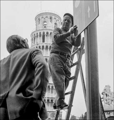
    Roel has give a very thorough assessment and I agree with his points, especially about photographing iconic structures as if they were casual backdrops. Well caught and nicely titled, the image is timeless. It could have been taken in the 50s as easily as the 70s. Of course that tower has been there, and has been leaning, for quite a long time. Excellent composition with the tower leaning between the two men, and the elements of the photo rising in stair steps from the left lower corner upward to the right upper corner. Good range of tonalities.

  • Members 1546 posts
    Dec. 2, 2023, 2:50 a.m.

    Ah, birds! They are such uncooperative models. I agree with Linda that the second is the strongest. The light on the birds is great, and light can make such a difference. The water is more appealing in this shot, smoother, with better reflections than the first one. The single bird who's rising "above the crowd" commands our attention immediately, We attribute certain qualities to the rising bird, but that's because of his visual difference and position. In the first shot, it seems like there's too much distance our eye has to travel across too many blurred and resting birds before we find the "riser" hidden moreso in the back of the flock. The second is an easier photo to read, with some extra appealing qualities.

    The ducks are sharply caught, with great color and detail. The Mrs was too shy to look at you and while that does not ruin the photo by any means, it would be a more captivating image if you had more of her face showing. But, birds will do what they want! The duck image would benefit, I think, from some cropping to close in on the subjects and eliminate some of the unexciting winter weeds at the top.

    For future efforts, I can't see that you're doing anything wrong. Get closer when you can, crop when you can't. If your camera has a special mode that buffers a bunch of shots before you actually full-press the shutter, use it. If not, find the best bird settings and save it on your camera as a preset so you don't have to fiddle as much onsite. Above all, be patient. Sit down and wait. Watch your birds and learn their behaviors and the clues they give that they are about to do something other than just stand there. Birds are great fun to photograph and never boring.

  • Members 1546 posts
    Dec. 2, 2023, 3:11 a.m.

    This is like the Weston pepper only in color and with creepy body parts like faces and legs floating around in it. Intriguing.

  • Members 1546 posts
    Dec. 2, 2023, 3:23 a.m.

    This is a photo of a rather mundane looking outdoor market that is brought to be more than that by your unique processing, which embues a soft glow, almost like an Orton effect. There are some other elements of interest hiding in the mix too, like the head of a dead deer. The powerful leading lines are impossible not to follow. Nice.

  • Members 861 posts
    Dec. 2, 2023, 11:38 a.m.
  • Members 1546 posts
    Dec. 2, 2023, 5:56 p.m.

    Welcome, Pete! Hope you'll enjoy your visit here, come back again and share more images and your own thoughts about the images you find here. I don't take pictures like these, so I don't think I have the expertise to offer much in the way of critique, so I'll just offer my own reactions. Others here are better equipped to help you with the challenges of travel portraits, OCL, and scene setups.

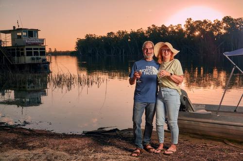
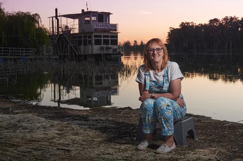
    Here's my own reactions: Both seem quite nice keepsake shots from a fun adventure. I prefer the second photo. Your wife looks most relaxed in this one, and less contrived. Her outfit is adorable. The full boat is in the scene along with its reflection. It and she are at about the thirds markers of a standard composition. There is no pale orb of light in the sky to wonder about. The sunset colors are lovely and muted, conducive to a portrait backdrop. The lighting is not overwhelming but is enough to illuminate her face. I might have looked around for any piece of local on-site junk to sit her on, like a rock or an old cement block but maybe there wasn't anything. In the first shot, both boats feel like they are too cut off and the spacing seems a little awkward. I'm just speaking from my own visual reactions and I've confessed this isn't my area, and I'm known to favor as much context as I can fit in a frame, so you might want to disregard my thoughts and wait for someone else to happen by!

  • Foundation 1463 posts
    Dec. 2, 2023, 7:16 p.m.

    Thatā€˜s a classic shot, Mike! I seem to recall that they straightened the tower up a little in the 1990s.

    David

  • Members 854 posts
    Dec. 3, 2023, 10:11 a.m.

    Hi Pete,
    Welcome to this forum, Itā€™s great to see new users joining us here on ā€œTHE PHOTOā€.

    Pete is my brother, and we have a lot in common, for example, we are both UK EX-PATS and moved to countries starting with the letters ā€œAUSTRā€¦ā€ while I stayed in Europe, Pete moved on much further afield :-)
    And,ā€¦ we both have a love of photography.

    It's been a bit quiet here this week on the website, maybe more comments will come soon.

    I also like the 2nd photo best. Kate looks quite relaxed here, and the gentle sunset colours and the reflections in the water work well.
    Using the OCF (off camera flash) was a good idea to light up "your models", without it they would have been quite dark and needed a lot of shadow pushing in pp.
    The flash also helps to keep your shutter speed up and avoids any motion blur. It gives the shot more studio quality.

    Keep posting :-)
    Trevor

  • Members 779 posts
    Dec. 3, 2023, 3:08 p.m.

    Let me extend another warm welcome to our little group of likeminded people.

    I don't have much to add to what was already said by Fireplace and by Minnie.
    The flash has been used effectively here, for the reasons stated, but also because it allowed to keep the background darker than it would have been if the whole image had been exposed for the light levels throughout : your human subject would have been darker and the background a bit brighter.

    Unfortunately there is little if any advice I can give in the territory of flash use.
    Except for occasional use of studio lights, I have always been an available light photographer.
    Sensor improvements and fast lenses have cemented those habits.