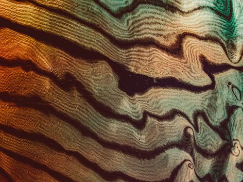
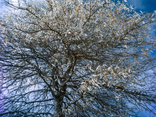
This is a beautiful abstract.
The wavy lines and swirly patterns are quite fascinating to follow.
Colours are good too.
-
-
-
Thanks, Trevor.
The good news seems to be that the graph is gradually trending down towards the target figure (unlike graphs illustrating world exploitation of oil and gas).
(Heute doesnt seem to report on good news like this.)
I now return you all to normal broadcasting!
David
-
@davidwien has written:@Fireplace33 has written:@davidwien has written:@Fireplace33 has written:
This area is 4 times higher than the government's set goal.
I am with you; but what do you mean by this bit?
David
Sorry if this is going a bit off topic,...
Hi David , since you're in Vienna, I guess you can speak German,
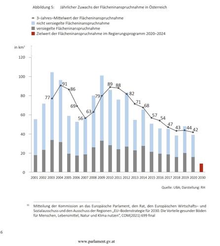
Here is a graph showing how much extra area of the "natural" land in Austria is changed over (in the" land use plan") and allowed to be used extra each year for development purposes, and how much of that is "sealed up". So the bars show the extra amount each year.
The red bar on the right for 2030 is way down below the actual values and that is the goal set by the current Austrian government.
It is on page 38 from this document from parliamentThanks, Trevor.
The good news seems to be that the graph is gradually trending down towards the target figure (unlike graphs illustrating world exploitation of oil and gas).
(Heute doesnt seem to report on good news like this.)
I now return you all to normal broadcasting!
David
Actually the loss of natural areas is still trending up. The graph shows the increase each year. But, at least it is not increasing as fast as it was before :-)
... still losing and sealing up 7 football fields of ground each day, which is far away from the goal. -
Sorry: I didnt red it carefully enough. But there is a lot of land in Austria that will fiercly resist being destroyed! Not so in the UK.
Best,
David
-
-
@RoelHendrickx has written:@MikeFewster has written:
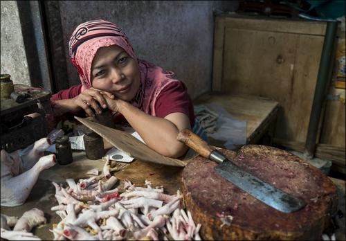
A Market in Bali
There is a beautiful inherent juxtaposition in this image.
On the one hand there is blood and violence : a sharp knife, a bloodied chopping block and chicken feet that have been hacked off.
Strong hands bear testimony of hard work. Determination.
On the other hand, there is a friendly and almost dreamy gaze.
A portrait full of life. A portrait full of meaning.I fully agree with @RoelHendrickx on the two sides and I love that diagonal which the eyes, arm and knife create. It's a great reminder that everyone has dreams and that many of the hard or even upleasant things we have to do in life are part of someone's plan to make them a reality. Excellent portrait with wonderful symbolism.
-
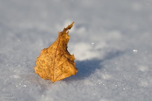
@Fireplace33 has written:
I love how pronounced the color and texture of the leaf (we would probably not pay any attention to on an earth-tone background) gets. Excellent use of the snow + shadow as a tool of contrast and composition. Simple things with great effect!
-
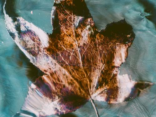
@OpenCube has written:
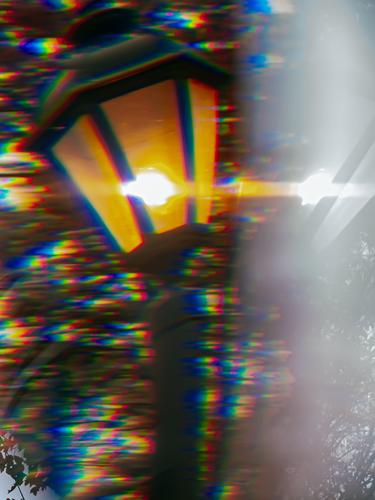
Well done and otherworldly capture, mostly because of the twisted shapes (was it shot through a car window/windshield?) but also because of the colors. Surreal but interesting, particularly in combination with the title.
-
@Sagittarius has written:
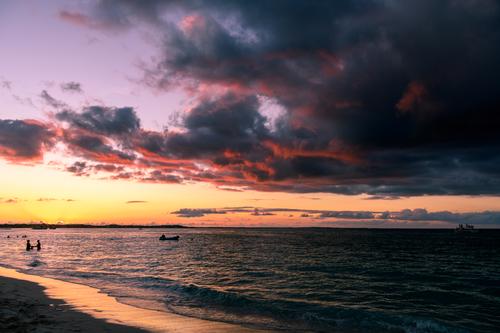
Darkness is falling
Beautiful colors of course and I like your inclusion of a title (Darkness is falling) because it helped to make me realize how much darker the wonderful gradient from left to right gets. And that in turn reminded me, that while the left side looks like a pleasant place to be (reminiscent of vacation indeed), the right side (reminiscent of the open sea at night) is a place I'd rather not be. What a difference light makes...
-
@simplejoy has written:@OpenCube has written:
Well done and otherworldly capture, mostly because of the twisted shapes (was it shot through a car window/windshield?) but also because of the colors. Surreal but interesting, particularly in combination with the title.
Same gimmicks as always just able to bring a subject much closer this time. At least I think that's what I was doing. I'm honestly not sure but I think this is the reflection and not the leaf itself.
-
@RoelHendrickx has written:
FIGHTING
Last week I shared a photo of a boxer and his coach hard at work sparring.
Spending several afternoons and evenings at their training facilities over the course of a few week, was the effort that earned me the privilege of being the official photographer for a boxing gala that took place two weeks later, and was hosted by the Antwerp Boxing Academy.
The position of "official photographer" was pretty unique, because I was the only one allowed onto the elevations immediately surrounding the boxing ring.
All other photographers (press and otherwise) were confined to a platform several meters from the ring, on one side.Obviously, I used that proximity to get really close to the action (during the rounds) and also to the coaching and refreshing action during the breaks (only in the ABA corner). I used telephoto for action, but also wide angle when circumstances allowed it for a sense of immersion.
During their training weeks, I had come to know the boxers (and their coach Renald De Vulder) quite well
And they had gotten used to my presence and trusted me to get good images. Everybody happy.The full series of that evening is here:
ANTWERP BOXING GALA 2014Like most things in my "photographic career", this was a one-time thing for me.
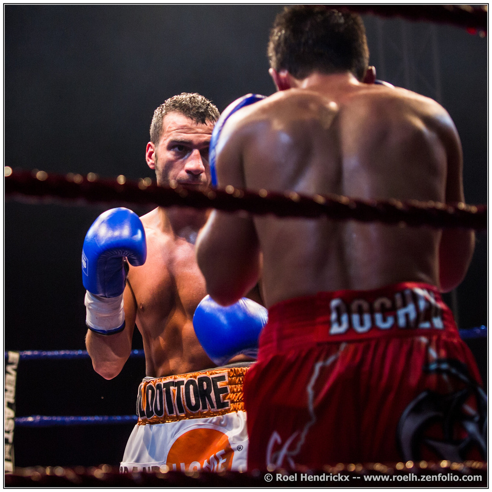
I like to try something new, find out how good I can become at it in a short time, and then move on to the next thing.So here are two images of the same boxer of last week, now in full-blooded action against a Romanian opponent.
His name is Ermano Fegatilli and his nickname is "Il Dottore" (the Doctor), as you can see on his shorts.
Not because he is an actual doctor. But he did have some job in the medical sector (he was a semi-pro boxer) and he is from Italian descent..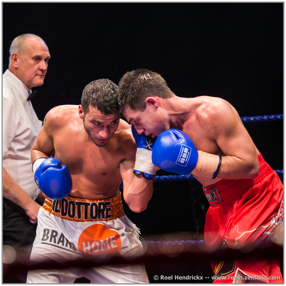
I've tried some boxing photos and the advantage in angle that your favoured elevated position gave you makes quite a difference. especially in the first shot. Here the closeness of the heads, the leaning in to each other and the eyes bring out the conflict. The ref is well placed. Removed from the action, slightly out of focus but clearly hovering over.
I wouldn't want a target saying "home" on my shorts in that position. -
@minniev has written:
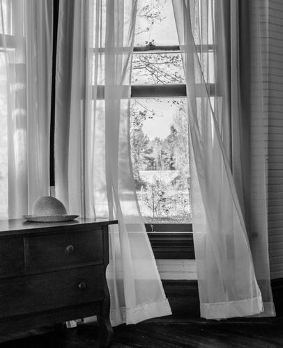
Wind From The Hayfield
Yes, Andrew Wyeth made me do it. Wyeth's "Wind From The Sea" is my favorite painting because of the feeling invoked by those curtains blowing in the breeze, and I'm always trying to create my own versions. I have no sea, but I do occasionally have wind. I love being at the country house with the wind moving through the curtains of an open window. I've posted one of the kitchen before, now here's my bedroom.
Andrew Wyeth indeed. The complementary curves of the curtains are exquisitely matched. I don't think you could have got them better if tou =has stached and pinned them to shape. The hat positioning is also perfect. The photo would not have looked balanced otherwise. It does more, we are aware of the person and what the view might mean to them.
Beautifully done. -
-
@Fireplace33 has written:
A walk in the snow
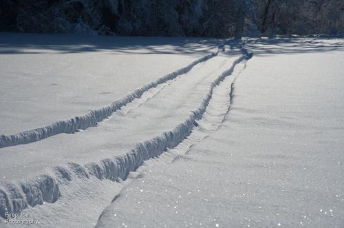
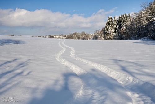
This weekend went for a short local walk in the new snow. I love the way it sparkles when the sun is shining :-)
Here's a few shots,...A tractor was here before me. You'll probably have to view this in original size to see all the little sparkling snow crystals.
with the sun behind you, it doesn't sparkle so much
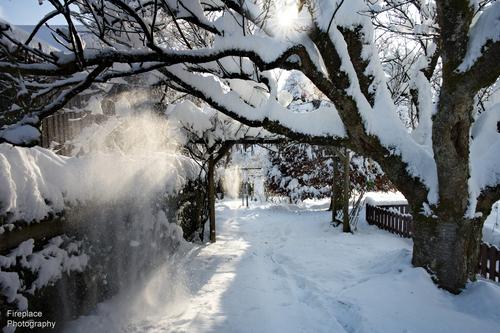
Back in our garden, I waited a while until the sun caused some tiny snow avalanches from the branches. That falling snow was caught nicely in the sunlight.
Snow photography is way out of my usual habitat so my first comment about the first photo may be way off the mark.
In photo one, the snow doesn't look white enough whereas in two, it does. Is this simply my inexperience with snow and sun on snow?
Similar tones on some of the snow in 4 but the little patch of direct sun and the sunstar lifts the image. The contrasting snow and branch lines plus the black and white railings frames up the image as well. The added detail feels more satisfying when compared to 1, even though much of the snow has similar colour.
Given the right boots and jacket, It would be a walk to enjoy. -
@Sagittarius has written:
Darkness is falling
The left/right daylight and night division is quite dramatic. The curtain is falling across the stage. In the daylight, appropriately we still have activity. Nicely judged exposure. There's a big dynamic range shift here but you have avoided burning out highlights or blocking up the shadows. The bright strip of sun reflection on the wet sand, foreground left, is balanced by the second bright strip, background right and they work together to bring a pleasing harmony to the shot.
-
@minniev has written:
Wind From The Hayfield
Yes, Andrew Wyeth made me do it. Wyeth's "Wind From The Sea" is my favorite painting because of the feeling invoked by those curtains blowing in the breeze, and I'm always trying to create my own versions. I have no sea, but I do occasionally have wind. I love being at the country house with the wind moving through the curtains of an open window. I've posted one of the kitchen before, now here's my bedroom.
I did not know the painting.
So pointing me in that direction is the first thing to be grateful for.
It (the painting) is a masterclass in the portrayal of transparant fabric, but even more so a masterclass is suggesting subtle movement (on the physical level) and suggesting tension and an aching sense of desire to look beyond the edges of the frame (on the emotional level).
That is a very high bar to aspire to.I must have somehow missed your kitchen curtains, but the bedroom is quite nice.
The wind in the curtains is more subtle, less turbulent than in Wyeth's painting.
There is not a rush of air coming into the room here, or a warning of stormy conditions outdoors.
Rather a gentle breeze and an invitation to come outside and enjoy it.The hat is a cool touch: it brings human presence and expands on the idea of going outdoors.
The B&W is nicely contained, with just enough detail remaining in the bright outdoors but also in the darkness of the cabinet with drawers. -
@simplejoy has written:
"Just let me think, please!"

Often I enjoy titles but not this time. Here, the title pushes my thoughts along a channel and it preconditions my response. It's an image that has broad interpretive possibilities and I would rather have digested them raw.
The tilt of the head suggests a question. The eye on the right is a little more focused so it becomes important. It bores into us. We feel involved. The dark spaces are sombre, it's a moment between us of some significance. The mouth is open and we wait for a statement. There is no clothing or background to give context. It's all him and us.
Palpable drama and tension. Very different to your usual whimsical moods.
