And once again the older image resonates. It is a classic travel shot, as are many of yours, featuring an exotic location and its accoutrements including a pair of charming boats and an humble structure across the waters plus all the palms and other foliage. The lone figure is dressed in colorful cultural attire. It is a classic image with all the necessary parts. I might have tried to raise the shadows a trifle over the bottom area to show more of his face and the details of the interiors of the boats, but that is a small matter. Very nice Nat Geo type image.
-
-
The colors of Christmas, SimpleJoy style! I don't know what the rose really is, perhaps a rosette from a child's or doll's garment. It looks more like fabric than vegetation. The color is rich and the limited focus pushes details our way. The curled leaf with its array of water drops is quite wonderful but of course the minute green spider steals the show with its camouflage act. Well done.
-
-
A grand series that really makes the viewer feel the cold crispness of fresh deep snow. Every one of these is capable of standing alone as an individual image. #1 and #6 are classic traditional landscape shots with all the beautiful elements of nature and none of man. #2 and #3 include man made elements set against spectacular backgrounds; these give us human context. The two abstracts are beautiful in an ethereal way, with the one that includes the fence incorporating some geometry, and the final one gives that sense of grand scale. So a smorgasbord of different kinds of images that when taken together, provide a thorough tour of this beautiful area. Well taken, well presented, and well curated. My favorite: #6 with its leading curly path through the snow, the pair of trees, the recurring V formation, the rich blue sky against the stark grays and whites of the rocks and snow.
-
Well, I do indeed see those dogs, spotted them first thing, and for a moment mistook them for cows. The color contrast is appealing (the old blue and orange combo that always works), as is the textural contrast between the softer texture at the top and the more crunchy texture at the bottom. What you made this of, I have no idea. But it works for me.
-
Wow, you have dialed back a few notches in the catalog. 1974. The year I finished grad school. You have been a Real Photographer for a long while. I'm impressed. These are beautifully composed, full of perfect tonalities, architectural geometry, and interesting subject matter. They are timeless. They could have been taken decades before, or yesterday. The woman might still be sitting in the doorway beneath the laundry, squinting into the sun. The boy might still be practicing soccer moves at the apex of the stairway where all the geometries meet. Well done, way back then, they resonate now too.
-
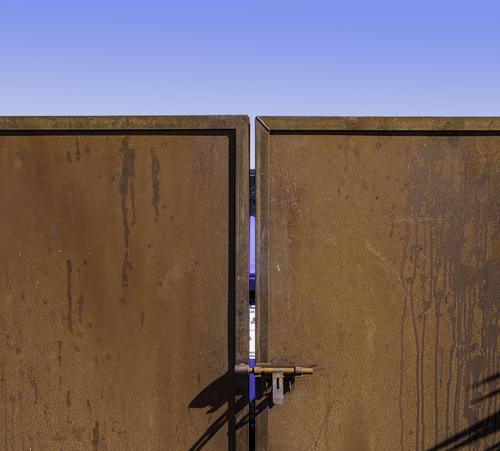
I liked it even more once I looked at it large. The gates dominate with their solidity and strong colour. The square shapes convey strength. But we can peek through. There's just enough information visible to lure us in, to make us want to see what's inside. Gates are like that. They keep us out and suggest that we might want to know what's on the other side.
The locking mechanism mirrors the shape of the gate and its gap. A nice bit of pattern making that adds a lot to the overall appeal.
Would you consider removing the shadow from the lower right? -
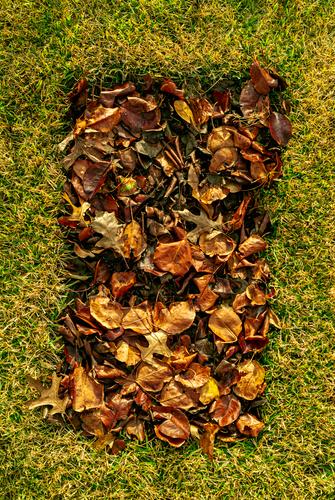
Looks like a grave, whether it is or not. It seems too small for a grave if one looks to the leaves for scale, but that does not prevent us from interpreting it that way nonetheless. A child's grave? A dog's grave? Burial of a crematory box? Details and colors are quite nice, a contrast between the colorful dead leaves and the green grass surrounding them. An image that makes us think.
-
This one is all about geometry and color contrast. Like Cube's offering, you've selected orange and blue, always the perfect color contrasts to my eye. The textures contrast as well - the bumpy rough rust of the gates and the smooth blue of the sky. And the shapes, the squares and rectangles, are the puzzle pieces. And the rest of the story is about what we imagine to be behind the gates: gated in or gated out. Interesting.
-
A very pretty scene with delicate greens, rich reds, and blues in the sky and water. You've got this well composed with foreground, midground and background elements in focus and a roughly rule-of-thirds composition. The purples that have sneaked inn on the upper left corner of the sky are a little distracting to me. If it were mine, which it is not, I might tone down the cyans a bit in the sky and try to mitigate the chromatic aberration, but that's always the photographer's choice.
-
Love the upside downers!
-
The three red trees are the point of the image. They are framed by green above and below and it is this contrast that lifts the shot. As always, personal choice but if it was me i wouild have taken a little off the top, the right hand edge and the lower edge. I'd want to give the three red trees even more prominence.
-
It's a long way to remember back. As recall it, HCB hadn't crossed my radar at this time. I might be wrong about that, certainly I don't recall him as an influence. Bill Brandt, Ansell Adams and Sam Haskins were my Photographic Gods in those days, each working in totally different fields.
I have seen a remarkably similar photo to the shot of the boy with the soccer ball in a Greek Village. Mine was a little earlier and the photographer of the similar shot was someone famous. His shot was better than mine. It's many decades since I saw that similar shot and I can't remember the details or the photographer. I have tried to locate it without success.
I still have quite a few of the 6x6 negatives from 1974 but I have only digitalized a few of them. -
-
@MikeFewster has written:@Rich42 has written:
Ubiquitous in parking lots of apartment complexes, shopping malls.
Rich
I liked it even more once I looked at it large. The gates dominate with their solidity and strong colour. The square shapes convey strength. But we can peek through. There's just enough information visible to lure us in, to make us want to see what's inside. Gates are like that. They keep us out and suggest that we might want to know what's on the other side.
The locking mechanism mirrors the shape of the gate and its gap. A nice bit of pattern making that adds a lot to the overall appeal.
Would you consider removing the shadow from the lower right?Thanks Mike.
I actually like the "intrusive" shadow. It takes away from the left-right symmetry just enough to remind that nothing is perfect!
Rich
-
@minniev has written:@Rich42 has written:
Ubiquitous in parking lots of apartment complexes, shopping malls.
Rich
This one is all about geometry and color contrast. Like Cube's offering, you've selected orange and blue, always the perfect color contrasts to my eye. The textures contrast as well - the bumpy rough rust of the gates and the smooth blue of the sky. And the shapes, the squares and rectangles, are the puzzle pieces. And the rest of the story is about what we imagine to be behind the gates: gated in or gated out. Interesting.
Thanks Minnie.
The intense blue against the rust was what I first noticed. It was one of those, "Oh migosh," moments. I was photographing something else, turned around and this was right in my face. The colors were vibrating against each other.
Here in Southern California, we get "Santa Ana" weather conditions in which the humidity is near zero and the air is crystal clear, making color and detail almost hyper-real. I really like the texture of the rusted steel. But I couldn't really appreciate that attribute until I processed the RAW image and saw it on my monitor. It was 12 minutes past Noon and the scene was so bright I had to squint to look at it.
I spent quite a while squaring myself and the camera, vertically and horizontally to the gate, to avoid as much lens perspective distortion ("key-stoning") as possible. This is a 45mm lens on medium format, so it took a bit of doing to get the top of the gate from looking like it was leaning back. I couldn't quite get the lines straight in camera. The perspective distortion controls in Photoshop took care of the last few percent of the issue.
Rich
-
@minniev has written:@OpenCube has written:
Looks like a grave, whether it is or not. It seems too small for a grave if one looks to the leaves for scale, but that does not prevent us from interpreting it that way nonetheless. A child's grave? A dog's grave? Burial of a crematory box? Details and colors are quite nice, a contrast between the colorful dead leaves and the green grass surrounding them. An image that makes us think.
I saw it much the same way as minniev in terms of images and symbols. I don't think it quite comes off though. The leaf rectangle feels wrong to me. It looks as though the leaves have been added over the top of the grass and the exposure and colour don't match sufficiently. This is more apparent at the top of the rectangle than the bottom. I'd try some gentle application of the dodge tool in Photoshop along the edges.
-
-
@OpenCube has written:
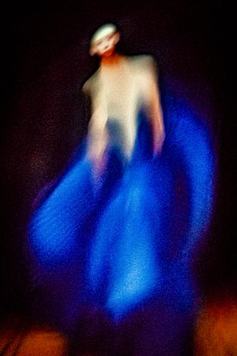
So much to like here, so many different ways to see this image, that I don't know where to begin.
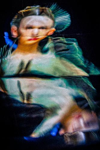
It draws on the style of fashion with preposterously thin models used as clothes hangers. The dress itself is a wonderful swirl of clour and movement- the model knows how to show it off to best effect. Just enough of the model's personality comes though as well and that's important in fashion work. A hint of gamin like face. An Audrey Hepburn like child/adult. The tilt of the head/upper body that then flows into blue curve that heads to the bottom left corner, is quite prefect.
Marvelous use of colour. Simple blocks, rich, alive.
Impressionism always appeals to me whether in paint, print, words or photography.
Open Cube, I suspect that you have manipulated another image that already had some of these characteristics. Whatever. I ca'tn remember them all, but this is probably the standout photo I have seen from your experiments.
Congrats.
