Great ex-stacked-ations... by simple.joy, on Flickr
-
-
That thing is some sort of flying insect, they were buzzing around me just as I was taking this. I cloned the others out but missed this little bugger :-)
-
@RoelHendrickx has written:
CALATRAVA STANCE
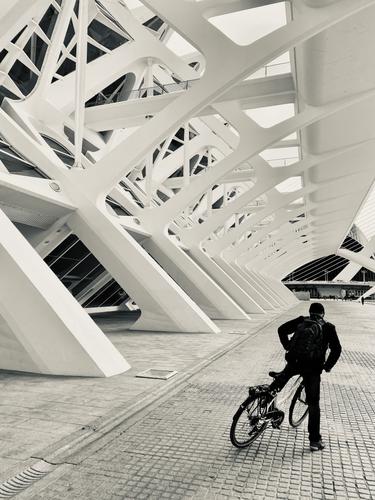
We started our Andalucia travels by flying into Valencia and spending New Year's Eve and January 1 there, before renting a car and setting off on our roadtrip.
Valencia was explored by bicycle, and of course we visited the collection of Calatrava designed building in the Ciudad de les Ciences y Artes at the far end of the Parque de Turia, a long park surrounding the Ciudad Vella, basically the whole of the river bed of the Turia.
This is an image from that bike trip.
It looks a bit like the hull of a big white skeleton ship in a dry dock. Very "Black and white" with the white ship and black bicycle rider.
Good depth in the photo. The rider looks a bit like he is half-on half-off the bike ? -
@OpenCube has written:
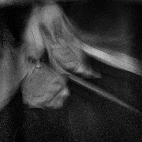
"Jekyll and Hyde"
The eyes and nose of the figure on the left really grab your attenention. The two things look a bit like two flying insects from some weird Monty Python type sketch, But that is just my strange mind working overtime :-)
-
@minniev has written:
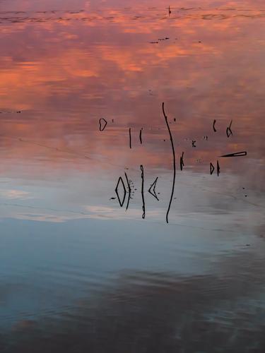
Nice gentle colours, The red and blue go together well here. A relaxing picture to look at. Minimalist, but with some details to investigate
-
@ChrisOly has written:
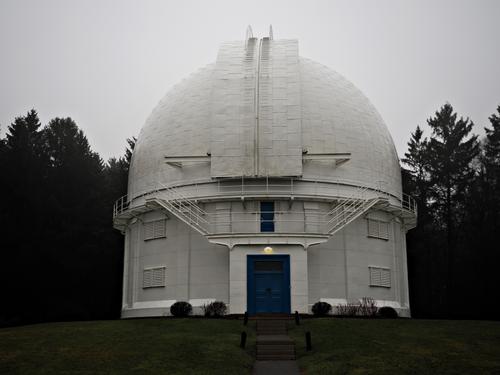
Dunlap Observatory near Toronto. It was built in 1935 and at that time housed the second largest telescope in the world. The Royal train with King George VI and Queen Mother while visiting the former colonies in 1939 happened to pass by and see the famous landmark. Today it's open to the public as a touring site in the summer months. I will make a point to go inside and explore further.
Would be great if you can look through the telescope on the open day and explore some of the distant galaxies on a guided tour
-
@simplejoy has written:

Great ex-stacked-ations... by simple.joy, on FlickrThe image is very good with those extremely sharp points and then the very blurry shafts. Nice choice of colours too!
Just out of curiosity, is this blurriness here created only with special optical lenses or is there some additional blur added here in the post processing ? -
-
@Fireplace33 has written:@simplejoy has written:

Great ex-stacked-ations... by simple.joy, on FlickrThe image is very good with those extremely sharp points and then the very blurry shafts. Nice choice of colours too!
Just out of curiosity, is this blurriness here created only with special optical lenses or is there some additional blur added here in the post processing ?Thanks a lot! The blur is just from a single exposure... so no additional blur or effect in post processing. The struggle in the macro space is usually getting enough in focus, so the in-focus parts consist of several shots (focus-stacking). This combination can create the effect of a very shallow DOF, even though 10-30 shots have been used in a stack. Many macro-photographers prefer to get everything in focus - hence the 200-300 image stacks of insects and flowers you often find around the web - but I'm not one of them. I like to show what any particular lens does in terms of rendering... in this case the 1963 made Carl Zeiss S-Sonnar 62 mm f/2.5 (at around f/3.5 perhaps), made for micro-documentation.
It's a lens made of 4 glass elements, designed and constructed 60 years ago... so while most people might be raving about the new Nikon Plena or whatever, color me impressed by that. 😉

And U2, Simply Red? by simple.joy, on Flickr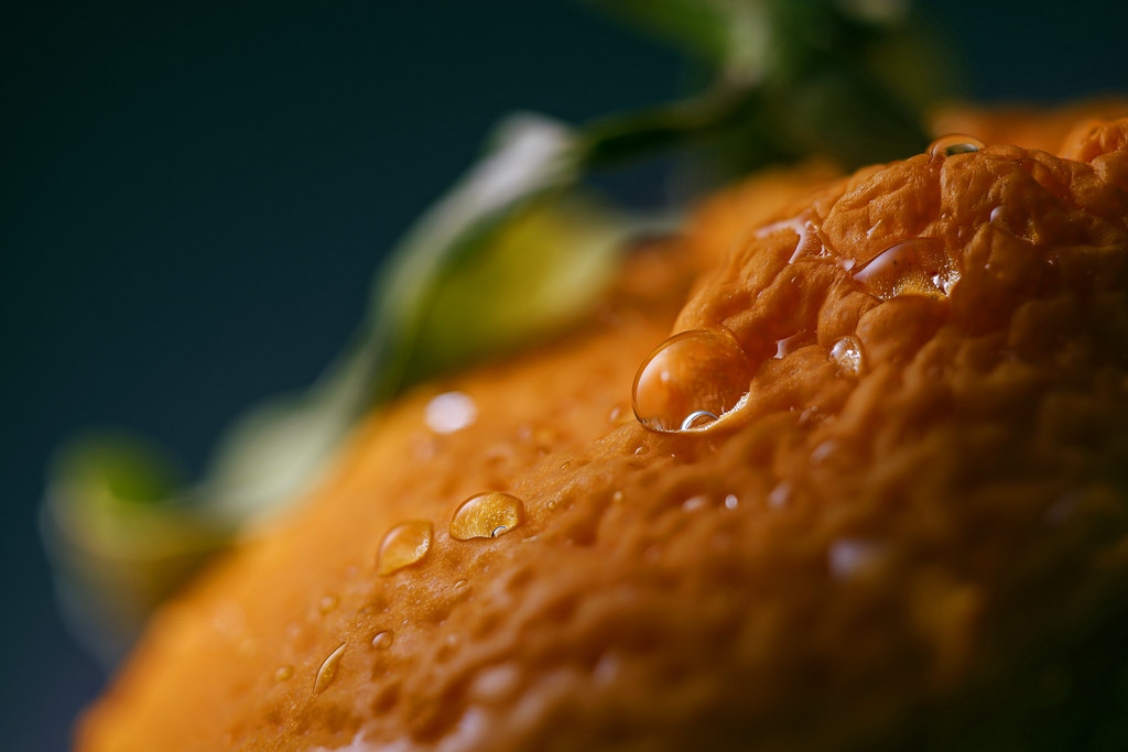
So close, yet out o'range! by simple.joy, on Flickr
Uneasy lies the head, that thinks of crowns by simple.joy, on Flickr
Heaven and earth and the green inbetween by simple.joy, on Flickr -
@Fireplace33 has written:
Thinking about summer in the mountains
It's a bit cold, wet and windy today; a good time to sort out some old photos :-)
Here's a pano made from 13 vertical shots back in June '22 from the top of the Hochkeil mountain, in Austria.
It's a fairly easy hike with a good view of the "Mandlwand" from the summit.
Taken with the Z7+ Z14-30/F4
The details are seen best, if you view the original image :-)
Technically, the stitching result isn't perfect, I can see some vertical lines of different brightness in the blue sky:-(
I might try stitching it again sometime with "Tiff's" instead of "JPG's"I think it is a beautiful landscape and pano. I wasn't disturbed by your verticals or David's spiders until I read about those concerns.. Not sure they would ever bother me unless this were printed about 8 feet in length and hung on my office wall where I would look at it daily. But then using Affinity I would use the healing and/or InPainting brush to correct whatever bothered me and probably have lost those clouds over the mountain before printing .. but it dissevers even as is to be printed and hung and i assume you have ...
WhyNot
-
@RoelHendrickx has written:
CALATRAVA STANCE
We started our Andalucia travels by flying into Valencia and spending New Year's Eve and January 1 there, before renting a car and setting off on our roadtrip.
Valencia was explored by bicycle, and of course we visited the collection of Calatrava designed building in the Ciudad de les Ciences y Artes at the far end of the Parque de Turia, a long park surrounding the Ciudad Vella, basically the whole of the river bed of the Turia.
This is an image from that bike trip.
Excellent image. The geometry of the architecture is fetching enough to hold our attention, but the executive bike rider in perfect parallel to the lines of the structure is beyond wonderful. A Decisive Moment for sure. The monochrome conversion with its slightly antique look helps us make the connection to Cartier Bresson even stronger. Well done.
-
@Fireplace33 has written:
Thinking about summer in the mountains
It's a bit cold, wet and windy today; a good time to sort out some old photos :-)
Here's a pano made from 13 vertical shots back in June '22 from the top of the Hochkeil mountain, in Austria.
It's a fairly easy hike with a good view of the "Mandlwand" from the summit.
Taken with the Z7+ Z14-30/F4
The details are seen best, if you view the original image :-)
Technically, the stiching result isn't pefect, I can see some vertical lines of different brightnesses in the blue sky:-(
I might try stitching it again sometime with "Tiff's" instead of "JPG's"Wonderful pano, with all manner of detail to keep us hunting through every nook and cranny to find more treasures. Love the painter in the upper right: once we find him, he anchors the pano and forces us to think of the scene from his viewpoint. The central mountain is so beautiful that it is almost surreal. Yes, sky tones are one of the challenges of panos. Sometimes I can solve them with various PP tricks and sometimes I have to just accept them. I do wish for some lessening of the shadows around the biker to make him more easily spotted.
-
@OpenCube has written:
"Jekyll and Hyde"
These are the stuff of nightmares. Not sure what they might be - I'm almost inclined to believe they are the backs of moths. Powerful image that I'm compelled to look at longer than is comfortable. And yes, monochrome is the best choice.
-
@WhyNot has written:
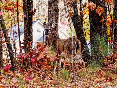
*Looking at Me #7*
WhyNot
A dear little deer caught in the act of spying in a subdivision. Love the way you've used more intense colors in the deer and the foreground foliage, and allowed the background colors to go blurred and pale. Nice separation of colors and tones, it helps us recognize the two environments as distinctly separate in more ways than distance.
-
@ChrisOly has written:
Dunlap Observatory near Toronto. It was built in 1935 and at that time housed the second largest telescope in the world. The Royal train with King George VI and Queen Mother while visiting the former colonies in 1939 happened to pass by and see the famous landmark. Today it's open to the public as a touring site in the summer months. I will make a point to go inside and explore further.
Nice architectural image with excellent balance and detail. Each side could be a mirror image of the other. Observatories whether old or modern often seem almost alien structures, with a bit mystery to them because they are so different from every other architectural style. Only the slight yellow tinge of the light above the door keeps this from being monochrome, and I think it works well this way.
-
@Rich42 has written:
Rich
What a fun image! Shape, color, texture, lettering with no clear context or theme, all caught in a small rectangular form. Proves an effective image can be found anywhere, with the right artistic eye.
-
@simplejoy has written:

Great ex-stacked-ations... by simple.joy, on FlickrLovely. The choice to select slightly dulled pencils is brilliant. The viewer understands that real work was done with them rather than just photographing them, and then we figure out that the colors are aligned parts of a particular palette. We even see how they blend as they blur into one another. Great use of shadow and blur. Excellent piece.
-
@OpenCube has written:
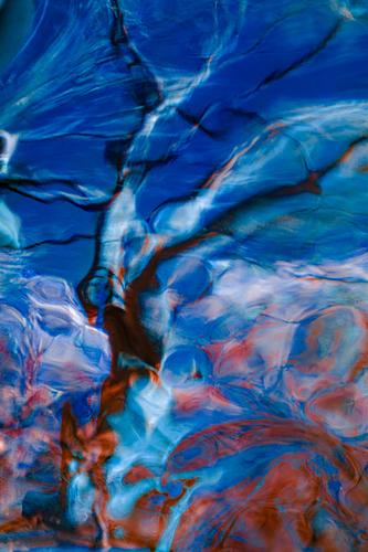
That's a pretty abstract with great rich colors and lines to guide the eye through the composition. Still no idea what you've photographed to create this one.
