All of these are very nice but the last one has special appeal for me with those carefully detailed needles displayed against the blurred elements.
-
-
@minniev has written:@OpenCube has written:
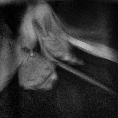
"Jekyll and Hyde"
These are the stuff of nightmares. Not sure what they might be - I'm almost inclined to believe they are the backs of moths. Powerful image that I'm compelled to look at longer than is comfortable. And yes, monochrome is the best choice.
Don't fret, it's just The Cabinet of Dr. Caligari.
-
@minniev has written:
I just wish I "had the eye" to identify opportunities like this
Tim
-
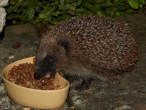
European Hedgehog
This little chap/chapess turned up in the garden in October - looking for slugs and any waste wild bird food he could find. He looked a little underweight to survive the coming winter and so hedgehog food was procured and served. At first he was hungry enough to ignore my presence and I got this picture - thinking there would be plenty of opportunities to get more/better. However, after a week of good suppers he became much more circumspect and would not approach the food if I was anywhere around. Lesson learned - always take the opportunity when it arises...
The good news is that he's still taking food - but only if i make myself scarce - so, hopefully will make it through to the winter.
Tim
-
@minniev has written:@Rich42 has written:
Rich
What a fun image! Shape, color, texture, lettering with no clear context or theme, all caught in a small rectangular form. Proves an effective image can be found anywhere, with the right artistic eye.
Thanks Minnie,
Shape, color, texture, lettering with no clear context or theme, all caught in a small rectangular form
Exactly!
When I saw the scene all those elements caught my eye and I thought I could really make something with the image. I worked with it in the viewfinder, squaring myself to the wall, moving in and out, never really "getting" anything, but the disparate elements, especially the colors which vibrated against each other.
Then in editing, I removed the last bits of perspective distortion, squared and cropped further, not really getting a cohesive image, but liking it anyway for whatever it is.
I like the repetition of "spikes" of the stars in the lower right and Liberty's "tiara" in the upper left.
Rich
-
-
@OpenCube has written:
One can spend some time trying to visualize what the imaginary subject that is.
-
@simplejoy has written:

Great ex-stacked-ations... by simple.joy, on FlickrThis image has a great and colorful impact.
-
@Rich42 has written:@minniev has written:@Rich42 has written:
Rich
What a fun image! Shape, color, texture, lettering with no clear context or theme, all caught in a small rectangular form. Proves an effective image can be found anywhere, with the right artistic eye.
Thanks Minnie,
Shape, color, texture, lettering with no clear context or theme, all caught in a small rectangular form
Exactly!
When I saw the scene all those elements caught my eye and I thought I could really make something with the image. I worked with it in the viewfinder, squaring myself to the wall, moving in and out, never really "getting" anything, but the disparate elements, especially the colors which vibrated against each other.
Then in editing, I removed the last bits of perspective distortion, squared and cropped further, not really getting a cohesive image, but liking it anyway for whatever it is.
I like the repetition of "spikes" of the stars in the lower right and Liberty's "tiara" in the upper left.
Rich
This image has certainly great and interesting visual elements. The colours and framing make it.
-
@minniev has written:@simplejoy has written:@Fireplace33 has written:@simplejoy has written:

Great ex-stacked-ations... by simple.joy, on FlickrThe image is very good with those extremely sharp points and then the very blurry shafts. Nice choice of colours too!
Just out of curiosity, is this blurriness here created only with special optical lenses or is there some additional blur added here in the post processing ?Thanks a lot! The blur is just from a single exposure... so no additional blur or effect in post processing. The struggle in the macro space is usually getting enough in focus, so the in-focus parts consist of several shots (focus-stacking). This combination can create the effect of a very shallow DOF, even though 10-30 shots have been used in a stack. Many macro-photographers prefer to get everything in focus - hence the 200-300 image stacks of insects and flowers you often find around the web - but I'm not one of them. I like to show what any particular lens does in terms of rendering... in this case the 1963 made Carl Zeiss S-Sonnar 62 mm f/2.5 (at around f/3.5 perhaps), made for micro-documentation.
It's a lens made of 4 glass elements, designed and constructed 60 years ago... so while most people might be raving about the new Nikon Plena or whatever, color me impressed by that. 😉

And U2, Simply Red? by simple.joy, on Flickr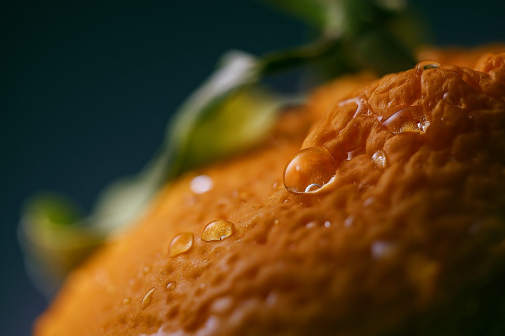
So close, yet out o'range! by simple.joy, on Flickr
Uneasy lies the head, that thinks of crowns by simple.joy, on Flickr
Heaven and earth and the green inbetween by simple.joy, on FlickrAll of these are very nice but the last one has special appeal for me with those carefully detailed needles displayed against the blurred elements.
Great assortment of colours and shapes create visual interest, undoubtedly.
-
-
@ChrisOly has written:@Rich42 has written:@minniev has written:@Rich42 has written:
Rich
What a fun image! Shape, color, texture, lettering with no clear context or theme, all caught in a small rectangular form. Proves an effective image can be found anywhere, with the right artistic eye.
Thanks Minnie,
Shape, color, texture, lettering with no clear context or theme, all caught in a small rectangular form
Exactly!
When I saw the scene all those elements caught my eye and I thought I could really make something with the image. I worked with it in the viewfinder, squaring myself to the wall, moving in and out, never really "getting" anything, but the disparate elements, especially the colors which vibrated against each other.
Then in editing, I removed the last bits of perspective distortion, squared and cropped further, not really getting a cohesive image, but liking it anyway for whatever it is.
I like the repetition of "spikes" of the stars in the lower right and Liberty's "tiara" in the upper left.
Rich
This image has certainly great and interesting visual elements. The colours and framing make it.
Thanks Chris.
Rich
-
@RoelHendrickx has written:
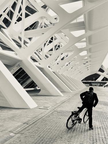
CALATRAVA STANCE
We started our Andalucia travels by flying into Valencia and spending New Year's Eve and January 1 there, before renting a car and setting off on our roadtrip.
Valencia was explored by bicycle, and of course we visited the collection of Calatrava designed building in the Ciudad de les Ciences y Artes at the far end of the Parque de Turia, a long park surrounding the Ciudad Vella, basically the whole of the river bed of the Turia.
This is an image from that bike trip.
The leading lines and contrasting shadows and subject pull you in.
-
@Fireplace33 has written:
Thinking about summer in the mountains
It's a bit cold, wet and windy today; a good time to sort out some old photos :-)
Here's a pano made from 13 vertical shots back in June '22 from the top of the Hochkeil mountain, in Austria.
It's a fairly easy hike with a good view of the "Mandlwand" from the summit.
Taken with the Z7+ Z14-30/F4
The details are seen best, if you view the original image :-)
Technically, the stiching result isn't pefect, I can see some vertical lines of different brightnesses in the blue sky:-(
I might try stitching it again sometime with "Tiff's" instead of "JPG's"I feel like I need a bigger screen to appreciate this image. Even zoomed in on my 32 inch screen I miss a lot of the detail. I love you can see the hills in blue at the edges of the image and the cyclists. It gives a nice sense of size to the image.
-
@simplejoy has written:

Great ex-stacked-ations... by simple.joy, on FlickrI'm curious why you have the focal plane end where the color shell of the pencil starts vs a little further or a little less.
I like it creates a portion of a color spectrum, the red and yellow blurring into an orange. It is like choosing a color palette, from undefined idea in the background to defined idea in the fore.Edit: I caught up to what you said to other people's comments. Thanks, love what you did here. I didn't realize many macro images were focus stacked.
-
-
@TimRichards has written:
European Hedgehog
This little chap/chapess turned up in the garden in October - looking for slugs and any waste wild bird food he could find. He looked a little underweight to survive the coming winter and so hedgehog food was procured and served. At first he was hungry enough to ignore my presence and I got this picture - thinking there would be plenty of opportunities to get more/better. However, after a week of good suppers he became much more circumspect and would not approach the food if I was anywhere around. Lesson learned - always take the opportunity when it arises...
The good news is that he's still taking food - but only if i make myself scarce - so, hopefully will make it through to the winter.
Tim
Oh, it is Mrs. Twiggy-winkle! All she needs is her apron! She is adorable. She might be a little cuter with a tiny bit of brightening (I know it was probably dark when you too this, but artistic license lets you tinker), and perhaps some doctoring on her slightly scary reflective eye. I know Lightroom does a good job on people and dog eyes. Not sure about hedgehog eyes??? Might try and see. Way cute regardless. I'd be thrilled to get a picture like this of such a creature!
