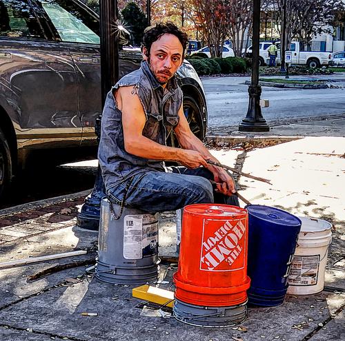
I like the subject and the composition. Ditto for the colour treatment and the red upturned pail that makes its origins abundantly clear. Same for the arm and extended stick that stand out against their backgrounds.
However, the very stylized PP with what feels like added charcoal line emphasis, doesn't appeal to me. I think I'd prefer a less PP'd treatment. The musician has enough presence and dignity in his own right.
Jan. 10, 2024
86
-

-
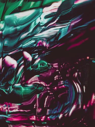
My response is much the same as Pete's. Lovely inky blue blacks with a core of honey tones. Paintbrush like swirls though the glass. It's pleasant but I miss the visual and verbal intrigue. Could we manage a hint of genie lurking within?
-
It would never have occurred to me to put a political twist on Rich's photo. Time and place can sure change our perception filters. The USA must be one of the only places on the globe where red gets linked with the conservative side of matters.
Doorways are full of symbolic opportunities for photographers and this pair earn the attention.
The symmetry here is very important. If you wanted to polish the shot further, you might explore removing the wreathe on the right edge. Isn't Adobe's generative replacement wonderful? -
I find waiting to fly to be surreal. The idea that shortly you will be sealed into a cigar tube and blasted across time and space and then emerge in a different world is self evidently absurd.
Here, I think you have caught it. Time and dimensions are in flux. There is a small area with real people and normalcy. They are fading. Hold on to it. -
An inversion of the colour combination used by Simplejoy this week. It pleases the eye in the same way though.
I feel that there are two images here and they are working somewhat differently. There's the tunnel of arches and reflections. Then there is the soft interplay of light and old stone.
The tunnel doesn't feel as though it is satisfying to me. The lines take us to the blue grey area at the end and the colour of that area further suggests something awaits us there. But it doesn't. The area is slightly out of focus and the inky blues don't resolve into anything of significance.
I enjoyed the close up details on the stonework. It also is a little out of focus but here it feels like the patina of years and moonlight.
I've been to The Alhambra by day and night but I can't figure out where you were when you took this shot? -
Good timing. There is some discussion of colour and Ansell Adams going on at the moment in Mike Johnston's blog. The online Photographer.
theonlinephotographer.typepad.com/the_online_photographer/blog_index.html
He suggests that Adams was notorious for his lack of colour sense and that Adams loathed rendering all the blues and greens that he was faced with in Landscape colour photography. I don't think Ansell would have enjoyed the Australian bush greens.
It's a problem I understand. Inland deserts are far easier to manage. Not sure, but I think there is a second factor stacking up against you here. On hot days the trees release a haze of eucalyptus mist. Not only is it combustible, it makes life tough for photographers. The blue in your sky might be showing some of the mist. Possibly , as you note, the angle is helping in bringing out gradation of colour across the tree tops.
It's a difficult balance to get right. -
Unfortunately, the posting stripped the meta data and the meta data is needed to get a feel for what was involved.
Focusing was hopeless. I wanted lots of dof in the hope that maybe something would be in focus this time when I fired. Most were around F9. and 1/8000 1/6400 second. Generally I finished up with a fine collection of images where swifts had been shortly before hand.
iso 3200-6400 -

Mike, this is not in the Alhambra (Granada) but in the Real Alcazar in Sevilla.
It is a kind of subterranean area of ancient baths, accessible through the gardens. -
Thank you. It now makes sense. Much head scratching was going on trying to figure this out. Last time I was there the whole Lion Court/Fountain area was closed for repairs. Was there something in that area I didn't know about? Exactly what are the blue forms at the end of the arches. I dug through old photos of mine and searched Alhambra online collections.
Tonight I will be able to sleep. -

"A Clock Ticking in Somalia"
Madness and movement is a never ending circle of time heading towards no conceivable end. -

Thank you for the critique .. I too thought it was a bit over processed but this is my "standard" pp (sort of) for my street photography and I usually do a set from a day all the same. AND, I think all these from that day were all a bit more detailed, contrasty, whatever, than usual.. I have just taken these files off the computer and put them on backup disks and as is my usual procedure I threw away the Affinity processing files so I'm not sure how they were processed .... but I reworked this one ...
Almost the same but I see less character and think I prefer the one posted. (and I prefer this pp to "straight" presentation of the picture ... but then probably not everyone's cup of tea ... )
Thanks again .
WhyNot
-
As you say, different cups of tea. I prefer the original version.
In either version, I might have placed the main character a bit more to the left but I can see issues with brighter areas that would then be up against the left margin. Maye? Maybe not. -
A text book example of the issues and complexities in discussing art. And especially weighing the input of the external experience through which each viewer's response is uniquely filtered.
To get the personal stuff on the table first. I'm not against zoos. They have an invaluable role in educating and sensitizing humans to animal wonder and needs. The "cage" or whatever has to be adequate for the mental and physical needs of the animal. Teaching animals to perform is a different matter and, as far as I can tell, is always accompanied by stress for the animals.
Re the photos. The interaction in one is wonderful. Two black/white species reaching towards each other in complementary curves. It is hard not to interpret the moment as real desire for communication. Dr. Doolittle tapped a hunger in humans.
Two is different. It's the "capture" itself that is compelling. The dolphins are frozen in an arc above the humans. It's all about marveling at a moment in time where we need a photograph to appreciate the perfection. -
I think that shots like these are all about showing the other world details that we usually overlook. 1 is a little sharper than 2 and therefore works better at bringing out the details. Why not make the most of the details by cropping in harder, in portrait mode? I don't feel that the background adds anything here. There is enough immediately behind the cicada to give all the interest needed.
-

I think the decision to compose the lines asymmetrically was good, and I like the result. I find perfectly symmetrical photos of reflections to be a bit repetitive now, even though I am guilty of doing it myself sometimes!
This is definitely not one to be seen larger. As Mike pointed out, looking for detail in the blue “Easter Egg” at the end of the tunnel of curves, simply reveals the limitations of a phone picture. However, there is no need to magnify greatly and it is fine to enjoy the image at a lower magnification, as it was meant to be seen on the screen of the phone itself.Pete