"Ready to Transition"
Up is down. Black is white. What is, will be what was.
Jan. 17, 2024
83
-

-
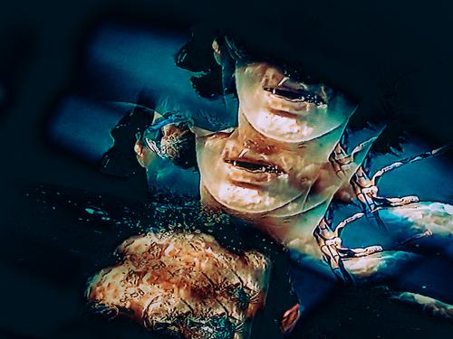
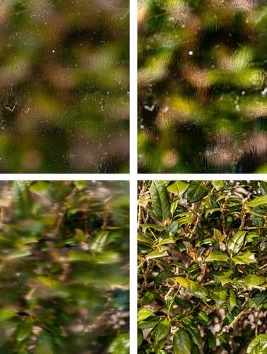
Tried to do some test shooting with the intent of "merging" images in Photoshop to create the look I'm going for. It did not work and the freezing to get these photos sucked. Should have broke the glass tool about 2 seconds out the door when I dropped it via ice slippage, but by some miracle, it bounced on the ice and didn't break.
I tried manual focus at different distances. You can see the results. I tried playing around with blend modes, but all the results sucked. The last photo is with the glass out of the way.
This turned out ok.
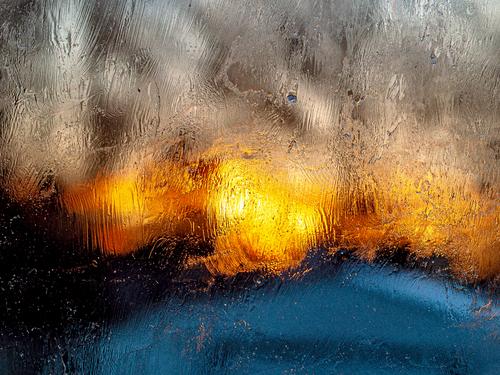
"Sunset"
-

Thanks minniev for your comment.
When I edited the photo on a large monitor, the top part of the image looked fine to me, but now that I've seen it on my smartphone it also looks a bit dark.
I've followed your suggestion and I've followed your suggestion and lifted the shadows, (just a little) as I was afraid it would take away from the importance of the other insights in the composition. Link from the new edition. -

A "Back to the Future "moment. If you remember the time, you would never have expected today's reality for this icon. The wise, flat design was modern. Now the wa lens has used the design to create a letter box slot through which we can't miss the ironic."Food Mart." The PP treatment suggests gritty and commercial but not totally real. Appropriate.
-
A simple and beautiful series. The similarities of color and time of year link them. The variation in shape gives each its own point of difference. Rich and satisfying.
A great concept for a series. -
Beautifully composed in line, colour and use of focus. It all gets us to the centre stamens of the flower and exquisitely sharp they are- examining the details is a delight.
-
A subjective view of a display designed to entice. It does. The field is full. Icecream, games and colour. I want some. Please.
-

-
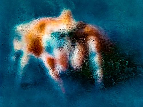
"Dream Spider"
-

I would say this is more than "ok" - absolutely gorgeous. Like it a lot! Seems like your technique works very well with lights. Would be interesting to try with some neon signs or lights from traffic at night as well.
-
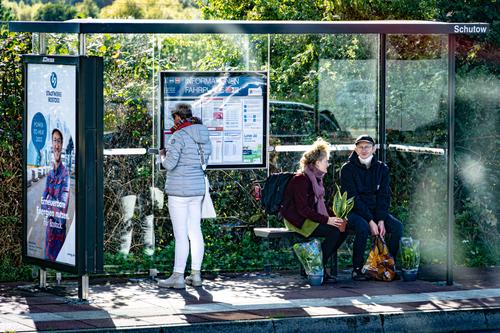
The composition uses the structure to create a series of frames. The frames work in grouping two of the figures and isolating the other two ) including the advertisement as another figure.) It sums up as a small study on relationships. The couple seem comfortable with each other. Their houseplants contribute to the feeling. The woman with the phone has her back to us and looks at the phone. She doesn't engage. Then we have the man in the advertisement. He, at least his company, wants us to feel that he relates to us with goodwill. A microcosm of relationships.
-
I can't add anything to minniev's discussion. I'm in Australia watching the Australian Open on tv. The end of a match has something of this mood but it tends to be the winners who lie down on the court.
-
This works for me as a satisfying assemblage of colours and shapes. There's a "fire and water" feel to it. The golden shape suggests they are moving forward. It has the appeal of a restaurant's glow of neon welcome on a cold wet night.
-

Would it be too pretentious to suggest that it has a bit of a ‘JMW Turner’ feel about it?
-
-

Apologies that I have not been able so far to be very active this week.
I will make it up by posting in the next hour or so, some comments on photos that tickle my fancy.
As I have also not had time to read to previous comments, excuse me if I post comments that are similar to someone else's.
I may try to hook onto some comments if they call for it.The new thread will start tomorrow between 8.00 AM and 10.00 AM (Brussels time).
-
Exactly. That orange looks fiery against the blue and white.
We are rewatching the HBO series Game of Thrones currently.
Your image could serve perfectly as an illustration for the original source material: the books under common title "A Song of Ice and Fire". -
I like the image of the mountain, but I simply ADORe the image of that courageous red leaf that holds the fort in a landscape filled with frost and blue hues.
My only comment/suggestion on that one would be to maybe crop a bit from the left (top or bottom to maintain ratio: not sure what would work best) in order to get that leaf closer to the 1/3 vs 2/3 spot in the image composition (not quite, but close).