I needed the title to understand what I was looking at. Then I was able to make some guesses.
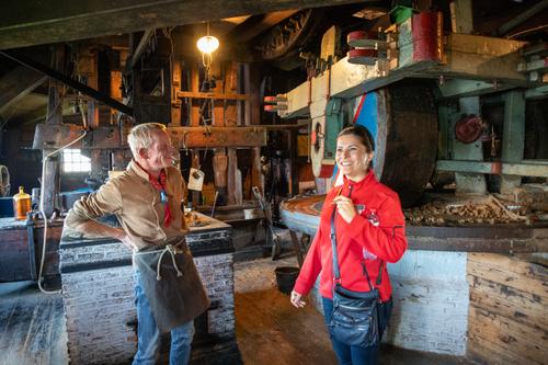
It reeks of old wood and old and heavy machinery. The grinding wheel? I think that is what it is, is especially impressive.Your color range appropriately suggests age and warmth.
After that, I think there is a bit of a problem. Is it a contemprary portrait of a couple, a vistor and a tradesman, or a study of the mill? The interaction between the couple seems totally divorced from the mill setting. As it stands, they might be on a bridge, by a river- the setting feels irrelevant. At the same time, the girl, while looking happy, doesn't appear to be communication with the man - although he is looking at her.
In conclusion, There are a number of elements in the picture that offer opportunities but here I don't feel that they are "gelling" into one story for the viewer.
Of course, if the shot was taken as a record of a particular person and their visit to a particular place and the image was made to share that moment with friends, that's a completely different scenario.
-
-
Super.
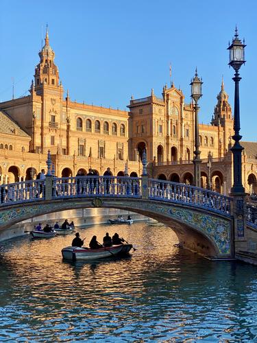
This has great lighting and a very nice composition.
The way that the people in the boats under the bridge appear as dark silouhettes against the golden light, makes that light shine out even brighter. -
-
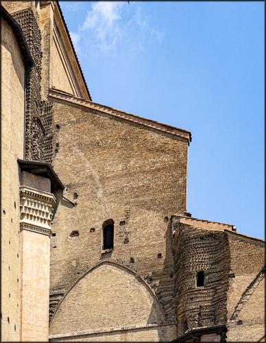
Well crafted brickwork can be just as artistic as any kind of stonecutting and sculpture.
Bricks may seem a boring and mundane material, but the patterns that can be achieved are endless.
Too bad that in current buildings, bricks are mostly used for flat vertical surfaces without any imagination.
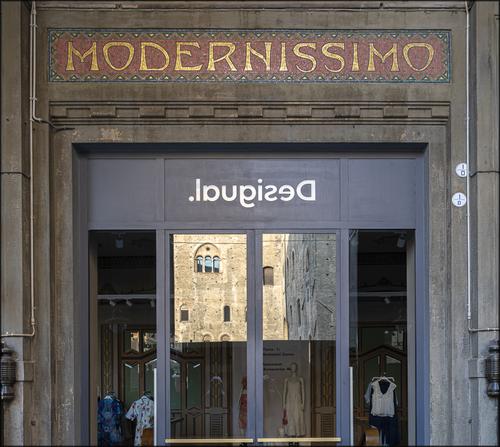
Your examples (from Bologna, that I consider as my second alma mater because I have spent half a year there in the final year of University) are eloquent and well chosen. They are also diverse, and are testament to the versatility of the brick : bricks can be used for religious buildings that are more often associated with marble and other natural stones, but also for military/civil purposes and also for embellishments on commercial property. A good sampling, thus. -
Unless the situation was really foggy or you had (David Hamilton-esque) a layer of vaseline on your lens, it seems that there has been some softening in PP applied to this image, giving almost a "counter/whiteness"-vignette like you would find on a certain type of wedding portraiture.
While I don't mind that look, I also don't think that it really adds much.
If it were mine, I would probably reduce this image to roughly 1/3 of the total surface, cropping from left, from right and from top, to concentrate on waves and birds. -
I kinda like the effect (and I am sure that the LGBTQ+X etc community would approve of your colour scheme).
But it does not grab me as many others of yours do. -
I like how you brought out the characteristics of the shapes of the different bridges.
If you are interesting in bridges and how they are constructed, transported and put into place, you may like a documentary photo series of mine, that was shot over the course of roughly 36 hours in winter 2017, to show the final stages of a bridge replacement.
I will add the link later. The gallery seems to have been auto-archived on zenfolio, so I will need to restore the link first. -
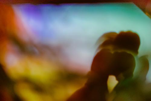
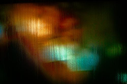
Your title is instrumental (even crucial) in shaping our perception of this image.
Without the title, it looks like a fun experiment in light and colour.
The title makes us regard this as an image of human life in early stages, just like what we can see in proud ultrasound images that parents-to-be show their family.
Cool! -
Bhutan...
Hmmm.
Never been there.
Want to go!This image could easily have been a standard picture postcard (albeit with a more overcast sky than we would ideally expect in picture postcards) : the grand building sitting amidst greenery, with mountains and clouds behind it and a stream running in front of it. Maybe also that bridge a bit further up (but I would expect the building to be shot straight-on for a picture postcard.
In fact, if we were to crop this image (maintaining ratio) from just right of the elbow of th man, and from bottom and top, excluding the ledge he is sitting on, then there you have it, that picture postcard.Including the man adds a layer, and creates a story. Or multiple stories.
He is our Everyman over whose shoulder we look, together with him. We see what he is watching.
Did he come from that building/village, over that far bridge, to this panorama point, to look at his own place from a distance?
Is this a last look back, upon leaving?
Or is he a weary traveler who has come from far and is enjoying his first good look at his destination, thankful that he is almost there?
The story/stories elevate the image. -
There is clear joy here.
The woman in red is enjoying the talk of the craftsman, explaining the workings of his ancient machinery.
(We seem to have a theme going on, spanning weeks, where women in red are the character of the tourist exploring.)
The miller is equally enjoying himself with the explanation that he has undoubtedly given countless times but does not get tired of. (Having the attention of a beautiful woman always helps, I suppose.)Like you said : it is a moment in time. But an enjoyable one.
-
Could also have been called "Brace for Impact".
A great documentary shot of the perfect diving technique that some species develop.
I love it, not just for the bird, but also for the geometry of the image.
It is an image that can be used in a classroom instruction on "rule of thirds" and why that is an effective composition tool. -
Sorry, replied to the wrong post
-
-
@RoelHendrickx has written:@JSPhotoHobby has written:
Just a moment in time
There is clear joy here.
The woman in red is enjoying the talk of the craftsman, explaining the workings of his ancient machinery.
(We seem to have a theme going on, spanning weeks, where women in red are the character of the tourist exploring.)
The miller is equally enjoying himself with the explanation that he has undoubtedly given countless times but does not get tired of. (Having the attention of a beautiful woman always helps, I suppose.)Like you said : it is a moment in time. But an enjoyable one.
Yeh, they were chatting, being flirty and I saw an opportunity and jumped in and took the photo.
@MikeFewster makes a good point, the subject isn't totally clear. Clear to me of course, I remember what I saw and why I took it.
It is a place maintained for educating people about the purpose of Dutch windmills, like Colonial Williamsburg in the USA or Louisbourg Fortress in Canada. I was exploring this one after the gentleman demonstrated how peanut butter was made (on the right). The tour guide, in red, gives this tour frequently so she knows the guy, work colleagues in a sense. After the demonstration we, the tourists, are free to wander while they chat 'by the water cooler.'
Their body language told this story of how they had crushes on each other but had never said anything. They talked an laughed and tried not to send signals of interest even though they were clearly interested in each other. She's telling a story that isn't quite funny but she loves telling it to him and he is ready to laugh, to be empathetic to whatever she's going to say. She's a little blurry because she was animated as she was talking.I had setup my camera for architectural images, big depth of field and slow shutter in a relatively dark space. I just didn't want the moment to go buy and be lost to the aether forever.
I can't figure out whether to title these images, explain them or just let it stand for itself.
-
@RoelHendrickx has written:
SEVILLA - PLAZA de ESPANA
Plaza de Espana is one of the tourist highlights of Sevilla.
If you are interested in the history and meaning of this (actually fairly recent) Plaza and its architecture and symbolism, you can find lots of information online.For our long walking day in Sevilla, we had no preconceived itinerary.
So it was almost by accident that we ended up on Plaza de Espana right at the best moment of the day as far as light is concerned.I made some cracker shots with my telephoto and wide angle lenses on the E-M1.
But those shots are still miserably confined to my hard drives, waiting for a closer look.
The old iphone (still using an 11Pro model) did not do too bad, fortunately, for this "preview".I found Spain Square difficult to shoot. I was there mid-morning and the light seems to fall over it at the wrong angle. Plus, soo much orange brick with these more subtle blue and green tiles. After I saw your image, I spent 3 days this week re-editing my photos of this place to see if I could get one I liked. -sigh- It is going to snow tomorrow, I know what I'll be doing.
I like that you were able to get so many of the details that make the structure so interesting. The orange light of the late sun and the orange brickwork really draws your attention. I love the silhouettes of the people in the boats.
I wish the bridge wasn't in shadow, the tile work is a point of interest to me and the highlighting from the low angle sun really pulls you away to the background and I think I could almost miss it. -
@MikeFewster has written:
A further homage to bricks and bricklayers
Some months ago I posted a series on the use of bricks in Italy.
I spent this morning on my first ever brick construction, Preparing for a very simple little BBQ. I was ruefully reminded of the brickwork I had seen in Italy.
My admiration is limitless. The following three are all from Bologna.[
]
(/a/vrHyQPprpgf6ZO0cwqNSl4mYE2qJjEmurhIRgZRsPFvXHRxD1r6tQ77NYcHUQuKy/20880/?shva=1)I love the converging lines of the second image, gives it a sense of being very tall.
In the third image, was the Desigual logo backwards or was the Modernissimo logo backwards in real life? Edit: caught up to your reply when Pete asked a similar question. Something I didn't know about the company, thanks!
-
@JSPhotoHobby has written:@RoelHendrickx has written:@JSPhotoHobby has written:
Just a moment in time
There is clear joy here.
The woman in red is enjoying the talk of the craftsman, explaining the workings of his ancient machinery.
(We seem to have a theme going on, spanning weeks, where women in red are the character of the tourist exploring.)
The miller is equally enjoying himself with the explanation that he has undoubtedly given countless times but does not get tired of. (Having the attention of a beautiful woman always helps, I suppose.)Like you said : it is a moment in time. But an enjoyable one.
Yeh, they were chatting, being flirty and I saw an opportunity and jumped in and took the photo.
@MikeFewster makes a good point, the subject isn't totally clear. Clear to me of course, I remember what I saw and why I took it.
It is a place maintained for educating people about the purpose of Dutch windmills, like Colonial Williamsburg in the USA or Louisbourg Fortress in Canada. I was exploring this one after the gentleman demonstrated how peanut butter was made (on the right). The tour guide, in red, gives this tour frequently so she knows the guy, work colleagues in a sense. After the demonstration we, the tourists, are free to wander while they chat 'by the water cooler.'
Their body language told this story of how they had crushes on each other but had never said anything. They talked an laughed and tried not to send signals of interest even though they were clearly interested in each other. She's telling a story that isn't quite funny but she loves telling it to him and he is ready to laugh, to be empathetic to whatever she's going to say. She's a little blurry because she was animated as she was talking.I had setup my camera for architectural images, big depth of field and slow shutter in a relatively dark space. I just didn't want the moment to go buy and be lost to the aether forever.
I can't figure out whether to title these images, explain them or just let it stand for itself.
Re titles.It is always a dilemma and there is no always correct answer. Sometimes a title is witty and the title is enjoyed for itself.
Sometimes A title can result in tunnel vision and confine the viewer's response. Of course, what one viewer might find confining might not be seen that way by another.
Sometimes a title is needed to give a clue that assists the interpretation.
I wouldn't worry about it. Add titles as it feels appropriate to you. -
@RoelHendrickx has written:@ChrisOly has written:
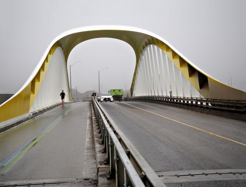
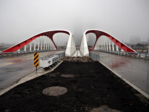
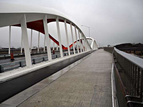
3 Bridges
Agreement between municipal, provincial and federal governments resulted in creation of a massive $1.5 B flood control project where Don river meets Lake Ontario. In order to facilitate grand landscape development 3 sets of bridges were constructed. Designed in UK, engineered in Germany, manufactured in Holland, assembled in Nova Scotia and brought on barges to Toronto for final installation. There is still a lot of construction around, but bridges are open to vehicular traffic, walkers, runners and bikers. I could have spent hours there, but I think return trip in better weather is a must.
I like how you brought out the characteristics of the shapes of the different bridges.
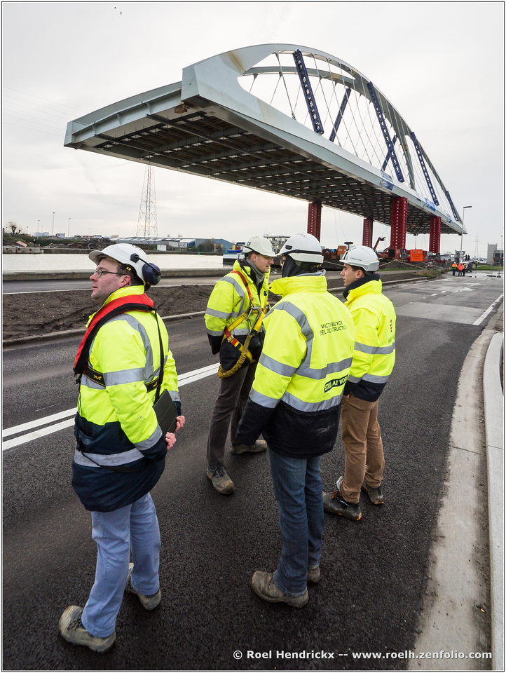
If you are interesting in bridges and how they are constructed, transported and put into place, you may like a documentary photo series of mine, that was shot over the course of roughly 36 hours in winter 2017, to show the final stages of a bridge replacement.
I will add the link later. The gallery seems to have been auto-archived on zenfolio, so I will need to restore the link first.Here is that link that I promised:
Sample image:
-
@RoelHendrickx has written:@RoelHendrickx has written:@ChrisOly has written:
3 Bridges
Agreement between municipal, provincial and federal governments resulted in creation of a massive $1.5 B flood control project where Don river meets Lake Ontario. In order to facilitate grand landscape development 3 sets of bridges were constructed. Designed in UK, engineered in Germany, manufactured in Holland, assembled in Nova Scotia and brought on barges to Toronto for final installation. There is still a lot of construction around, but bridges are open to vehicular traffic, walkers, runners and bikers. I could have spent hours there, but I think return trip in better weather is a must.
I like how you brought out the characteristics of the shapes of the different bridges.
If you are interesting in bridges and how they are constructed, transported and put into place, you may like a documentary photo series of mine, that was shot over the course of roughly 36 hours in winter 2017, to show the final stages of a bridge replacement.
I will add the link later. The gallery seems to have been auto-archived on zenfolio, so I will need to restore the link first.Here is that link that I promised:
Sample image:

Thank you Roel. Absolutely incredible feat of engineering. Your shots revealed it all.
Night captures are truly amazing. -
@OpenCube has written:
Yes, it could be an embryo in a womb, but it could be other things too and thinking about that is what makes the image.
No matter what the viewer sees in it, the image has pleasing haves and colours, which makes it a peaceful experience.Pete
-
@JSPhotoHobby has written:
Just a moment in time
A moment in time. We see two people who are interacting with each other, and, judging by their expressions, it seems to be an enjoyable experience. However, he is looking directly at her and she is looking somewhere else. Has the enjoyable moment in time just finished? Was the exchange between them a compliment, or a friendly or even witty remark? Or did they have a more substantial conversation? We don’t know, and it is unimportant. What is important is that the photo triggers us to have these thoughts and spend time with it.
The background is very cluttered, but is that a problem? I don’t think so, as the people are still easily seen and the background is important to give a sense of place and give a sense of brevity to the meeting. Had this been a plush café, it would probably have led us to believe the metering had been longer , more intimate.Pete
-
@Rich42 has written:
Rich
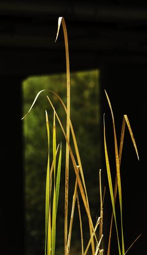
The grasses are nice and sharp, which I think is important for the photo to work. The colours are attractive, and so is the arrangement of the grasses. The background is unusual, with the rectangle of out of focus objects with similar colours to the grasses and the black, but it works well.
Pete
-
@PeteS has written:@OpenCube has written:
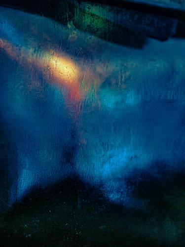
Yes, it could be an embryo in a womb, but it could be other things too and thinking about that is what makes the image.
No matter what the viewer sees in it, the image has pleasing haves and colours, which makes it a peaceful experience.Pete
Considering the original source is kinda nightmare fuel, that is funny.
-
@PeteS has written:@Rich42 has written:
Rich
The grasses are nice and sharp, which I think is important for the photo to work. The colours are attractive, and so is the arrangement of the grasses. The background is unusual, with the rectangle of out of focus objects with similar colours to the grasses and the black, but it works well.
Pete
Minnie, Mike and Pete,
Thanks so much for the comments.
Rich
